


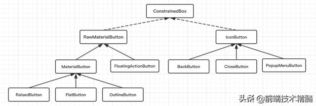
Flutter 中没有 Button Widget,但提供了很多不同类型的 Child Button Widget;小菜分析源码整体可分为 RawMaterialButton 和 IconButton 两类;
其中 RaisedButton / FlatButton / OutlineButton 继承自 MaterialButton 且 MaterialButton 是对 RawMaterialButton 的封装;而BackButton / CloseButton / PopupMenuButton 继承自 IconButton;最终 RawMaterialButton 和 IconButton 都是由 ConstrainedBox 填充绘制;
RawMaterialButton 系列
所有Material 库中的按钮都有如下相同点:
- 按下时都会有“水波动画”(又称“涟漪动画”,就是点击时按钮上会出现水波荡漾的动画)。
- 有一个onPressed属性来设置点击回调,当按钮按下时会执行该回调,如果不提供该回调则按钮会处于禁用状态,禁用状态不响应用户点击。
下面是源码分析
const RawMaterialButton({ Key key, @required this.onPressed, this.onHighlightChanged, // 高亮变化的回调 this.textStyle, // 文字属性 this.fillColor, // 填充颜色 this.highlightColor, // 背景高亮颜色 this.splashColor, // 水波纹颜色 this.elevation = 2.0, // 阴影 this.highlightElevation = 8.0, // 高亮时阴影 this.disabledElevation = 0.0, // 不可点击时阴影 this.padding = EdgeInsets.zero, // 内容周围边距 this.constraints = const BoxConstraints(minWidth: 88.0, minHeight: 36.0), // 默认按钮尺寸 this.shape = const RoundedRectangleBorder(), // 形状样式 this.animationDuration = kThemeChangeDuration, // 动画效果持续时长 this.clipBehavior = Clip.none, // 抗锯齿剪切效果 MaterialTapTargetSize materialTapTargetSize, // 点击目标的最小尺寸 this.child,})分析源码可知,RawMaterialButton 没有设置宽高的属性,可根据 padding 或外层依赖 Container 适当调整位置和大小;默认最小尺寸为 88px * 36px。
FloatingActionButton
FloatingActionButton 是 RawMaterialButton 的封装,主要用于浮动在屏幕内容之上,一般是位于底部左右角或中间;一般一个页面只有一个;
源码分析
const FloatingActionButton({ Key key, this.child, this.tooltip, // 长按提醒 this.foregroundColor, // 按钮上子元素颜色 this.backgroundColor, // 背景色 this.heroTag = const _DefaultHeroTag(), // Hero 动画标签 this.elevation = 6.0, // 阴影 this.highlightElevation = 12.0, // 高亮时阴影 @required this.onPressed, this.mini = false, // 尺寸大小,分为 mini 和 default this.shape = const CircleBorder(), // 样式形状 this.clipBehavior = Clip.none, // 抗锯齿剪切效果 this.materialTapTargetSize, // 点击目标的最小尺寸 this.isExtended = false, // 是否采用 .extended 方式})RaisedButton
源码分析
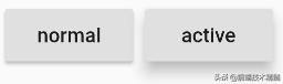
const RaisedButton({ Key key, @required VoidCallback onPressed, ValueChanged onHighlightChanged, ButtonTextTheme textTheme, // 按钮文字主题 Color textColor, // 子元素颜色 Color disabledTextColor, // 不可点击时子元素颜色 Color color, // 按钮背景色 Color disabledColor, // 不可点击时按钮背景色 Color highlightColor, // 点击高亮时按钮背景色 Color splashColor, // 水波纹颜色 Brightness colorBrightness, // 颜色对比度 double elevation, // 阴影高度 double highlightElevation, // 高亮时阴影高度 double disabledElevation, // 不可点击时阴影高度 EdgeInsetsGeometry padding, // 子元素周围边距 ShapeBorder shape, // 按钮样式 Clip clipBehavior = Clip.none, // 抗锯齿剪切效果 MaterialTapTargetSize materialTapTargetSize, Duration animationDuration, // 动画时长 Widget child,})RaisedButton 即”漂浮”按钮,它默认带有阴影和灰色背景。按下后,阴影会变大,如图所示:
使用RaisedButton非常简单,如:
RaisedButton( child: Text("normal"), onPressed: () {},);FlatButton
源码分析
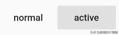
const FlatButton({ Key key, @required VoidCallback onPressed, ValueChanged onHighlightChanged, ButtonTextTheme textTheme, // 按钮文字主题 Color textColor, // 子元素颜色 Color disabledTextColor, // 不可点击时子元素颜色 Color color, // 按钮背景色 Color disabledColor, // 不可点击时按钮背景色 Color highlightColor, // 点击高亮时按钮背景色 Color splashColor, // 水波纹颜色 Brightness colorBrightness, // 颜色对比度 EdgeInsetsGeometry padding, // 子元素周围边距 ShapeBorder shape, // 按钮样式 Clip clipBehavior = Clip.none, // 抗锯齿剪切效果 MaterialTapTargetSize materialTapTargetSize, @required Widget child, })//示例FlatButton( color: Colors.blue, highlightColor: Colors.blue[700], colorBrightness: Brightness.dark, splashColor: Colors.grey, child: Text("Submit"), shape:RoundedRectangleBorder(borderRadius: BorderRadius.circular(20.0)), onPressed: () {},)FlatButton即扁平按钮,默认背景透明并不带阴影。按下后,会有背景色,如图3-11所示:
使用FlatButton也很简单,代码如下:
FlatButton( child: Text("normal"), onPressed: () {},)OutlineButton
源码分析
const OutlineButton({ Key key, @required VoidCallback onPressed, ButtonTextTheme textTheme, // 按钮文字主题 Color textColor, // 文字颜色 Color disabledTextColor, // 不可点击时文字颜色 Color color, // 按钮背景色 Color highlightColor, // 高亮时颜色 Color splashColor, // 水波纹颜色 double highlightElevation, // 高亮时阴影高度 this.borderSide, // 边框样式 this.disabledBorderColor, // 不可点击时边框颜色 this.highlightedBorderColor, // 高亮时边框颜色 EdgeInsetsGeometry padding, // 内容周围边距 ShapeBorder shape, // 按钮样式 Clip clipBehavior = Clip.none, // 抗锯齿剪切效果 Widget child,})分析源码可知,OutlineButton 与其他两种按钮略有不同,强调边框的样式属性且无长按的 tooltip 属性;
以下为 OutlineButton 特有属性:borderSide 代表边框样式;disabledBorderColor 代表不可点击时边框颜色;highlightedBorderColor 代表高亮时边框颜色;其中 borderSide 可以设置边框颜色宽度及样式(solid / none);
OutlineButton 还提供了 .icon 带图标的简单方式,icon / label 两个属性是必须属性;
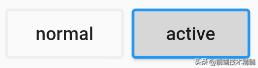
OutlineButton默认有一个边框,不带阴影且背景透明。按下后,边框颜色会变亮、同时出现背景和阴影(较弱),如图所示:
使用OutlineButton也很简单,代码如下:
OutlineButton( child: Text("normal"), onPressed: () {},)IconButton 系列
IconButton 系列属于图标按钮,使用相对简单;其核心是 InkResponse 水波纹效果;
IconButton
源码分析
const IconButton({ Key key, this.iconSize = 24.0, // 图标大小 this.padding = const EdgeInsets.all(8.0), // 图标周围间距 this.alignment = Alignment.center, // 图标位置 @required this.icon, // 图标资源 this.color, // 图标颜色 this.highlightColor, // 点击高亮颜色 this.splashColor, // 水波纹颜色 this.disabledColor, // 不可点击时高亮颜色 @required this.onPressed, this.tooltip // 长按提示})分析源码,其中 icon 和 onPressed 是必须要设置的,其余属性根据需求而适当调整;
IconButton是一个可点击的Icon,不包括文字,默认没有背景,点击后会出现背景,如图3-13所示:
代码如下:
IconButton( icon: Icon(Icons.thumb_up), onPressed: () {},)BackButton
BackButton 作用非常明确,一般用作返回上一个页面;
源码分析
const BackButton({ Key key, this.color })分析源码,BackButton 继承自 IconButton,只允许设置图标颜色,图标样式 Android 与 iOS 不同且不可修改;点击时会优先判断 maybePop 是否可以返回上一页;
案例尝试
BackButton();BackButton(color: Colors.green);CloseButton
CloseButton 一般用作导航栏关闭按钮与 BackButton 类似;
源码分析
const CloseButton({ Key key }) : super(key: key);分析源码,CloseButton 继承自 IconButton,无需设置任何属性;点击时会优先判断 maybePop 是否可以返回上一页;
案例尝试
CloseButton();


 213
213


 被折叠的 条评论
为什么被折叠?
被折叠的 条评论
为什么被折叠?
 到【灌水乐园】发言


