


import numpy as np
import pandas as pd
import matplotlib.pyplot as plt
import seaborn as sns
import statsmodels.api as sm
import statsmodels.formula.api as smf
import statsmodels.tsa.api as smt
一些可视化参数设置
pd.set_option('display.float_format', lambda x: '%.5f' % x) # pandas
np.set_printoptions(precision=5, suppress=True) # numpy

pd.set_option('display.max_columns', 100)
pd.set_option('display.max_rows', 100)

# seaborn plotting style
sns.set(style='ticks', context='poster')
导入数据
Sentiment = './data/sentiment.csv'
Sentiment = pd.read_csv(Sentiment, index_col=0, parse_dates=[0])
print(Sentiment.head())
             UMCSENT
DATE
2000-01-01 112.00000
2000-02-01 111.30000
2000-03-01 107.10000
2000-04-01 109.20000
2000-05-01 110.70000
差分法(一般一阶查分就可以了)
#选择数据中一些序列
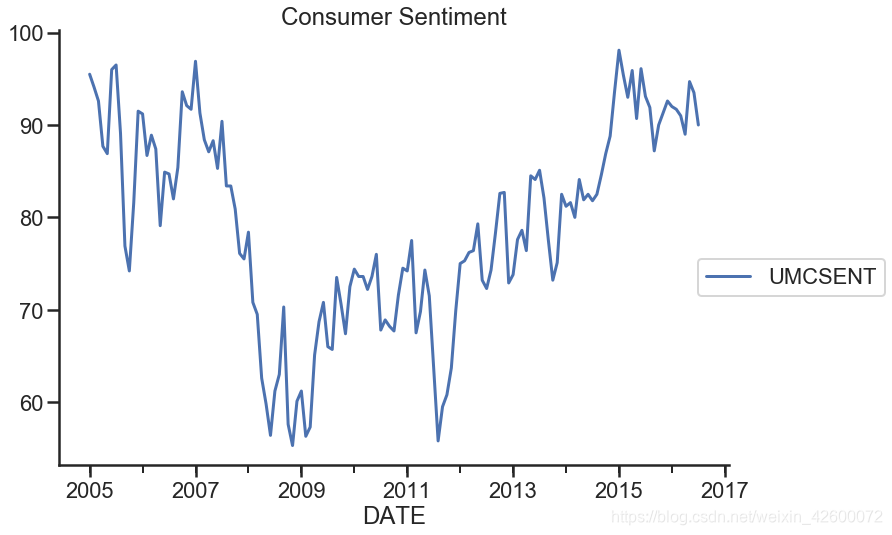
sentiment_short = Sentiment.loc['2005':'2016']
sentiment_short.plot(figsize=(12,8))
plt.legend(bbox_to_anchor=(1.25, 0.5))
plt.title('Consumer Sentiment')
sns.despine()
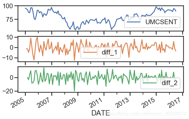
#数字1表示一阶差分,两次一阶差分即可得到两阶差分
sentiment_short['diff_1'] = sentiment_short['UMCSENT'].diff(1)
sentiment_short['diff_2'] = sentiment_short['diff_1'].diff(1)
sentiment_short.plot(subplots=True, figsize=(10,6))
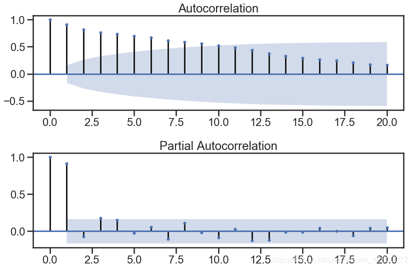
ARIMA模型
- 确定差分阶数d
- ACF函数和PACF函数确定p和q值
del sentiment_short['diff_2']
del sentiment_short['diff_1']
sentiment_short.head()
print (type(sentiment_short))
<class 'pandas.core.frame.DataFrame'>
fig = plt.figure(figsize=(12,8))

ax1 = fig.add_subplot(2,1,1)
fig = sm.graphics.tsa.plot_acf(sentiment_short, lags=20, ax=ax1)
ax1.xaxis.set_ticks_position('bottom')
fig.tight_layout();

ax2 = fig.add_subplot(2,1,2)
fig = sm.graphics.tsa.plot_pacf(sentiment_short, lags=20, ax=ax2)
ax2.xaxis.set_ticks_position('bottom')
fig.tight_layout();
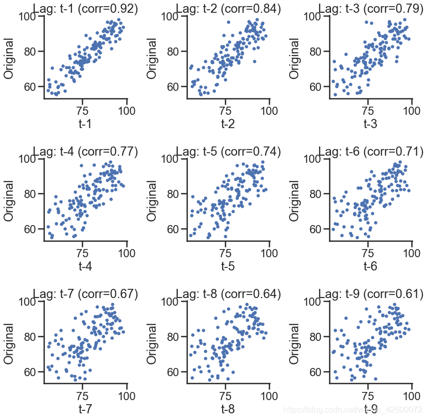
# 散点图也可以表示

lags = 9

ncols = 3
nrows = int(np.ceil(lags / ncols))

fig, axes = plt.subplots(
    ncols=ncols, nrows=nrows, figsize=(4 * ncols, 4 * nrows))

for ax, lag in zip(axes.flat, np.arange(1, lags + 1, 1)):
    lag_str = 't-{}'.format(lag)
    X = (pd.concat(
        [sentiment_short, sentiment_short.shift(-lag)],
        axis=1,
        keys=['y'] + [lag_str]).dropna())

    X.plot(
        ax=ax, kind='scatter', y='y', x=lag_str)
    corr = X.corr().as_matrix()[0][1]
    ax.set_ylabel('Original')
    ax.set_title('Lag: {} (corr={:.2f})'.format(lag_str, corr))
    ax.set_aspect('equal')
    sns.despine()

fig.tight_layout()
模板画图,直接套用即可
# 更直观一些
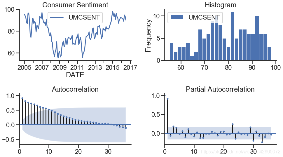
def tsplot(y, lags=None, title='', figsize=(14, 8)):
fig = plt.figure(figsize=figsize)
layout = (2, 2)
ts_ax = plt.subplot2grid(layout, (0, 0))
hist_ax = plt.subplot2grid(layout, (0, 1))
acf_ax = plt.subplot2grid(layout, (1, 0))
pacf_ax = plt.subplot2grid(layout, (1, 1))
y.plot(ax=ts_ax)
ts_ax.set_title(title)
y.plot(ax=hist_ax, kind='hist', bins=25)
hist_ax.set_title('Histogram')
smt.graphics.plot_acf(y, lags=lags, ax=acf_ax)
smt.graphics.plot_pacf(y, lags=lags, ax=pacf_ax)
[ax.set_xlim(0) for ax in [acf_ax, pacf_ax]]
sns.despine()
plt.tight_layout()
return ts_ax, acf_ax, pacf_ax
tsplot(sentiment_short, title='Consumer Sentiment', lags=36)
(<matplotlib.axes._subplots.AxesSubplot at 0x154936a0>,
 <matplotlib.axes._subplots.AxesSubplot at 0x154c47b8>,
 <matplotlib.axes._subplots.AxesSubplot at 0x154e6160>)


 1650
1650


 被折叠的 条评论
为什么被折叠?
被折叠的 条评论
为什么被折叠?
 到【灌水乐园】发言


