


怪异盒模型:
box-sizing:
属性值:
- content-box;(标准盒模型)
- border-box;(怪异盒模型)
怪异盒模型特点:
padding和border不会对盒子大小产生影响
所添加padding和border在宽高内部。
弹性盒模型:布局方法
作用:弹性盒控制子元素(不包括孙子辈元素)的布局方法。
特点:
- a: 弹性盒默认情况下,子元素沿着“主轴”排列,默认情况下X轴为主轴
- b: 弹性盒的子元素称作“ 灵活元素 ”,所有的子元素都能设置宽高(注:内联元素也可以)
- c: 如果一个子元素在弹性盒子里面左右上下居中,只需要给子元素添加margin:auto;(注意子元素为单个才可以,如果多个子元素的话不行)
1: 触发弹性盒( 添加在父元素上面 )
display:flex;
2: 改变主轴的方向( 添加在父元素上面 )
flex-direction:
属性值:
- row X轴为主轴
- column Y轴为主轴
- row-reverse X轴为主轴并反向排列
- column-reverse Y轴为主轴并反向排列
3: 主轴的对齐方式( 添加在父元素上面 )
justify-content:
属性值:
- flex-start 弹性盒开始位置对齐
- flex-end 弹性盒结束位置对齐
- center 居中对齐
- space-between 两端对齐
- space-around 自动对齐,多余的空间分平分到元素的两侧
- space-evenly:自动对齐,多余的空间平均分配到元素的两侧,元素与元素之间的距离不会去叠加


4: 侧轴对齐方式( 添加在父元素上面 )
align-items:
属性值:
- flex-start 侧轴开始的位置
- flex-end 侧轴结束的位置
- center 侧轴中间
- baseline 和 flex-start 等效
- stretch(默认值) 拉伸
5: 是否让子元素超出的时候换行(弹性盒子元素默认不会换行(在主轴挤压))
flex-wrap:
属性值:
- nowrap 不换行挤压
- wrap 换行
- wrap-reverse 反向换行
6: 控制行与行之间的间距( 添加在父元素上面 )(注:必须多行才可以有效果)
align-content:
属性值:
- flex-start
- flex-end
- center
- space-between
- space-around
- stretch
7: flex-flow: ( 添加在父元素上面 )
flex-direction 和 flex-wrap的简写;
其中:
flex-direction : 改变主轴的方向
flex-wrap :是否让子元素超出的时候换行
eg: flex-flow:column wrap Y轴排列并且换行;
添加在子元素上面的属性:
8: 控制某一个子元素在侧轴的对齐方式
align-self:
属性值:
- auto 默认值。元素继承了它的父容器的 align-items 属性。如果没有父容器则为 “stretch”
- stretch 元素被拉伸以适应容器。
- center 元素位于容器的中心。
- flex-start 元素位于容器的开头。
- flex-end 元素位于容器的结尾。
注意:auto属性,如果父元素有 align-items,那么auto的值就为 父元素align-items的属性值,如果父元素没有 align-items 属性 auto的值就为 stretch
9: 控制子元素的先后排列顺序
order:
属性值是一个数字,数字越大越往后排列,能接收负数。
默认为:0
比如 order:1;
10:剩余空间的分配:
复合属性,设置或检索弹性盒模型对象的子元素如何分配空间,分配空间是分配主轴上的空间;
flex:1; ( 把剩余空间全部分配给当前元素 ) 或者(平均分配)
flex-shrink:0; 子元素不在主轴挤压
flex的三兄弟:
- flex-grow
一个数字,规定项目将相对于其他灵活的项目进行扩展的量。 - flex-shrink
一个数字,规定项目将相对于其他灵活的项目进行收缩的量。 - flex-basis
项目的长度
flex-grow 说明:
 <style>
        * {
            padding: 0;
            margin: 0;
        }
        ul,
        li {
            list-style: none;
        }
        ul {
            width: 500px;
            height: 400px;
            border: 2px solid green;
            display: flex;
        }

        /*
            flex 值之和 为 4,把父元素空间份为 4份
            第一个li占据 2份
            第二个和第三个各占据2fen
         */
        /* 设置子元素占据父元素的比份 */
        /* ul li:nth-child(1) {
            flex: 2;
        }

        ul li:nth-child(2) {
            flex: 1;
        }

        ul li:nth-child(3) {
            flex: 1;
        } */
        ul li {
            /* 父元素剩余空间还有 200px */
            width: 100px;
            background: pink;
        }

        ul li:nth-child(1) {
            /* flex-grow 把父元素的剩余空间平分 4份, */
            /* 占据剩余空间的 1份 */
            flex-grow: 1;
        }

        ul li:nth-child(2) {
            /* 占据剩余空间的 3份 */
            flex-grow: 3;
        }
    </style>
</head>

<body>
    <ul>
        <li>1</li>
        <li>2</li>
        <li>3</li>
    </ul>
</body>

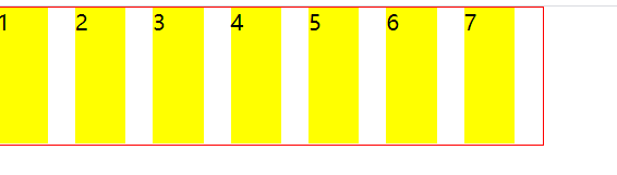
flex-basis 和flex- shrink 说明:
 <style>
        * {
            padding: 0;
            margin: 0;
        }
        ul,
        li {
            list-style: none;
        }

        ul {
            display: flex;
            width: 400px;
            height: 100px;
            border: 1px solid red;
            overflow: auto;
        }

        ul li {
            /* flex-basis 相当于给元素设置width ,当设置ul flex-basis之后,那么width的值没有效果 */
            flex-basis: 100px;
            width: 200px;/* 此处的width 没效果 */
            height: 100px;
            background: yellow;
            /* 设置子元素不被压缩 */
            flex-shrink: 0;
            margin-right: 20px;
        }
    </style>
</head>

<body>
    <ul>
        <li>1</li>
        <li>2</li>
        <li>3</li>
        <li>4</li>
        <li>5</li>
        <li>6</li>
        <li>7</li>
    </ul>
</body>

如果不设置flex-shrink :0的话、效果如下:
案例:骰子
<!DOCTYPE html>
<html lang="en">
<head>
    <meta charset="UTF-8">
    <meta name="viewport" content="width=device-width, initial-scale=1.0">
    <title>Document</title>
    <style>
        *{
            margin:0;
            padding:0;
        }
        body,html{
            height:100%;
        }
        section{
            width:100%;
            height:100%;
            /* 触发弹性盒子 */
            display:flex;
            /* 主轴对齐方式 */
            justify-content:space-around;
            /* 侧轴居中 */
            align-items:center;
            /* 换行 */
            flex-wrap:wrap;
        }
        div{
            width: 100px;
            height: 100px;
            background: #e7e7e7;
            padding: 4px;
            box-shadow: inset 0 5px white, inset 0 -5px #bbb, inset 5px 0 #d7d7d7, inset -5px 0 #d7d7d7;
            border-radius: 10px;
        }
        span{
            display:block;
            width: 24px;
            height: 24px;
            background: #333;
            box-shadow: inset 0 3px #111, inset 0 -3px #555;
            border-radius: 12px;
            margin: 4px;
        }
        p{
            background:red;
        }
        /* 第一个div */
            /* div:nth-child(1){
                display:flex;
            }
            div:nth-child(1) span{
                margin:auto;
            } */
        div:nth-child(1){
            display:flex;
            /* 主轴居中 */
            justify-content:center;
            /* 侧轴居中 */
            align-items:center;
        }

        /* 第二个div */
        div:nth-child(2){
            display:flex;
            /* 主轴两端对齐 */
            justify-content:space-between;
        }
        div:nth-child(2) span:nth-child(2){
            align-self:flex-end;
        }

        /* 第三个 */
        div:nth-child(3){
            display:flex;
            /* Y轴为主轴 */
            flex-direction:column;
            /* 主轴对齐 */
            justify-content:space-between;
        }
        div:nth-child(3) span:nth-child(2){
            align-self:center;
        }
        div:nth-child(3) span:nth-child(3){
            align-self:flex-end;
        }

        /* 第四个 */
        div:nth-child(4){
            display:flex;
            /* 主轴对齐方式 */
            justify-content:space-between;
        }
        div:nth-child(4) p{
            display:flex;
            /* 改变主轴方向 */
            flex-direction:column;
            /* 主轴两端对齐 */
            justify-content:space-between
        }

        /* 第五个 */
        div:nth-child(5){
            display:flex;
            justify-content:space-between;
        }
        div:nth-child(5) p{
            display:flex;
            flex-direction:column;
            justify-content:space-between;
        }
        div:nth-child(5) p:nth-child(2){
            justify-content:center;
        }
    </style>
</head>
<body>
    <section>
        <div>
            <span></span>
        </div>
        <div>
            <span></span><span></span>
        </div>
        <div>
            <span></span>
            <span></span>
            <span></span>
        </div>
        <div>
            <p>
                <span></span><span></span><span></span>
            </p>
            <p>
                <span></span><span></span><span></span>
            </p>
        </div>
        <div>
            <p>
                <span></span><span></span>
            </p>
            <p><span></span></p>
            <p>
                <span></span><span></span>
            </p>
        </div>
        <div></div>
    </section>
</body>
</html>
效果图:

案例布局
案例:怪异盒——定位实现固定两栏布局
 <style>
        *{
            margin:0;
            padding:0;
        }
        body,html{
            height:100%;
        }
        header,footer{
            width:100%;
            height:40px;
            background:red;
            text-align:center;
            line-height:40px;
            color:#fff;
            /* 定位 */
            position:fixed;
        }
        header{
            top:0;
        }
        footer{
            bottom:0;
        }
        section{
            width:100%;
            height:100%;
            background:#ccc;
            padding:40px 0;
            box-sizing:border-box;
        }
        article{
            width:100%;
            height:100%;
            background:pink;
        }
    </style>
</head>
<body>
    <header>header</header>
    <section>
        <article></article>
    </section>
    <footer>footer</footer>
</body>
效果图:

案例:弹性盒——上下固定中间自适应布局&&圣杯布局
 <style>
        *{
            margin:0;
            padding:0;
        }
        body,html{
            height:100%;
        }
        div{
            width:100%;
            height:100%;
            background:#ccc;
            /* 触发弹性盒子 */
            display:flex;
            /* Y轴为主轴 */
            flex-direction:column;
        }
        header,footer{
            width:100%;
            height:88px;
            background:blue;
        }
        section{
            flex:1;
            background:orange;
            /* 触发弹性盒子 */
            display:flex;
        }
        nav{
            width:150px;
            height:100%;
            background:pink;
        }
        aside{
            width:150px;
            height:100%;
            background:purple;

        }
        main{
            flex:1;
            background:yellow;
        }
    </style>
</head>
<body>
    <div>
        <header>header</header>
        <section>
            <nav></nav>
            <main></main>
            <aside></aside>
        </section>
        <footer>footer</footer>
    </div>
</body>
效果图:


 2521
2521


 被折叠的 条评论
为什么被折叠?
被折叠的 条评论
为什么被折叠?
 到【灌水乐园】发言


