


2 第二章:数据可视化
开始之前,导入numpy、pandas以及matplotlib包和数据
import numpy as np
import pandas as pd
TrainSet=pd.read_csv('result.csv')
TrainSet=TrainSet.drop(['Unnamed: 0'],axis=1)
2.7 如何让人一眼看懂你的数据?
《Python for Data Analysis》第九章
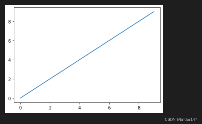
2.7.1 任务一:跟着书本第九章,了解matplotlib,自己创建一个数据项,对其进行基本可视化
【思考】最基本的可视化图案有哪些?分别适用于那些场景?(比如折线图适合可视化某个属性值随时间变化的走势)
import matplotlib.pyplot as plt
data = np.arange(10)
plt.plot(data)
2.7.2 任务二:可视化展示泰坦尼克号数据集中男女中生存人数分布情况(用柱状图试试)。
SexSur=TrainSet.groupby('Sex').agg({'Survived':'sum'})
type(SexSur)
SexSur.reset_index(inplace=True)
SexSur

SurNum = pd.to_numeric(SexSur["Survived"])
SurNum = SurNum.to_list()
SLabels = SexSur["Sex"]
SLabels = SLabels.to_list()
plt.bar(range(len(SurNum)), SurNum, width=0.35)
plt.xticks(range(len(SurNum)),SLabels)
plt.xlabel("Sex")
plt.ylabel("The numbers of Survived")
plt.show()
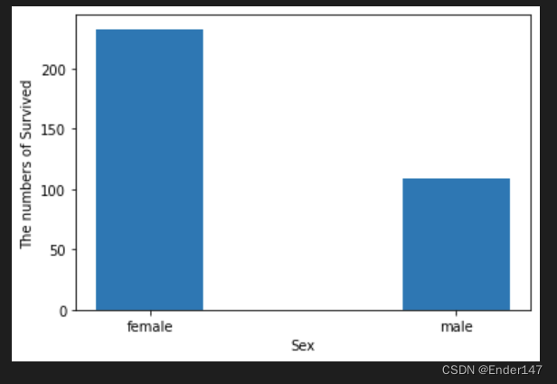
【思考】计算出泰坦尼克号数据集中男女中死亡人数,并可视化展示?如何和男女生存人数可视化柱状图结合到一起?看到你的数据可视化,说说你的第一感受(比如:你一眼看出男生存活人数更多,那么性别可能会影响存活率)。
答:下一步的操作将回答这个问题。
2.7.3 任务三:可视化展示泰坦尼克号数据集中男女中生存人与死亡人数的比例图(用柱状图试试)。
SexNUM = TrainSet.groupby('Sex').agg({'PassengerId':'count'})
SexNUM.reset_index(inplace=True)
SexNum = pd.to_numeric(SexNUM["PassengerId"])
SexNum = SexNum.to_list()
SexDead = [SexNum[i] - SurNum[i] for i in range(len(SexNum))]
x=np.arange(len(SexDead))
plt.bar(x, SurNum, width=0.35, color = 'b', label = 'Survived')
plt.bar(x + 0.35, SexDead, width=0.35, color = 'r', label = 'Dead')
plt.xticks(x, SLabels)
plt.xlabel("Sex")
plt.legend()
plt.show()

2.7.4 任务四:可视化展示泰坦尼克号数据集中不同票价的人生存和死亡人数分布情况。(用折线图试试)(横轴是不同票价,纵轴是存活人数)
【提示】对于这种统计性质的且用折线表示的数据,你可以考虑将数据排序或者不排序来分别表示。看看你能发现什么?
FareNUM = TrainSet.groupby('Fare').agg({'Survived':'count'})
SurFare = TrainSet.groupby('Fare').agg({'Survived':'sum'})
SurFare.reset_index(inplace=True)
FareNum = pd.to_numeric(FareNUM["Survived"])
FareNum = FareNum.to_list()
XFare = SurFare['Fare']
XFare = XFare.to_list()
Y1Survived = pd.to_numeric(SurFare["Survived"])
Y1Survived = Y1Survived.to_list()
Y2Survived = [FareNum[i] - Y1Survived[i] for i in range(len(Y1Survived))]
plt.plot(XFare, Y1Survived, linestyle='-', color='b', marker='x', linewidth=1.5, label = 'Survived')
plt.plot(XFare, Y2Survived, linestyle='-', color='r', marker='x', linewidth=1.5, label = 'Dead')
# 画网格线
plt.grid(which='minor', c='lightgrey')
# 设置x轴标签
plt.xlabel("Fare")
plt.legend()
plt.show()

2.7.5 任务五:可视化展示泰坦尼克号数据集中不同仓位等级的人生存和死亡人员的分布情况。(用柱状图试试)
ClassNUM = TrainSet.groupby('Pclass').agg({'PassengerId':'count'})
ClassNUM.reset_index(inplace=True)
ClassNum = pd.to_numeric(ClassNUM["PassengerId"])
ClassNum = ClassNum.to_list()
Clabels = ClassNUM['Pclass']
Clabels = Clabels.to_list()

SurClass = TrainSet.groupby('Pclass').agg({'Survived':'sum'})
SurClass = pd.to_numeric(SurClass["Survived"])
SurClass = SurClass.to_list()

DeadClass = [ClassNum[i] - SurClass[i] for i in range(len(SurClass))]

x=np.arange(len(DeadClass))
plt.bar(x, SurClass, width=0.35, color = 'b', label = 'Survived')
plt.bar(x + 0.35, DeadClass, width=0.35, color = 'r', label = 'Dead')
plt.xticks(x, Clabels)
plt.xlabel("Pclass")
plt.legend()
plt.show()

【思考】看到这个前面几个数据可视化,说说你的第一感受和你的总结
matplotlib的功能十分强大。能满足画图的所有需求。
2.7.6 任务六:可视化展示泰坦尼克号数据集中不同年龄的人生存与死亡人数分布情况。(不限表达方式)
AgeNUM = TrainSet.groupby('Age').agg({'Survived':'count'})
SurAge = TrainSet.groupby('Age').agg({'Survived':'sum'})
SurAge.reset_index(inplace=True)
AgeNum = pd.to_numeric(AgeNUM["Survived"])
AgeNum = AgeNum.to_list()
XAge = SurAge['Age']
XAge = XAge.to_list()
Y1SurvivedAge = pd.to_numeric(SurAge["Survived"])
Y1SurvivedAge = Y1SurvivedAge.to_list()
Y2DeadAge = [AgeNum[i] - Y1SurvivedAge[i] for i in range(len(Y1SurvivedAge))]
plt.plot(XAge, Y1SurvivedAge, linestyle='-', color='b', marker='x', linewidth=1.5, label = 'Survived')
plt.plot(XAge, Y2DeadAge, linestyle='-', color='r', marker='x', linewidth=1.5, label = 'Dead')
# 画网格线
plt.grid(which='minor', c='lightgrey')
# 设置x轴标签
plt.xlabel("Age")
plt.legend()
plt.show()

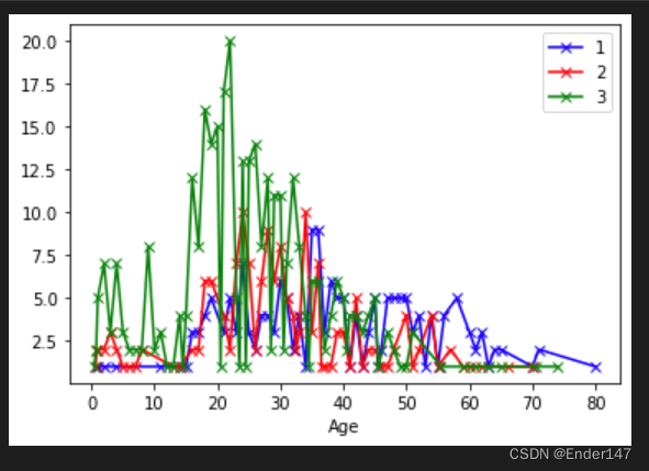
2.7.7 任务七:可视化展示泰坦尼克号数据集中不同仓位等级的人年龄分布情况。(用折线图试试)
PAgeNUM = TrainSet.groupby(['Pclass','Age']).agg({'PassengerId':'count'})
PAgeNUM.reset_index(inplace=True)

XP1Age = PAgeNUM.loc[0:56,:]
X1Age = XP1Age['Age']
X1Age = X1Age.to_list()
Y1CAge = pd.to_numeric(XP1Age["PassengerId"])
Y1CAge = Y1CAge.to_list()


XP2Age = PAgeNUM.loc[57:113,:]
X2Age = XP2Age['Age']
X2Age = X2Age.to_list()
Y2CAge = pd.to_numeric(XP2Age["PassengerId"])
Y2CAge = Y2CAge.to_list()

XP3Age = PAgeNUM.loc[114:181,:]
X3Age = XP3Age['Age']
X3Age = X3Age.to_list()
Y3CAge = pd.to_numeric(XP3Age["PassengerId"])
Y3CAge = Y3CAge.to_list()

plt.plot(X1Age, Y1CAge, linestyle='-', color='b', marker='x', linewidth=1.5, label = '1')
plt.plot(X2Age, Y2CAge, linestyle='-', color='r', marker='x', linewidth=1.5, label = '2')
plt.plot(X3Age, Y3CAge, linestyle='-', color='g', marker='x', linewidth=1.5, label = '3')
# 画网格线
plt.grid(which='minor', c='lightgrey')
# 设置x轴标签
plt.xlabel("Age")
plt.legend()
plt.show()


 117
117


 被折叠的 条评论
为什么被折叠?
被折叠的 条评论
为什么被折叠?
 到【灌水乐园】发言


