


文章目录
参考
Views & Controls(视图和控件)
1.UIView
1.1 定义
管理屏幕上的矩形区域的内容
1.2 初始化
//屏幕左上角是坐标(0,0)
//创建宽高为100的矩形,矩形的左上角的坐标是(100,100)
let view = UIView(frame: CGRect(x: 100, y: 100, width: 100, height: 100))
1.3 视觉和外观
| 属性 | 解释 |
|---|---|
| backgroundColor | 背景色 |
| isHidden | 是否隐藏 |
| alpha | 透明度 |
| isOpaque | 是否不透明 |
| tintColor | 染色,类似前景色,主要在图片使用;如果没设置这个属性,则view会向父view寻找该属性,找不到的话就设置为系统默认的颜色(蓝色) |
| clipToBounds | 是否子view限于其边界.true的话,子view将被剪裁到其边界 |
| mask | 遮罩 |
1.4 事件相关
| 属性 | 解释 |
|---|---|
| isUserInteractionEnabled | 是否禁用用户交互(触摸,按下,键盘和焦点事件) |
| isMultipleTouchEnabled | 是否接受多点触摸 |
| isExclusiveTouch | 是否唯一触摸.(为true时,将会阻止触摸事件传递到同一窗口的其他视图) |
1.5 配置边界和框架矩形
| 属性 | 解释 |
|---|---|
| frame | 描述view在父view坐标系中的位置和大小 |
| bounds | 描述view在自己坐标系中的位置和大小 |
| center | frame的中心点 |
//详细举例说明,以Image为例
//1.设置UIImageView的frame:宽高为100,距离父view上边100,左边100,见图1.5.1
imageView.frame = CGRect(x: 100, y: 100, width: 100, height: 100)
//2.设置UIImageView的bounds:这时候使用的是自己的坐标系,以image的中心点为原点,宽高变为200,即沿着中心向四周扩大,上下左右各增加50。x为-200表示image内容向右平移200,y为100表示image内容向上平移100,见图1.5.2
imageView.bounds = CGRect(x: -200, y: 100, width: 200, height: 200)
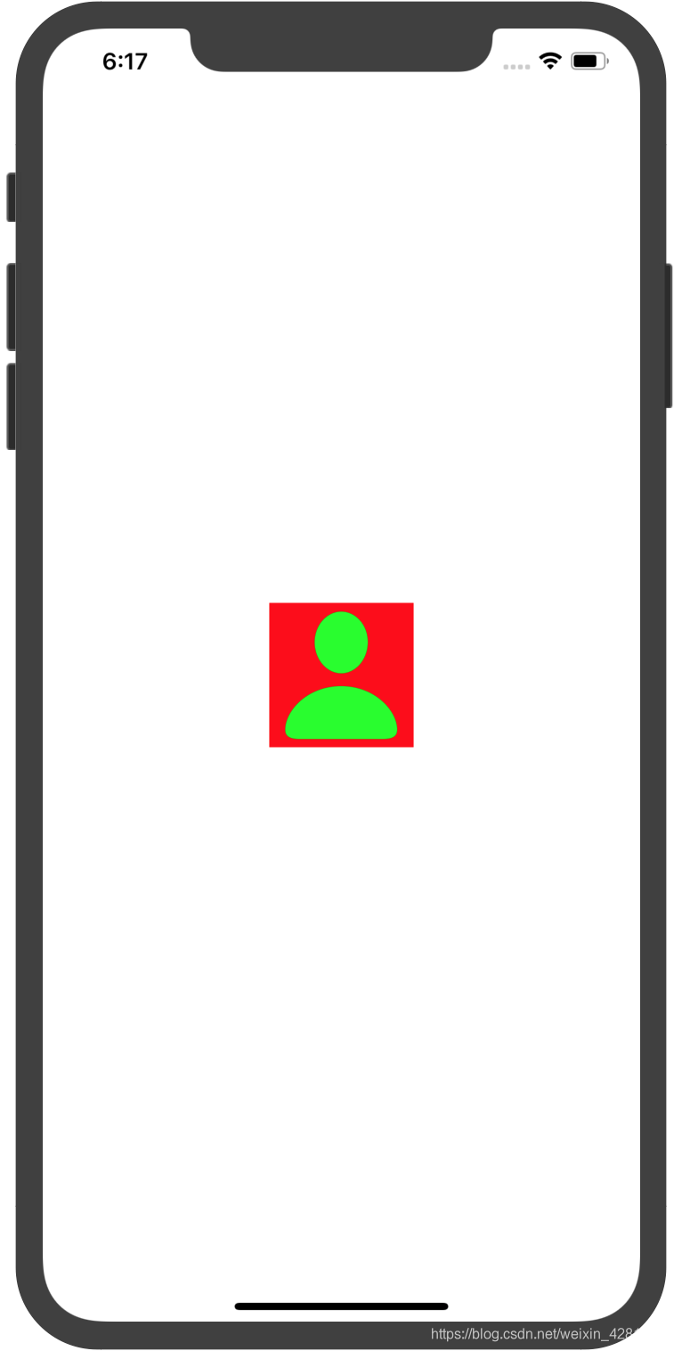
//3.在图1中imageview的center为(150,150)(相对于父view),可以更改imageview的center,这样也就更改了imageview的位置,见图1.5.3
imageView.frame = CGRect(x: 0, y: 0, width: 100, height: 100)
imageView.center = view.center
图1.5.1:
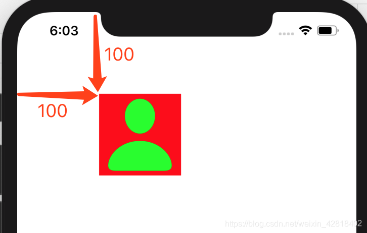
图1.5.2: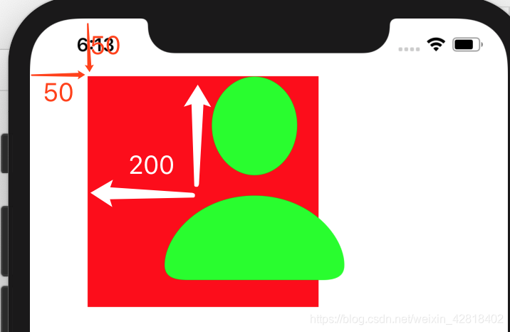
图1.5.3:
1.6 管理层次结构
| 属性 | 解释 |
|---|---|
| superview | 获取父view |
| subviews | 获取子views |
| window | 该view所处的窗口 |
| addSubView(UIView) | 添加子view |
| bringSubviewToFront(UIView) | 将某个子view显示在顶部 |
| sendSubviewToBack(UIView) | 将某个子view移动在底部 |
| removeFromSuperview() | 从父view中删除自己 |
| insertSubview(UIView,at) | 在指定的index插入子view |
| insertSubview(UIView,aboveSubview) | 在一个子view上方插入一个新的子view |
| insertSubview(UIView,belowSubview) | 在一个子view下方插入一个新的子view |
| exchangeSubview(at,withSubviewAt) | 在指定索引处交换子view |
| view1.isDescendant(of:view2) | view1是否是view2的子view |
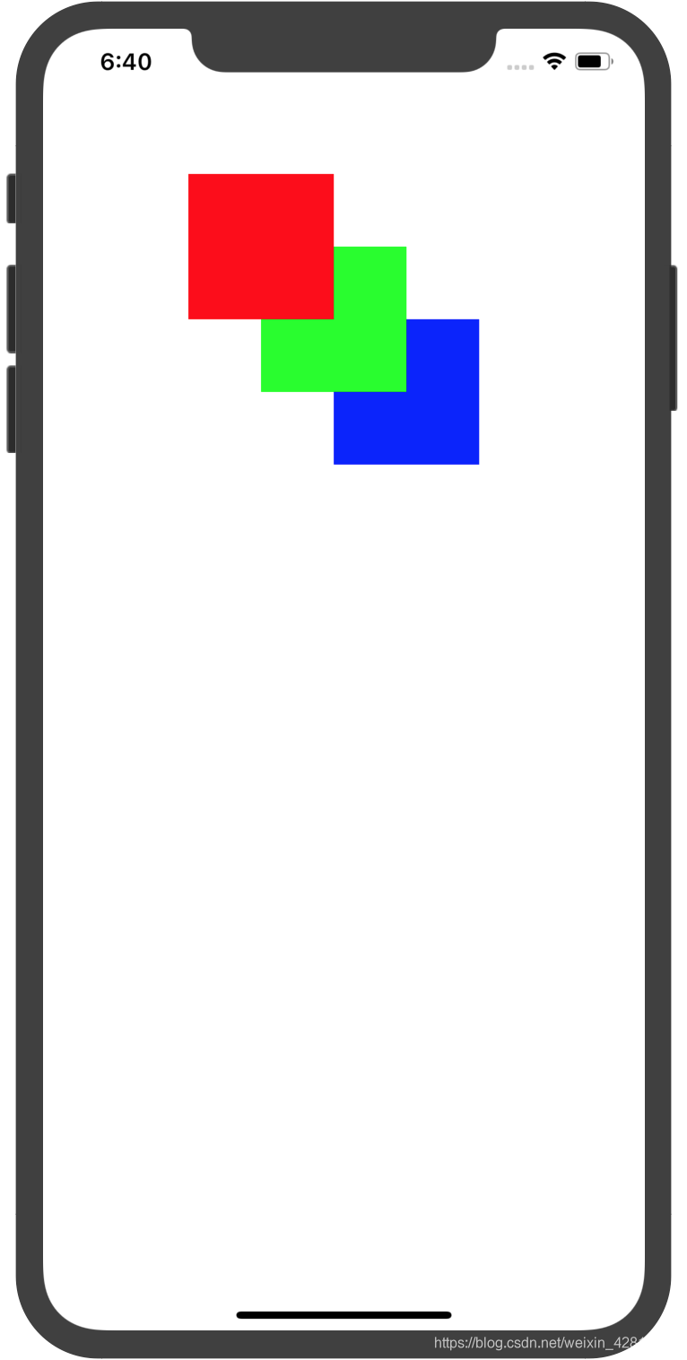
//例,见图1.6.1
        let v1 = UIView(frame: CGRect(x: 100, y: 100, width: 100, height: 100))
        v1.backgroundColor = .red
        let v2 = UIView(frame: CGRect(x: 150, y: 150, width: 100, height: 100))
        v2.backgroundColor = .green
        let v3 = UIView(frame: CGRect(x: 200, y: 200, width: 100, height: 100))
        v3.backgroundColor = .blue
        view.addSubview(v1)
        view.addSubview(v2)
        view.addSubview(v3)
        view.bringSubviewToFront(v2)
        view.sendSubviewToBack(v2)
        view.sendSubviewToBack(v3)
1.7 内容边距&安全区域
unFinished
1.8 管理视图约束
| 属性或方法 | 解释 |
|---|---|
| constraints | 所有约束 |
| addConstraint() | 添加约束 |
| addConstrants() | 添加多个约束 |
| removeConstraint() | 删除指定的约束 |
| removeConstraints() | 删除指定的约束 |
1.9 使用布局锚点创建约束
见
1.10 使用布局指南
unFinished
| 属性或方法 | 解释 |
|---|---|
| addLayoutGuide | 添加布局指南 |
| layoutGuides | 所有布局指南 |
| layoutMarginsGuide | 视图边距的布局指南 |
1.11 自动布局中的测量
1.12 在自动布局中对齐视图
1.13 触发自动布局
| 属性或方法 | 解释 |
|---|---|
| needsUpdateConstraints | 是否需要更新视图的约束 |
| setNeedsUpdateConstraints | 设置是否view的约束需要更新 |
| updateConstraints | 更新约束 |
| updateConstraintsIfNeeded | 每当为视图触发新的布局遍历时,系统都会调用此方法以确保使用来自当前视图层次结构及其约束的信息来更新该视图及其子视图的任何约束。该方法由系统自动调用,但是如果您需要检查最新的约束,则可以手动调用 |
1.14 调试自动布局
1.15 调整内容大小
在设置view大小后,内容应该怎样显示
| 属性或方法 | 解释 |
|---|---|
| ContentMode | 设置显示模式,view的大小不变 |
| sizeToFit | 调整view的大小,以便仅包围内容 |
| autoresizesSubviews | 自动调整子view的大小 |
1.16 手动布置子view
1.17 调整用户界面
1.18 添加和移除交互
1.19 绘制和更新视图
1.20 捕获视图快照
| 属性或方法 | 解释 |
|---|---|
| snapshotView | 根据当前视图的内容返回快照视图 |
| resizableSnapshotView | 根据当前视图的指定内容返回快照视图,并带有可拉伸的插图 |
| drawHierarchy | 将完整的视图层次结构的快照呈现为在屏幕上可见的当前上下文 |
1.21 在运行时识别视图
设置tag
| 属性或方法 | 解释 |
|---|---|
| tag | 设置tag |
| viewWithTag | 通过tag获取view |
2.UIControl
可以与用户交互的View
2.1 属性
| 属性 | 解释 |
|---|---|
| state | 状态 |
| isEnabled | 是否启用 |
| isSelected | 是否处于选定状态 |
| isHighlighted | 是否突出显示 |
| contentVerticalAlignment | 内容垂直对齐方式 |
| contentHorizontalAlignment | 内容水平对齐方式 |
- state有以下几种
normal正常状态
highlighted突出显示状态(例Button的按下去的状态)
disabled禁用状态
selected选中状态
focused被焦点选中状态
application可供应用程序使用的其他控制状态标志
reserved保留供内部框架使用的控制状态标志
2.2 响应事件
| 方法 | 解释 |
|---|---|
| addTarget | 添加响应事件操作 |
| removeTarget | 移除响应事件操作 |
| actions | 获取指定事件发生时,对目标对象执行的操作 |
| allControlEvents | 获取与此控件相关联的动作的事件 |
| allTargets | 返回与控件关联的所有目标对象 |
//例:UIButton的点击事件.addTarget方法的第一个参数target可以设置为nil,这样系统会在事件响应链中依次寻找clickBtn这个方法来调用,也可以指定为具体的实例,比如指定为self,self是该viewController的实例,这样系统就直接调用self.clickBtn()方法。第二个参数action不能为nil
class ViewController:UIViewController{
	override func viewDidLoad() {
		btn.addTarget(self, action: #selector(clickBtn), for: .touchUpInside)
	}
	@objc func clickBtn(){
		print("ok")
	}
}
2.3 触发Actions
//手动触发view的指定事件
btn.sendActions(for: .touchUpInside)
2.4 跟踪触摸和重绘
2.5 UIControl.Event全部事件
Down是手指按下去,Up是手指抬起
| 事件 | 解释 |
|---|---|
| touchDown | 按下去(在内部Down) |
| touchDownRepeat | 连续按下去两次(在内部Down-Up-Down) |
| touchDragInside | 在内部拖动(只要拖动一点就会响应一次事件,如果连续拖动则会响应多次事件) |
| touchDragOutside | 从内部拖动到外部(拖动到外部后,连续拖动会响应多次事件) |
| touchDragEnter | 外部拖动到内部 |
| touchDragExit | 内部拖动到外部(只会响应一次事件) |
| touchUpInside | 在内部Down-Up(点击事件) |
| touchUpOutside | 在内部Down,在外部Up |
| touchCancel | 系统事件终止此次触摸 |
| valueChanged | 值改变 |
| primaryActionTriggered | A semantic action triggered by buttons. |
| editingDidBegin | UITextField开始编辑 |
| editingChanged | UITextField编辑状态改变 |
| editingDidEnd | UITextField结束编辑 |
| editingDidEndOnExit | A touch ending an editing session in a UITextField object. |
| allTouchEvents | 所有触摸事件 |
| allEditingEvents | UITextField所有触摸编辑事件 |
| applicationReserved | A range of control-event values available for application use |
| systemReserved | A range of control-event values reserved for internal framework use. |
| allEvents | 包括系统事件的全部事件 |
3.常用view
3.1 UILabel
显示一行或多行只读文本,通常与UIControl使用
- 文本属性
| 属性 | 解释 |
|---|---|
| text | 文本 |
| attributedText | 带样式文本 |
| font | 字体 |
| textColor | 字体颜色 |
| textAlignment | 文本内容对齐方式 |
| lineBreakMode | 空间不够时,文本的截断方式 |
| isEnabled | 是否启用,为false时,文本会暗一点 |
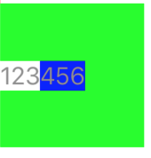
//带样式文本NSMutableAttributedString,见图3.1.1
let attrStr = NSMutableAttributedString(string: "123456")
        attrStr.addAttribute(.backgroundColor, value: UIColor.white, range: NSRange(location: 0, length: 3))
        attrStr.addAttribute(.backgroundColor, value: UIColor.blue, range: NSRange(location: 3, length: 3))
        lable.attributedText = attrStr
图3.1.1
- 调整文本大小
| adjustsFontSizeToFitWidth | 为true时,空间不够的话,会减小文字字体大小来显示更多文本 |
| allowsDefaultTighteningForTruncation | 为true时,空间不够将会被截断时,会压缩文本间距来显示更多文本 |
| baselineAdjustment | 文本需要缩小时,如何调整基线 |
| minimumScaleFactor | 文本需要缩小时,缩小到原来的几倍,如果设置为0,则会使用最小的字体大小 |
| numberOfLines | 行数 |
- 高亮和阴影
| 属性 | 解释 |
|---|---|
| isHighlighted | 是否高亮 |
| highlightedTextColor | 高亮颜色 |
| shadowColor | 文字阴影颜色 |
| shadowOffset | 阴影偏移量 |
3.2 UITextField
可编辑文本区域
- 属性
| 属性 | 解释 |
|---|---|
| text | 文本值 |
| placeholder | 没有文本值时,显示提示 |
| font | 字体 |
| textColor | 文字颜色 |
| textAlignment | 对齐方式 |
| borderStyle | 边框类型(none:不显示边框;line:矩形边框;bezel:矩形边框加阴影;roundedRect:圆角矩形) |
| background | 背景图像 |
| disabledBackground | 禁用时的背景图像 |
- 调整文本大小
| 属性 | 解释 |
|---|---|
| adjustFontSizeToFitWidth | 减小字体大小适应宽度 |
| minimumFontSize | 允许最小的字体大小 |
- 管理编辑行为
| 属性 | 解释 |
|---|---|
| isEditing | 是否处于编辑模式 |
| clearsOnBeginEditing | 开始编辑时是否删除旧文本 |
| clearsOnInsertion | A Boolean value indicating whether inserting text replaces the previous contents. |
- 控制文本内容
textContentType期望的输入类型
//几个常用的
//URL,emailAddress,telephoneNumber,username,password,newPassword,oneTimeCode(一次性/短信验证码)
//设置password
tf.isSecureTextEntry = true
tf.textContentType = .password
- 管理叠加视图
| 属性 | 解释 |
|---|---|
| clearButtonMode | 清除按钮的模式(always:一直显示;never:从不显示;unlessEditing:不编辑时/失去焦点时;whileEditing:编辑时) |
| leftView | 添加左侧view |
| leftviewMode | 左侧view显示模式,和clearButtonMode类似 |
| rightView | 添加右侧view |
| rightViewMode | 右侧view显示模式 |
注意:右侧view和清除按钮是在一个位置的,可以同时存在,要设置mode,控制什么时候显示
- 键盘属性
| 属性 | 解释 |
|---|---|
| autocapitalizationType | 自动大写类型 |
| autocorrectionType | 自动更正类型 |
| spellCheckingType | 拼写检查类型 |
| keyboardType | 键盘类型 |
| keyboardAppearance | 键盘样式 |
| returnKeyType | 键盘返回键类型 |
//键盘类型有两种:一种是专用键盘,只能输入指定的内容,不能切换为输入其他的内容;另一种是优化键盘,为某种功能进行优化,方便输入某些字符,同时可以切换键盘,输入任意内容
| 专用键盘 | 解释 |
|---|---|
| asciiCapable | 只能输入ASCII字符(大小写字母,数字,符号) |
| numberPad | 只能输入数字 |
| phonePad | 只能输入数字和*# |
| decimalPad | 只能输入数字和小数点 |
| asciiCapableNumberPad | 只能输入数字 |
| 优化键盘 | 解释 |
|---|---|
| default | 默认的 |
| numbersAndPunctuation | 数字和标点(可以切换为输入其他的) |
| URL | URL键盘(添加. / .com)(可以切换为输入其他的) |
| namePhonePad | 输入字母和电话号码(可以切换为输入其他的) |
| emailAddress | 电子邮件(可以切换为输入其他的) |
| 访问@和*(可以切换为其他的) | |
| webSearch | 访问空格和.(可以切换为其他的) |
//键盘样式有4种
| 键盘样式 | 解释 |
|---|---|
| dark | 暗的 |
| alert | 暗的 |
| default | 默认的|亮的 |
| light | 亮的 |
//return键类型(标题)
| 返回键 | 英文键盘标题 | 中文键盘标题(即对应的中文翻译) |
|---|---|---|
| default | return | 换行 |
| go | Go | 前往 |
| search | 搜索 | |
| join | join | 加入 |
| next | next | 下一步 |
| route | route | 路线 |
| search | search | 搜索 |
| send | send | 发送 |
| yahoo | search | 搜索 |
| done | done | 完成 |
| continue | continue | 继续 |
注意:google,search,yahoo这三个是一样效果的
- UITextFieldDelegate
设置代理
| 代理方法 | 解释 |
|---|---|
| textFieldShouldBeginEditing | 是否可以开始编辑 |
| textFieldDidBeginEditing | 开始编辑 |
| textFieldShouldEndEditing | 是否可以终止编辑 |
| textFieldDidEndEditing | 终止编辑 |
| textField | 是否更改指定的文本 |
| textFieldShouldClear | 是否可以删除(通过右边的clearButton) |
| textFieldShouldReturn | 是否可以按下return |
| textFieldDidChangeSelection | 内容变化(ios13以上) |
//设置代理方法
//第一种viewController实现UITextFieldDelegate,然后在viewController中实现方法
class ViewController: UIViewController,UITextFieldDelegate{
	 override func viewDidLoad() {
        super.viewDidLoad()
        //...
        tf.delegate = self
        //...
     }
     //实现需要的方法
     func textFieldDidEndEditing(_ textField: UITextField) {
           //...
        }
}
//第二种自定义类实现UITextFieldDelegate,需要注意其实例需要被强引用,参考https://stackoverflow.com/questions/41253656/custom-uitextviewdelegate-uitextfielddelegate-not-called
class ViewController: UIViewController{
	var tfDelegate = TFDelegate()
	class TFDelegate : NSObject,UITextFieldDelegate{
//实现需要的方法
     func textFieldDidEndEditing(_ textField: UITextField) {
           //...
        }
}

	 override func viewDidLoad() {
        super.viewDidLoad()
        //...
        tf.delegate = tfDelegate
        //...
     }

}
- 监听其他事件
//例:监听文本改变editingChanged
tf.addTarget(self, action: #selector(editChange(_:)), for: .editingChanged)
@objc func editChange(_ sender:UITextField){
        print("editChange:\(sender.text)")
    }
3.3 UITextView
可滚动的多行文本区域,继承自UIScrollView
- 特有的属性
| 属性 | 解释 |
|---|---|
| isEditable | 是否可编辑 |
| isSelectable | 是否可选择 |
- 当可以编辑的时候,可以设置
UITextViewDelegate获取相关事件,与UITextField类似
3.4 UISearchTextField
ios13以上
3.5 UIActivityIndicatorView
显示loading,如图3.5.1
图3.5.1
| 属性/方法 | 解释 |
|---|---|
| startAnimating() | 开始转圈圈 |
| stopAnimatiog() | 停止转圈圈 |
| isAnimating | 是否在转圈圈的状态 |
| hidesWhenStopped | 停止转圈圈的时候是否隐藏 |
| color | 颜色 |
| style | 样式 |
3.6 UIImageView
显示单个图像或多个图像形成的动画,主要属性(透明度,tintColor,缩放,响应触摸等)可以参考UIView
- 新建单个图像
let iv = UIImageView(frame: CGRect(x: 100, y: 100, width: 100, height: 100))
        iv.image = UIImage(named: "person.fill")
- 新建多个图像组成的动画
//两张图片,每隔0.5s切换一次,一共切换10次
let iv = UIImageView(frame: CGRect(x: 100, y: 100, width: 100, height: 100))
        iv.animationImages = [UIImage(named: "person.fill")!,UIImage(named: "person")!]
        iv.animationDuration = TimeInterval(exactly: 0.5)!
        iv.animationRepeatCount = 10
        iv.startAnimating()
3.7 UIPickerView
滚轮的选择器
- UIDatePicker
选择日期时间的选择器
//简单的使用
let picker = UIDatePicker(frame: view.frame)
//mode可以是日期,日期时间,时间,倒计时
picker.datePickerMode = .date
picker.addTarget(self, action: #selector(pickerValueChange), for: .valueChanged)
    @objc func pickerValueChange(_ sender:UIDatePicker){
        print(sender.date)
    }
- 自定义Picker
//直接实现DataSource和Delegate的方法即可
picker.dataSource = pickerDataSource
picker.delegate = pickerDelegate
class PickerDataSource:NSObject,UIPickerViewDataSource{
//列数
        func numberOfComponents(in pickerView: UIPickerView) -> Int {
            1
        }
        //行数
        func pickerView(_ pickerView: UIPickerView, numberOfRowsInComponent component: Int) -> Int {
            5
        }

    }
    class PickerDelegate:NSObject,UIPickerViewDelegate{
    //显示标题
        func pickerView(_ pickerView: UIPickerView, titleForRow row: Int, forComponent component: Int) -> String? {
            "\(row)"
        }
        //响应选择事件
        func pickerView(_ pickerView: UIPickerView, didSelectRow row: Int, inComponent component: Int) {
            print(row)
        }
    }
- 其他属性或方法
– reloadAllComponents()
重新加载选择器视图的所有组件
– reloadComponent(Int)
重新加载选择器视图的特定组件
– selectRow(row,inComponent,animated)
选择一行
– selectedRow(inComponent)
返回component中所选行
3.8 UIProgressView
进度条
//进度条在屏幕中央,高度不可调
let progress = UIProgressView(frame: CGRect(x: 0, y: view.frame.height/2, width: view.frame.width, height: 100))
//样式
progress.progressViewStyle = .bar
//已填充的颜色
progress.progressTintColor = .green
//未填充颜色
progress.trackTintColor = .black
//每隔0.1秒progress加0.1
Timer.scheduledTimer(withTimeInterval: TimeInterval(0.1), repeats: true) { timer in
            print(progress.progress )
            guard progress.progress != 1 else{
                timer.invalidate()
                return
            }
            progress.setProgress(progress.progress+0.1, animated: true)
        }
3.9 UIButton
- 按钮样式
| 样式 | 解释 |
|---|---|
| custom | 没有样式 |
| system |  |
| detailDisclosure |  |
| infoLight | |
| infoDark | |
| contactAdd |  |
| roundedRect |  |
- 外观
| 属性或方法 | 解释 |
|---|---|
| setTitle | 设置标题 |
| title | 获取标题 |
| setTitleColor | 设置标题颜色 |
| titleColor | 获取标题颜色 |
| setImage | 设置标题左边的图像 |
3.10 UIPageControl
水平的点,指示页面
| 属性或方法 | 解释 |
|---|---|
| currentPage | 当前页面(从0开始) |
| numberOfPages | page数量 |
| hidesForSinglePage | 只有一个页面时是否隐藏 |
| pageIndicatorTintColor | 颜色 |
| currentPageIndicatorTintColor | 当前页面颜色 |
3.11 UISegmentedControl
多选一
- 初始化
//传NSString或UIImage数组,可以混合
let seg = UISegmentedControl(items: ["A","B",UIImage(named: "person.fill")])
- 管理
| 方法 | 解释 |
|---|---|
| func setImage(UIImage?, forSegmentAt: Int) | 将段的内容设置为给定图像 |
| func imageForSegment(at: Int) -> UIImage? | 返回特定段的图像 |
| func setTitle(String?, forSegmentAt: Int) | 设置段的标题 |
| func titleForSegment(at: Int) -> String? | 返回指定句段的标题 |
| func insertSegment(with: UIImage?, at: Int, animated: Bool) | 在接收器的指定位置插入一个片段,并为其提供图像作为内容 |
| func insertSegment(withTitle: String?, at: Int, animated: Bool) | 在接收器中的特定位置插入一个片段,并为其指定标题作为内容 |
| numberOfSegments | 数量 |
| removeAllSegments | 移除所有 |
| removeSegment(at,animated) | 删除指定的 |
| selectedSegmentIndex | 返回选定的索引,如果没有选定的返回-1 |
| isMomentary | 是否短暂选中.为true时,选中后会触发一下valueChanged事件,然后回到未选中状态,相当于点击了一下,没有保存选中状态 |
| func setEnabled(Bool, forSegmentAt: Int) | 是否启用指定的段 |
| func setWidth(CGFloat, forSegmentAt: Int) | 设置接收者指定段的宽度 |
| apportionsSegmentWidthsByContent | 指示控件是否尝试根据其内容宽度调整段宽度 |
3.12 UISlider
连续值选择单值
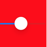
| 属性/方法 | 解释 |
|---|---|
| value | 当前值 |
| setValue | 设置当前值 |
| minimumValue | 最小值 |
| maximumValue | 最大值 |
| isContinuous | 是否连续生成valueChanged事件,为true时,移动的过程中会一直生成valueChanged事件,为false时,松开后只生成一次valueChanged事件 |
| minimumValueImage | 在最左边的图像 |
| maximumValueImage | 在最右边的图像 |
| thumbTintColor | 小圆球的颜色 |
| minimumTrackTintColor | 左边已经经过的颜色 |
| maximumTrackTintColor | 右边还未经过的颜色 |
3.13 UIStepper
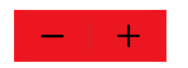
//minimumValue:最小值
//maxmumValue:最大值
//stepValue:步值
//value:当前值
3.14 UISwitch

//setOn:设置开关
//isOn:获取状态
//OnTintColor:打开时的颜色
//thumbTintColor:小圆球的颜色
4.容器视图
4.1 UICollectionView
- UICollectionView快速实现
//in ViewDidLoad()
        let flowLayout = UICollectionViewFlowLayout( )
        flowLayout.scrollDirection = .vertical
        flowLayout.headerReferenceSize = CGSize(width: 200, height: 100)
        flowLayout.sectionHeadersPinToVisibleBounds = true
        let collectionView = UICollectionView(frame: view.frame, collectionViewLayout: flowLayout)
        collectionView.register(UICollectionViewCell.self, forCellWithReuseIdentifier: "cell")
        collectionView.register(UICollectionViewCell.self, forSupplementaryViewOfKind: "header", withReuseIdentifier: "header")
        collectionView.dataSource = collectionViewDataSource
        collectionView.delegate = collectionViewDelegate
        collectionView.backgroundColor = .red
//Delegate
        class CollectionViewDelegate : NSObject,UICollectionViewDelegateFlowLayout{
        func collectionView(_ collectionView: UICollectionView, didSelectItemAt indexPath: IndexPath) {
            print(indexPath)
        }
    }
//DataSource
    class CollectionViewDataSource : NSObject,UICollectionViewDataSource{
        func collectionView(_ collectionView: UICollectionView, numberOfItemsInSection section: Int) -> Int {
            20
        }
        func numberOfSections(in collectionView: UICollectionView) -> Int {
            2
        }
        func collectionView(_ collectionView: UICollectionView, viewForSupplementaryElementOfKind kind: String, at indexPath: IndexPath) -> UICollectionReusableView {
            let header = collectionView.dequeueReusableSupplementaryView(ofKind: "header", withReuseIdentifier: "header", for: indexPath)
            header.backgroundColor = .blue
            let lb = UILabel(frame: CGRect(x: 0, y: 0, width: 100 , height: 100))
            lb.textAlignment = .center
            lb.backgroundColor = .green
            lb.text = "header"
            header.addSubview(lb)
            return header

        }
        func collectionView(_ collectionView: UICollectionView, cellForItemAt indexPath: IndexPath) -> UICollectionViewCell {
            let cell = collectionView.dequeueReusableCell(withReuseIdentifier: "cell", for: indexPath)
            cell.backgroundColor = .blue
            let lb = UILabel(frame: CGRect(x: cell.frame.width/4, y: cell.frame.height/4, width: cell.frame.width/2, height: cell.frame.width/2))
            lb.textAlignment = .center
            lb.backgroundColor = .green
            lb.text = "\(indexPath.row)"
            cell.contentView.addSubview(lb)
            return cell
        }
    }
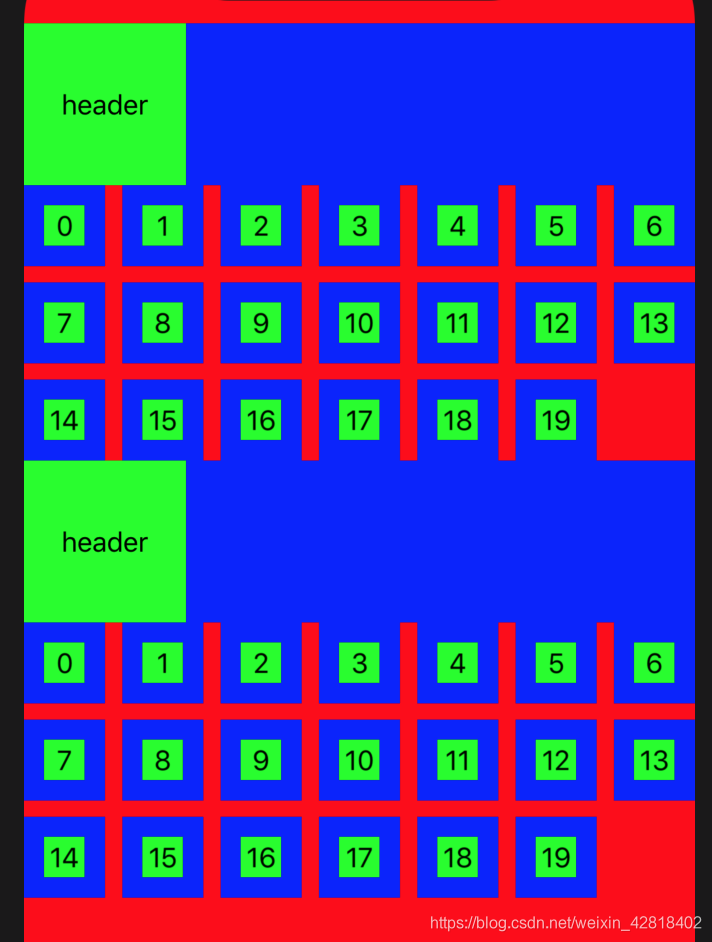
图4.1.1
- UICollectionViewLayout
– 这是一个抽象基类,定义CollectionView的布局方式,需要被子类继承实现后使用
– 作用是决定cells,supplementary views,decoration views如何在collectionView的范围内布置
– iOS已经提供了一个实现UICollectionViewFlowLayout,可以将项目组织到一个个的网格中,提供可选的Header和Footer
使用UICollectionViewFlowLayout
| 属性 | 解释 |
|---|---|
| scrollDirection | 设置滚动方向,如果为竖向,网格会一行一行的填充 |
| minimumLineSpacing | 每行之间的最小间距 |
| minimumInteritemSpacing | 同一行,格子之间的最小间距 |
| itemSize | 格子的大小 |
| sectionInset | 每个section之间的边距 |
| headerReferenceSize | header大小 |
| footerReferenceSize | footer大小 |
| sectionHeadersPinToVisibleBounds | 滚动时header是否固定在顶部 |
| sectionFootersPinToVisibleBounds | 滚动时footer是否固定在底部 |
注意:UICollectionViewFlowLayout提供了UICollectionViewDelegateFlowLayout,这个代理提供了一些方法可以修改cell,footer,header等样式,见下方UICollectionViewDelegate
- UICollectionViewCell
– 带数据的单元格,继承自UICollectionReusableView
–UICollectionReuseableView:可重复使用的view。当其中一个view从屏幕上滚动出去(没在屏幕上显示)的时候,collectionview并没有把该view删除掉,而是把该view放在reuse queue(可重用队列)上,以供下次使用,这样不用频繁创建和销毁view。
– 使用方式
//注意:不要手动去调用其构造器
//1.首先注册UICollectionViewCell类
collectionView.register(UICollectionViewCell.self, forCellWithReuseIdentifier: "cell")
//collectionview可以显示多种cell,因此可以注册多种cell,用identifier区别
//2.获取cell实例
let cell = collectionView.dequeueReusableCell(withReuseIdentifier: "cell", for: indexPath)
//3.在cell内添加内容,不能直接使用cell.addSubView,因为cell管理了多层内容,应该使用cell.contentView
cell.contentView.addSubview()
- UICollectionViewDataSource
| 协议方法 | 解释 |
|---|---|
func collectionView(UICollectionView, numberOfItemsInSection: Int) -> Int | 必要item的数量 |
| func numberOfSections(in: UICollectionView) -> Int | section的数量 |
| func collectionView(UICollectionView, cellForItemAt: IndexPath) -> UICollectionViewCell | 必要生成cell |
| func collectionView(UICollectionView, viewForSupplementaryElementOfKind: String, at: IndexPath) -> UICollectionReusableView | 生成header,footer |
//生成Header和Cell
//1.注册Header和Cell的类
        collectionView.register(UICollectionViewCell.self, forCellWithReuseIdentifier: "cell")
        collectionView.register(UICollectionViewCell.self, forSupplementaryViewOfKind: "header", withReuseIdentifier: "header")
//2.实现DataSource
    class CollectionViewDataSource : NSObject,UICollectionViewDataSource{
        func collectionView(_ collectionView: UICollectionView, numberOfItemsInSection section: Int) -> Int {
            100
        }
        func numberOfSections(in collectionView: UICollectionView) -> Int {
            2
        }
        func collectionView(_ collectionView: UICollectionView, viewForSupplementaryElementOfKind kind: String, at indexPath: IndexPath) -> UICollectionReusableView {
            let header = collectionView.dequeueReusableSupplementaryView(ofKind: "header", withReuseIdentifier: "header", for: indexPath)
            header.backgroundColor = .blue
            let lb = UILabel(frame: CGRect(x: 0, y: 0, width: 100 , height: 100))
            lb.textAlignment = .center
            lb.backgroundColor = .green
            lb.text = "header"
            header.addSubview(lb)
            return header

        }
        func collectionView(_ collectionView: UICollectionView, cellForItemAt indexPath: IndexPath) -> UICollectionViewCell {
            let cell = collectionView.dequeueReusableCell(withReuseIdentifier: "cell", for: indexPath)
            cell.backgroundColor = .blue
            let lb = UILabel(frame: CGRect(x: cell.frame.width/4, y: cell.frame.height/4, width: cell.frame.width/2, height: cell.frame.width/2))
            lb.textAlignment = .center
            lb.backgroundColor = .green
            lb.text = "\(indexPath.row)"
            cell.contentView.addSubview(lb)
            return cell
        }


    }
- UICollectionViewDelegate
监听事件,布置外观等
//点击事件
    class CollectionViewDelegate : NSObject,UICollectionViewDelegateFlowLayout{
        func collectionView(_ collectionView: UICollectionView, didSelectItemAt indexPath: IndexPath) {
            print(indexPath)
        }
    }
//更多:
//更改单元格大小
func collectionView(UICollectionView, layout: UICollectionViewLayout, sizeForItemAt: IndexPath) -> CGSize
//section间距
//header,footer大小等...
4.2 UITableView
和UICollectionView使用类似
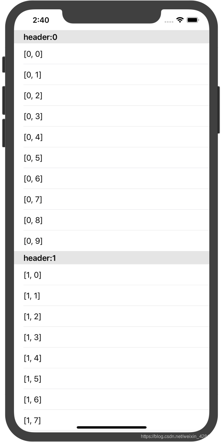
图4.2.1
        let tableView = UITableView(frame: view.frame, style: .plain)
        tableView.register(UITableViewCell.self, forCellReuseIdentifier: "cell")
        tableView.register(UITableViewHeaderFooterView.self, forHeaderFooterViewReuseIdentifier: "header")
        tableView.dataSource = tableDataSource
        tableView.delegate = tableDelegate
        view.addSubview(tableView)
        class TableDataSource:NSObject,UITableViewDataSource{

        func numberOfSections(in tableView: UITableView) -> Int {
            2
        }
        func tableView(_ tableView: UITableView, numberOfRowsInSection section: Int) -> Int {
            10
        }
        func tableView(_ tableView: UITableView, cellForRowAt indexPath: IndexPath) -> UITableViewCell {
            let cell = tableView.dequeueReusableCell(withIdentifier: "cell", for: indexPath)
            cell.textLabel?.text = "\(indexPath)"
            return cell
        }


    }

    class TableDelegate:NSObject,UITableViewDelegate{

        func tableView(_ tableView: UITableView, didSelectRowAt indexPath: IndexPath) {
            print(indexPath)
        }
        func tableView(_ tableView: UITableView, viewForHeaderInSection section: Int) -> UIView? {
            let header = tableView.dequeueReusableHeaderFooterView(withIdentifier: "header")!
            header.textLabel?.text = "header:\(section)"
            return header
        }
    }
4.3 UIStackView
类似Android的LinerLayout,见下方的View_Layout
4.4 UIScrollView
滚动视图
5.视觉效果
//例:为UIImageView添加模糊效果
        let img = UIImageView(frame: CGRect(x: 100, y: 100, width: 100, height: 100))
        img.image = UIImage(named: "person.fill")
        img.backgroundColor = .red
        let effectView = UIVisualEffectView(frame: img.bounds)
        effectView.effect = UIBlurEffect(style: .regular)
        effectView.alpha = 1
        img.addSubview(effectView)
        view.addSubview(img)
6.Bars
管理导航栏,标签栏,搜索栏和工具栏上显示的项目
ViewControllers(视图控制器)
1.UIViewController
1.1 生命周期
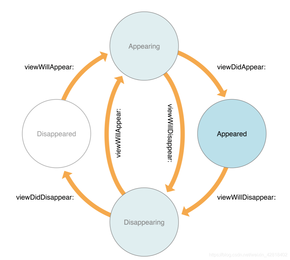
根视图为view
| 生命周期 | 解释 |
|---|---|
| viewWillAppear | view开始被添加到视图层次结构 |
| viewDidAppear | view已经被添加到视图层次结构 |
| viewWillDisappear | view开始从视图层次结构移除 |
| viewDidDisappear | view已经从视图层次结构移除 |
| viewDidLoad | 根视图加载到内存 |
//viewController的显示,事件调用顺序
viewDidLoad → viewWillAppear → viewDidAppear
1.2 使用
//打开一个viewController
let vc2 = ViewController2()
        show(vc2, sender: self)
//        showDetailViewController(vc2, sender: self)
//        modalPresentationStyle = .formSheet
//        definesPresentationContext = true
//        present(vc2, animated: true) {
//            print("presented")
//        }
//关闭viewController
dismiss
2.UIViewController容器
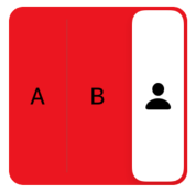
2.1 UISplitViewController
左右分割视图,一般用于ipad
2.2 UINavigationController
- 初始化
let navigationController = UINavigationController(rootViewController: ViewController())
window.rootViewController = navigationController
- 访问堆栈上的controller
– topViewController 顶部的
– visibleViewController 可见的
– viewControllers 全部的 - 推入和弹出
– pushViewController(vc,animated) push到堆栈顶部
– popViewController(animated) 顶部的弹出
– popToRootViewController(animated) 除了rootViewController外,其他的全部弹出
– popToViewController(vc,animated) 一直弹出,直到vc位于顶部 导航栏NavigationBar
– 关系:一个UINavigationController有一个NavigationBar,一个NavigationBar有多个NavigationItem,每个NavigationItem对应一个ViewController,每个NavigationItem有多个(UIbarButtonItem和自定义view等)
– UINavigationController 管理NavigationBar,因此不能再指定NavigationBar的Delegate,也不能手动去调用NavigationBar的堆栈操作(push,pop)
– NavigationBar
一个UINavigationController只有一个NavigationBar。NavigationBar内部以堆栈的形式管理NavigationItem。当NavigationControllerPush一个ViewController到顶部时,会生成一个NavigationItem,并将这个NavigationItemPush到 NavigationBar的顶部
| 推入和弹出项目(navigationBar由NavigationController自动管理,因此不能手动去调用push,pop等set方法) | 解释 |
|---|---|
| pushItem | pushNavigationItem到NavigationBar顶部 |
| popItem | 弹出顶部NavigationItem |
| setItems | 设置NavigationItem数组 |
| items | 获取NavigationItem数组 |
| topItem | 顶部的NavigationItem |
| backItem | 在顶部下方的第一个NavigationItem |
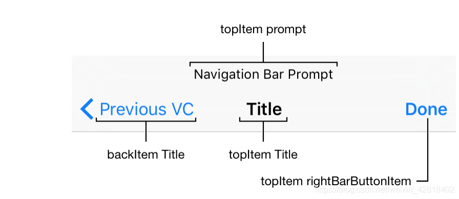
注意:如上图所示,在初始化一个NavigationItem时,backButton是来自backItem的Title,因此如果需要修改backButton,需要理解ViewController和navigationItem的初始化顺序,见下方修改backButton
– NavigationItem
| 属性/方法 | 解释 |
|---|---|
| title | 正中间的标题 |
| largeTitleDisplayMode | 大标题 |
| prompt | 标题上方的文字 |
| backBarButtonItem | 返回按钮 |
| hidesBackButton | 是否隐藏返回按钮 |
| setHidesBackButton | 是否隐藏返回按钮,带动画 |
| leftItemsSupplementBackButton | 是否返回按钮和左边的Item共存。如果设置了leftItem,那么返回按钮是自动隐藏的。如果这个属性设置为true,那么返回按钮和leftItem都会存在 |
| titleView | 在标题位置提供自定义视图 |
| leftBarButtonItem | 左边的item(在返回按钮右边) |
| rightBarButtonItem | 右边的item |
| setLeft/right BarButtonItem/Items | 带动画 |
– UIBarButtonItem
| 用systemItem初始化 | 图像/解释 |
|---|---|
| done |  |
| cancel |  |
| edit |  |
| save |  |
| add |  |
| flexibleSpace | 在两个item之间,自动宽度显示空白 |
| fixedSpace | 在两个item之间,手动宽度显示空白,设置width属性 |
| compose |  |
| reply |  |
| action |  |
| organize |  |
| bookmarks |  |
| search |  |
| refresh |  |
| stop |  |
| camera |  |
| trash |  |
| play |  |
| pause |  |
| rewind |  |
| fastForward |  |
| undo |  |
| redo |  |
//其他创建方式
//显示文本,style为plain或done,done的样式会更粗一些
let rightBarBtnItem = UIBarButtonItem(title: "Title", style: .plain, target: nil, action: nil)
//显示image
let rightBarBtnItem = UIBarButtonItem(image: UIImage(named: "person.fill"), style: .plain, target: nil, action: nil)
//显示自定义view
init(customView: UIView)

//其他属性
设置item宽度
rightBarBtnItem.width = 50
– 修改backButton
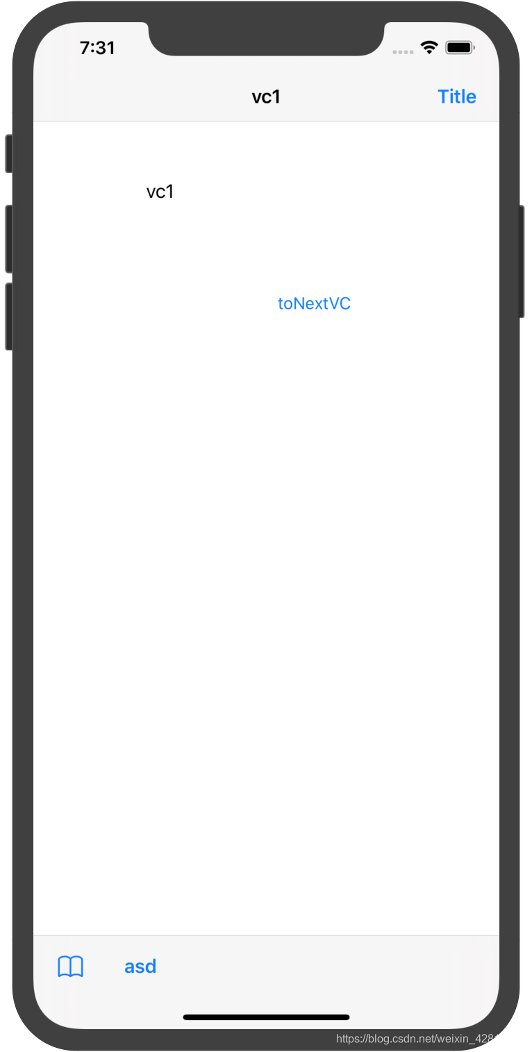
//需求:使用UINavigationController(nc)管理两个ViewController(vc1,vc2),vc1为nc的根视图,vc1跳转到vc2,现在需要修改vc2的返回按钮。
//vc2的返回按钮的创建过程:vc2的返回按钮是来自UINavigationBar(bar)的BackItem,这个backItem指的是vc1的navigationItem.因此设置vc2的返回按钮,需要在vc1中设置
///在vc1,viewDidLoad()
let backBarBtnItem = UIBarButtonItem()
backBarBtnItem.title = "返回"
navigationItem.backBarButtonItem = backBarBtnItem
//在vc2中,也可以设置,需要取得backItem的引用,该引用可以在vc2的viewDidAppear()中获得,因为此时navigationBar把vc2的navigationItem push到了堆栈
//在vc2,viewDidAppear()
let backBarBtnItem = UIBarButtonItem()
backBarBtnItem.title = "返回"      navigationController?.navigationBar.backItem?.backBarButtonItem = backBarBtnItem
//第一种方法更好
- Toolbar
可以在下方显示Toolbar
let item = UIBarButtonItem(barButtonSystemItem: .bookmarks, target: nil, action: nil)
let item2 = UIBarButtonItem(title: "asd", style: .done, target: nil, action: nil)
//注意这里不能调用navigationController.toolbarItems或者navigationController.toolbar.toolbarItems
self.toolbarItems = [item,item2]
- 滑动手势控制
//设置navigationItem.hidesBackButton = true时,默认不能左滑弹出
//可以通过添加代理,控制topViewController能否左滑弹出
navigationController?.interactivePopGestureRecognizer?.delegate = self

    func gestureRecognizerShouldBegin(_ gestureRecognizer: UIGestureRecognizer) -> Bool {
        //添加禁止滑动手势的ViewControllers
        let banned = NSArray(array: [ViewController.self,ViewController2.self])
        return !banned.contains(object_getClass(navigationController?.topViewController)!)
    }
2.3 UITabBarController
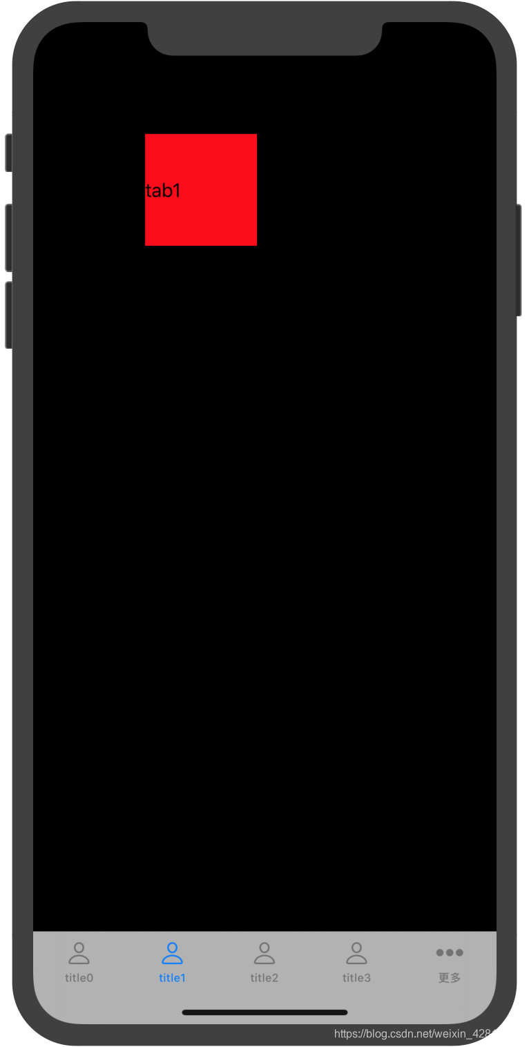
//使用
        let tabBarController = UITabBarController()
        var viewControllers:[UIViewController] = []
        for i in 0..<9{
            let vc = TabViewController(i)
            vc.tabBarItem.title = "title\(i)"
            vc.tabBarItem.image = UIImage(named: "person")
            viewControllers.append(vc)
        }
        tabBarController.viewControllers =  viewControllers
        window.rootViewController = tabBarController
- 与navigationController结合使用:tabBarController的每一个子ViewController设置为navigationController即可。层次为:UIScreen->UIWindow->TabBarController->NavigationControllers->ViewControllers
2.4 UIPageViewController
class TestPageViewController : UIPageViewController,UIPageViewControllerDataSource,UIPageViewControllerDelegate{

    var pageItemVCs : [UIViewController] = []

    init() {
//        super.init(transitionStyle: .scroll, navigationOrientation: .horizontal, options: nil)
        super.init(transitionStyle: .pageCurl, navigationOrientation: .horizontal, options:nil)
        self.dataSource = self
        self.delegate = self
        for i in 0..<5{
            let pageItemVc = PageItemVC (i)
            pageItemVCs.append(pageItemVc)
        }

        self.setViewControllers([pageItemVCs[0]], direction: .forward, animated: true,completion: nil)
    }

    required init?(coder: NSCoder) {
        fatalError("init(coder:) has not been implemented")
    }

    //MARK: - UIPageViewControllerDataSource
    func pageViewController(_ pageViewController: UIPageViewController, viewControllerBefore viewController: UIViewController) -> UIViewController? {
        print("viewControllerBefore")
        let index = pageItemVCs.firstIndex (of: viewController)
        if index == 0 {
            return nil
        }else{
            return pageItemVCs[index!-1]
        }
    }


    func pageViewController(_ pageViewController: UIPageViewController, viewControllerAfter viewController: UIViewController) -> UIViewController? {
        print("viewControllerAfter")
        let index = pageItemVCs.firstIndex (of: viewController)
        if index == pageItemVCs.count-1 {
            return nil
        }else{
            return pageItemVCs[index!+1]
        }
    }

    func presentationCount(for pageViewController: UIPageViewController) -> Int {
        print("presentationCount:\(pageItemVCs.count)")
        return pageItemVCs.count
    }

    func presentationIndex(for pageViewController: UIPageViewController) -> Int {
        0
    }
    //MARK: -UIPageViewControllerDelegate
    func pageViewController(_ pageViewController: UIPageViewController, didFinishAnimating finished: Bool, previousViewControllers: [UIViewController], transitionCompleted completed: Bool) {
        print("didFinishAnimating")
    }
    func pageViewController(_ pageViewController: UIPageViewController, willTransitionTo pendingViewControllers: [UIViewController]) {
        print("willTransitionTo")
    }

}
2.5 其他ViewController
- UISearchController
- UIImagePickerController
- UIVideoEditorController
- UIDocumentViewController
View Layout(布局)
1.UIStackView
- 以堆栈的形式管理子view,不重叠
- 属性
| 属性 | 解释 |
|---|---|
| addArrangedSubview | 添加受管理的子view |
| insertArrangedSubview | 插入受管理的子view |
| removeArrangedSubview | 删除受管理的子view |
| axis,alignment,distribution | 如果axis为纵向,那么子view会依次向下放置,alignment就代表子view在横向的对齐方式,distribution代表纵向的对齐方式 |
| Distribution类型 | 解释 |
|---|---|
| fill |  第一个view被拉伸 第一个view被拉伸 |
| fillEqually |  平均分配 平均分配 |
| fillProportionally |  按内容多少分配 按内容多少分配 |
| equalSpacing |  相等间距 相等间距 |
| equalCentering |  中间的会靠近中间 中间的会靠近中间 |
| 还可以添加spacing |  fillEqually+spacing fillEqually+spacing |
| 指定view后的距离setCustomSpacing(lb2,50) |  fillEqually+setCustomSpacing fillEqually+setCustomSpacing |
2.AutoLayout
参考:https://www.jianshu.com/p/90811f80dd1e
https://developer.apple.com/library/archive/documentation/UserExperience/Conceptual/AutolayoutPG/index.html#//apple_ref/doc/uid/TP40010853-CH7-SW1
2.1 简介
- AutoLayout的作用是为view添加
约束,约束是指view与其他view(包括父view,子view)之间的关系 - 注意事项
//1.要先禁止视图的autoresizing功能,视图的下列属性设置为false:
view.translatesAutoresizingMaskIntoConstraints = NO;
//2.添加约束之前,一定保证相关控件都已经添加到各自的父视图上。
//3.不再需要为视图设置frame。
2.2 使用
- 使用代码实现
//例:创建一个view,在父view的中间,长宽为100。
let myView = UIView()
myView.translatesAutoresizingMaskIntoConstraints = false
myView.backgroundColor = .red
view.addSubview(myView)
//有三种方式创建约束
//方式一:使用Anchor
myView.centerXAnchor.constraint(equalTo: view.centerXAnchor).isActive = true
myView.centerYAnchor.constraint(equalTo: view.centerYAnchor).isActive = true
myView.widthAnchor.constraint(equalToConstant: 100).isActive = true
myView.heightAnchor.constraint(equalToConstant: 100).isActive = true
//方式二:使用NSLayoutConstraint
NSLayoutConstraint(item: myView, attribute: .centerX, relatedBy: .equal, toItem: view, attribute: .centerX, multiplier: 1.0, constant: 0.0).isActive = true
NSLayoutConstraint(item: myView, attribute: .centerY, relatedBy: .equal, toItem: view , attribute: .centerY, multiplier: 1.0, constant: 0.0).isActive = true
NSLayoutConstraint(item: myView, attribute: .height, relatedBy: .equal, toItem: myView, attribute: .height, multiplier: 0.0, constant: 100).isActive = true
NSLayoutConstraint(item: myView, attribute: .width, relatedBy: .equal, toItem: myView, attribute: .width, multiplier: 0.0, constant: 100).isActive = true
//方式三:使用VFL(视觉格式语言)
//参考:https://www.jianshu.com/p/6bb998424695
//https://www.jianshu.com/p/757cc57fd9ea
var consts = NSLayoutConstraint.constraints(withVisualFormat: "H:|-space-[myView1]-space-|", options: [], metrics: ["space":view.bounds.width/2-50], views: ["myView1":myView1])
consts += NSLayoutConstraint.constraints(withVisualFormat: "V:|-space-[myView1]-space-|", options: [], metrics: ["space":view.bounds.height/2-50], views: ["myView1":myView1])
NSLayoutConstraint.activate(consts)
2.3 细节
- NSLayoutConstraint
//构造器
init(item: Any, attribute: NSLayoutConstraint.Attribute, relatedBy: NSLayoutConstraint.Relation, toItem: Any?, attribute: NSLayoutConstraint.Attribute, multiplier: CGFloat, constant: CGFloat)
//解释:
//item : view1
//attribute : view1的属性
//relatedBy : 关系
//toItem : view2
//attribute : view2的属性
//multiplier : 乘法系数
//constant : 常量
//这样就构建了一个线性方程
//view1.attribute relatedBy mltiplier*view2.attribute + constant
//attribute值
//上下左右前后(及边距),宽高,X中心Y中心(及边距),notAnAttribute
//notAnAttribute解释,如果只想设置view.height = 100
NSLayoutConstraint(item: myView1, attribute: .height, relatedBy: .equal, toItem: nil, attribute: .notAnAttribute, multiplier: 0.0, constant: 100).isActive = true
//relatedBy值
等于,大于等于,小于等于
//激活约束
constraint.isActive = true
或
NSLayoutConstraint.activate([])
或
view.addConstraint()
- VFL语言
//通过VFL快速建立约束
//参考:https://developer.apple.com/library/archive/documentation/UserExperience/Conceptual/AutolayoutPG/VisualFormatLanguage.html#//apple_ref/doc/uid/TP40010853-CH27-SW1

//vfl创建约束
class func constraints(withVisualFormat: String, options: NSLayoutConstraint.FormatOptions, metrics: [String : Any]?, views: [String : Any]) -> [NSLayoutConstraint]
//?是0个或1个,*是0个或多个
VFL组成:(<orientation>:)?
(<superview><connection>)?
<view>(<connection><view>)*
(<connection><superview>)?
| 标签 | 表示或组成 | 解释 |
|---|---|---|
| <orientation> | H或V | 表示横向或纵向 |
| <superview> | | | 父view |
| <view> | [<viewName>(<predicateListWithParens>)?] | view名称加上0个或1个predicateListWithParens,再用中括号[]括起来 |
| <connection> | 空或-<predicateList>-或- | view之间的间隔,空:两个view之间紧贴着,-:默认间距8点;-<predicateList>-:指定间距 |
| <predicateList> | <simplePredicate>或<predicateListWithParens> | 简单predicate或多个predicate列表 |
| <simplePredicate> | <metricName>或<positiveNumber> | 简单的predicate,数字变量或者正数 |
| <predicateListWithParens> | (<predicate>(,<predicate>)*) | 多个predicate,逗号分隔,括号括起来 |
| <predicate> | (<relation>)?(<objectOfPredicate>)(@<priority>)? | 0个或1个关系+(需要predicate的对象)+0个或1个权重 |
| <relation> | ==或<=或>= | 关系 |
| <objectOfPredicate> | <constant>或<viewName> | 常量或view名 |
| <priority> | <metricName>或<number> | 数字变量或数字 |
| <constant> | <metricName>或<number> | 数字变量或数字 |
| <viewName> | view名 | 需要放在在views参数中 |
| <metricName> | 数字名 | 需要放在metrics参数中 |
| <number> | 数字 | 直接是数字 |
//NSLayoutConstraint.FormatOptions
设置两个view的对齐方式,这是个数组,可以传多个
对齐方式主要有
上下左右前后X中心Y中心
- Demo1.设置一个view的宽度等于父view的宽度,高度为100,距离父view的顶部20点
let myView1 = UIView()
myView1.translatesAutoresizingMaskIntoConstraints = false
myView1.backgroundColor = .red
view.addSubview(myView1)

var consts = NSLayoutConstraint.constraints(withVisualFormat: "H:|[myView1]|", options: [], metrics: nil, views: ["myView1":myView1])
//演示metrics用法
consts += NSLayoutConstraint.constraints(withVisualFormat: "V:|-space-[myView1(100)]", options: [], metrics: ["space":20], views:["myView1":myView1])
NSLayoutConstraint.activate(consts)
- Demo2:两个view横着排列平分空间,高度为100,在屏幕中央
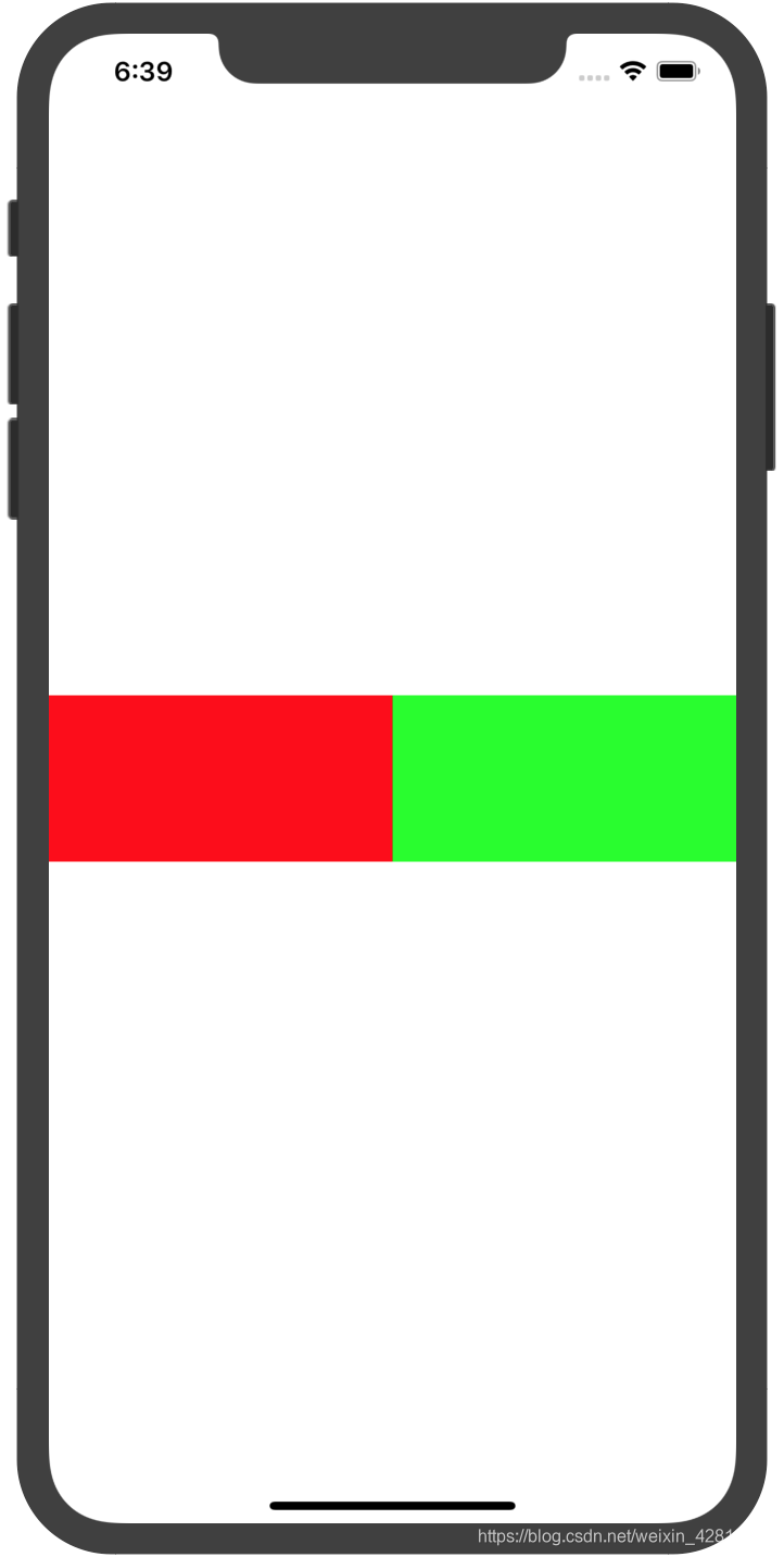
var consts = NSLayoutConstraint.constraints(withVisualFormat: "H:|[myView1][myView2(==myView1)]|", options: [.alignAllTop,.alignAllBottom,.alignAllCenterY], metrics: nil, views: ["myView1":myView1,"myView2":myView2])

//这里垂直居中需要计算得到
consts += NSLayoutConstraint.constraints(withVisualFormat: "V:|-space-[myView1]-space-|", options: [], metrics: ["space":view.bounds.height/2-50], views:["myView1":myView1])
3. 安全区域
- 在安全区域内设置约束
使用view.safeAreaLayoutGuide与anchor
NSLayoutConstraint.activate([myView.topAnchor.constraint(equalTo: view.safeAreaLayoutGuide.topAnchor),myView.leftAnchor.constraint(equalTo: view.safeAreaLayoutGuide.leftAnchor),myView.widthAnchor.constraint(equalToConstant: 100),myView.heightAnchor.constraint(equalToConstant: 100)])
4. StoryBoard、Xib
Appearance Customization(外观定制)
深色模式,自定义Bar外观等,大部分需要ios13以上
Animation & Haptics(动画和触觉)
动画使用
1.UIViewPropertyAnimator
属性动画器
//简单使用
let myView = UIView(frame: CGRect(x: 100, y: 100, width: 100, height: 100))
//myView的位置在3秒内变到指定位置,匀速的
UIViewPropertyAnimator.runningPropertyAnimator(withDuration: 3, delay: 0, options: [], animations: {
            self.myView.frame = CGRect(x: 200, y: 100, width: 200, height: 200)
        })
- 创建
//使用时序曲线AnimationCurve
convenience init(duration: TimeInterval,
curve: UIView.AnimationCurve,animations: (() -> Void)? = nil)
//例
UIViewPropertyAnimator(duration: 3, curve: .easeIn) {
self.myView.frame = CGRect(x: 200, y: 100, width: 200, height: 200)
}
//curve的值有:
//easeInOut:慢速-快速-慢速
//easeIn:慢速-快速
//easeOut:快速-慢速
//linear:匀速
//使用三次贝塞尔曲线
init(duration: TimeInterval, controlPoint1: CGPoint, controlPoint2: CGPoint, animations: (() -> Void)?)
//如果controlPoint1为(0,0),controlPoint2为(1,1),则为匀速的。
//即定义一条曲线,起点为(0,0),终点为(1,1),在区域{0<=x<=1,0<=y<=1}中找两个控制点,拉伸成曲线,其中的曲率即代表不同时刻的动画速度
//使用回弹效果
convenience init(duration: TimeInterval,
    dampingRatio ratio: CGFloat,
      animations: (() -> Void)? = nil)
ratio为震荡指数,越接近0,震荡效果越明显
//自定义时序曲线
init(duration: TimeInterval, timingParameters: UITimingCurveProvider)
//使用类方法快捷创建并运行
class func runningPropertyAnimator(withDuration: TimeInterval, delay: TimeInterval, options: UIView.AnimationOptions, animations: () -> Void, completion: ((UIViewAnimatingPosition) -> Void)?) -> Self
//options为选项数组
//提供的选项有
//layoutSubviews:动画携带子view
//allowUserInteraction:允许动画时交互
//repeat:无限重复
//autoreverse:前后运行(重复时,从上次的结束点开始)
//showHideTransitionViews:在视图过渡期间隐藏或显示视图
//curveEaseInout,curveEaseIn,curveEaseOut,curveLinear

//如果要使用这些option还必须调用UIView方法
//如repeat,autoreverse
UIViewPropertyAnimator.runningPropertyAnimator(withDuration: 3, delay: 0, options: [.repeat,.autoreverse], animations: {
//这两个方法在ios13标记为过时的,需要查找替代的方法
UIView.setAnimationRepeatCount(2)            UIView.setAnimationRepeatAutoreverses(true)
self.myView.frame = CGRect(x: 200, y: 100, width: 200, height: 200)
})
- 控制
//开始,暂停,停止,结束动画
//start,pause,stop,finish
2.ViewController转换动画
Windows & Screens(窗口和屏幕)
关系(一般来说):一个设备UIDevice有一个屏幕UIScreen,屏幕上有一个窗口UIWindow,一个窗口有一个根视图控制器UIVIewController,根视图控制器可以跳转或维护更多的UIViewController
1. UIScreen
//获取单例
UIScreen.main
//屏幕范围
UIScreen.main.bounds
//屏幕亮度
UIScreen.main.brightness
2.UIWindow
//使用Window
@UIApplicationMain
class AppDelegate: UIResponder, UIApplicationDelegate {
	var window: UIWindow?
	func application(_ application: UIApplication, didFinishLaunchingWithOptions launchOptions: [UIApplication.LaunchOptionsKey: Any]?) -> Bool {
        // Override point for customization after application launch.
        let window = UIWindow()
        //设置根视图控制器
        window.rootViewController = ViewController()
        //使其变为关键窗口,并显示
        window.makeKeyAndVisible()
        self.window = window
        return true
    }
}
3.弹窗
3.1 UIPopoverPresentationController
参考:https://www.jianshu.com/p/2c6f98c35f31
在当前VC上以弹窗的形式显示另一个VC的内容,可以指定另一个VC的大小
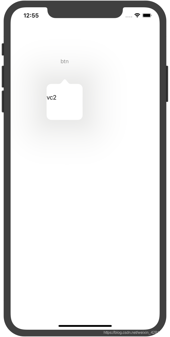
    @objc func click(){
        let vc2 = ViewController2()
        vc2.modalPresentationStyle = .popover
        vc2.preferredContentSize = CGSize(width: 100, height: 100)
        vc2.popoverPresentationController?.delegate = self
        vc2.popoverPresentationController?.sourceView = btn
        vc2.popoverPresentationController?.permittedArrowDirections = .up
        self.present(vc2, animated: true) {
            print("ok")
        }
    }

func adaptivePresentationStyle(for controller: UIPresentationController) -> UIModalPresentationStyle {
        .none
}
- 更多属性
//配置锚点:从哪个view弹出
可以是barButtonItem,sourceView,sourceRect其中之一
//配置箭头方向
vc2.popoverPresentationController?.permittedArrowDirections = .up//箭头向上,弹出位置在锚点下方
- 注意
//这里实现这个代理方法,返回none.在默认的情况下,UIPopoverPresentationController 会根据是否是 iphone 和 ipad 来选择弹出的样式,如果当前的设备是 iphone ,那么系统会选择 modal 样式,并弹出到全屏.如果我们需要改变这个默认的行为,则需要实现代理,在代理 - adaptivePresentationStyleForPresentationController: 这个方法中返回一个 UIModalPresentationNon
func adaptivePresentationStyle(for controller: UIPresentationController) -> UIModalPresentationStyle {
        .none
}
3.2 通知框
- alert
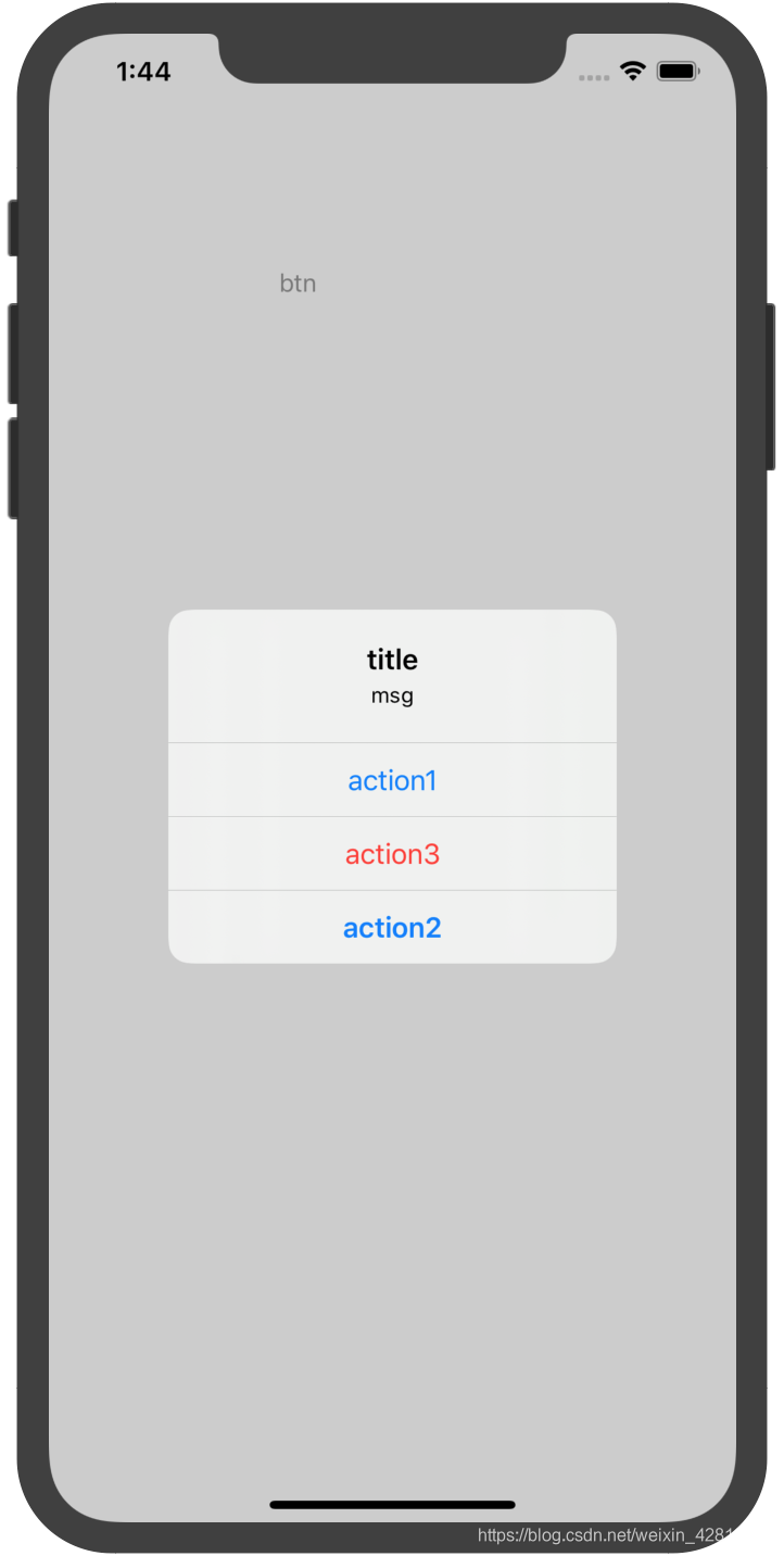
        let ac = UIAlertController(title: "title", message: "msg", preferredStyle: .alert)
        ac.addAction(UIAlertAction(title: "action1", style: .default, handler: { action in
            print("click:\(action)")
        }))
        ac.addAction(UIAlertAction(title: "action2", style: .cancel, handler: { action in
            print("click:\(action)")
        }))
        ac.addAction(UIAlertAction(title: "action3", style: .destructive, handler: { action in
            print("click:\(action)")
        }))

        self.present(ac, animated: true, completion: nil)
- actionSheet
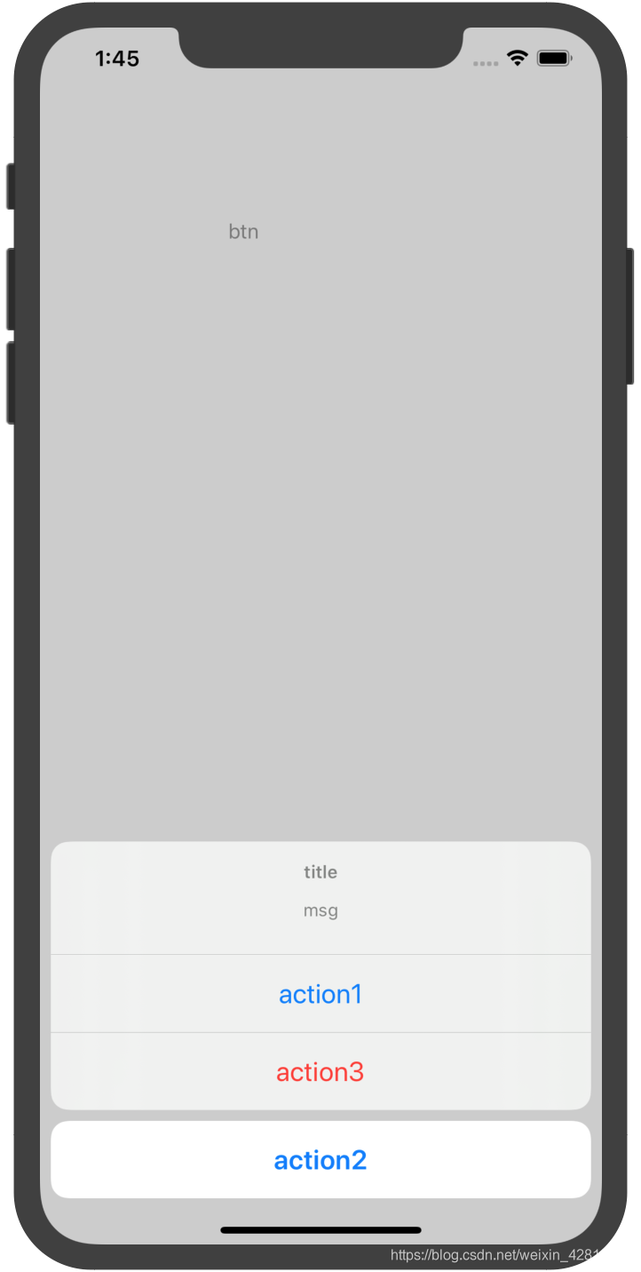
let ac = UIAlertController(title: "title", message: "msg", preferredStyle: .actionSheet)
- 带输入框的
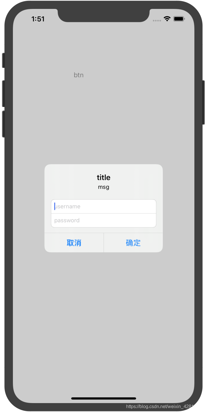
let ac = UIAlertController(title: "title", message: "msg", preferredStyle: .alert)
        ac.addAction(UIAlertAction(title: "确定", style: .default, handler: { action in
            print("username:\(ac.textFields?[0].text)")
            print("password:\(ac.textFields?[1].text)")
            print("click:\(action)")
        }))
        ac.addAction(UIAlertAction(title: "取消", style: .cancel, handler: { action in
            print("click:\(action)")
        }))
        ac.addTextField { tf in
            tf.placeholder = "username"
        }
        ac.addTextField { tf in
            tf.placeholder = "password"
        }
        self.present(ac, animated: true, completion: nil)


 扫一扫
扫一扫
 1906
1906

 被折叠的 条评论
为什么被折叠?
被折叠的 条评论
为什么被折叠?
 到【灌水乐园】发言


