


动画介绍
html里面的好看的动画效果,包括基本的平移,旋转,抖动,变色等动画效果,可以直接嵌入代码使用;
元素属性介绍
1.位置 :位移 translate(x,y);
2.大小 :缩放 scale(xx px);
3.状态:旋转 rotate(xx deg);
4.形态:skew(xx deg);
转化属性
css转化属性 transform : none 不转换/ transform-function;转化函数 如 transform:translate位移(170px);

转换原点
 transform-origin:
 如 transform-origin: 50% 50%;
取值 :
数值 :以元素左上方的点为(0,0),再去计算其他点
百分比:
0% , 0% : 左上方的点
50% , 50% :元素的中心点
关键字:
left
right
top
bottom
center
left top : 表示左上方
transform-origin赋值:
一个值 :x轴的移动
两个值 :x轴和y轴
三个值 :x轴,y轴,z轴


-webkit-animation-name: shaky-slow;	// webkit内核
-ms-animation-name: shaky-slow;		// ie内核
animation-name: shaky-slow;		// 原生
animation-duration: 4s;			// 动画执行时间
animation-delay: 0s;			// 动画等待时间
animation-iteration-count: infinite;	// 动画执行次数,infinite为一直执行
animation-timing-function: ease-in-out;	// 动画执行速度
animation-delay: 0s;			// 动画延时时间
animation-play-state: running;		// 动画执行状态,一般没必要parse
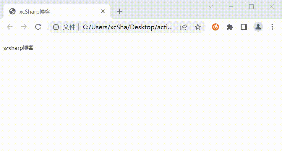
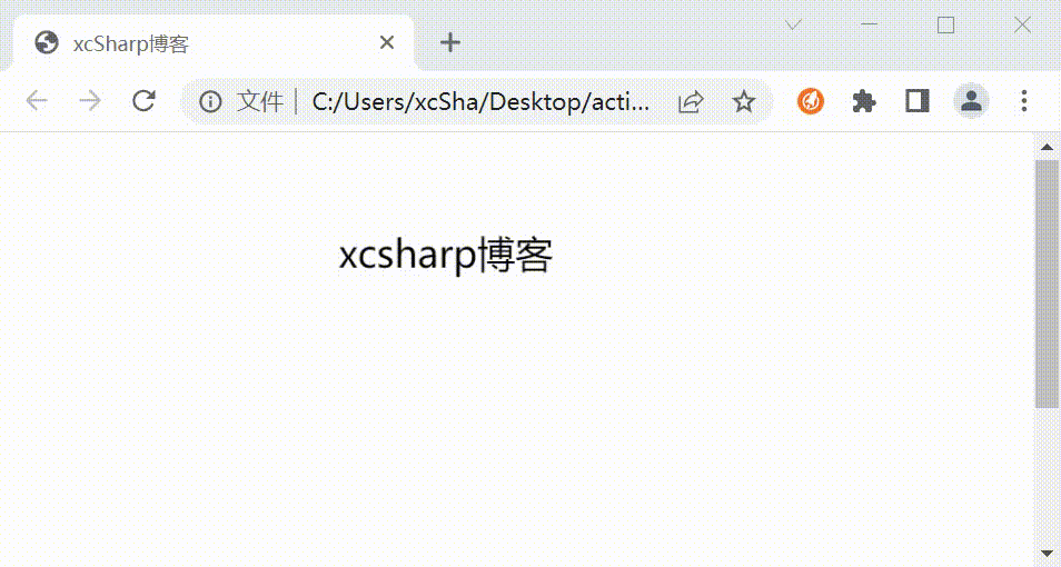
动画效果1 - 平移
- 基本语法格式:
transform:translate(x-value,y-value);
x-value 指元素在 水平方向 上移动的距离, y-value 指元素在 垂直方向 上移动的距离。如果 省略了第二个参数 , 则取默认值0 。当值为 负数 时,表示 反方向移动 元素。
-
效果
-
源码
<html>
<head>
<title>xcSharp博客</title>
<style type="text/css">
.box10{
          animation: test 0.8s;
}
@keyframes test{
        0% {
			opacity: 0;
            transform: translate(-30px, 0px);
        }
        33% {
			opacity: 0.3;
            transform: translate(-20px, 0px);
        }
        66% {
			opacity: 0.6;
            transform: translate(-10px, 0px);
        }
        100% {
			opacity: 1;
            transform: translate(0px, 0px);
        }
    }
</style>
</head>
<body>
<p class="box10">xcsharp博客</p>
</body>
</html>
动画效果2 - 抖动
-
效果
-
源码
<html>
<head>
<title>xcSharp博客</title>
<style type="text/css">
    .shaky {
        display: inline-block;
        padding: 1px;
        font-size: 12px;
        -webkit-transform-origin: center center;
        -ms-transform-origin: center center;
        transform-origin: center center;
        -webkit-animation-name: shaky-slow;
        -ms-animation-name: shaky-slow;
        animation-name: shaky-slow;
        -webkit-animation-duration: 4s;
        -ms-animation-duration: 4s;
        animation-duration: 4s;
        -webkit-animation-iteration-count: infinite;
        -ms-animation-iteration-count: infinite;
        animation-iteration-count: infinite;
        -webkit-animation-timing-function: ease-in-out;
        -ms-animation-timing-function: ease-in-out;
        animation-timing-function: ease-in-out;
        -webkit-animation-delay: 0s;
        -ms-animation-delay: 0s;
        animation-delay: 0s;
        -webkit-animation-play-state: running;
        -ms-animation-play-state: running;
        animation-play-state: running;
    }
    @-webkit-keyframes shaky-slow {
        0% {
            -webkit-transform: translate(0px, 0px) rotate(0deg);
        }
        2% {
            -webkit-transform: translate(-1px, 1.5px) rotate(1.5deg);
        }
        4% {
            -webkit-transform: translate(1.3px, 0px) rotate(-0.5deg);
        }
        6% {
            -webkit-transform: translate(1.4px, 1.4px) rotate(-2deg);
        }
        8% {
            -webkit-transform: translate(-1.3px, -1px) rotate(-1.5deg);
        }
        10% {
            -webkit-transform: translate(1.4px, 0px) rotate(-2deg);
        }
        12% {
            -webkit-transform: translate(-1.3px, -1px) rotate(-2deg);
        }
        14% {
            -webkit-transform: translate(1.5px, 1.3px) rotate(1.5deg);
        }
        16% {
            -webkit-transform: translate(1.5px, -1.5px) rotate(-1.5deg);
        }
        18% {
            -webkit-transform: translate(1.3px, -1.3px) rotate(-2deg);
        }
        20% {
            -webkit-transform: translate(1px, 1px) rotate(-0.5deg);
        }
        22% {
            -webkit-transform: translate(1.3px, 1.5px) rotate(-2deg);
        }
        24% {
            -webkit-transform: translate(-1.4px, -1px) rotate(2deg);
        }
        26% {
            -webkit-transform: translate(1.3px, -1.3px) rotate(0.5deg);
        }
        28% {
            -webkit-transform: translate(1.6px, -1.6px) rotate(-2deg);
        }
        30% {
            -webkit-transform: translate(-1.3px, -1.3px) rotate(-1.5deg);
        }
        32% {
            -webkit-transform: translate(-1px, 0px) rotate(2deg);
        }
        34% {
            -webkit-transform: translate(1.3px, 1.3px) rotate(-0.5deg);
        }
        36% {
            -webkit-transform: translate(1.3px, 1.6px) rotate(1.5deg);
        }
        38% {
            -webkit-transform: translate(1.3px, -1.6px) rotate(1.5deg);
        }
        40% {
            -webkit-transform: translate(-1.4px, -1px) rotate(-0.5deg);
        }
        42% {
            -webkit-transform: translate(-1.4px, 1.3px) rotate(-0.5deg);
        }
        44% {
            -webkit-transform: translate(-1.6px, 1.4px) rotate(0.5deg);
        }
        46% {
            -webkit-transform: translate(-2.1px, -1.3px) rotate(-0.5deg);
        }
        48% {
            -webkit-transform: translate(1px, 1.6px) rotate(1.5deg);
        }
        50% {
            -webkit-transform: translate(1.6px, 1.6px) rotate(1.5deg);
        }
        52% {
            -webkit-transform: translate(-1.4px, 1.6px) rotate(0.5deg);
        }
        54% {
            -webkit-transform: translate(1.6px, -1px) rotate(-2deg);
        }
        56% {
            -webkit-transform: translate(1.3px, -1.6px) rotate(-2deg);
        }
        58% {
            -webkit-transform: translate(-1.3px, -1.6px) rotate(0.5deg);
        }
        60% {
            -webkit-transform: translate(1.3px, 1.6px) rotate(-0.5deg);
        }
        62% {
            -webkit-transform: translate(0px, 0px) rotate(-1.5deg);
        }
        64% {
            -webkit-transform: translate(-1.6px, -1.6px) rotate(-2deg);
        }
        66% {
            -webkit-transform: translate(1.6px, -1.6px) rotate(0.5deg);
        }
        68% {
            -webkit-transform: translate(0px, -1.6px) rotate(-2deg);
        }
        70% {
            -webkit-transform: translate(-1.6px, 1px) rotate(1.5deg);
        }
        72% {
            -webkit-transform: translate(-1.6px, 1.6px) rotate(2deg);
        }
        74% {
            -webkit-transform: translate(1.3px, -1.6px) rotate(-0.5deg);
        }
        76% {
            -webkit-transform: translate(1.4px, 1px) rotate(-0.5deg);
        }
        78% {
            -webkit-transform: translate(-1px, 1.4px) rotate(2deg);
        }
        80% {
            -webkit-transform: translate(1.4px, 1.6px) rotate(2deg);
        }
        82% {
            -webkit-transform: translate(-1.6px, -1.6px) rotate(-0.5deg);
        }
        84% {
            -webkit-transform: translate(-1.4px, 1.4px) rotate(-2deg);
        }
        86% {
            -webkit-transform: translate(1px, 1.4px) rotate(-2deg);
        }
        88% {
            -webkit-transform: translate(-1.4px, 1.4px) rotate(-1.5deg);
        }
        90% {
            -webkit-transform: translate(-1.6px, -1.6px) rotate(-2deg);
        }
        92% {
            -webkit-transform: translate(-1.6px, 1.6px) rotate(2deg);
        }
        94% {
            -webkit-transform: translate(-1.6px, -1.6px) rotate(-2deg);
        }
        96% {
            -webkit-transform: translate(-1.4px, 1.3px) rotate(-2deg);
        }
        98% {
            -webkit-transform: translate(1.3px, 1px) rotate(-0.5deg);
        }
    }
    @keyframes shaky-slow {
        0% {
            transform: translate(0px, 0px) rotate(0deg);
        }
        2% {
            transform: translate(-1px, 1.5px) rotate(1.5deg);
        }
        4% {
            transform: translate(1.3px, 0px) rotate(-0.5deg);
        }
        6% {
            transform: translate(1.4px, 1.4px) rotate(-2deg);
        }
        8% {
            transform: translate(-1.3px, -1px) rotate(-1.5deg);
        }
        10% {
            transform: translate(1.4px, 0px) rotate(-2deg);
        }
        12% {
            transform: translate(-1.3px, -1px) rotate(-2deg);
        }
        14% {
            transform: translate(1.5px, 1.3px) rotate(1.5deg);
        }
        16% {
            transform: translate(1.5px, -1.5px) rotate(-1.5deg);
        }
        18% {
            transform: translate(1.3px, -1.3px) rotate(-2deg);
        }
        20% {
            transform: translate(1px, 1px) rotate(-0.5deg);
        }
        22% {
            transform: translate(1.3px, 1.5px) rotate(-2deg);
        }
        24% {
            transform: translate(-1.4px, -1px) rotate(2deg);
        }
        26% {
            transform: translate(1.3px, -1.3px) rotate(0.5deg);
        }
        28% {
            transform: translate(1.6px, -1.6px) rotate(-1.5deg);
        }
        30% {
            transform: translate(-1.3px, -1.3px) rotate(-1.5deg);
        }
        32% {
            transform: translate(-1px, 0px) rotate(2deg);
        }
        34% {
            transform: translate(1.3px, 1.3px) rotate(-0.5deg);
        }
        36% {
            transform: translate(1.3px, 1.6px) rotate(1.5deg);
        }
        38% {
            transform: translate(1.3px, -1.6px) rotate(1.5deg);
        }
        40% {
            transform: translate(-1.4px, -1px) rotate(-0.5deg);
        }
        42% {
            transform: translate(-1.4px, 1.3px) rotate(-0.5deg);
        }
        44% {
            transform: translate(-1.6px, 1.4px) rotate(0.5deg);
        }
        46% {
            transform: translate(-2.1px, -1.3px) rotate(-0.5deg);
        }
        48% {
            transform: translate(1px, 1.6px) rotate(1.5deg);
        }
        50% {
            transform: translate(1.6px, 1.6px) rotate(1.5deg);
        }
        52% {
            transform: translate(-1.4px, 1.6px) rotate(0.5deg);
        }
        54% {
            transform: translate(1.6px, -1px) rotate(-2deg);
        }
        56% {
            transform: translate(1.3px, -1.6px) rotate(-2deg);
        }
        58% {
            transform: translate(-1.3px, -1.6px) rotate(0.5deg);
        }
        60% {
            transform: translate(1.3px, 1.6px) rotate(-0.5deg);
        }
        62% {
            transform: translate(0px, 0px) rotate(-1.5deg);
        }
        64% {
            transform: translate(-1.6px, -1.6px) rotate(-2deg);
        }
        66% {
            transform: translate(1.6px, -1.6px) rotate(0.5deg);
        }
        68% {
            transform: translate(0px, -1.6px) rotate(-2deg);
        }
        70% {
            transform: translate(-1.6px, 1px) rotate(1.5deg);
        }
        72% {
            transform: translate(-1.6px, 1.6px) rotate(2deg);
        }
        74% {
            transform: translate(1.3px, -1.6px) rotate(-0.5deg);
        }
        76% {
            transform: translate(1.4px, 1px) rotate(-0.5deg);
        }
        78% {
            transform: translate(-1px, 1.4px) rotate(2deg);
        }
        80% {
            transform: translate(1.4px, 1.6px) rotate(2deg);
        }
        82% {
            transform: translate(-1.6px, -1.6px) rotate(-0.5deg);
        }
        84% {
            transform: translate(-1.4px, 1.4px) rotate(-2deg);
        }
        86% {
            transform: translate(1px, 1.4px) rotate(-2deg);
        }
        88% {
            transform: translate(-1.4px, 1.4px) rotate(-1.5deg);
        }
        90% {
            transform: translate(-1.6px, -1.6px) rotate(-2deg);
        }
        92% {
            transform: translate(-1.4px, 1.6px) rotate(2deg);
        }
        94% {
            transform: translate(-1.6px, -1.6px) rotate(-2deg);
        }
        96% {
            transform: translate(-1.4px, 1.3px) rotate(-2deg);
        }
        98% {
            transform: translate(1.3px, 1px) rotate(-0.5deg);
        }
    }
</style>
</head>
<body>
<p class="shaky">xcsharp博客</p>
</body>
</html>
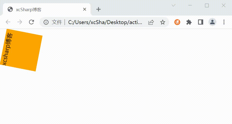
动画效果3 - 旋转
- 基本语法格式:
1、利用“元素{animation:名称 时间 infinite}”语句给元素绑定动画;2、利用“@keyframes 名称{100%{transform:rotate(旋转角度)}}”语句设置动画的旋转动作,实现元素一直旋转效果。
其中属性的值设置为“infinite”时,规定动画无限次播放,当我们给元素绑定旋转动画时就能够一直旋转了。
-
效果
-
源码
<html>
<head>
<title>xcSharp博客</title>
<style type="text/css">
    div{
        width:100px;
        height:100px;
        background-color:orange;
        animation:fadenum 5s infinite;
    }
    @keyframes fadenum{
        100%{transform:rotate(360deg);}
	}
</style>
</head>
<body>
<div>xcsharp博客</div>
</body>
</html>
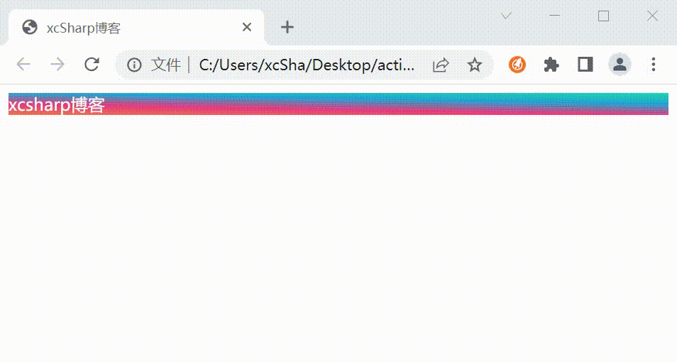
动画效果4 - 变色
- 基本语法格式:
background: linear-gradient(偏向角度,起始点颜色,终止点颜色)
background: linear-gradient( top, left, bottom, center, right.)
-
效果
-
源码
<html>
<head>
<title>xcSharp博客</title>
<style type="text/css">
.changeColor{
        animation-name: anim1;
        animation-direction: alternate;
        animation-timing-function: linear;
        animation-delay: 0s;
        animation-iteration-count: infinite;
        animation-duration: 10s;
}

@keyframes anim1{
        0% {
			background: linear-gradient(1deg, #EE7752, #E73C7E, #23A6D5, #23D5AB);//背景色
			color:white; //文字颜色
        }
        25% {
			background: linear-gradient(60deg, #EE7752, #E73C7E, #23A6D5, #23D5AB);
			color:orange;
        }
        50% {
			background: linear-gradient(120deg, #EE7752, #E73C7E, #23A6D5, #23D5AB);
			color:black;
        }
        75% {
			background: linear-gradient(60deg, #EE7752, #E73C7E, #23A6D5, #23D5AB);
			color:blue;
        }
        100% {
			background: linear-gradient(1deg, #EE7752, #E73C7E, #23A6D5, #23D5AB);
			color:white;
        }
}
</style>
</head>
<body>
<div class="changeColor">xcsharp博客</div>
</body>
</html>
动画效果5 - 放大缩小
- 基本语法格式:
-
效果
-
源码
<html>
<head>
<title>xcSharp博客</title>
<style type="text/css">
/*css部分*/
@keyframes scaleDraw {
	/*定义关键帧、scaleDrew是需要绑定到选择器的关键帧名称*/
	0% {
		transform: scale(1);/*开始为原始大小*/
	}
	25% {
		transform: scale(1.5);/*放大1.1倍*/
	}
	50% {
		transform: scale(1);
	}
	75% {
		transform: scale(1.5);
	}
	100% {
		transform: scale(1);
	}
}
.changeColor {
	width: 150px;
	height: 200px;
	margin: 100px auto;
	-webkit-animation-name: scaleDraw;/*关键帧名称*/
	-webkit-animation-timing-function: ease-in-out;/*动画的速度曲线*/
	-webkit-animation-iteration-count: infinite;/*动画播放的次数*/
	-webkit-animation-duration: 5s;/*动画所花费的时间*/
	/*可以简写为*/
	/* animation: scaleDraw 5s ease-in-out infinite; */
	/* -webkit-animation: scaleDraw 5s ease-in-out infinite; */
}
</style>
</head>
<body>
<div class="changeColor">xcsharp博客</div>
</body>
</html>
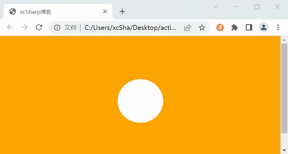
动画效果6 - 翻转
-
效果
-
源码
<html>
<head>
<title>xcSharp博客</title>
<style type="text/css">
  body {
    background-color: orange;
 }
.xcsharp {
border-radius:100px;
    width: 100px;
    height: 100px;
    background-color: #fff;
    margin: 100px auto;
    -webkit-animation: sk-rotateplane 1.2s infinite ease-in-out;
    animation: sk-rotateplane 1.2s infinite ease-in-out;
}
@-webkit-keyframes sk-rotateplane {
    0% {
        -webkit-transform: perspective(120px)
    }
    50% {
        -webkit-transform: perspective(120px) rotateY(180deg)
    }
    100% {
        -webkit-transform: perspective(120px) rotateY(180deg) rotateX(180deg)
    }
}
@keyframes sk-rotateplane {
    0% {
        transform: perspective(120px) rotateX(0deg) rotateY(0deg);
        -webkit-transform: perspective(120px) rotateX(0deg) rotateY(0deg)
    }

    50% {
        transform: perspective(120px) rotateX(-180.1deg) rotateY(0deg);
        -webkit-transform: perspective(120px) rotateX(-180.1deg) rotateY(0deg)
    }
    100% {
        transform: perspective(120px) rotateX(-180deg) rotateY(-179.9deg);
        -webkit-transform: perspective(120px) rotateX(-180deg) rotateY(-179.9deg);
    }
}
</style>
</head>
<body>
    <div class="xcsharp"></div>
</body>
</html>
总结
上述几个动画效果,可以结合运用,比如放大的同时,可以改变颜色,可以旋转的方式放大;活学活用;


 1091
1091


 被折叠的 条评论
为什么被折叠?
被折叠的 条评论
为什么被折叠?
 到【灌水乐园】发言


