


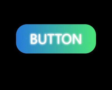
做这个的话主要就是利用了基础的html css以及css3的渐变背景以及关键帧动画
基本结构如下:
<a href="" class="btn">button</a>基本样式如下:
* {
    margin: 0;
    padding: 0;
}

a {
    text-decoration: none;
    color: #fff;
}

body {
    height: 100vh;
    display: flex;
    /* 水平居中 */
    justify-content: center;
    /* 垂直居中 */
    align-items: center;
    background-color: #000;
}

.btn {
    position: relative;
    display: inline-block;
    width: 220px;
    height: 80px;
    line-height: 80px;
    font-size: 35px;
    text-transform: uppercase;
    text-align: center;
    border-radius: 30px;
    /* 渐变背景 */
    background: linear-gradient(90deg,rgb(39,122,218),rgb(74,230,121),rgb(201,214,13),rgb(226,20,233),rgb(16,172,219));
    background-size: 400%;
    z-index: 1;
    /* 设置文字阴影
这里写两行是为了让字体给人的感觉是更亮 */
    text-shadow: 0 0 5px white,
                 0 0 5px white;
}
鼠标经过时的动画效果:
/* 鼠标经过时的动画效果 */
.btn:hover {
    animation: move 5s linear alternate infinite;
}

@keyframes move {
    0% {
        background-position: 0%;
    }

    100% {
        background-position: 100%;
    }
}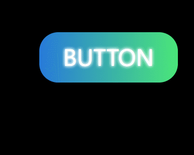
定义盒子周围的光晕:
/* 定义盒子周围的光晕 */
.btn::before {
    content: "";
    position: absolute;
    top: -10px;
    left: -10px;
    width: 240px;
    height: 100px;
    /* 渐变背景 */
    background: linear-gradient(90deg,rgb(39,122,218),rgb(74,230,121),rgb(243,169,10),rgb(226,20,233),rgb(16,172,219));
    background-size: 400%;
    opacity: 0;
    z-index: -1;
    border-radius: 45px;
    transform: .6s;
}

.btn:hover::before {
    /* 设置高斯模糊 */
    filter: blur(15px);
    opacity: 1;
    animation: move 8s linear alternate infinite;
}
源码:
<!DOCTYPE html>
<html lang="en">
<head>
    <meta charset="UTF-8">
    <meta http-equiv="X-UA-Compatible" content="IE=edge">
    <meta name="viewport" content="width=device-width, initial-scale=1.0">
    <title>Document</title>
    <link rel="stylesheet" href="index.css">
</head>
<body>
    <a href="" class="btn">button</a>
</body>
</html>
* {
margin: 0;
padding: 0;
}
a {
text-decoration: none;
color: #fff;
}
body {
height: 100vh;
display: flex;
/* 水平居中 */
justify-content: center;
/* 垂直居中 */
align-items: center;
background-color: #000;
}
.btn {
position: relative;
display: inline-block;
width: 220px;
height: 80px;
line-height: 80px;
font-size: 35px;
text-transform: uppercase;
text-align: center;
border-radius: 30px;
/* 渐变背景 */
background: linear-gradient(90deg,rgb(39,122,218),rgb(74,230,121),rgb(201,214,13),rgb(226,20,233),rgb(16,172,219));
background-size: 400%;
z-index: 1;
/* 设置文字阴影
这里写两行是为了让字体给人的感觉是更亮 */
text-shadow: 0 0 5px white,
0 0 5px white;
}
/* 鼠标经过时的动画效果 */
.btn:hover {
animation: move 5s linear alternate infinite;
}
@keyframes move {
0% {
background-position: 0%;
}
100% {
background-position: 100%;
}
}
/* 定义盒子周围的光晕 */
.btn::before {
content: "";
position: absolute;
top: -10px;
left: -10px;
width: 240px;
height: 100px;
/* 渐变背景 */
background: linear-gradient(90deg,rgb(39,122,218),rgb(74,230,121),rgb(243,169,10),rgb(226,20,233),rgb(16,172,219));
background-size: 400%;
opacity: 0;
z-index: -1;
border-radius: 45px;
transform: .6s;
}
.btn:hover::before {
/* 设置高斯模糊 */
filter: blur(15px);
opacity: 1;
animation: move 8s linear alternate infinite;
}


 320
320


 被折叠的 条评论
为什么被折叠?
被折叠的 条评论
为什么被折叠?
 到【灌水乐园】发言


