


离职了,闲来无事,写个边框旋转按钮,打打牙祭。
效果:
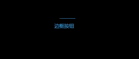
代码
<!DOCTYPE html>
<html lang="en">

<head>
  <meta charset="UTF-8">
  <meta http-equiv="X-UA-Compatible" content="IE=edge">
  <meta name="viewport" content="width=device-width, initial-scale=1.0">
  <title>Document</title>
</head>

<body>
  <div class="container">
    <button>边框按钮</button>
  </div>
</body>

</html>

<style>
  body {
    background-color: #000000;
    text-align: center;
  }

  button {
    width: 120px;
    height: 40px;
    position: relative;
    overflow: hidden;
    margin: 100px 0;
    background-color: #000;
    color: #0ebeff;
    border-radius: 10px;
    outline: none;
    border: none;
    z-index: 1;
  }

  button::before {
    content: "";
    position: absolute;
    background-color: #0ebeff;
    width: 200%;
    height: 200%;
    left: 50%;
    top: 50%;
    transform-origin: 0 0;
    animation: rotate 3s linear infinite;
    z-index: -2;
  }

  button::after {
    content: "";
    position: absolute;
    background-color: #000;
    border-radius: 10px;
    width: calc(100% - 2px);
    height: calc(100% - 2px);
    left: 1px;
    top: 1px;
    z-index: -1;
  }


  @keyframes rotate {
    to {
      transform: rotate(1turn);
    }
  }
</style>
思路
-
在按钮内放置一个元素宽高为父元素的200%,左上角定位到按钮的中心点,然后为这个元素设置旋转动画(此元素为A)
-
在按钮内放入第二个元素,层级在A元素的上层,设置该元素距离按钮各个边的间隙为1px
-
这样A元素旋转正好绕着整个按钮的边框,旋转的可视线条1px


 906
906


 被折叠的 条评论
为什么被折叠?
被折叠的 条评论
为什么被折叠?
 到【灌水乐园】发言


