


前言
👏Clip-path实现按钮流动边框动画,速速来Get吧~
🥇文末分享源代码。记得点赞+关注+收藏!
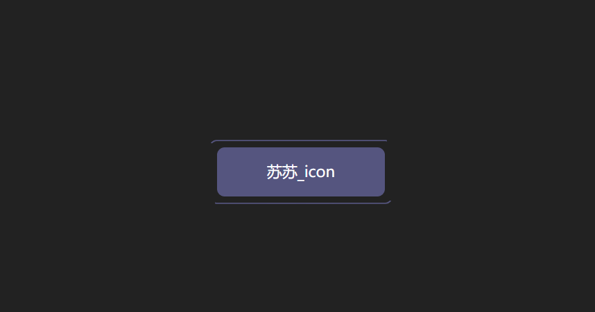
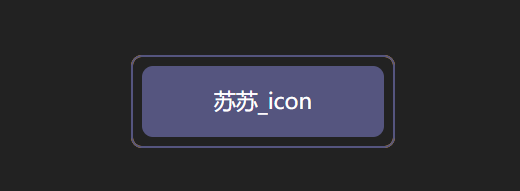
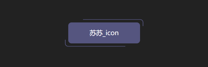
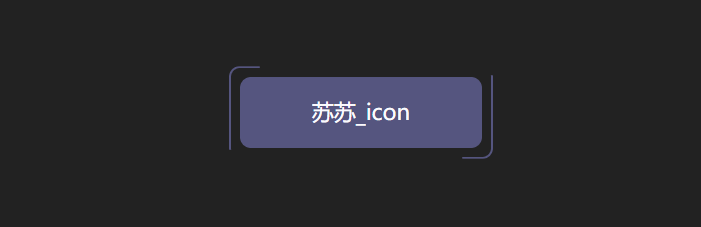
1.实现效果
2.实现步骤
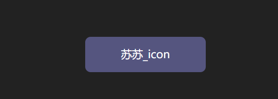
- 添加div标签
<div>苏苏_icon</div>
- 添加样式
div {
  position: relative;
  width: 220px;
  height: 64px;
  line-height: 64px;
  text-align: center;
  color: #fff;
  font-size: 20px;
  background: #55557f;
  cursor: pointer;
  border-radius: 10px;
}
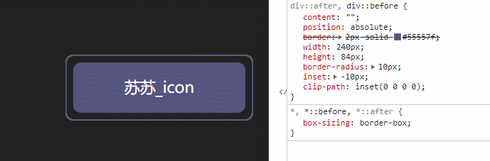
- 为div添加前后伪元素,为了方便区分,设置前后伪元素的边框颜色不同
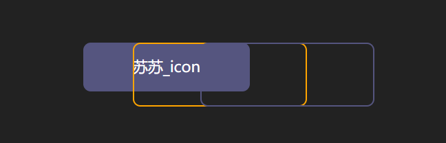
div::after,
div::before {
   content: "";
   position: absolute;
   width: 240px;
   height: 84px;
   border: 2px solid #55557f;
   border-radius: 10px;
 }
div::before{
 border: 2px solid orange;
}
- 修改伪元素的定位位置
div::after,
div::before{
 + left: calc(110px - 120px);
 + top: calc(32px - 42px);
}
- 可以简写为inset
inset属性:用来设置left/right/bottom/top
div::after,
div::before{
 - left: calc(110px - 120px);
 - top: calc(32px - 42px);
 - inset: -10px;
}
- 为伪元素添加动画效果,实现clip-path的变化
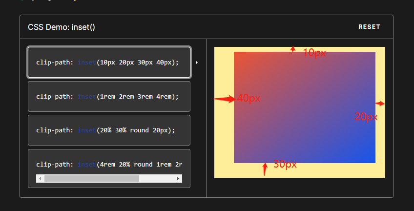
clip-path:clip-path CSS 属性使用裁剪方式创建元素的可显示区域。区域内的部分显示,区域外的隐藏。
inset()定义一个 inset 矩形。
- 语法:
clip-path: inset(20px 50px 10px 0 round 50px);
- 解释:
当提供所有四个参数时:
它们表示从参考框向内的顶部、右侧、底部和左侧偏移量,这些偏移量定义了插入矩形边缘的位置。这些参数遵循 margin速记的语法,让您可以为所有四个插图设置一个、两个或四个值。
可选border-radiu参数:
使用 border-radius 速记语法为插入矩形定义圆角
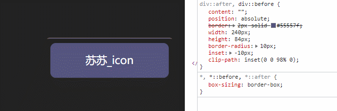
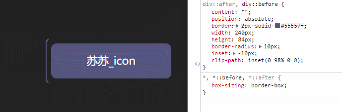
- 我们尝试对伪元素设置inset
div::after,
div::before{
  + clip-path: inset(0 0 98% 0);
}
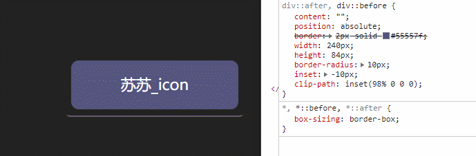
div::after,
div::before{
  + clip-path: inset(0 98% 0 0);
}
div::after,
div::before{
  + clip-path: inset( 98% 0  0 0);
}
div::after,
div::before{
 + clip-path: inset(0  0 0  98% ) ;
}
- 添加动画
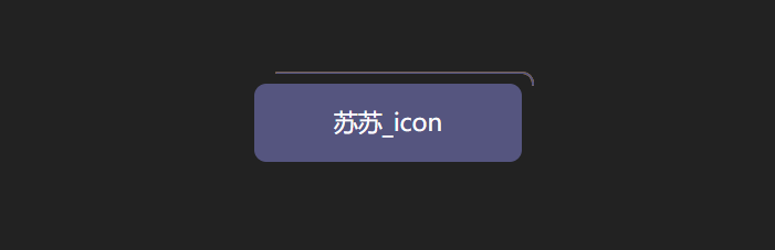
div::after,
div::before{
  + animation: pathRotate 3s infinite linear;
}
@keyframes pathRotate {
  0%,
  100% {
    clip-path: inset(0 0 98% 0);
  }
  25% {
    clip-path: inset(0 98% 0 0);
  }
  50% {
    clip-path: inset(98% 0 0 0);
  }
  75% {
    clip-path: inset(0 0 0 98%);
  }
}
- 为后伪元素添加动画延迟,形成视差效果
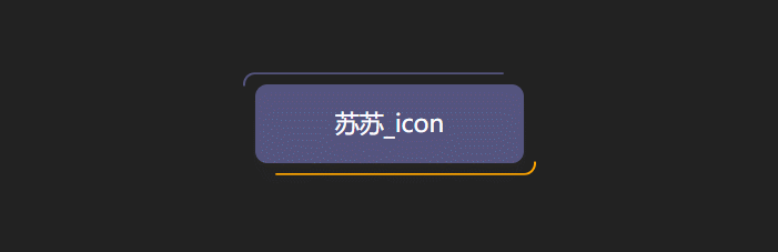
animation-delay:
CSS属性指定从将动画应用到元素到开始执行动画之前等待的时间量。动画可以稍后开始,从开头立即开始,或者立即在动画的中途开始。
正值表示动画应该在经过指定的时间量后开始。默认值0s表示动画应在应用后立即开始。
负值会导致动画立即开始,但会在其循环的中途开始。例如,如果您指定-1s动画延迟时间,则动画将立即开始,但会在动画序列开始 1 秒后开始。如果您为动画延迟指定负值,但起始值是隐式的,则起始值是从动画应用于元素的那一刻起获取的。
div::after {
 animation-delay: -1.5s;
}
- 去掉前伪元素的border色值设置
-div::before {
 -  border: 2px solid orange;
-}
- div添加hover事件,就完成啦~
div:hover {
  filter: brightness(1.5);
}
div{
	/* 添加过渡效果 */
	transition: all 0.5s;
}
3.实现代码
<!DOCTYPE html>
<html>
  <head>
    <meta charset="utf-8" />
    <title>clip-path实现按钮流动边框</title>
  </head>
  <link rel="stylesheet" href="../common.css" />
  <style>
    div {
      position: relative;
      width: 220px;
      height: 64px;
      line-height: 64px;
      text-align: center;
      color: #fff;
      font-size: 20px;
      background: #55557f;
      cursor: pointer;
      border-radius: 10px;
      /* 添加过渡效果 */
      transition: all 0.5s;
    }
    div::after,
    div::before {
      content: "";
      position: absolute;
      border: 2px solid #55557f;
      width: 240px;
      height: 84px;
      border-radius: 10px;
      /* 简写为 */
      inset: -10px;
      /* 添加动画 */
      animation: pathRotate 3s infinite linear;
    }
    @keyframes pathRotate {
      0%,
      100% {
        clip-path: inset(0 0 98% 0);
      }
      25% {
        clip-path: inset(0 98% 0 0);
      }
      50% {
        clip-path: inset(98% 0 0 0);
      }
      75% {
        clip-path: inset(0 0 0 98%);
      }
    }
    div::after {
      animation-delay: -1.5s;
    }
    div:hover {
      filter: brightness(1.5);
    }
  </style>
  <body>
    <div>苏苏_icon</div>
  </body>
</html>
4.在线预览🍒
CSS新手教程系列之Clip-path实现按钮流动边框动画


 1680
1680


 被折叠的 条评论
为什么被折叠?
被折叠的 条评论
为什么被折叠?
 到【灌水乐园】发言


