


所有assignment相关链接:
Coursera | Applied Plotting, Charting & Data Representation in Python(University of Michigan)| Assignment1
Coursera | Applied Plotting, Charting & Data Representation in Python(University of Michigan)| Assignment2
Coursera | Applied Plotting, Charting & Data Representation in Python(University of Michigan)| Assignment3
Coursera | Applied Plotting, Charting & Data Representation in Python(University of Michigan)| Week3 Practice Assignment
Coursera | Applied Plotting, Charting & Data Representation in Python(University of Michigan)| Assignment4
有时间(需求)就把所有代码放到github上
推广下自己的博客,以后CSDN的文章都会放到自己的博客的。
Coursera | Applied Plotting, Charting & Data Representation in Python(University of Michigan)| Week3 Practice Assignment (Optional)
Practice Assignment: Understanding Distributions Through Sampling
第三周Optional的pratice,做不做都可以,不做也可以直接去看看其他做了人的代码,学习下。
难度不大不小,主要是读懂题,然后考animation。
有个问题折腾了我很久,希望有知道的小伙伴解答。a = animation.FuncAnimation(fig, update, interval=100)这里,貌似只能用a = ...,其他的变量名,比如simulation b等都不行,都会造成动画效果不停止,一直运行下去,尝试了很久,还是找不到原因 😦
欢迎评论区提出建议~
** This assignment is optional, and I encourage you to share your solutions with me and your peers in the discussion forums! **
To complete this assignment, create a code cell that:
- Creates a number of subplots using the
pyplot subplotsormatplotlib gridspecfunctionality. - Creates an animation, pulling between 100 and 1000 samples from each of the random variables (
x1,x2,x3,x4) for each plot and plotting this as we did in the lecture on animation. - Bonus: Go above and beyond and “wow” your classmates (and me!) by looking into matplotlib widgets and adding a widget which allows for parameterization of the distributions behind the sampling animations.
Tips:
- Before you start, think about the different ways you can create this visualization to be as interesting and effective as possible.
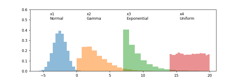
- Take a look at the histograms below to get an idea of what the random variables look like, as well as their positioning with respect to one another. This is just a guide, so be creative in how you lay things out!
- Try to keep the length of your animation reasonable (roughly between 10 and 30 seconds).
import matplotlib.pyplot as plt
import numpy as np

%matplotlib notebook

# generate 4 random variables from the random, gamma, exponential, and uniform distributions
x1 = np.random.normal(-2.5, 1, 10000)
x2 = np.random.gamma(2, 1.5, 10000)
x3 = np.random.exponential(2, 10000)+7
x4 = np.random.uniform(14,20, 10000)

# plot the histograms
plt.figure(figsize=(9,3))
plt.hist(x1, normed=True, bins=20, alpha=0.5)
plt.hist(x2, normed=True, bins=20, alpha=0.5)
plt.hist(x3, normed=True, bins=20, alpha=0.5)
plt.hist(x4, normed=True, bins=20, alpha=0.5);
plt.axis([-7,21,0,0.6])

plt.text(x1.mean()-1.5, 0.5, 'x1\nNormal')
plt.text(x2.mean()-1.5, 0.5, 'x2\nGamma')
plt.text(x3.mean()-1.5, 0.5, 'x3\nExponential')
plt.text(x4.mean()-1.5, 0.5, 'x4\nUniform')
import matplotlib.pyplot as plt
import numpy as np
import matplotlib.animation as animation
%matplotlib notebook
# generate 4 random variables from the random, gamma, exponential, and uniform distributions
x1 = np.random.normal(-2.5, 1, 10000)
x2 = np.random.gamma(2, 1.5, 10000)
x3 = np.random.exponential(2, 10000)+7
x4 = np.random.uniform(14,20, 10000)
x = [x1, x2, x3, x4]
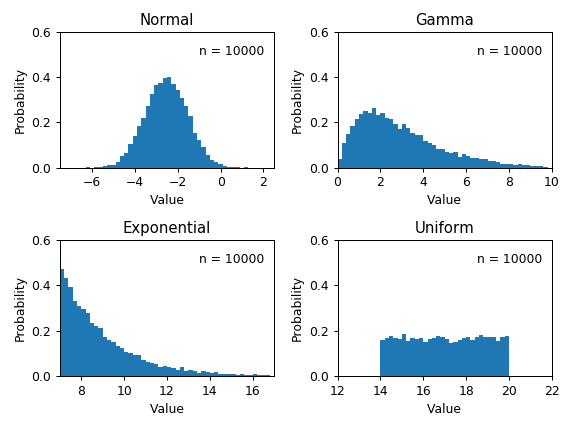
# generate 4 subplots
fig, ((ax1, ax2), (ax3, ax4)) = plt.subplots(2, 2, sharey = True)
ax = [ax1, ax2, ax3, ax4]
# generate 4 axises(xmin, xmax, ymin, ymax) for each graph
axis1 = [-7.5, 2.5, 0, 0.6]
axis2 = [0, 10, 0, 0.6]
axis3 = [7, 17, 0, 0.6]
axis4 = [14, 20, 0, 0.6]
axis = [axis1, axis2, axis3, axis4]
# generate 4 bins for each graph
bins1 = np.arange(-7.5, 2.5, 0.2)
bins2 = np.arange(0, 10, 0.2)
bins3 = np.arange(7, 17, 0.2)
bins4 = np.arange(12, 22, 0.2)
bins = [bins1, bins2, bins3, bins4]
# annotation positions
anno_x = [-1, 6.5, 13.5, 18]
# generate titles
titles = ["Normal", "Gamma", "Exponential", "Uniform"]
# create the function that will do the plotting, where curr is the current frame
def update(curr):
# check if animation is at the last frame, and if so, stop the animation
if curr == n:
a.event_source.stop()
# plot the histograms
for i in range(len(ax)):
ax[i].cla()
ax[i].hist(x[i][:100*curr], normed = True, bins = bins[i])
ax[i].axis(axis[i])
ax[i].set_title(titles[i])
ax[i].set_ylabel('Probability')
ax[i].set_xlabel('Value')
ax[i].annotate('n = {}'.format(100*curr), [anno_x[i], 0.5])
plt.tight_layout()
n=100
# only variable name is a is available why?
a = animation.FuncAnimation(fig, update, interval=100)
import matplotlib.pyplot as plt
import numpy as np
import matplotlib.animation as animation
%matplotlib notebook


# generate 4 random variables from the random, gamma, exponential, and uniform distributions
x1 = np.random.normal(-2.5, 1, 10000)
x2 = np.random.gamma(2, 1.5, 10000)
x3 = np.random.exponential(2, 10000)+7
x4 = np.random.uniform(14,20, 10000)
x = [x1, x2, x3, x4]

# generate 4 subplots
fig, ((ax1, ax2), (ax3, ax4)) = plt.subplots(2, 2, sharey = True)
ax = [ax1, ax2, ax3, ax4]

# generate 4 axises(xmin, xmax, ymin, ymax) for each graph
axis1 = [-7.5, 2.5, 0, 0.6]
axis2 = [0, 10, 0, 0.6]
axis3 = [7, 17, 0, 0.6]
axis4 = [14, 20, 0, 0.6]
axis = [axis1, axis2, axis3, axis4]

# generate 4 bins for each graph
bins1 = np.arange(-7.5, 2.5, 0.2)
bins2 = np.arange(0, 10, 0.2)
bins3 = np.arange(7, 17, 0.2)
bins4 = np.arange(12, 22, 0.2)
bins = [bins1, bins2, bins3, bins4]

# annotation positions
anno_x = [-1, 6.5, 13.5, 18]

# generate titles
titles = ["Normal", "Gamma", "Exponential", "Uniform"]

# create the function that will do the plotting, where curr is the current frame
def update(curr):
    # check if animation is at the last frame, and if so, stop the animation
    if curr == n:
        a.event_source.stop()

    # plot the histograms
    for i in range(len(ax)):
        ax[i].cla()
        ax[i].hist(x[i][:1000*curr], normed = True, bins = bins[i])
        ax[i].axis(axis[i])
        ax[i].set_title(titles[i])
        ax[i].set_ylabel('Probability')
        ax[i].set_xlabel('Value')
        ax[i].annotate('n = {}'.format(1000*curr), [anno_x[i], 0.5])
    plt.tight_layout()

n=10
a = animation.FuncAnimation(fig, update, interval=100)


 2916
2916


 被折叠的 条评论
为什么被折叠?
被折叠的 条评论
为什么被折叠?
 到【灌水乐园】发言


