


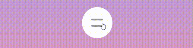
网页伸缩式导航栏
效果图如下:
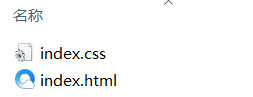
文件目录:
html代码:
index.html
<!DOCTYPE html>
<html lang="en">
<head>
  <meta charset="UTF-8">
  <meta http-equiv="X-UA-Compatible" content="IE=edge">
  <meta name="viewport" content="width=device-width, initial-scale=1.0">
  <title>伸缩式导航栏</title>
  <link rel="stylesheet" href="index.css">
</head>
<body>
  <div class="navbar">
    <input type="checkbox" name="" id="">
    <span></span>
    <span></span>
    <ul>
      <li><a href="javascript:void(0)">点赞</a></li>
      <li><a href="javascript:void(0)">投币</a></li>
      <li><a href="javascript:void(0)">收藏</a></li>
      <li><a href="javascript:void(0)">关注</a></li>
      <li><a href="javascript:void(0)">分享</a></li>
    </ul>
  </div>
</body>
</html>
css代码:
index.css
* {
  /* 页面初始化,清除元素原有的内外边距 */
  margin: 0;
  padding: 0;
}

body {
  height: 100vh;
  /* 网页背景渐变色 */
  background: linear-gradient(#99f, #f99);
}

body,
.navbar,
.navbar ul {
  display: flex;
  justify-content: center;
  align-items: center;
}
.navbar {
  position: relative;
  padding: 20px;
  border-radius: 50px;
  background-color: #fff;
}
.navbar input {
  width: 40px;
  height: 40px;
  /* 透明度为0 */
  opacity: 0;
  cursor: pointer;
}
.navbar span {
  position: absolute;
  left: 25px;
  top: calc(50% - 10px);
  width: 30px;
  height: 4px;
  border-radius: 15px;
  background-color: #999;
  /* span覆盖着复选框,鼠标放到span上点不中复选框 */
  pointer-events: none;
  /* 收回来的时候刚好相反 */
  transition: transform 0.3s ease-in-out, top 0.3x ease-in-out 0.3s;
}
.navbar span:nth-child(3) {
  top: calc(50% + 6px);
}
.navbar ul {
  width: 0;
  /* 隐藏溢出的元素 */
  overflow: hidden;
  /* 将文字一行显示 */
  white-space: nowrap;
  transition: all 0.5s;
}
.navbar ul li {
  list-style: none;
  margin: 0 15px;
}
.navbar ul li a {
  text-decoration: none;
  font-size: 20px;
  font-weight: 700;
  color: #333;
}
.navbar ul li a:hover {
  color: #fb7299;
}
/* :checked是当复选框选中的时候, */
.navbar input:checked ~ ul {
  width: 350px;
}
.navbar input:checked ~ span:nth-child(2) {
  top: calc(50% - 2px);
  transform: rotate(-45deg);
  background-color: #fb7299;
  /* 先做top 然后0.3后执行transform */
  transition: top 0.3s ease-in-out, transform 0.3s ease-in-out 0.3s;
}
.navbar input:checked ~ span:nth-child(3) {
  top: calc(50% - 2px);
  transform: rotate(45deg);
  background-color: #fb7299;
  transition: top 0.3s ease-in-out, transform 0.3s ease-in-out 0.3s;
}


 4万+
4万+


 被折叠的 条评论
为什么被折叠?
被折叠的 条评论
为什么被折叠?
 到【灌水乐园】发言


