


QSS
简介
QSS称为Qt Style Sheets也就是Qt样式表,它是Qt提供的一种用来自定义控件外观的机制。QSS大量参考了CSS的内容,只不过QSS的功能比CSS要弱很多,体现在选择器要少,可以使用的QSS属性也要少很多,并且并不是所有的属性都可以用在Qt的所有控件上。
语法规则
QSS语法主要包含两类:控件和属性。控件表示受影响的控件类型和控件编号,又叫选择器。属性表示要改变的控件属性。例如QPushButton { color: red }表示控件QPushButton以及其子类的color属性为红色。
选择器
- 通配型选择器
*:匹配所有控件 - 类型选择器
object:匹配指定的控件类型及其子类 - 属性选择器
object[**]:例如QPushButton[flat=“false”],匹配所有flat属性为false的按钮 - 类选择器
.object:匹配所有指定类型实例,但不匹配子类。 - ID选择器
#ID:匹配ID对应的控件,指定控件名字。 - 后代选择器
Qdialog QPushButton:所有Qdialog容器中包含的QPushButton。 - 子选择器
Qdialog > QPushButton:所有Dialog下的QPushButton。
另外上面所有的这些选择器可以联合使用,并且支持一次设置多个选择器类型,用逗号隔开,这点与CSS一样,例如#frameCut,#frameInterrupt,#frameJoin 表示所有这些id使用一个规则。#mytable QPushButton 表示选择所有id为mytable的容器下面的QPushButton实例
子控件
用法
控件类型 ::子控件类型 { 属性:属性值 }
QComboBox::drop-down { image: url(dropdown.png) }
常见子控件
- ::down-arrow combo box或spin box的下拉箭头
- ::down-button spin box的向下按钮
- ::drop-down combo box的下拉箭头
- ::indicator checkbox、radio button或可选择group box的指示器
- ::item menu、menu bar或status bar的子项目
- ::menu-indicator push button的菜单指示器
- ::title group box的标题
- ::up-arrow spin box的向上箭头
- ::up-button spin box的向上按钮
伪状态
QSS的伪状态选择器实际上与CSS中的类似,是以冒号开头的一个选择表达式。例如:hover表示当鼠标经过时候的状态。他限制了当控件在某一种状态下的时候才能应用QSS规则,伪状态只能描述一个控件的状态,或者是一个复合控件中的子控件的状态,所以该伪状态选择器只能放在选择器的最后面。
用法
控件类型 :控件伪状态 { 属性:属性值 }
QComboBox:hover { image: url(dropdown.png) }
常见伪状态
- :checked button部件被选中
- :disabled 部件被禁用
- :enabled 部件被启用
- :focus 部件获得焦点
- :hover 鼠标位于部件上
- :indeterminate checkbox或radiobutton被部分选中
- :off 部件可以切换,且处于off状态
- :on 部件可以切换,且处于on状态
- :pressed 部件被鼠标按下
- :unchecked button部件未被选中
实例:
QPushButton:hover{
        color: rgba(85, 170, 255,100);
        background-color: rgba(85, 230, 127,100);
}
常用样式属性
经典样式表
QSS-白色靓丽
/**********子界面背景**********/
QWidget#customWidget {
        background: rgb(173, 202, 232);
        image: url(:/background.jpg);
}

/**********子界面中央背景**********/
QWidget#centerWidget {
        background: rgb(232, 241, 252);
}

/**********主界面样式**********/
QWidget#mainWindow {
        border: 1px solid rgb(111, 156, 207);
        background: rgb(232, 241, 252);
}

QWidget#messageWidget {
        background: rgba(173, 202, 232, 50%);
}

QWidget#loadingWidget {
        border: none;
        border-radius: 5px;
        background: rgb(187, 212, 238);
}

QWidget#remoteWidget {
        border-top-right-radius: 10px;
        border-bottom-right-radius: 10px;
        border: 1px solid rgb(111, 156, 207);
        border-left: none;
        background: transparent;
}

StyledWidget {
        qproperty-normalColor: rgb(65, 65, 65);
        qproperty-disableColor: rgb(180, 180, 180);
        qproperty-highlightColor: rgb(0, 160, 230);
        qproperty-errorColor: red;
}

QProgressIndicator {
        qproperty-color: rgb(2, 65, 132);
}

/**********提示**********/
QToolTip{
        border: 1px solid rgb(111, 156, 207);
        background: white;
        color: rgb(51, 51, 51);
}

/**********菜单栏**********/
QMenuBar {
        background: rgb(187, 212, 238);
        border: 1px solid rgb(111, 156, 207);
        border-left: none;
        border-right: none;
}
QMenuBar::item {
        border: 1px solid transparent;
        padding: 5px 10px 5px 10px;
        background: transparent;
}
QMenuBar::item:enabled {
        color: rgb(2, 65, 132);
}
QMenuBar::item:!enabled {
        color: rgb(155, 155, 155);
}
QMenuBar::item:enabled:selected {
        border-top-color: rgb(111, 156, 207);
        border-bottom-color: rgb(111, 156, 207);
        background: rgb(198, 224, 252);
}

/**********菜单**********/
QMenu {
        border: 1px solid rgb(111, 156, 207);
        background: rgb(232, 241, 250);
}
QMenu::item {
        height: 22px;
        padding: 0px 25px 0px 20px;
}
QMenu::item:enabled {
        color: rgb(84, 84, 84);
}
QMenu::item:!enabled {
        color: rgb(155, 155, 155);
}
QMenu::item:enabled:selected {
        color: rgb(2, 65, 132);
        background: rgba(255, 255, 255, 200);
}
QMenu::separator {
        height: 1px;
        background: rgb(111, 156, 207);
}
QMenu::indicator {
        width: 13px;
        height: 13px;
}
QMenu::icon {
        padding-left: 2px;
        padding-right: 2px;
}

/**********状态栏**********/
QStatusBar {
        background: rgb(187, 212, 238);
        border: 1px solid rgb(111, 156, 207);
        border-left: none;
        border-right: none;
        border-bottom: none;
}
QStatusBar::item {
    border: none;
    border-right: 1px solid rgb(111, 156, 207);
}

/**********分组框**********/
QGroupBox {
        font-size: 15px;
        border: 1px solid rgb(111, 156, 207);
        border-radius: 4px;
        margin-top: 10px;
}
QGroupBox::title {
        color: rgb(56, 99, 154);
        top: -12px;
        left: 10px;
}

/**********页签项**********/
QTabWidget::pane {
        border: none;
        border-top: 3px solid rgb(0, 78, 161);
        background: rgb(187, 212, 238);
}
QTabWidget::tab-bar {
        border: none;
}
QTabBar::tab {
        border: none;
        border-top-left-radius: 4px;
        border-top-right-radius: 4px;
        color: white;
        background: rgb(120, 170, 220);
        height: 28px;
        min-width: 85px;
        margin-right: 5px;
        padding-left: 5px;
        padding-right: 5px;
}
QTabBar::tab:hover {
        background: rgb(0, 78, 161);
}
QTabBar::tab:selected {
        color: white;
        background: rgb(0, 78, 161);
}

QTabWidget#tabWidget::pane {
        border: 1px solid rgb(111, 156, 207);
        background: rgb(232, 241, 252);
        margin-top: -1px;
}

QTabBar#tabBar::tab {
        border: 1px solid rgb(111, 156, 207);
        border-bottom: none;
        color: rgb(70, 71, 73);
        background: transparent;
}
QTabBar#tabBar::tab:hover {
        color: rgb(2, 65, 132);
}
QTabBar#tabBar::tab:selected {
        color: rgb(2, 65, 132);
        background: rgb(232, 241, 252);
}

/**********表头**********/
QHeaderView{
        border: none;
        border-bottom: 3px solid rgb(0, 78, 161);
        background: transparent;
        min-height: 30px;
}
QHeaderView::section:horizontal {
        border: none;
        color: rgb(2, 65, 132);
        background: transparent;
        padding-left: 5px;
}
QHeaderView::section:horizontal:hover {
        color: white;
        background: rgb(0, 78, 161);
}
QHeaderView::section:horizontal:pressed {
        color: white;
        background: rgb(6, 94, 187);
}
QHeaderView::up-arrow {
        width: 13px;
        height: 11px;
        padding-right: 5px;
        image: url(:/White/topArrow);
        subcontrol-position: center right;
}
QHeaderView::up-arrow:hover, QHeaderView::up-arrow:pressed {
        image: url(:/White/topArrowHover);
}
QHeaderView::down-arrow {
        width: 13px;
        height: 11px;
        padding-right: 5px;
        image: url(:/White/bottomArrow);
        subcontrol-position: center right;
}
QHeaderView::down-arrow:hover, QHeaderView::down-arrow:pressed {
        image: url(:/White/bottomArrowHover);
}

/**********表格**********/
QTableView {
        border: 1px solid rgb(111, 156, 207);
        background: rgb(224, 238, 255);
        gridline-color: rgb(111, 156, 207);
}
QTableView::item {
        padding-left: 5px;
        padding-right: 5px;
        border: none;
        background: white;
        border-right: 1px solid rgb(111, 156, 207);
        border-bottom: 1px solid rgb(111, 156, 207);
}
QTableView::item:selected {
        background: rgba(255, 255, 255, 100);
}
QTableView::item:selected:!active {
        color: rgb(65, 65, 65);
}
QTableView::indicator {
        width: 20px;
        height: 20px;
}
QTableView::indicator:enabled:unchecked {
        image: url(:/White/checkBox);
}
QTableView::indicator:enabled:unchecked:hover {
        image: url(:/White/checkBoxHover);
}
QTableView::indicator:enabled:unchecked:pressed {
        image: url(:/White/checkBoxPressed);
}
QTableView::indicator:enabled:checked {
        image: url(:/White/checkBoxChecked);
}
QTableView::indicator:enabled:checked:hover {
        image: url(:/White/checkBoxCheckedHover);
}
QTableView::indicator:enabled:checked:pressed {
        image: url(:/White/checkBoxCheckedPressed);
}
QTableView::indicator:enabled:indeterminate {
        image: url(:/White/checkBoxIndeterminate);
}
QTableView::indicator:enabled:indeterminate:hover {
        image: url(:/White/checkBoxIndeterminateHover);
}
QTableView::indicator:enabled:indeterminate:pressed {
        image: url(:/White/checkBoxIndeterminatePressed);
}

/**********滚动条-水平**********/
QScrollBar:horizontal {
        height: 20px;
        background: transparent;
        margin-top: 3px;
        margin-bottom: 3px;
}
QScrollBar::handle:horizontal {
        height: 20px;
        min-width: 30px;
        background: rgb(170, 200, 230);
        margin-left: 15px;
        margin-right: 15px;
}
QScrollBar::handle:horizontal:hover {
        background: rgb(165, 195, 225);
}
QScrollBar::sub-line:horizontal {
        width: 15px;
        background: transparent;
        image: url(:/White/arrowLeft);
        subcontrol-position: left;
}
QScrollBar::add-line:horizontal {
        width: 15px;
        background: transparent;
        image: url(:/White/arrowRight);
        subcontrol-position: right;
}
QScrollBar::sub-line:horizontal:hover {
        background: rgb(170, 200, 230);
}
QScrollBar::add-line:horizontal:hover {
        background: rgb(170, 200, 230);
}
QScrollBar::add-page:horizontal,QScrollBar::sub-page:horizontal {
        background: transparent;
}

/**********滚动条-垂直**********/
QScrollBar:vertical {
        width: 20px;
        background: transparent;
        margin-left: 3px;
        margin-right: 3px;
}
QScrollBar::handle:vertical {
        width: 20px;
        min-height: 30px;
        background: rgb(170, 200, 230);
        margin-top: 15px;
        margin-bottom: 15px;
}
QScrollBar::handle:vertical:hover {
        background: rgb(165, 195, 225);
}
QScrollBar::sub-line:vertical {
        height: 15px;
        background: transparent;
        image: url(:/White/topArrow);
        subcontrol-position: top;
}
QScrollBar::add-line:vertical {
        height: 15px;
        background: transparent;
        image: url(:/White/bottomArrow);
        subcontrol-position: bottom;
}
QScrollBar::sub-line:vertical:hover {
        background: rgb(170, 200, 230);
}
QScrollBar::add-line:vertical:hover {
        background: rgb(170, 200, 230);
}
QScrollBar::add-page:vertical, QScrollBar::sub-page:vertical {
        background: transparent;
}

QScrollBar#verticalScrollBar:vertical {
        margin-top: 30px;
}

/**********下拉列表**********/
QComboBox {
        height: 25px;
        border-radius: 4px;
        border: 1px solid rgb(111, 156, 207);
        background: white;
}
QComboBox:enabled {
        color: rgb(84, 84, 84);
}
QComboBox:!enabled {
        color: rgb(80, 80, 80);
}
QComboBox:enabled:hover, QComboBox:enabled:focus {
        color: rgb(51, 51, 51);
}
QComboBox::drop-down {
        width: 20px;
        border: none;
        background: transparent;
}
QComboBox::drop-down:hover {
        background: rgba(255, 255, 255, 30);
}
QComboBox::down-arrow {
        image: url(:/White/arrowBottom);
}
QComboBox::down-arrow:on {
        /**top: 1px;**/
}
QComboBox QAbstractItemView {
        border: 1px solid rgb(111, 156, 207);
        background: white;
        outline: none;
}
QComboBox QAbstractItemView::item {
        height: 25px;
        color: rgb(73, 73, 73);
}
QComboBox QAbstractItemView::item:selected {
        background: rgb(232, 241, 250);
        color: rgb(2, 65, 132);
}

/**********进度条**********/
QProgressBar{
        border: none;
        text-align: center;
        color: white;
        background: rgb(173, 202, 232);
}
QProgressBar::chunk {
        background: rgb(16, 135, 209);
}

QProgressBar#progressBar {
        border: none;
        text-align: center;
        color: white;
        background-color: transparent;
        background-image: url(":/White/progressBar");
        background-repeat: repeat-x;
}
QProgressBar#progressBar::chunk {
        border: none;
        background-color: transparent;
        background-image: url(":/White/progressBarChunk");
        background-repeat: repeat-x;
}

/**********复选框**********/
QCheckBox{
        spacing: 5px;
}
QCheckBox:enabled:checked{
        color: rgb(2, 65, 132);
}
QCheckBox:enabled:!checked{
        color: rgb(70, 71, 73);
}
QCheckBox:enabled:hover{
        color: rgb(0, 78, 161);
}
QCheckBox:!enabled{
        color: rgb(80, 80, 80);
}
QCheckBox::indicator {
        width: 20px;
        height: 20px;
}
QCheckBox::indicator:unchecked {
        image: url(:/White/checkBox);
}
QCheckBox::indicator:unchecked:hover {
        image: url(:/White/checkBoxHover);
}
QCheckBox::indicator:unchecked:pressed {
        image: url(:/White/checkBoxPressed);
}
QCheckBox::indicator:checked {
        image: url(:/White/checkBoxChecked);
}
QCheckBox::indicator:checked:hover {
        image: url(:/White/checkBoxCheckedHover);
}
QCheckBox::indicator:checked:pressed {
        image: url(:/White/checkBoxCheckedPressed);
}
QCheckBox::indicator:indeterminate {
        image: url(:/White/checkBoxIndeterminate);
}
QCheckBox::indicator:indeterminate:hover {
        image: url(:/White/checkBoxIndeterminateHover);
}
QCheckBox::indicator:indeterminate:pressed {
        image: url(:/White/checkBoxIndeterminatePressed);
}

/**********单选框**********/
QRadioButton{
        spacing: 5px;
}
QRadioButton:enabled:checked{
        color: rgb(2, 65, 132);
}
QRadioButton:enabled:!checked{
        color: rgb(70, 71, 73);
}
QRadioButton:enabled:hover{
        color: rgb(0, 78, 161);
}
QRadioButton:!enabled{
        color: rgb(80, 80, 80);
}
QRadioButton::indicator {
        width: 20px;
        height: 20px;
}
QRadioButton::indicator:unchecked {
        image: url(:/White/radioButton);
}
QRadioButton::indicator:unchecked:hover {
        image: url(:/White/radioButtonHover);
}
QRadioButton::indicator:unchecked:pressed {
        image: url(:/White/radioButtonPressed);
}
QRadioButton::indicator:checked {
        image: url(:/White/radioButtonChecked);
}
QRadioButton::indicator:checked:hover {
        image: url(:/White/radioButtonCheckedHover);
}
QRadioButton::indicator:checked:pressed {
        image: url(:/White/radioButtonCheckedPressed);
}

/**********输入框**********/
QLineEdit {
        border-radius: 4px;
        height: 25px;
        border: 1px solid rgb(111, 156, 207);
        background: white;
}
QLineEdit:enabled {
        color: rgb(84, 84, 84);
}
QLineEdit:enabled:hover, QLineEdit:enabled:focus {
        color: rgb(51, 51, 51);
}
QLineEdit:!enabled {
        color: rgb(80, 80, 80);
}

/**********文本编辑框**********/
QTextEdit {
        border: 1px solid rgb(111, 156, 207);
        color: rgb(70, 71, 73);
        background: rgb(187, 212, 238);
}

/**********滚动区域**********/
QScrollArea {
        border: 1px solid rgb(111, 156, 207);
        background: rgb(187, 212, 238);
}

/**********滚动区域**********/
QWidget#transparentWidget {
        background: transparent;
}

/**********微调器**********/
QSpinBox {
        border-radius: 4px;
        height: 24px;
        min-width: 40px;
        border: 1px solid rgb(111, 156, 207);
        background: white;
}
QSpinBox:enabled {
        color: rgb(60, 60, 60);
}
QSpinBox:enabled:hover, QSpinBox:enabled:focus {
        color: rgb(51, 51, 51);
}
QSpinBox:!enabled {
        color: rgb(210, 210, 210);
        background: transparent;
}
QSpinBox::up-button {
        border-left: 1px solid rgb(111, 156, 207);
        width: 18px;
        height: 12px;
        border-top-right-radius: 4px;
        image: url(:/White/upButton);
}
QSpinBox::up-button:!enabled {
        background: transparent;
}
QSpinBox::up-button:enabled:hover {
        background: rgb(255, 255, 255, 30);
}
QSpinBox::down-button {
        border-left: 1px solid rgb(111, 156, 207);
        width: 18px;
        height: 12px;
        border-bottom-right-radius: 4px;
        image: url(:/White/downButton);
}
QSpinBox::down-button:!enabled {
        background: transparent;
}
QSpinBox::down-button:hover {
        background: rgb(255, 255, 255, 30);
}

/**********标签**********/
QLabel#grayLabel {
        color: rgb(70, 71, 73);
}

QLabel#highlightLabel {
        color: rgb(2, 65, 132);
}

QLabel#redLabel {
        color: red;
}

QLabel#grayYaHeiLabel {
        color: rgb(175, 175, 175);
        font-size: 16px;
}

QLabel#blueLabel {
        color: rgb(0, 160, 230);
}

QLabel#listLabel {
        color: rgb(51, 51, 51);
}

QLabel#lineBlueLabel {
        background: rgb(0, 78, 161);
}

QLabel#graySeperateLabel {
        background: rgb(200, 220, 230);
}

QLabel#seperateLabel {
        background: rgb(112, 153, 194);
}

QLabel#radiusBlueLabel {
        border-radius: 15px;
        color: white;
        font-size: 16px;
        background: rgb(0, 78, 161);
}

QLabel#skinLabel[colorProperty="normal"] {
        color: rgb(56, 99, 154);
}
QLabel#skinLabel[colorProperty="highlight"] {
        color: rgb(0, 160, 230);
}

QLabel#informationLabel {
        qproperty-pixmap: url(:/White/information);
}

QLabel#errorLabel {
        qproperty-pixmap: url(:/White/error);
}

QLabel#successLabel {
        qproperty-pixmap: url(:/White/success);
}

QLabel#questionLabel {
        qproperty-pixmap: url(:/White/question);
}

QLabel#warningLabel {
        qproperty-pixmap: url(:/White/warning);
}

QLabel#groupLabel {
        color: rgb(56, 99, 154);
        border: 1px solid rgb(111, 156, 207);
        font-size: 15px;
        border-top-color: transparent;
        border-right-color: transparent;
        border-left-color: transparent;
}

/**********按钮**********/
QToolButton#nsccButton {
        border: none;
        color: rgb(2, 65, 132);
        background: transparent;
        padding: 10px;
        qproperty-icon: url(:/White/nscc);
        qproperty-iconSize: 32px 32px;
        qproperty-toolButtonStyle: ToolButtonTextUnderIcon;
}
QToolButton#nsccButton:hover {
        background: rgb(187, 212, 238);
}

QToolButton#transferButton {
        border: none;
        color: rgb(2, 65, 132);
        background: transparent;
        padding: 10px;
        qproperty-icon: url(:/White/transfer);
        qproperty-iconSize: 32px 32px;
        qproperty-toolButtonStyle: ToolButtonTextUnderIcon;
}
QToolButton#transferButton:hover {
        background: rgb(187, 212, 238);
}

/**********按钮**********/
QPushButton{
        border-radius: 4px;
        border: none;
        width: 75px;
        height: 25px;
}
QPushButton:enabled {
        background: rgb(120, 170, 220);
        color: white;
}
QPushButton:!enabled {
        background: rgb(180, 180, 180);
        color: white;
}
QPushButton:enabled:hover{
        background: rgb(100, 160, 220);
}
QPushButton:enabled:pressed{
        background: rgb(0, 78, 161);
}

QPushButton#blueButton {
        color: white;
}
QPushButton#blueButton:enabled {
        background: rgb(0, 78, 161);
        color: white;
}
QPushButton:!enabled {
        background: rgb(180, 180, 180);
        color: white;
}
QPushButton#blueButton:enabled:hover {
        background: rgb(2, 65, 132);
}
QPushButton#blueButton:enabled:pressed {
        background: rgb(6, 94, 187);
}

QPushButton#selectButton {
        border: none;
        border-radius: none;
        border-left: 1px solid rgb(111, 156, 207);
        background: transparent;
        image: url(:/White/scan);
        color: rgb(51, 51, 51);
}
QPushButton#selectButton:enabled:hover{
        background: rgb(187, 212, 238);
}
QPushButton#selectButton:enabled:pressed{
        background: rgb(120, 170, 220);
}

QPushButton#linkButton {
        background: transparent;
        color: rgb(0, 160, 230);
        text-align:left;
}
QPushButton#linkButton:hover {
        color: rgb(20, 185, 255);
        text-decoration: underline;
}
QPushButton#linkButton:pressed {
        color: rgb(0, 160, 230);
}

QPushButton#transparentButton {
        background: transparent;
}

/*****************标题栏按钮*******************/
QPushButton#minimizeButton {
        border-radius: none;
        border-bottom-left-radius: 4px;
        border-bottom-right-radius: 4px;
        background: rgb(120, 170, 220);
        image: url(:/White/minimizeHover);
}
QPushButton#minimizeButton:hover {
        image: url(:/White/minimize);
}
QPushButton#minimizeButton:pressed {
        image: url(:/White/minimizePressed);
}

QPushButton#maximizeButton[maximizeProperty="maximize"] {
        border-radius: none;
        border-bottom-left-radius: 4px;
        border-bottom-right-radius: 4px;
        background: rgb(120, 170, 220);
        image: url(:/White/maximizeHover);
}
QPushButton#maximizeButton[maximizeProperty="maximize"]:hover {
        image: url(:/White/maximize);
}
QPushButton#maximizeButton[maximizeProperty="maximize"]:pressed {
        image: url(:/White/maximizePressed);
}

QPushButton#maximizeButton[maximizeProperty="restore"] {
        border-radius: none;
        border-bottom-left-radius: 4px;
        border-bottom-right-radius: 4px;
        background: rgb(120, 170, 220);
        image: url(:/White/restoreHover);
}
QPushButton#maximizeButton[maximizeProperty="restore"]:hover {
        image: url(:/White/restore);
}
QPushButton#maximizeButton[maximizeProperty="restore"]:pressed {
        image: url(:/White/restorePressed);
}

QPushButton#closeButton {
        border-radius: none;
        border-bottom-left-radius: 4px;
        border-bottom-right-radius: 4px;
        background: rgb(120, 170, 220);
        image: url(:/White/closeHover);
}
QPushButton#closeButton:hover {
        image: url(:/White/close);
}
QPushButton#closeButton:pressed {
        image: url(:/White/closePressed);
}

QPushButton#skinButton {
        border-radius: none;
        border-bottom-left-radius: 4px;
        border-bottom-right-radius: 4px;
        background: rgb(120, 170, 220);
        image: url(:/White/skinHover);
}
QPushButton#skinButton:hover {
        image: url(:/White/skin);
}
QPushButton#skinButton:pressed {
        image: url(:/White/skinPressed);
}

QPushButton#feedbackButton {
        border-radius: none;
        border-bottom-left-radius: 4px;
        border-bottom-right-radius: 4px;
        background: rgb(120, 170, 220);
        image: url(:/White/feedbackHover);
}
QPushButton#feedbackButton:hover {
        image: url(:/White/feedback);
}
QPushButton#feedbackButton:pressed {
        image: url(:/White/feedbackPressed);
}

QPushButton#closeTipButton {
        border-radius: none;
        border-image: url(:/White/close);
        background: transparent;
}
QPushButton#closeTipButton:hover {
        border-image: url(:/White/closeHover);
}
QPushButton#closeTipButton:pressed {
        border-image: url(:/White/closePressed);
}

QPushButton#changeSkinButton{
        border-radius: 4px;
        border: 2px solid rgb(111, 156, 207);
        background: rgb(204, 227, 252);
}
QPushButton#changeSkinButton:hover{
        border-color: rgb(60, 150, 200);
}
QPushButton#changeSkinButton:pressed, QPushButton#changeSkinButton:checked{
        border-color: rgb(0, 160, 230);
}

QPushButton#transferButton {
        padding-left: 5px;
        padding-right: 5px;
        color: white;
        background: rgb(0, 78, 161);
}
QPushButton#transferButton:hover {
        background: rgb(2, 65, 132);
}
QPushButton#transferButton:pressed {
        background: rgb(6, 94, 187);
}
QPushButton#transferButton[iconProperty="left"] {
        qproperty-icon: url(:/White/left);
}
QPushButton#transferButton[iconProperty="right"] {
        qproperty-icon: url(:/White/right);
}

QPushButton#openButton {
        border-radius: none;
        image: url(:/White/open);
        background: transparent;
}
QPushButton#openButton:hover {
        image: url(:/White/openHover);
}
QPushButton#openButton:pressed {
        image: url(:/White/openPressed);
}

QPushButton#deleteButton {
        border-radius: none;
        image: url(:/White/delete);
        background: transparent;
}
QPushButton#deleteButton:hover {
        image: url(:/White/deleteHover);
}
QPushButton#deleteButton:pressed {
        image: url(:/White/deletePressed);
}

QPushButton#menuButton {
        text-align: left center;
        padding-left: 3px;
        color: rgb(84, 84, 84);
        border: 1px solid rgb(111, 156, 207);
        background: white;
}
QPushButton#menuButton::menu-indicator{
        subcontrol-position: right center;
        subcontrol-origin: padding;
        image: url(:/White/arrowBottom);
        padding-right: 3px;
}
QSS-黑色炫酷
QWidget#frmLogin,QWidget#frmPopup,QWidget#frmHostInfo,QWidget#frmLogout,QWidget#frmConfig,QWidget#frmData,QWidget#frmDefence,QWidget#frmHost,QWidget#frmMain,QWidget#frmPwd,QWidget#frmSelect,QWidget#frmMessageBox{
    border:1px solid #4D4D4D;
    border-radius:0px;
}

.QFrame{
    border:1px solid #636363;
    border-radius:5px;
}

QWidget#widget_title{
    background: qlineargradient(spread:pad, x1:0, y1:0, x2:0, y2:1, stop:0 #4D4D4D, stop:1 #292929);
}

QLabel#lab_Ico,QLabel#lab_Title{
    border-radius:0px;
    color: #F0F0F0;
    background-color:rgba(0,0,0,0);
    border-style:none;
}

QLineEdit {
    border: 1px solid #636363;
    border-radius: 5px;
    padding: 2px;
    background: none;
    selection-background-color: #4D4D4D;
}

QLineEdit[echoMode="2"] {
    lineedit-password-character: 9679;
}

.QGroupBox{
    border: 1px solid #636363;
    border-radius: 5px;
}

.QPushButton{
    border-style: none;
    border: 0px;
    color: #F0F0F0;
    padding: 5px;
    min-height: 20px;
    border-radius:5px;
    background: qlineargradient(spread:pad, x1:0, y1:0, x2:0, y2:1, stop:0 #4D4D4D, stop:1 #292929);
}

.QPushButton[focusPolicy="0"] {
    border-style: none;
    border: 0px;
    color: #F0F0F0;
    padding: 0px;
    min-height: 10px;
    border-radius:3px;
    background: qlineargradient(spread:pad, x1:0, y1:0, x2:0, y2:1, stop:0 #4D4D4D, stop:1 #292929);
}

.QPushButton:hover{
    background: qlineargradient(spread:pad, x1:0, y1:0, x2:0, y2:1, stop:0 #636363, stop:1 #575757);
}

.QPushButton:pressed{
    background: qlineargradient(spread:pad, x1:0, y1:0, x2:0, y2:1, stop:0 #4D4D4D, stop:1 #292929);
}

QPushButton#btnMenu,QPushButton#btnMenu_Min,QPushButton#btnMenu_Max,QPushButton#btnMenu_Close{
    border-radius:0px;
    color: #F0F0F0;
    background-color:rgba(0,0,0,0);
    border-style:none;
}

QPushButton#btnMenu:hover,QPushButton#btnMenu_Min:hover,QPushButton#btnMenu_Max:hover{
    background-color: qlineargradient(spread:pad, x1:0, y1:1, x2:0, y2:0, stop:0 rgba(25, 134, 199, 0), stop:1 #636363);
}

QPushButton#btnMenu_Close:hover{
    background-color: qlineargradient(spread:pad, x1:0, y1:1, x2:0, y2:0, stop:0 rgba(238, 0, 0, 128), stop:1 rgba(238, 44, 44, 255));
}

QCheckBox {
    spacing: 2px;
}

QCheckBox::indicator {
    width: 20px;
    height: 20px;
}

QCheckBox::indicator:unchecked {
    image: url(:/image/checkbox_unchecked.png);
}

QCheckBox::indicator:checked {
    image: url(:/image/checkbox_checked.png);
}

QRadioButton {
    spacing: 2px;
}

QRadioButton::indicator {
    width: 15px;
    height: 15px;
}

QRadioButton::indicator::unchecked {
    image: url(:/image/radio_normal.png);
}

QRadioButton::indicator::checked {
    image: url(:/image/radio_selected.png);
}

QComboBox,QDateEdit{
    border-radius: 3px;
    padding: 1px 10px 1px 5px;
    border: 1px solid #636363;
}

QComboBox::drop-down,QDateEdit::drop-down {
    subcontrol-origin: padding;
    subcontrol-position: top right;
    width: 15px;
    border-left-width: 1px;
    border-left-style: solid;
    border-top-right-radius: 3px;
    border-bottom-right-radius: 3px;
    border-left-color: #636363;
}

QComboBox::down-arrow,QDateEdit::down-arrow {
    image: url(:/image/array_down.png);
}

QMenu {
    background-color:#F0F0F0;
    margin: 2px;
}

QMenu::item {
    padding: 2px 12px 2px 12px;
}

QMenu::indicator {
    width: 13px;
    height: 13px;
}

QMenu::item:selected {
    color: #F0F0F0;
    background: qlineargradient(spread:pad, x1:0, y1:0, x2:0, y2:1, stop:0 #4D4D4D, stop:1 #292929);
}

QMenu::separator {
    height: 1px;
    background: #636363;
}

QProgressBar {
    border-radius: 5px;
    text-align: center;
    border: 1px solid #636363;
}

QProgressBar::chunk {
    width: 5px;
    margin: 0.5px;
    background-color: #4D4D4D;
}

QSlider::groove:horizontal,QSlider::add-page:horizontal {
    background: #808080;
    height: 8px;
    border-radius: 3px;
}

QSlider::sub-page:horizontal {
    height: 8px;
    border-radius: 3px;
    background: qlineargradient(spread:pad, x1:0, y1:0, x2:0, y2:1, stop:0 #4D4D4D, stop:1 #292929);
}

QSlider::handle:horizontal {
    width: 13px;
    margin-top: -3px;
    margin-bottom: -3px;
    border-radius: 6px;
    background: qradialgradient(spread:pad, cx:0.5, cy:0.5, radius:0.5, fx:0.5, fy:0.5,stop:0.6 #F0F0F0, stop:0.778409 #636363);
}

QSlider::handle:horizontal:hover {
    background: qradialgradient(spread: pad, cx: 0.5, cy: 0.5, radius: 0.5, fx: 0.5, fy: 0.5, stop: 0.6 #F0F0F0,stop:0.778409 #4D4D4D);
}

QSlider::groove:vertical,QSlider::sub-page:vertical {
    background:#808080;
    width: 8px;
    border-radius: 3px;
}

QSlider::add-page:vertical {
    width: 8px;
    border-radius: 3px;
    background: qlineargradient(spread:pad, x1:0, y1:0, x2:0, y2:1, stop:0 #4D4D4D, stop:1 #292929);
}

QSlider::handle:vertical {
    height: 14px;
    margin-left: -3px;
    margin-right: -3px;
    border-radius: 6px;
    background: qradialgradient(spread: pad, cx: 0.5, cy: 0.5, radius: 0.5, fx: 0.5, fy: 0.5, stop: 0.6 #F0F0F0, stop:0.778409 #636363);
}

QSlider::handle:vertical:hover {
    background: qradialgradient(spread: pad, cx: 0.5, cy: 0.5, radius: 0.5, fx: 0.5, fy: 0.5, stop: 0.6 #F0F0F0,stop:0.778409 #4D4D4D);
}

QScrollBar:vertical {
    width:10px;
    background-color:rgba(0,0,0,0%);
    padding-top:10px;
    padding-bottom:10px;
}

QScrollBar:horizontal {
    height:10px;
    background-color:rgba(0,0,0,0%);
    padding-left:10px; padding-right:10px;
}

QScrollBar::handle:vertical {
    width:10px;
    background: qlineargradient(spread:pad, x1:0, y1:0, x2:0, y2:1, stop:0 #636363, stop:1 #575757);
}

QScrollBar::handle:horizontal {
    height:10px;
    background: qlineargradient(spread:pad, x1:0, y1:0, x2:0, y2:1, stop:0 #636363, stop:1 #575757);
}

QScrollBar::handle:vertical:hover {
    width:10px;
    background: qlineargradient(spread:pad, x1:0, y1:0, x2:0, y2:1, stop:0 #4D4D4D, stop:1 #292929);
}

QScrollBar::handle:horizontal:hover {
    height:10px;
    background: qlineargradient(spread:pad, x1:0, y1:0, x2:0, y2:1, stop:0 #4D4D4D, stop:1 #292929);
}

QScrollBar::add-line:vertical {
    height:10px;
    width:10px;
    subcontrol-position: bottom;
    subcontrol-origin: margin;
    border-image:url(:/image/add-line_vertical.png);
}

QScrollBar::add-line:horizontal {
    height:10px;
    width:10px;
    subcontrol-position: right;
    subcontrol-origin: margin;
    border-image:url(:/image/add-line_horizontal.png);
}

QScrollBar::sub-line:vertical {
    height:10px;
    width:10px;
    subcontrol-position: top;
    subcontrol-origin: margin;
    border-image:url(:/image/sub-line_vertical.png);
}

QScrollBar::sub-line:horizontal {
    height:10px;
    width:10px;
    subcontrol-position: left;
    subcontrol-origin: margin;
    border-image:url(:/image/sub-line_horizontal.png);
}

QScrollBar::add-page:vertical,QScrollBar::sub-page:vertical {
    width:10px;
    background: #C0C0C0;
}

QScrollBar::add-page:horizontal,QScrollBar::sub-page:horizontal {
    height:10px;
    background: #C0C0C0;
}

QScrollArea {
    border: 0px ;
}

QTreeView,QListView,QTableView{
    border: 1px solid #636363;
    selection-background-color: #4D4D4D;
    selection-color: #F0F0F0;
}

QTableView::item:selected, QListView::item:selected, QTreeView::item:selected {
    color: #F0F0F0;
    background: qlineargradient(spread:pad, x1:0, y1:0, x2:0, y2:1, stop:0 #4D4D4D, stop:1 #292929);
}

QTableView::item:hover, QListView::item:hover, QTreeView::item:hover {
    color: #F0F0F0;
    background: qlineargradient(spread:pad, x1:0, y1:0, x2:0, y2:1, stop:0 #636363, stop:1 #575757);
}

QTableView::item, QListView::item, QTreeView::item {
    padding: 5px;
    margin: 0px;
}

QHeaderView::section {
    padding:3px;
    margin:0px;
    color:#F0F0F0;
    border: 1px solid #F0F0F0;
    background: qlineargradient(spread:pad, x1:0, y1:0, x2:0, y2:1, stop:0 #636363, stop:1 #575757);
}

QTabBar::tab {
    border-bottom-left-radius:0px;
    border-bottom-right-radius:0px;
    color: #F0F0F0;
    min-width: 60px;
    min-height: 20px;
    padding: 3px 8px 3px 8px;
    margin:1px;
    background: qlineargradient(spread:pad, x1:0, y1:0, x2:0, y2:1, stop:0 #636363, stop:1 #575757);
}

QTabBar::tab:selected, QTabBar::tab:hover {
    background: qlineargradient(spread:pad, x1:0, y1:0, x2:0, y2:1, stop:0 #4D4D4D, stop:1 #292929);
}

QStatusBar::item {
     border: 1px solid #636363;
     border-radius: 3px;
}
实现方法
- 新建QT工程
- 新建style.qss文件,写入qss样式表。
- 新建qrc,添加样式表和资源文件
- 代码启用样式表
#include "widget.h"
#include <QApplication>
#include <QFile>
#include <QPushButton>
#include <QTextStream>
#include <QString>
#include <QWidget>

int main(int argc, char *argv[])
{
    QApplication a(argc, argv);
    //读取样式表文件
    QFile my_style(":/qss/style.qss");
    if(my_style.open(QFile::ReadOnly))
    {
        QString style_string = QLatin1String(my_style.readAll());
        //设置启用样式表
        a.setStyleSheet(style_string);
        my_style.close();
    }

    Widget w;
    w.show();

    return a.exec();
}
- 有时候背景图不能自行刷新,需要添加如下代码进行刷新:
.....
#include <QPainter>
......

void Widget::paintEvent(QPaintEvent *event)
{
    Q_UNUSED(event);
    QStyleOption o;
    o.initFrom(this);
    QPainter p(this);
    style()->drawPrimitive(QStyle::PE_Widget, &o, &p, this);
    QWidget::paintEvent(event);
}
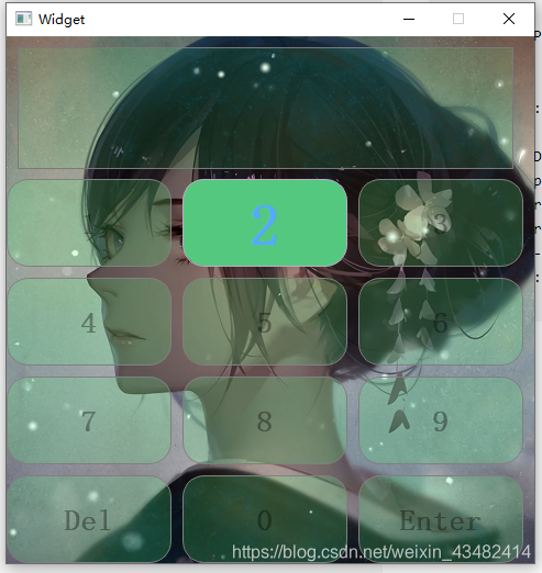
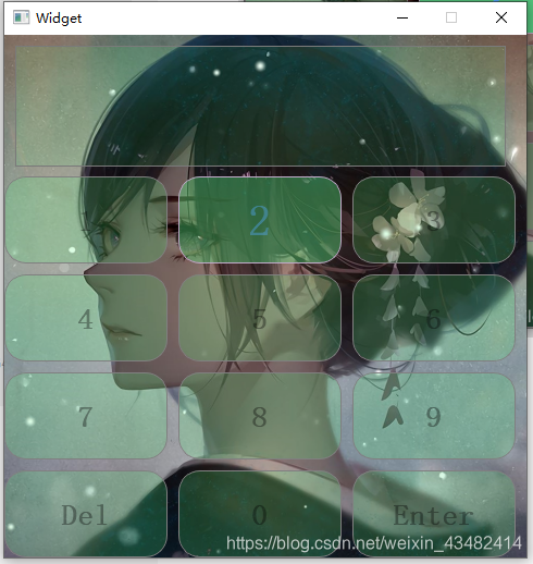
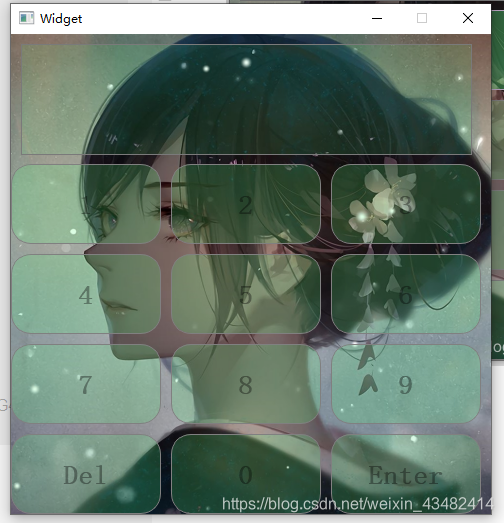
效果展示
- 按下状态
- 聚焦状态
- 初始状态
对应样式表
#Widget{
        image: url(:/background.jpg);
        background-image: ;

}


QPushButton{
            color: rgba(0, 0, 0,90);

            background-color: rgba(85, 255, 127,50);
            font: 20pt "微软雅黑";


            border:1px solid gray;
            border-width: 1px;
            border-radius: 20px;
            border-color: gray;
            padding: 5px;
            font-weight:bold;


}

QPushButton:hover{
        color: rgba(85, 170, 255,100);
        background-color: rgba(85, 230, 127,100);
        font: 30pt "微软雅黑";
        border-width: 1px;
        border-radius: 20px;
        border-color: rgb(191, 169, 200);
        padding: 5px;
        font-weight:bold;

}

QPushButton:pressed{
        color: rgb(85, 170, 255);
        background-color: rgb(85, 200, 127);
        font: 40pt "微软雅黑";
        border-width: 1px;
        border-radius: 20px;
        border-color: rgb(191, 169, 200);
        padding: 5px;
        font-weight:bold;
}

QTextEdit
{
        font: 40pt "微软雅黑";
        color: rgba(0, 170, 255,70);

        background-color: rgba(85, 255, 127,30);

}
QDateTimeEdit
{
        font: 20pt "微软雅黑";
        color: rgba(0, 170, 255,70);
        background-color: rgba(85, 255, 127,30);
        min-width:200;
        min-height:100;
        max-width:600;
        max-height:600;
}
qQDateTimeEdit::down-button
{
        background-color: rgba(85, 150, 255,100);

}
QDateTimeEdit::down-arrow
{
        color: rgba(0, 0, 0,70);
        background-color: rgba(85, 255, 255,100);
}
qQDateTimeEdit::up-button
{

        background-color: rgba(85, 150, 255,100);

}
QDateTimeEdit::up-arrow
{
        color: rgba(0, 0, 0,70);
        background-color: rgba(85, 255, 255,100);

}


 2万+
2万+


 被折叠的 条评论
为什么被折叠?
被折叠的 条评论
为什么被折叠?
 到【灌水乐园】发言


