


文章目录
前言
《第三回:布局格式定方圆》笔记。
1 子图
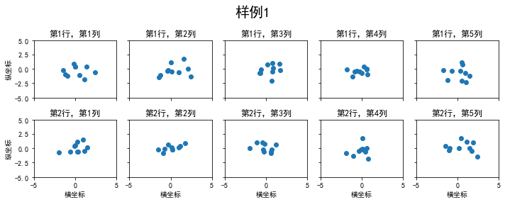
1.1 使用 plt.subplots 绘制均匀状态下的子图
"""
figsize 参数可以指定整个画布的大小

sharex 和 sharey 分别表示是否共享横轴和纵轴刻度

tight_layout 函数可以调整子图的相对大小使字符不会重叠
"""

fig, axs = plt.subplots(2, 5, figsize=(10, 4), sharex=True, sharey=True)
fig.suptitle('样例1', size=20)
for i in range(2):
    for j in range(5):
        axs[i][j].scatter(np.random.randn(10), np.random.randn(10))
        axs[i][j].set_title('第%d行,第%d列'%(i+1,j+1))
        axs[i][j].set_xlim(-5,5)
        axs[i][j].set_ylim(-5,5)
        if i==1: axs[i][j].set_xlabel('横坐标')
        if j==0: axs[i][j].set_ylabel('纵坐标')
fig.tight_layout()
使用plt.subplot()和prejection船舰极坐标系下的图表:
N = 150
r = 2 * np.random.rand(N)
theta = 2 * np.pi * np.random.rand(N)
area = 200 * r**2
colors = theta

plt.subplot(projection='polar')
plt.scatter(theta, r, c=colors, s=area, cmap='hsv', alpha=0.75)

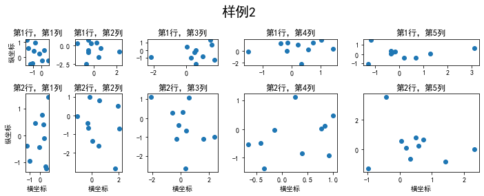
1.2 使用 GridSpec 绘制非均匀子图
非均匀包含两层含义:
- 图的比例大小不同但没有跨行或跨列
- 图为跨列或跨行状态
第一种含义:
fig = plt.figure(figsize=(10, 4))
spec = fig.add_gridspec(nrows=2, ncols=5, width_ratios=[1,2,3,4,5], height_ratios=[1,3])
fig.suptitle('样例2', size=20)
for i in range(2):
    for j in range(5):
        ax = fig.add_subplot(spec[i, j]) # gridspec子图。可以通过切片获取
        ax.scatter(np.random.randn(10), np.random.randn(10))
        ax.set_title('第%d行,第%d列'%(i+1,j+1))
        if i==1: ax.set_xlabel('横坐标')
        if j==0: ax.set_ylabel('纵坐标')
fig.tight_layout()
第二种:
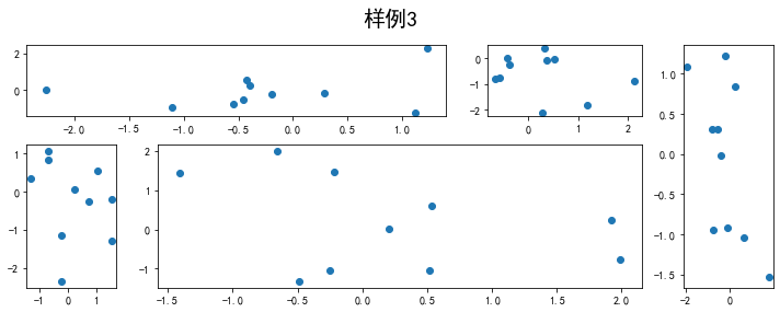
可以这样理解,我们设置拥有2行3列子图的figure,然后把其中几个子图合并,就得到了大小不同的子图。加入我们合并其中2个子图,那么本来2行3列一共6个子图就会变成5个,不信我们试试看:
fig = plt.figure(figsize=(10, 4))
spec = fig.add_gridspec(nrows=2, ncols=6, width_ratios=[1,1,1,1,1,1], height_ratios=[1,1])
fig.suptitle('样例3', size=20)
#sub1
ax = fig.add_subplot(spec[0,0])
ax.scatter(np.random.randn(10), np.random.randn(10))
#sub2
ax = fig.add_subplot(spec[0,1])
ax.scatter(np.random.randn(10), np.random.randn(10))
#sub3
ax = fig.add_subplot(spec[:,2])
ax.scatter(np.random.randn(10), np.random.randn(10))
#sub4
ax = fig.add_subplot(spec[1,0])
ax.scatter(np.random.randn(10), np.random.randn(10))
#sub5
ax = fig.add_subplot(spec[1, 1])
ax.scatter(np.random.randn(10), np.random.randn(10))

fig.tight_layout()
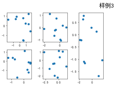
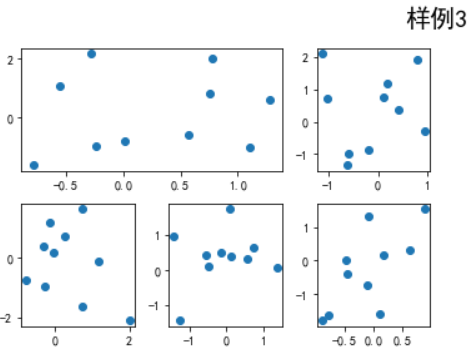
fig = plt.figure(figsize=(10, 4))
spec = fig.add_gridspec(nrows=2, ncols=6, width_ratios=[1,1,1,1,1,1], height_ratios=[1,1])
fig.suptitle('样例3', size=20)
# sub1
ax = fig.add_subplot(spec[0,0:2])
ax.scatter(np.random.randn(10), np.random.randn(10))
# sub2
ax = fig.add_subplot(spec[0,2])
ax.scatter(np.random.randn(10), np.random.randn(10))
# sub3
ax = fig.add_subplot(spec[1:,0])
ax.scatter(np.random.randn(10), np.random.randn(10))
# sub4
ax = fig.add_subplot(spec[1,1])
ax.scatter(np.random.randn(10), np.random.randn(10))
# sub5
ax = fig.add_subplot(spec[1, 2])
ax.scatter(np.random.randn(10), np.random.randn(10))

fig.tight_layout()
给个复杂点的例子:
fig = plt.figure(figsize=(10, 4))
spec = fig.add_gridspec(nrows=2, ncols=6, width_ratios=[2,2.5,3,1,1.5,2], height_ratios=[1,2])
fig.suptitle('样例3', size=20)
# sub1
ax = fig.add_subplot(spec[0, :3])
ax.scatter(np.random.randn(10), np.random.randn(10))
# sub2
ax = fig.add_subplot(spec[0, 3:5])
ax.scatter(np.random.randn(10), np.random.randn(10))
# sub3
ax = fig.add_subplot(spec[:, 5])
ax.scatter(np.random.randn(10), np.random.randn(10))
# sub4
ax = fig.add_subplot(spec[1, 0])
ax.scatter(np.random.randn(10), np.random.randn(10))
# sub5
ax = fig.add_subplot(spec[1, 1:5])
ax.scatter(np.random.randn(10), np.random.randn(10))
fig.tight_layout()
2 子图上的方法
在 ax 对象上定义了和 plt 类似的图形绘制函数,常用的有:
plot, hist, scatter, bar, barh, pie
2.1 plot-线的绘制
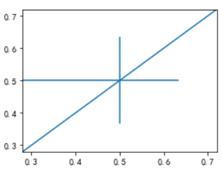
- 绘制任意直线
fig, ax = plt.subplots(figsize=(4,3))
ax.plot([1,2],[2,1])

fig, ax = plt.subplots(figsize=(4,3))
ax.plot(np.random.rand(10),np.random.rand(10))
fig, ax = plt.subplots(figsize=(4,3))
ax.axhline(0.5,0,0.8) # 0.5是y的取值;后两个参数的意思是从左到右,占整个图的0%的位置和百分之80%的位置
ax.axvline(0.5,0.2,0.8) # 0.5是y的取值;后两个参数的意思是从左到右,占整个图的20%的位置和80%的位置
ax.axline([0.3,0.3],[0.7,0.7]) # 经过这两个坐标[0.3,0.3],[0.7.0.7
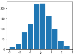
2.2 hist-直方图的绘制
fig, ax = plt.subplots(figsize=(4,3))
ax.hist(np.random.randn(1000))

使矩形之间产生间隔:
fig, ax = plt.subplots(figsize=(4,3))
ax.hist(np.random.randn(1000),rwidth=0.9)
2.3 对图像的特殊设置
- 使用
grid可以加灰色网格
fig, ax = plt.subplots(figsize=(4,3))
ax.grid(True)

- 使用
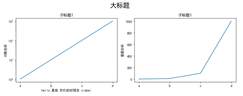
set_xscale,set_title,set_xlabel分别可以设置坐标轴的规度(指对数坐标等)、标题、轴名
fig, axs = plt.subplots(1, 2, figsize=(10, 4))
fig.suptitle('大标题', size=20)
for j in range(2):
    axs[j].plot(list('abcd'), [10**i for i in range(4)])
    if j==0:
        axs[j].set_yscale('log')
        axs[j].set_title('子标题1')
        axs[j].set_ylabel('对数坐标')
        axs[j].set_xlabel('hello 是我 你们的好朋友 xlabel')
    else:
        axs[j].set_title('子标题1')
        axs[j].set_ylabel('普通坐标')
fig.tight_layout()
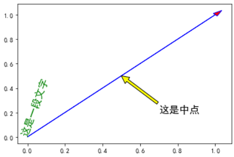
- 与一般的 plt 方法类似,
legend,annotate,arrow,text对象也可以进行相应的绘制
fig, ax = plt.subplots()
ax.arrow(0, 0, 1, 1, head_width=0.03, head_length=0.05, facecolor='red', edgecolor='blue')
ax.text(x=0, y=0,s='这是一段文字', fontsize=16, rotation=70, rotation_mode='anchor', color='green')
ax.annotate('这是中点', xy=(0.5, 0.5), xytext=(0.7, 0.2), arrowprops=dict(facecolor='yellow', edgecolor='black'), fontsize=16)
fig, ax = plt.subplots()
ax.plot([1,2],[2,1],label="line1")
ax.plot([1,1],[1,2],label="line1")
ax.legend(loc=1)
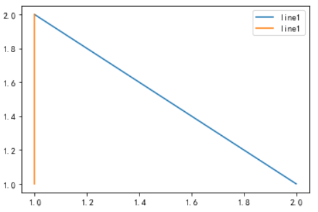
其中,图例的 loc 参数如下:
| string | code |
|---|---|
| best | 0 |
| upper right | 1 |
| upper left | 2 |
| lower left | 3 |
| lower right | 4 |
| right | 5 |
| center left | 6 |
| center right | 7 |
| lower center | 8 |
| upper center | 9 |
| center | 10 |
大部分操作都是通过axex来实现的,所以说axex是画图时最核心的部分。
作业
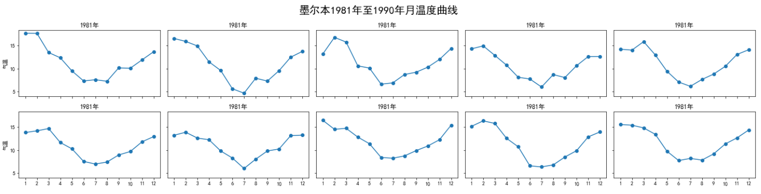
1. 墨尔本1981年至1990年的每月温度情况
import matplotlib.pyplot as plt
from matplotlib.pyplot import MultipleLocator
import pandas as pd
import numpy as np
plt.rcParams['font.sans-serif'] = ['SimHei'] #设置字体为SimHei显示中文
plt.rcParams['axes.unicode_minus'] = False #设置正常显示字符

data = pd.read_csv('./layout_ex1.csv')

fig, axs = plt.subplots(2,5,figsize=(20,5),sharex=True,sharey=True)
fig.suptitle('墨尔本1981年至1990年月温度曲线',size=20)

index = 0
for i in range(2):
    for j in range(5):
        axs[i][j].plot(np.arange(1,13),data['Temperature'].values[index*12:(index*12+12)],'o-')
        axs[i][j].set_title('%s年'%data['Time'].values[index][:4])
        axs[i][j].xaxis.set_major_locator(MultipleLocator(1)) #把横坐标设置为1的倍数
        axs[i][j].yaxis.set_major_locator(MultipleLocator(5)) #把纵坐标设置为5的倍数
        if(j==0):
            axs[i][j].set_ylabel('气温')
        index += 1

fig.tight_layout()
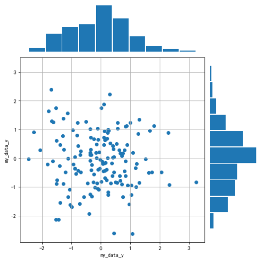
2. 画出数据的散点图和边际分布
import matplotlib.pyplot as plt
import numpy as np

data = np.random.randn(2, 150)
fig = plt.figure(figsize=(7,7))
spec = fig.add_gridspec(9,9,width_ratios=np.ones((9)),height_ratios=np.ones((9)))

ax1 = fig.add_subplot(spec[2:9,0:7])
ax2 = fig.add_subplot(spec[0:2,0:7],sharex=ax1) # 与子图1共享x坐标
ax3 = fig.add_subplot(spec[2:9,7:9],sharey=ax1) # 与子图1共享y坐标

#第一个子图
ax1.scatter(data[0],data[1])
ax1.set_ylabel('my_data_y',fontsize=10)
ax1.set_xlabel('my_data_y',fontsize=10)
ax1.grid(True)

#第二个子图
ax2.hist(data[0,:],rwidth=0.94)
# 隐藏x轴标度
ax2.get_xaxis().set_visible(False)
# 隐藏y轴标度
ax2.get_yaxis().set_visible(False)
# 关闭边框
for spine in ax2.spines.values():
    spine.set_visible(False)

#第三个子图
ax3.hist(data[0,:],rwidth=0.94, orientation='horizontal')
# 隐藏x轴标度
ax3.get_xaxis().set_visible(False)
# 隐藏y轴标度
ax3.get_yaxis().set_visible(False)
# 关闭边框
for spine in ax3.spines.values():
    spine.set_visible(False)

fig.tight_layout()


 1085
1085

 被折叠的 条评论
为什么被折叠?
被折叠的 条评论
为什么被折叠?
 到【灌水乐园】发言


