


最近做项目UI那边那边提了个比较少见的需求,如图:

我一开始想到的自然是用element ui的进度条来做,但找了许久都没找到这种的样式效果。
于是考虑用柱状图,如果这三个数据只用一个柱状图自然很难实现这样的效果(对我而言),于是就考虑用三个柱状图,一条数据就用一个柱状图。通过把柱状图的x轴和y轴都隐藏,只保留一个柱体,然后其余的数据就通过el-row 和el-col布局来实现。
布局如下:
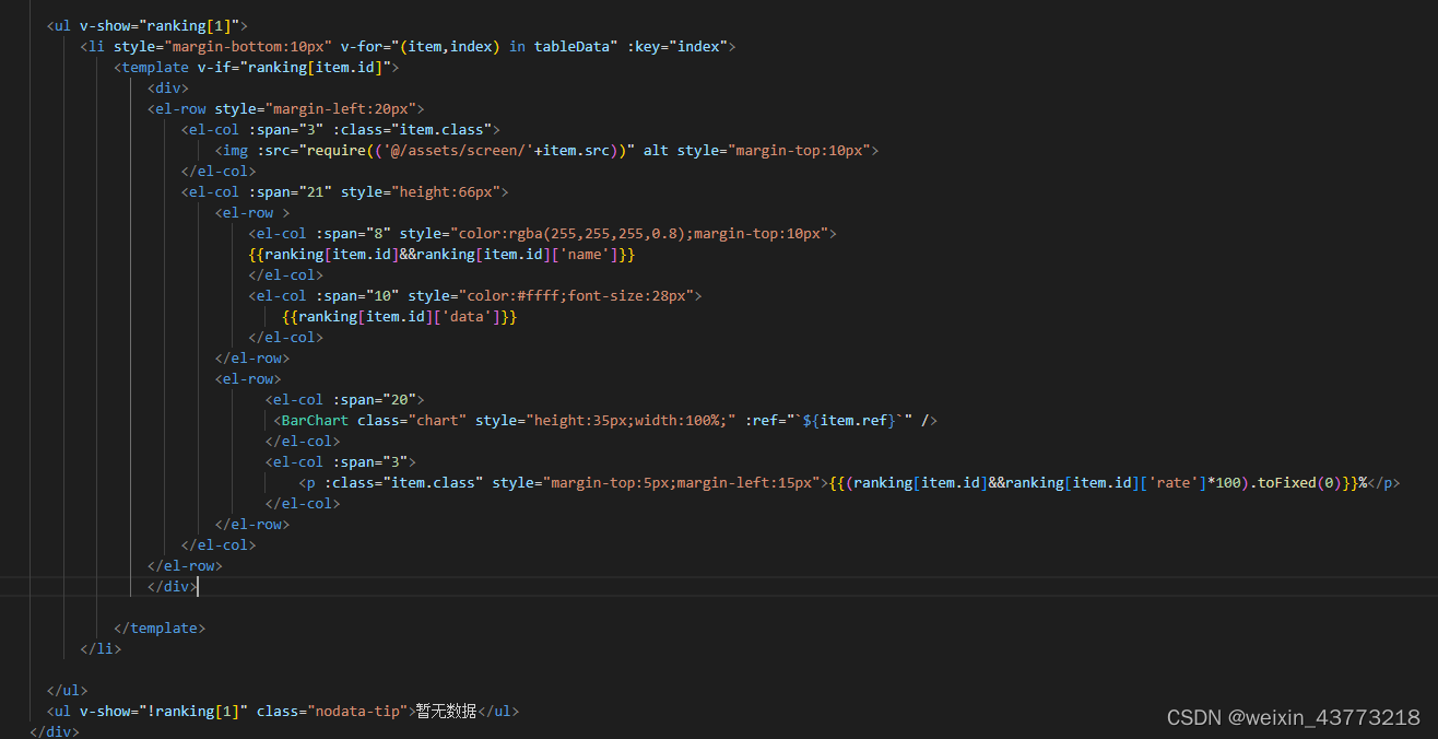
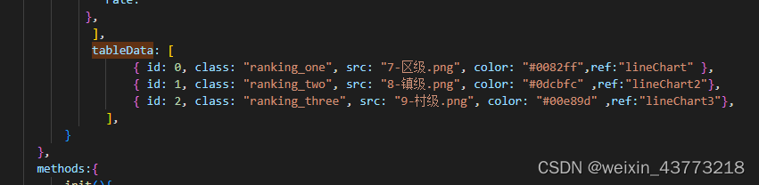
通过:ref="`${item.ref}`"来动态绑定。ranking是后端返回的数据
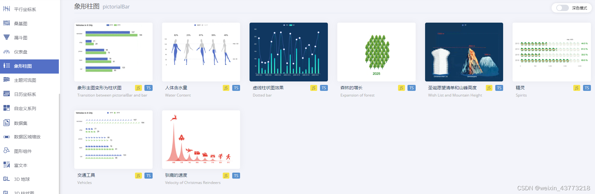
这种类似的效果图在echarts官方示例中叫象形柱图
options配置如下
var option = {
    grid: [{//图形的位置
        left: -73,
        bottom:3,
        top: 3,
        right: 75
    }],
    xAxis: {
        show: false//是否展示X轴
    },
    yAxis: {
        data: category,
        show: false,
        axisLabel: {
            inside: true,
            verticalAlign: 'middle',
            lineHeight: 150,
            color: '#4488bc',
            fontSize: 8
        },
        axisLine: {
            show: false//不展示刻度
        }
    },
    series: [
        { // 下层块
            name: '',
            type: 'pictorialBar',
            symbol: 'roundRect',
            barWidth: '3%',
            barMaxWidth: '20%',
            symbolOffset: [75, 0],
            itemStyle: {
            color: new echarts.graphic.LinearGradient(0, 0, 0, 1, [
            { offset: 0, color: 'rgba(0,130,255,0.05) '},
            { offset: 0.5, color: 'rgba(0,130,255,0.1)' },
            { offset: 1, color: 'rgba(0,130,255,0.15)' }
            ])
        },
            z: -11,
            symbolRepeat: true,
            symbolSize: [6, 16],
            data: this.lineData,
            barGap: 50,
            barCategoryGap: 0,
            animationEasing: 'elasticOut',

        },

        { // 上层块
            name: '', // blue bar
            type: 'pictorialBar',
            symbol: 'roundRect',
            barWidth: '3%',
            barMaxWidth: 100,
            symbolOffset: [75, 0],
            itemStyle: {
            color: new echarts.graphic.LinearGradient(0, 0, 1, 0, [
            { offset: 0, color: 'rgba(113,173,230,0.1) '},
            { offset: 0.5, color: 'rgba(64,155,243,0.5)' },
            { offset: 1, color: 'rgba(0,130,255,1)' }
            ])
        },
            symbolRepeat: true,
            symbolSize: [6, 16],
            // symbolClip: true,
            data: this.countyData,
        },
        /*
         */

    ],


}
下层块是下面一层颜色较浅的部分,下层块是上面颜色较深的部分
itemStyle: {
            color: new echarts.graphic.LinearGradient(0, 0, 1, 0, [
            { offset: 0, color: 'rgba(113,173,230,0.1) '},
            { offset: 0.5, color: 'rgba(64,155,243,0.5)' },
            { offset: 1, color: 'rgba(0,130,255,1)' }
            ])
        },
这是设置柱体颜色渐变
柱体渐变可查看->柱体渐变效果
参考文章:象形柱图


 2207
2207


 被折叠的 条评论
为什么被折叠?
被折叠的 条评论
为什么被折叠?
 到【灌水乐园】发言


