


 这篇博客介绍了Android中常见的UI控件的使用,包括TextView的textcolor属性设置,Button的点击事件设定,EditText的常用属性及获取信息方法,以及ImageView的属性应用,并给出了具体示例。
文章目录
TextView
TextView控件用于显示文本信息
TextView常用属性
| 属性名称 | 功能描述 |
|---|---|
| android:layout_width | 设置控件的宽度 |
| android:layout_height | 设置控件的高度 |
| android:id | 设置控件的唯一标识 |
| android:background | 设置控件的背景 |
| android:layout_margin | 设置控件与屏幕边界或周围控件、布局的距离 |
| android:padding | 设置控件与该控件中内容的距离 |
| android:text | 设置控件的文本内容 |
| android:textColor | 设置控件的颜色 |
| android:textSize | 设置控件的大小 |
| android:gravity | 设置文本内容的位置 |
| android:maxLength | 设置文本最大长度,超出此长度的文本不显示 |
| android:lines | 设置文本的行数,超出此长度的文本不显示 |
| android:maxLines | 设置文本的最大行数,超出此行数的文本不显示 |
| android:ellipsize | 设置当文本超出TextView规定的范围显示方式,属性值可选为“start”、“middle”和“end”,分别表示当文本超出控件规定范围时,在文本开始、中间或者末尾显示省略号 |
| android:drawableTop | 在文本顶部显示图像 |
| android:lineSpacingExtra | 设置文本的行间距 |
| android:textStyle | 设置文本样式,如bold(粗体),italic(斜体),normal(正常) |
设置文本颜色的三种方法
textcolor属性可以设置:
- 颜色码
- @android定义的颜色值,由谷歌公司提供选择
- colors.xml自己定义的颜色值
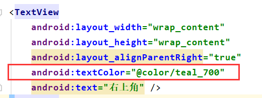
@android定义的颜色值:
colors.xml自己定义的颜色值:

直接使用颜色码:

举例
    <TextView
        android:text="测试文本"
        android:textSize="30dp"
        android:background="#ABBB86FC"
        android:textColor="@color/black"
        android:textStyle="italic|bold"
        android:gravity="center"
        android:layout_width="match_parent"
        android:layout_height="wrap_content">
    </TextView>

Button
button控件表示按钮,它继承自TextView控件。
为button控件设置点击事件的三种方式
- 在布局文件中指定onClick属性的方式设置点击事件
<!--布局文件-->
<Button
    android:id="@+id/bt2"
    android:layout_width="match_parent"
    android:layout_height="wrap_content"
    android:onClick=
最低0.47元/天 解锁文章


 4677
4677


 被折叠的 条评论
为什么被折叠?
被折叠的 条评论
为什么被折叠?
 到【灌水乐园】发言


