


目录
TextView(文本框)
用于显示文本的一个控件,文本的尺寸单位为sp
文本常用属性
| 属性名 | 作用 |
|---|---|
| id | 为TextView设置一个组件id,根据id,我们可以在Java代码中通过findViewById()的方法获取到该对象,然后进行相关属性的设置 |
| layout_width | 组件的宽度 |
| layout_height | 组件的高度 |
| gravity | 设置控件中内容的对齐方向,TextView中是文字,ImageView中是图片等等 |
| text | 设置显示的文本内容,一般我们是把字符串写到string.xml文件中,然后通过@String/xxx取得对应的字符串内容的 |
| textColor | 设置字体颜色,同上,通过colors.xml资源来引用 |
| textStyle | 设置字体风格,三个可选值:normal(无效果),bold(加粗),italic(斜体) |
| textSize | 字体大小,单位一般是用sp |
| background | 控件的背景颜色,可以理解为填充整个控件的颜色,可以是图片 |
| autoLink | 识别链接类型 (web, email, phone ,map ,none, all) |
文本案例
<TextView
    android:id="@+id/tv1"
    android:layout_width="wrap_content"
    android:layout_height="wrap_content"
    android:text="Hello World" />
文本设置边框
在drawable里面编写一个资源文件,然后将TextView的background设置为这个资源文件就行了。
-
<solid android:color="xxx" > 这个是设置背景颜色的
-
<stroke android:width="xdp" android:color="xxx"> 这个是设置边框的粗细,以及边
框颜色的
-
<padding androidLbottom="xdp"> 这个是设置边距的
-
<corners android:topLeftRadius="10px"> 这个是设置圆角的
- <gradient> 这个是设置渐变色的,可选属性有: startColor:起始颜色 endColor:结束颜色 centerColor:中间颜色 angle:方向角度,等于0时,从左到右,然后逆时针方向转,当angle = 90度时从下往上 type:设置渐变的类型
设置矩形的渐变边框
<?xml version="1.0" encoding="utf-8"?>
<shape xmlns:android="http://schemas.android.com/apk/res/android">
  <!-- 设置一个黑色边框 -->
  <stroke android:width="2px" android:color="#000000"/>
  <!-- 渐变 -->
  <gradient
    android:angle="270"
    android:endColor="#C0C0C0"
    android:startColor="#FCD209" />
  <!-- 设置一下边距,让空间大一点 -->
  <padding
    android:left="5dp"
    android:top="5dp"
    android:right="5dp"
    android:bottom="5dp"/>
</shape>
编写圆角矩形边框
<?xml version="1.0" encoding="utf-8"?>
<shape xmlns:android="http://schemas.android.com/apk/res/android">
  <!-- 设置透明背景色 -->
  <solid android:color="#87CEEB" />
  <!-- 设置一个黑色边框 -->
  <stroke
    android:width="2px"
    android:color="#000000" />
  <!-- 设置四个圆角的半径 -->
  <corners
    android:bottomLeftRadius="10px"
    android:bottomRightRadius="10px"
    android:topLeftRadius="10px"
    android:topRightRadius="10px" />
  <!-- 设置一下边距,让空间大一点 -->
  <padding
    android:bottom="5dp"
    android:left="5dp"
    android:right="5dp"
    android:top="5dp" />
</shape>
文本框带图片
| 属性名 | 作用 |
|---|---|
| android:drawableLeft | 文本左边设置图片 |
| android:drawableRight | 文本右边设置图片 |
| android:drawableBottom | 文本下边设置图片 |
| android:drawableTop | 文本上边设置图片 |
<EditText
android:layout_width="match_parent"
android:layout_height="wrap_content"
android:drawableLeft="@drawable/img_3"
android:textSize="30dp"
android:textColorHint="@color/white"
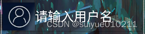
android:hint="请输入用户名"/>
<EditText
android:layout_width="match_parent"
android:layout_height="wrap_content"
android:drawableLeft="@drawable/img_4"
android:textSize="30dp"
android:inputType="number"
android:textColorHint="@color/white"
android:hint="请输入密码"/>EditText(输入框)
基本属性
| 属姓名 | 说明 |
|---|---|
| android:hint | 默认提示文本 |
| android:textColorHint | 默认提示文本的颜色 |
| android:selectAllOnFocus | 布尔值。点击输入框获得焦点后,获取到输入框中所有的文本内容 |
| android:inputType | 对输入的数据进行限制 |
| android:minLines | 设置最小行数 |
| android:maxLines | 设置最大行数 PS:当输入内容超过maxline,文字会自动向上滚动!! |
| android:singleLine | 只允许单行输入,而且不会滚动 |
| android:textScaleX | 设置字与字的水平间隔 |
| android:textScaleY | 设置字与字的垂直间隔 |
| android:capitalize | sentences:仅第一个字母大写 ;words:每一个单词首字母大小,用空格区分单词;characters:每一个英文字母都大写 |
设置EditText获得焦点,同时弹出键盘
edit.requestFocus(); //请求获取焦点
edit.clearFocus(); //清除焦点
获取焦点案例
        <EditText
            android:layout_width="match_parent"
            android:layout_height="wrap_content"
            android:drawableLeft="@drawable/img_3"
            android:textSize="30dp"
            android:textColorHint="@color/white"
            android:hint="请输入用户名">
            <requestFocus/>
        </EditText>
ImageView(图像视图)
常用属性
| 属性名 | 说明 |
|---|---|
| android:src | 设置图片资源 |
| android:scaleType | 设置图片缩放类型 |
| android:maxHeight | 最大高度 |
| android:maxWidth | 最大宽度 |
| android:adjustViewBounds | 调整View的界限 |
src属性和background属性的区别
前景(对应src属性):setImageDrawable();
背景(对应background属性):setBackgroundDrawable();
两者结合案例
<ImageView
    android:layout_gravity="center"
    android:padding="20dp"
    android:layout_width="200dp"
    android:layout_height="200dp"
    android:background="@drawable/shape_bg"
    android:src="@mipmap/pen" />
scaleType属性可选值
-
fitXY:对图像的横向与纵向进行独立缩放,使得该图片完全适应ImageView,但是图片的横纵比可能会发生改变
-
fitStart:保持纵横比缩放图片,知道较长的边与Image的编程相等,缩放完成后将图片放在ImageView的左上角
-
fitCenter:同上,缩放后放于中间;
-
fitEnd:同上,缩放后放于右下角;
-
center:保持原图的大小,显示在ImageView的中心。当原图的size大于ImageView的size,超过部分裁剪处理。
-
centerCrop:保持横纵比缩放图片,知道完全覆盖ImageView,可能会出现图片的显示不完全
-
centerInside:保持横纵比缩放图片,直到ImageView能够完全地显示图片
-
matrix:默认值,不改变原图的大小,从ImageView的左上角开始绘制原图, 原图超过ImageView的部分作裁剪处理
alpha设置图片透明度
设置区间是0-1 0是完全透明不显示,1是完全不透明。
<?xml version="1.0" encoding="utf-8"?>
<LinearLayout xmlns:android="http://schemas.android.com/apk/res/android"
    xmlns:app="http://schemas.android.com/apk/res-auto"
    xmlns:tools="http://schemas.android.com/tools"
    android:layout_width="match_parent"
    android:layout_height="match_parent"
    tools:context=".MainActivity4">


    <ImageView
        android:id="@+id/imageView"
        android:layout_width="match_parent"
        android:layout_height="match_parent"
        android:alpha="0.7"
        app:srcCompat="@drawable/touxiang" />
</LinearLayout>
Button(按钮)
基本属性
| 属性名 | 描述 |
|---|---|
| android:autoText | 如果设置,指定该TextView中有一个文本输入法,并自动纠正一些常见的拼写错误 |
| android:drawableBottom | 可拉伸要绘制的文本的下面 |
| android:drawableRight | 可拉伸要绘制的文本的右侧 |
| android:editable | 如果设置,指定该TextView有一个输入法 |
| android:text | 要显示的文本 |
| android:background | 这是一个可拉伸使用来做背景 |
| android:id | 对此视图提供一个标识符名称 |
| android:visibility | 控制视图的初始可视性 |
| android:onClick | 在本视图的上下文视图被点击时调用的方法的名称 |
| android:contentDescription | 定义文本简要介绍了视图内容 |
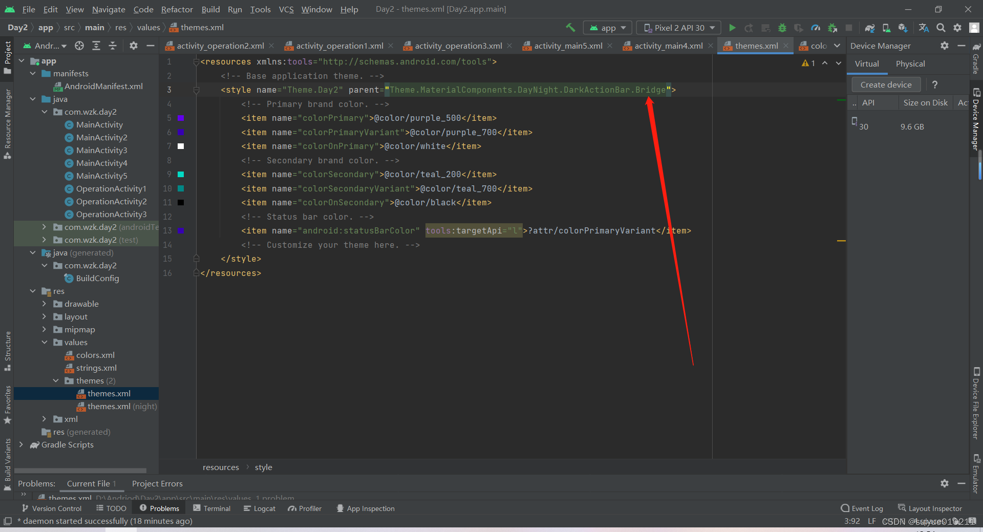
如果想要修改背景图或者颜色,没办法修改的话,就到res-values-thems<style>标签里后面添加上Brige不用系统颜色,用自己的颜色
StateListDrawable
stateListDrawable是一个资源文件
常用属性
| 属性名 | 说明 |
|---|---|
| drawable | 引用的Drawable位图,我们可以把他放到最前面,就表示组件的正常状态 |
| state_focused | 是否获得焦点 |
| state_window_focused | 是否获得窗口焦点 |
| state_enabled | 控件是否可用 |
| state_checkable | 控件可否被勾选 |
| state_checked | 控件是否被勾选 |
| state_selected | 控件是否被选择,针对有滚轮的情况 |
| state_pressed | 控件是否被按下 |
| state_active | 控件是否处于活动状态 |
| state_single | 控件包含多个子控件时,确定是否只显示一个子控件 |
| state_first | 控件包含多个子控件时,确定第一个子控件是否处于显示状态 |
| state_middle | 控件包含多个子控件时,确定中间一个子控件是否处于显示状态 |
| state_last | 控件包含多个子控件时,确定最后一个子控件是否处于显示状态 |
点击案例
用于button按钮的background里面
<?xml version="1.0" encoding="utf-8"?>
<selector xmlns:android="http://schemas.android.com/apk/res/android">
    <item android:drawable="@color/black" android:state_pressed="true"></item>
    <item android:drawable="@color/red"></item>
</selector>
如果没点击是显示第二个item的颜色,如果点击是显示第一个item的颜色


 728
728


 被折叠的 条评论
为什么被折叠?
被折叠的 条评论
为什么被折叠?
 到【灌水乐园】发言


