


觉得机械键盘的波纹灯光很好看,所以就设计了一个炫彩的按钮哈哈哈哈哈,记录一下。
我是把按钮封装了的,具体代码如下:
<template>
    <button :class="btnClass">
        <slot></slot>
    </button>
</template>
可以接收自定义的按钮类型。能接收两个参数,形状、大小。
<script>
  export default {
    name: 'MyButton',
    props: {
      type: {
        type: String,
        default: 'default'
      },
      size: {
        type: String,
        default: 'small'
      }
    },
    computed: {
      btnClass() {
        return `btn btn-${this.type} btn-${this.size}`;
      }
    },
  };
</script>
最后是样式部分:
<style>
@keyframes gradientAnimation {
  0% { background-position: 0% 0%; } /* 开始时的背景位置 */
  100% { background-position: 200% 0%; } /* 结束时的背景位置 */
}
.btn {
  /* 按钮的基本样式 */
  height: 30px;
  width: 80px;
  /* border-radius: 15px; */
}

.btn-default {
  /* 默认按钮样式 */
  background-color: rgb(217, 14, 14);
}

.btn-primary {
  /* 主要按钮样式 */
  background-color: rgb(11, 167, 230);
}
.btn-card {
  height: 300px;
  width: 300px;
}
.btn-color {
  /* 主要按钮样式 */
  background-image: linear-gradient(to bottom right, #d77a7a, #8aca8a, #7c7cce, skyblue, rgb(211, 211, 117),
  #d77a7a, #8aca8a, #7c7cce, skyblue, rgb(211, 211, 117), #d77a7a); /* 初始背景色 */
  background-size: 200% 300%;
  color: #3b31c8;
  animation-name: gradientAnimation;
  animation-duration: 2s;
  animation-iteration-count: infinite;
  animation-fill-mode: forwards;
  animation-timing-function: linear;
}

/* 按钮尺寸的样式 */
.btn-small {
  height: 20px;
  width: 60px;
  border-radius: 10px;
}
.btn-large {
  height: 40px;
  width: 100px;
  border-radius: 20px;
}
</style>
最后在其他组件里使用的话就按照正常步骤来就好了。我的话是把上述代码文件都写在一个MyButton.vue组件里
然后去main.js里全局注册使用:
import MoveBlock from './components/MoveBlock.vue';


app.component('MoveBlock', MoveBlock);
最后在其他组件中就可以正常使用了:
<my-button
    type="color"
    size="large"
>按钮</my-button>
最后的效果如下:
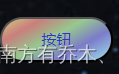

颜色会不断渐变。


 7236
7236


 被折叠的 条评论
为什么被折叠?
被折叠的 条评论
为什么被折叠?
 到【灌水乐园】发言


