


1. 什么是 tabBar
tabBar 是移动端应用常见的页面效果,用于实现多页面的快速切换。小程序中通常将其分为:
- 底部 tabBar
- 顶部 tabBar
注意:
- tabBar中只能配置最少 2 个、最多 5 个 tab 页签
- 当渲染顶部 tabBar 时,不显示 icon,只显示文本
2 tabBar 的 6 个组成部分
- backgroundColor:tabBar 的背景色
- borderStyle:tabBar 上边框的颜色
- color:tab 上文字的默认(未选中)颜色
- iconPath:未选中时的图片路径
- selectedIconPath:选中时的图片路径
- selectedColor:tab 上的文字选中时的颜色
3 tabBar 节点的配置项
| 属性 | 类型 | 必填 | 默认值 | 描述 |
|---|---|---|---|---|
| list | Array | 是 | tab 页签的列表,最少 2 个、最多 5 个 tab | |
| position | String | 否 | bottom | tabBar 的位置,仅支持 bottom/top |
| backgroundColor | HexColor | 否 | tabBar 的背景色 | |
| borderStyle | String | 否 | black | tabBar 上边框的颜色,仅支持 black/white |
| color | HexColor | 否 | tab 上文字的默认(未选中)颜色 | |
| selectedColor | HexColor | 否 | tab上的文字选中时的颜色 |
4 每个 tab 项的配置选项
| 属性 | 类型 | 必填 | 描述 |
|---|---|---|---|
| pagePath | String | 是 | 页面路径,页面必须在 pages 中预先定义 |
| text | String | 是 | tab 上显示的文字 |
| iconPath | String | 否 | 未选中时的图标路径;当 postion 为 top 时,不显示 icon |
| selectedIconPath | String | 否 | 选中时的图标路径;当 postion 为 top 时,不显示 icon |
5 案例:配置 tabBar
5.1 新建 3 个对应的 tab 页面
通过 app.json 文件的 pages 节点,快速新建 3 个对应的 tab 页面
app.json
  "pages": [
    "pages/home/home",
    "pages/message/message",
    "pages/contact/contact",

    "pages/list/list",
    "pages/index/index",
    "pages/logs/logs"

  ],
5.2 配置 tabBar 选项
- ① 打开 app.json 配置文件,和 pages、window 平级,新增 tabBar 节点
- ② tabBar 节点中,新增 list 数组,这个数组中存放的,是每个 tab 项的配置对象
- ③ 在 list 数组中,新增每一个 tab 项的配置对象。对象中包含的属性如下:
- pagePath 指定当前 tab 对应的页面路径【必填】
- text 指定当前 tab 上按钮的文字【必填】
- iconPath 指定当前 tab 未选中时候的图片路径【可选】
- selectedIconPath 指定当前 tab 被选中后高亮的图片路径【可选】
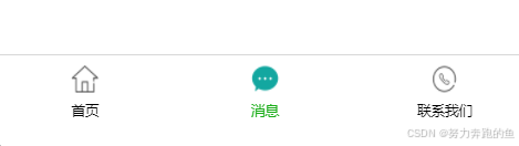
 "tabBar": {
    "position": "bottom",
    "list": [
      {
        "pagePath": "pages/home/home",
        "text": "首页",
        "iconPath": "/images/tabs/home.png",
        "selectedIconPath": "/images/tabs/home-active.png"
      },
      {
        "pagePath": "pages/message/message",
        "text": "消息",
        "iconPath": "/images/tabs/message.png",
        "selectedIconPath": "/images/tabs/message-active.png"
      },
      {
        "pagePath": "pages/contact/contact",
        "text": "联系我们",
        "iconPath": "/images/tabs/contact.png",
        "selectedIconPath": "/images/tabs/contact-active.png"
      }

    ]
  },
运行效果


 扫一扫
扫一扫


 498
498

 被折叠的 条评论
为什么被折叠?
被折叠的 条评论
为什么被折叠?
 到【灌水乐园】发言


