


1.定位实现水平垂直居中
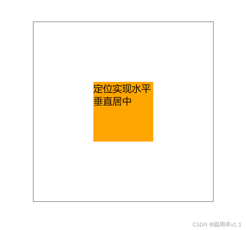
<div class="outer">
        <div class="test inner1">定位实现水平垂直居中</div>
    </div>

<style>
 .outer {
            width: 300px;
            height: 300px;
            border: 1px solid gray;
            margin: 100px auto 0;
            position: relative;
       }
       .test {
            width: 100px;
            height: 100px;
            background-color: orange;

       }
       .inner1 {
             /* 方法一 定位*/
             position: absolute;
            /* 相对于包含块,最近的定位的祖先或父元素 */
            top: 50%;
            left: 50%;
            margin-left: -50px;
            margin-top: -50px;
       }
</style>
2.定位+位移
<div class="outer">
        <div class="test inner2">定位+位移</div>
    </div>
<style>
.outer {
            width: 300px;
            height: 300px;
            border: 1px solid gray;
            margin: 100px auto 0;
            position: relative;
       }
       .test {
            width: 100px;
            height: 100px;
            background-color: orange;

       }
       .inner2 {
            position: absolute;
            top: 50%;
            left: 50%;
            /*方法二  translate中的百分比是相对自身,50% 相当于100*50% = 50*/
            transform: translate(-50%, -50%);
       }
</style>
3.相对于整个视口水平垂直居中
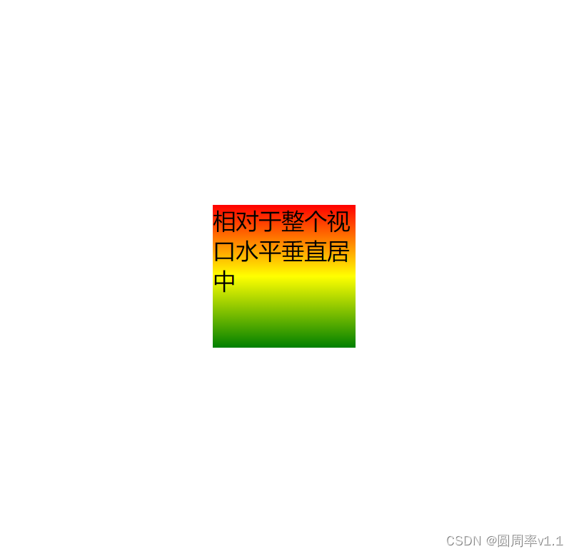
 <div class="view">相对于整个视口水平垂直居中</div>
    <style>

       body {
            position: relative;
        }
        /* 方法三 */
       .view {
            width: 100px;
            height: 100px;
            background-image: linear-gradient(red, yellow, green);
            position: fixed;
            top: 0;
            left: 0;
            right: 0;
            bottom: 0;
            margin: auto;
       }
    </style>
4.flex+margin
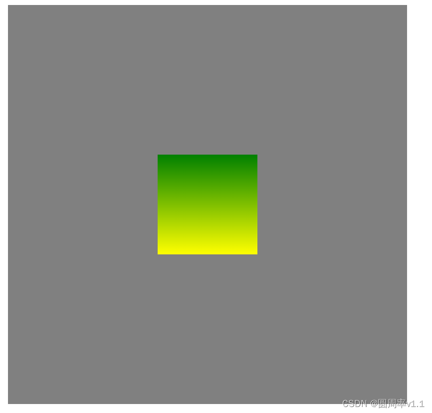
<head>
    <style>
        .outer {
            width: 400px;
            height: 400px;
            background-color: gray;
            display: flex;
        }
        .inner {
            width: 100px;
            height: 100px;
            margin: auto;
            background-image: linear-gradient(green, yellow);
        }
    </style>
</head>
<body>
    <div class="outer">
        <div class="inner"></div>
    </div>
</body>
5. flex 水平垂直居中
<head>
    <style>
        .outer {
            width: 400px;
            height: 400px;
            background-color: gray;
            display: flex;
            /* 水平居中 */
            justify-content: center;
            /* 垂直居中 */
            align-items: center;
        }
        .inner {
            width: 100px;
            height: 100px;
            background-image: linear-gradient(green, yellow);
        }
    </style>
</head>
<body>
    <div class="outer">
        <div class="inner"></div>
    </div>
</body>
6.遮挡层
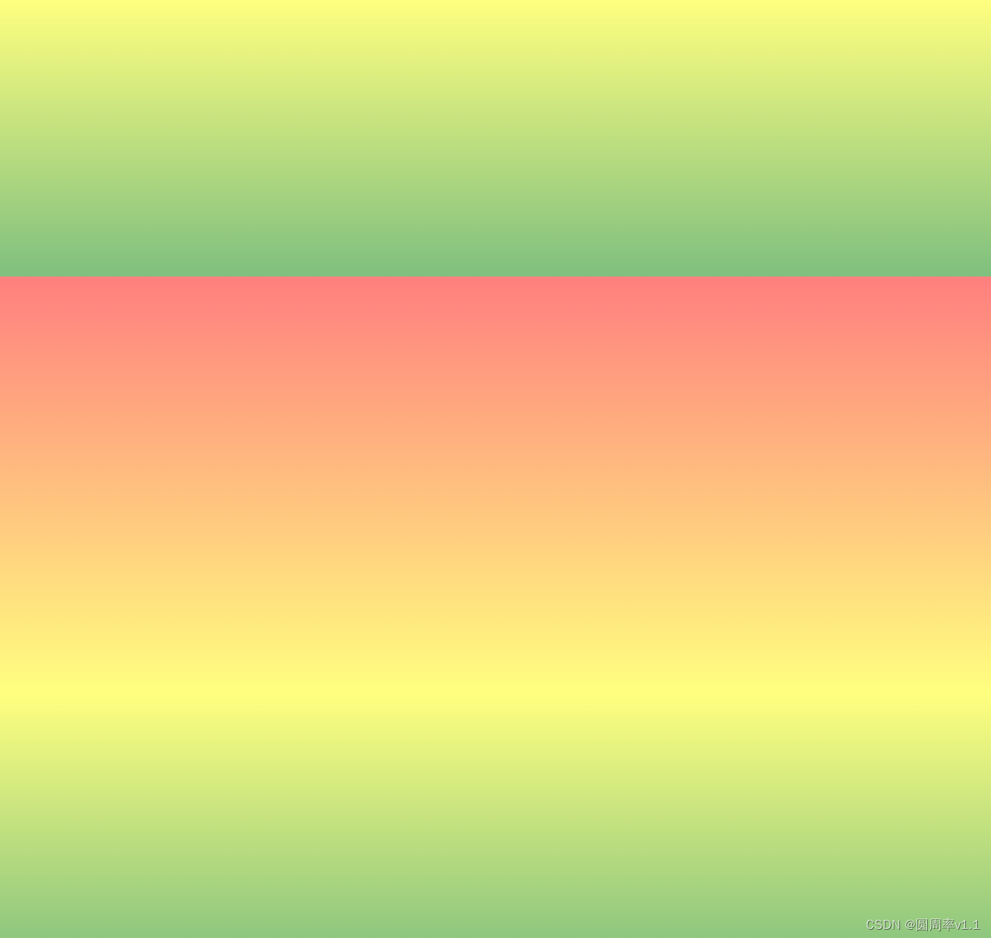
<div class="item"></div>

/* 遮挡层 */
       .item {
             background-image: repeating-linear-gradient(red 200px, yellow 500px, green 700px);
            opacity: 0.5;
            position: fixed;
            top: 0;
            left: 0;
            right: 0;
            bottom: 0;
       }


 434
434


 被折叠的 条评论
为什么被折叠?
被折叠的 条评论
为什么被折叠?
 到【灌水乐园】发言


