


文章目录
1.标注最大值最小值,区域渐变,设置高亮区域
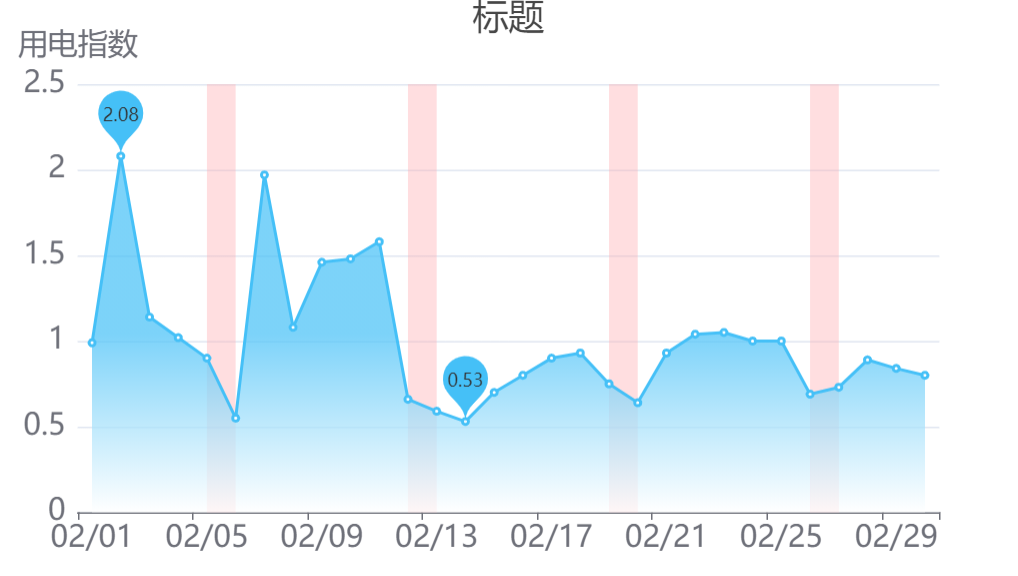
option = {
  title: {
    text: '标题',
    left: 'center',
    textStyle: {
      fontSize: '24',
      fontWeight: 'normal'
    }
  },
  tooltip: {
    trigger: 'axis'
  },
  xAxis: {
    type: 'category',
    data: [
      '02/01',
      '02/02',
      '02/03',
      '02/04',
      '02/05',
      '02/06',
      '02/07',
      '02/08',
      '02/09',
      '02/10',
      '02/11',
      '02/12',
      '02/13',
      '02/14',
      '06/15',

    ],
    axisLabel: {
      fontSize: 20
    }
  },
  yAxis: {
    type: 'value',
    name: '用电指数',
    nameTextStyle: {
      fontSize: 20
    },
    axisLabel: {
      fontSize: 20
    }
  },
  series: [
    {
      data: [
        '0.99',
        '2.08',
        '1.14',
        '1.02',
        '0.90',
        '0.55',
        '1.97',
        '1.08',
        '1.46',
        '1.48',
        '1.58',
        '0.66',
        '0.59',
        '0.53',
        '0.70',

      ],
      type: 'line',
      color: '#45C0F7',
      areaStyle: {
        normal: {
          color: new echarts.graphic.LinearGradient(0, 0, 0, 1, [
            { offset: 0, color: '#45C0F7' },
            { offset: 0.5, color: '#45C0F7' },
            { offset: 1, color: 'white' }
          ])
        }
      }, //填充区域样式 蓝色渐变
      markPoint: {
        data: [
          { type: 'max', name: '最大值' },
          { type: 'min', name: '最小值' }
        ]
      }, //显示最大值 最小值
      markArea: {//标注特殊区域 设置颜色
        itemStyle: {
          color: 'rgba(255, 173, 177, 0.4)'
        },
        data: [
          [
            {
              name: '',
              xAxis: '02/05'
            },
            {
              xAxis: '02/06'
            }
          ],
          [
            {
              name: '',
              xAxis: '02/12'
            },
            {
              xAxis: '02/13'
            }
          ],

        ]
      }
    }
  ]
};
2.x轴竖版显示,柱状图渐变色
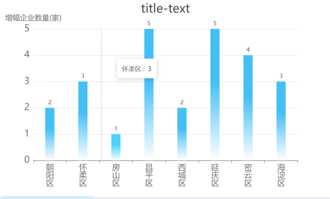
option = {
  title: {
        text: 'title-text',
        left: 'center',
        textStyle: {
          fontSize: 26,
          fontWeight: 'normal',
        },
      },
      tooltip: {
        trigger: 'axis',
        formatter: '{b}:{c}',
      },
      xAxis: {
        type: 'category',
        data: ["朝阳区", "怀柔区", "房山区", "昌平区", "西城区", "延庆区", "密云区", "海淀区"],
        tooltip: {
          trigger: 'axis',
        },
        axisLabel: {
          fontSize: 17,
          formatter: function (value) {
            //x轴的文字改为竖版显示
            var str = value.split('');
            return str.join('\n');
          },
        },
      },
      yAxis: {
        type: 'value',
        name: '增幅企业数量(家)',
        nameTextStyle: {
          fontSize: 16,
        },
        axisLabel: {
          fontSize: 20,
        },
      },
      series: [
        {
          data: [2,3,1,5,2,5,4,3],
          type: 'bar',
          barWidth: '20px',
          itemStyle: {
            normal: {
              label: {
                show: true,
                position: 'top',
              },
              color: new echarts.graphic.LinearGradient(
                0,
                1,
                0,
                0,
                [
                  {
                    offset: 0,
                    color: '#fff',
                  },
                  {
                    offset: 0.6,
                    color: '#45C0F7',
                  },
                  {
                    offset: 1,
                    color: '#45C0F7',
                  },
                ],
                false
              ),
            },
          },
        },
      ],

};
3.实现横向柱状图

let histo1 = {
    tooltip: {
      trigger: 'axis',
      axisPointer: {
        type: 'shadow',
      },
    },
    legend: {
      top: '-10%',
      left: '22%',
      data: ['大兴区'],
      itemWidth: 0,
      textStyle: {
        fontWeight: 'normal',
        fontSize: '15',
        color: '#fff',
        textAlign: 'center',
      },
    },
    grid: {
      width: '75%',
      top: '0%',
      left: '5%',
      right: '0%',
      bottom: '0%',
      containLabel: true,
    },
    xAxis: {
      type: 'value',
      // boundaryGap: [0, 0.01],
      show: false,
      splitLine: {
        // 网格线
        show: false,
      },
      axisTick: {
        //y轴刻度线
        show: false,
      },
      axisLine: {
        //轴线
        show: false,
      },
    },
    yAxis: {
      type: 'category',
      data: className,
      splitLine: {
        // 网格线
        show: false,
      },
      axisTick: {
        show: true,
        inside: true,
        length: 5,
        lineStyle: {
          color: '#8ad474',
          width: 2,
        },
      },
      axisLabel: {
        show: true,
        interval: 0,
        color: '#fff',
        fontSize: 15,
        padding: [10, 5, 10, 10],
        formatter: function (value, i) {
          return `{title|${className[i].title}} ${className[i].value ? `{value|${className[i].value}}` : ''}`;
        },
        rich: {
          title: {
            fontSize: 14,
            padding: 0,
            margin: 0,
            left: 10,
            bottom: 0,
            top: 0,
            right: 0,
          },
          value: {
            fontSize: 14,
            verticalAlign: 'bottom',
            padding: 0,
            margin: 0,
          },
        },
      },
      axisLine: {
        show: true,
        lineStyle: {
          color: '#8ad474',
          width: 2,
        },
      },
    },
    series: [
      {
        // name: '大兴区',
        type: 'bar',
        data: dataDaxing,
        left: '1%',
        right: '1%',
        bottom: '1%',
        top: '10%',
        barWidth: 10,
        barGap: '5%',
        itemStyle: {
          color: '#8ad474',
        },
        label: {
          //数据
          show: true,
          position: 'right',
          color: '#8ad474',
          textStyle: {
            fontWeight: 'normal',
            fontSize: '15',
            fontWeight: 700,
            textAlign: 'center',
          },
        },
      },
    ],
  };
  let histo2 = {
    tooltip: {
      trigger: 'axis',
      axisPointer: {
        type: 'shadow',
      },
    },
    legend: {
      top: '5%',
      right: '10%',
      data: ['北京市'],
      itemWidth: 0,
      textStyle: {
        fontWeight: 'normal',
        fontSize: '15',
        color: '#fff',
        textAlign: 'center',
      },
    },
    grid: {
      width: '60%',
      top: '0%',
      right: '0%',
      bottom: '0%',
      containLabel: true,
    },
    xAxis: {
      type: 'value',
      // boundaryGap: [0, 0.01],
      inverse: true,
      show: false,
      splitLine: {
        // 网格线
        show: false,
      },
      axisLine: {
        //轴线
        show: true,
        lineStyle: {
          color: '#318ef1',
        },
      },
    },
    yAxis: {
      type: 'category',
      data: ['', '', '', '', '', ''],
      splitLine: {
        // 网格线
        show: false,
      },
      axisTick: {
        show: true,
        inside: false,
        length: 5,
        lineStyle: {
          // color: "#8ad474",
          width: 2,
        },
      },
      axisLabel: {
        show: true,
        interval: 0,
        color: '#fff',
        fontSize: 15,
        padding: [10, 5, 10, 10],
      },
      axisLine: {
        show: true,
        lineStyle: {
          color: '#318ef1',
          width: 2,
        },
      },
    },
    series: [
      {
        // name: '北京市',
        type: 'bar',
        data: data,
        barWidth: 10,
        itemStyle: {
          color: '#318ef1',
        },
        label: {
          //数据
          show: true,
          position: 'left',
          color: '#318ef1',
          textStyle: {
            fontWeight: 'normal',
            fontSize: '15',
            fontWeight: 700,
            textAlign: 'center',
          },
        },
      },
    ],
  };


return(
 <div className="left-b-left-histograms">
        <div className="left-b-left-histogram-daxing">
          <MapEcharts chartsOption={histo2} />
        </div>
        <div className="left-b-left-histogram-beijing">
          <MapEcharts chartsOption={histo1} />
        </div>
      </div>
)
4.两个legend,legend表示柱状图颜色
option = {
  color:['blue','green','yellow','orange','red'],
  legend:[{
    data:['1-2','3-4','4-5','5-6'],
  orient: 'vertical',
  right:'right',
  top:'center',
   itemGap: 30,
  },{
  data:['未检测'],
  top:'top',

   itemGap: 30,
  }],
  xAxis: {
    type: 'category',
    data: ['Mon', 'Tue', 'Wed', 'Thu', 'Fri', 'Sat', 'Sun']
  },
  yAxis: {
    type: 'value'
  },
  series: [
    {
      data: [120, 200, 150, 80, 70, 110, 130],
      type: 'bar',
      showBackground: true,
      backgroundStyle: {
        color: 'rgba(180, 180, 180, 0.2)'
      },
      name:'0-1',
      barWidth:50,
       itemStyle: {
            normal: {
                // 随机显示
                //color:function(d){return "#"+Math.floor(Math.random()*(256*256*256-1)).toString(16);}

                // 定制显示(按顺序)
                color: function(params) {
                  console.log('params',params)
                    var colorList = ['#C33531','#EFE42A','#64BD3D','#EE9201','#29AAE3', '#B74AE5','#0AAF9F','#E89589','#16A085','#4A235A','#C39BD3 ','#F9E79F','#BA4A00','#ECF0F1','#616A6B','#EAF2F8','#4A235A','#3498DB' ];
                    return colorList[params.dataIndex]
                }
            },
        },
    },
     {
      data: [],
      type: 'bar',
      showBackground: true,
      backgroundStyle: {
        color: 'rgba(180, 180, 180, 0.2)'
      },
      name:'1-2',
       barWidth:0
    },
     {
      data: [],
      type: 'bar',
      showBackground: true,
      backgroundStyle: {
        color: 'rgba(180, 180, 180, 0.2)'
      },
      name:'3-4',
         barWidth:0
    },
        {
      data: [],
      type: 'bar',
      showBackground: true,
      backgroundStyle: {
        color: 'rgba(180, 180, 180, 0.2)'
      },
      name:'4-5',
         barWidth:0
    },
     {
      data: [],
      type: 'bar',
      showBackground: true,
      backgroundStyle: {
        color: 'rgba(180, 180, 180, 0.2)'
      },
      name:'5-6',
         barWidth:0
    },
     {
      data: [],
      type: 'bar',
      showBackground: true,
      backgroundStyle: {
        color: 'rgba(180, 180, 180, 0.2)'
      },
      name:'未检测',
         barWidth:0
    },
  ]
};
5.高亮区域设置legend
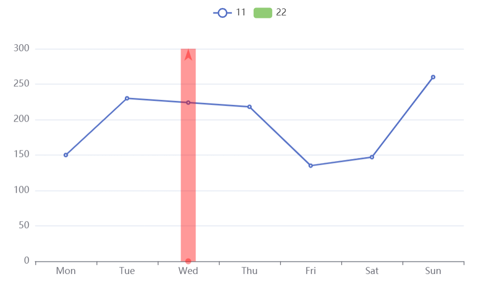
option = {
  xAxis: {
    type: 'category',
    data: ['Mon', 'Tue', 'Wed', 'Thu', 'Fri', 'Sat', 'Sun']
  },
  yAxis: {
    type: 'value'
  },
  legend: {},
  series: [
    {
      name: '11',
      data: [150, 230, 224, 218, 135, 147, 260],
      type: 'line'
    },
    {
      name: '22',
      data: [],
      type: 'bar',
      markLine: {
        data: [{ xAxis: 'Wed' }],
        label: {
          normal: { show: false },
          emphasis: { show: false }
        },
        lineStyle: {
          emphasis: {
            type: 'solid',
            opacity: 0.8,
            color: 'blue',
            width: 20
          },
          normal: {
            type: 'solid',
            opacity: 0.4,
            color: 'red',
            width: 20
          }
        }
      }
    }
  ]
};
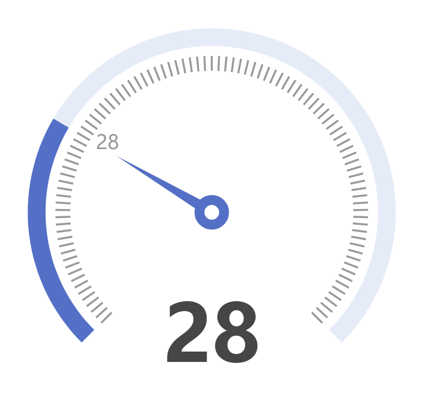
6.仪表盘 指针处展示数值
仪表盘,只有指针处展示数值,其他刻度不展示,下面数值也不能消失。
option = {
  series: [
    {
      type: 'gauge',
      progress: {
        show: true,
        width: 18
      },
      axisLine: {
        lineStyle: {
          width: 18
        }
      },
      axisTick: {
        show: false
      },
      splitNumber:100,
      splitLine: {
        length: 15,
        lineStyle: {
          width: 2,
          color: '#999'
        }
      },
      axisLabel: {
        distance: 25,
        color: '#999',
        fontSize: 20,
        formatter:function(value){
          if(value==28){
            return value
          }else{
            return ''
          }
        }
      },
      anchor: {
        show: true,
        showAbove: true,
        size: 25,
        itemStyle: {
          borderWidth: 10
        }
      },
      detail: {
        valueAnimation: true,
        fontSize: 80,
        offsetCenter: [0, '70%']
      },
      data: [
        {
          value: 28
        }
      ]
    }
  ]
};
7.柱状图根据数值每个注展示不同的颜色,legend设置为实心
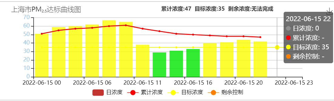
getBgColorForHour1New方法:
根据传进去的污染物id和数值,返回一个对象,包含应该展示的颜色
{
            title: [
              {
                text: [
                  i.name,
                  `{a|${pollutionType.name}}`,
                  `{b|${pollutionType.subName}}`,
                  '达标曲线图',
                ].join(''),
                left: 20,
                textStyle: {
                  fontWeight: 180,
                  fontSize: 15,
                  rich: {
                    a: {
                      fontSize: 14,
                    },
                    b: {
                      fontSize: 8,
                      verticalAlign: 'bottom',
                    },
                  },
                },
              },
              {
                text:
                  '累计浓度:' +
                  i.cumulative_value_single +
                  '  目标浓度:' +
                  i.target_value_single +
                  '  剩余浓度:' +
                  (i.residual_control_single > 0
                    ? i.residual_control_single
                    : '无法完成'),
                left: 350,
                textStyle: {
                  fontSize: 12,
                  fontWeight: 550,
                },
              },
            ],
            tooltip: {
              trigger: 'axis',
            },
            toolbox: {
              feature: {
                saveAsImage: {},
              },
            },
            xAxis: {
              type: 'category',
              axisLine: { lineStyle: { color: fontColor } },
              data: i.time,
            },
            legend: {
              bottom: '2%',
              textStyle: { color: fontColor },
            },
            grid: {
              bottom: '24%',
              top: '14%',
            },
            yAxis: {
              type: 'value',
              axisLabel: {
                color: '#9ec7e7',
              },
              axisLine: {
                show: true,
                lineStyle: {
                  color: fontColor,
                },
              },
            },
            series: [
              {
                name: '日浓度',
                data: i.initial_value,
                type: 'bar',
                itemStyle: {
                  normal: {
                    color: function (params) {
                      return getBgColorForHour1New(params.value, data.var_id)
                        .backgroundColor;
                    },
                  },
                },
              },
              {
                name: '累计浓度',
                data: i.cumulative_value,
                type: 'line',
                symbol: 'circle',//legend设置为实心
                itemStyle: {
                  color: '#f90000',
                },
              },
              {
                name: '目标浓度',
                data: i.target_value,
                type: 'line',
                symbol: 'circle',
                itemStyle: {
                  color: '#feff00',
                },
              },
              {
                name: '剩余控制',
                data: i.residual_control,
                type: 'line',
                symbol: 'circle',
                itemStyle: {
                  color: '#fb7f00',
                },
              },
            ],
          };


 8908
8908


 被折叠的 条评论
为什么被折叠?
被折叠的 条评论
为什么被折叠?
 到【灌水乐园】发言


