


学习视频:https://www.bilibili.com/video/BV1Jb4y187C4?p=20
LinearLayout布局
常见属性
- orentation 布局中组件的排列方式
- gravity 控件组件所包含的子元素的对齐方式,可多个组合
- layout_gravity 控制该组件在父容器里的对齐方式
- background 为该组件设置一个背景图片,或者是直接用颜色覆盖
- divider 分割线
- showDivider 设置分割线所在的位置,none(无),beginning(开始),end(结束),middle(每两个组件间)
- dividerPadding 设置分割线的 padding
- layout_weight(权重) 该属性是用来等比例的划分区域
创建一个module,linearlayout

选择Empty Activity,下一步

最后Finish
但是还需要看一下进度条
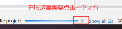
直到看到这里出现绿色的原点才证明成功

下载需要用到的图片

点击Clip Art进行选择需要的图片下载

下一步然后Finish即可
在activity_main.xml中
<?xml version="1.0" encoding="utf-8"?>
<LinearLayout xmlns:android="http://schemas.android.com/apk/res/android"
    android:layout_height="match_parent"
    android:layout_width="match_parent"
    android:divider="@drawable/ic_baseline_horizontal_rule_24"
    android:showDividers="middle"
    android:dividerPadding="20dp"
    android:orientation="vertical">
    <!--vertical:纵向排列   horizontal:水平排列(默认)
        android:orientation="vertical"  如果这里设置为纵向排列,
            那么下面的盒子 LinearLayout 中再设置这个居中 center_vertical 就没反应了
        android:gravity="center_vertical|right"   盒子纵向水平居中,并且右向排列
        android:divider="@drawable/ic_baseline_horizontal_rule_24"
        android:showDividers="middle"   这两个配合使用
        android:dividerPadding="20dp"  这个可以辅助上面两个使用
    -->
    <!--android:layout_weight="1"  权重的作用,把剩余的空间根据权重分配。注意,分配的是剩余的空间
    如果有两个权重,那么按照权重的大小进行分配空间,权重越大分配的越多
    但是是在宽高原有的基础上去增加,比如原有基础是100dp,改成200dp的时候权重又会发生变化
        如果所有高度是一个android:layout_height="match_parent",那么权重的分配就要计算
        所以开发过程中一般设置高度为0dp。这还要根据上面设置的是纵向排列还是水平排列,权重对象也跟着改变-->
    <LinearLayout
        android:background="#71DBA3"
        android:layout_weight="1"
        android:layout_gravity="center_vertical"
        android:layout_width="100dp"
        android:layout_height="100dp" />

    <!--分割线还可以这样设置,这个应用多-->
    <View
        android:background="#000fff"
        android:layout_width="match_parent"
        android:layout_height="1dp" />

    <LinearLayout
        android:background="#FAB54B"
        android:layout_width="100dp"
        android:layout_weight="3"
        android:layout_height="100dp" />

    <LinearLayout
        android:background="#FF5956"
        android:layout_width="100dp"
        android:layout_height="100dp" />
    <!--上面有两个权重为1一个权重为2,那么计算是,1-4=-2 ; 1-2*(2/4)=0 所以权重为2的不显示 -->
</LinearLayout>
实现效果可以根据自己喜好改

RelativeLayout布局
常见属性
根据父容器定位
- layout_alignParentLeft 左对齐
- layout_alignParentRight 右对齐
- layout_alignParentTop 顶部对齐
- layout_alignParentBottom 底部对齐
- layout_centerHorizontal 水平居中
- layout_centerVertical 垂直居中
- layout_centerInParent 中间位置
根据兄弟组件定位(相对定位)
这个得设置id
- layout_toLeftOf 放置于参考组件的左边
- layout_toRightOf 放置于参考组建的右边
- layout_above 放置于参考组件的上方
- layout_below 放置于参考组件的下方
- layout_alignTop 对齐参考组件的上边界
- layout_alignBottom 对齐参考组件的下边界
- layout_alignLeft 对齐参考组件的左边界
- layout_alignRight 对齐参考组件的右边界
通用属性
margin 设置组件与父容器的边距
- layout_margin 上下左右偏移
- layout_marginLeft 左偏移
- layout_marginRight 右偏移
- layout_marginTop 上偏移
- layout_marginBottom 下偏移
padding 设置组件内部元素的边距。跟上面的一样设置
创建一个module,relativelayout
在activity_main.xml中
<?xml version="1.0" encoding="utf-8"?>
<RelativeLayout xmlns:android="http://schemas.android.com/apk/res/android"
    android:layout_height="match_parent"
    android:layout_width="match_parent"
    >
    <!--两个盒子叠在一起,因为都是根据父容器进行定位。后面的一个盒子会覆盖前面的那个盒子
        android:layout_toLeftOf="@id/location"  相对于下面的橙色盒子左对齐
    -->
    <RelativeLayout
        android:id="@+id/location"
        android:layout_centerInParent="true"
        android:background="#71DBA3"
        android:layout_width="100dp"
        android:layout_height="100dp" />

    <RelativeLayout
        android:layout_toRightOf="@id/location"
        android:background="#FAB54B"
        android:layout_width="100dp"
        android:layout_height="100dp" />

</RelativeLayout>
效果

FrameLayout布局
常见属性
android:foreground 设置前景
android:foregroundGravity 设置前景位置
创建一个module,framelayout,下载一张图片

在activity_main.xml中
<?xml version="1.0" encoding="utf-8"?>
<FrameLayout xmlns:android="http://schemas.android.com/apk/res/android"
    android:layout_height="match_parent"
    android:layout_width="match_parent"
    >
    <!--也是父容器的左上角开始绘制,下面的会覆盖掉上面的一个
        android:foreground    设置前景,也就是背景图片
        android:foregroundGravity    设置图片放置位置
        android:foregroundGravity="right|top"   右下角放置
    -->
    <FrameLayout
        android:background="#71DBA3"
        android:layout_width="200dp"
        android:layout_height="200dp" />

    <FrameLayout
        android:foreground="@drawable/img2"
        android:background="#FAB54B"
        android:layout_width="100dp"
        android:layout_height="100dp" />

</FrameLayout>
TableLayout布局(表格布局)
常见属性
android:collapaseColumns 设置需要被隐藏的序号,从0开始
android:stretchColumns 设置允许被拉伸的列的列序号,从0开始
android:shrinkColumns 设置允许被收缩的列的列序号,从0开始
子控件设置属性
android:layout_colum 显示在第几列
android:layout_span 横向跨几列
新建一个module,tablelayout
在activity_main.xml中
<?xml version="1.0" encoding="utf-8"?>
<TableLayout xmlns:android="http://schemas.android.com/apk/res/android"
    android:shrinkColumns="4"
    android:layout_height="match_parent"
    android:layout_width="match_parent">

    <!-- android:collapseColumns="2,4" 。TableRow中的button5和... 被隐藏
        android:stretchColumns="0"  这个拉伸,需要有可以拉伸的位置,如果没有空间则拉伸不了
        android:shrinkColumns="4"  。这个跟上面的拉伸相反,要有超出的部分才能收缩
        在TableLayout中写上控件,那么这个控件占用一行内容
        如果想要多个控件占用一行,就需要结合TableRow;
        TableRow里面的控件如果超过一行的宽度会直接隐藏,不会自动换行
    -->
    <TableRow>
        <Button
            android:text="3"
            android:layout_width="wrap_content"
            android:layout_height="wrap_content" />
        <Button
            android:text="4"
            android:layout_width="wrap_content"
            android:layout_height="wrap_content" />
        <Button
            android:text="5"
            android:layout_width="wrap_content"
            android:layout_height="wrap_content" />
        <Button
            android:text="6"
            android:layout_width="wrap_content"
            android:layout_height="wrap_content" />
        <Button
            android:text="7"
            android:layout_width="wrap_content"
            android:layout_height="wrap_content" />
    </TableRow>
    <!-- android:layout_column="2"  。 在第二列的位置显示这个盒子
        android:layout_span="2"  . 横跨两列显示这个盒子
    -->
    <TableRow>
        <Button
            android:text="8"
            android:layout_span="2"
            android:layout_column="2"
            android:layout_width="wrap_content"
            android:layout_height="wrap_content" />
        <Button
            android:text="9"
            android:layout_width="wrap_content"
            android:layout_height="wrap_content" />
    </TableRow>

    <Button
        android:text="1"
        android:layout_width="wrap_content"
        android:layout_height="wrap_content" />

    <Button
        android:text="2"
        android:layout_width="wrap_content"
        android:layout_height="wrap_content" />

</TableLayout>
效果

GridLayout布局(网格布局)
常见属性
android:orientation 设置水平显示或垂直显示
android:columCount 设置行的显示个数
android:rowCount 设置列的显示个数
子控件属性
android:layout_column 显示在第几列
android:layout_columnSpan 横跨几列
android:layout_columnWeight 横向剩余控件分配方式
android:layout_gravity 在网格中的显示位置
android:layout_row 显示在第几行
android:layout_rowSpan 横向跨几行
android:layout_rowWeight 纵向剩余空间分配方式
新建一个module,gridlayout
在activity_main.xml中
<?xml version="1.0" encoding="utf-8"?>
<GridLayout xmlns:android="http://schemas.android.com/apk/res/android"
    android:layout_height="match_parent"
    android:layout_width="match_parent">

    <!-- android:columnCount="2"  设置一行显示2个,超出的部分自动换行
    这个设置与android:orientation="horizontal"搭配使用
        android:rowCount="3"   设置一列显示3行,多出部分从第二列开始排列
    这个设置与android:orientation="vertical"搭配使用
    -->
    <Button
        android:text="1"
        android:layout_height="wrap_content"
        android:layout_width="wrap_content" />
    <!--android:layout_columnSpan="3"   占3行显示,但是没有效果
        android:layout_gravity="fill"   与这个搭配使用才会看到效果-->
    <Button
        android:text="2"
        android:layout_columnSpan="3"
        android:layout_gravity="fill"
        android:layout_height="wrap_content"
        android:layout_width="wrap_content" />

    <!--android:layout_row="1"  让button3在第二行显示,
        android:layout_column="0"    让button3在第0列显示
        这里设置重复的话,后面的会把前面的覆盖掉
    -->
    <Button
        android:text="3"
        android:layout_row="1"
        android:layout_column="0"
        android:layout_height="wrap_content"
        android:layout_width="wrap_content" />
    <!--android:layout_rowWeight="1"  占满一整列的空间-->
    <Button
        android:text="4"
        android:layout_rowWeight="1"
        android:layout_height="wrap_content"
        android:layout_width="wrap_content" />
    <!--android:layout_columnWeight="1" 把剩余的空间全部占用-->
    <Button
        android:text="5"
        android:layout_columnWeight="1"
        android:layout_height="wrap_content"
        android:layout_width="wrap_content" />

</GridLayout>
效果

ConstraintLayout布局(约束布局)
新建一个module,constraintlayout

然后直接在这里进行布局

看右边

设置完成后,回到activity_main.xml中可以看到直接帮你把代码写上去了


 858
858


 被折叠的 条评论
为什么被折叠?
被折叠的 条评论
为什么被折叠?
 到【灌水乐园】发言


