


css3如何制作风琴效果
-~~~~~~~~~~~~~~~~~~~~~~~~~~~~~~~~~~~~~~~~~~~~~~~~~~~~~~~~~~~~~~~~
开发工具与关键技术:Dw CSS3
作者:xqll
撰写时间:2019/01/19
-~~~~~~~~~~~~~~~~~~~~~~~~~~~~~~~~~~~~~~~~~~~~~~~~~~~~~~~~~~~~~~~~
来源于潘老师课程
-~----------------------------------------------------------------------
下面我来演示一下如果利用CSS3完成风琴效果
首先给它们一个div
<div class="fqdh">
	<a href=""><em>C</em>啦啦啦~</a>
	<a href=""><em>S</em>哈哈哈~</a>
	<a href=""><em>S</em>噜噜噜~</a>
	<a href=""><em>3</em>嗷嗷嗷~</a>
	<a href=""><em>风</em>哇哇哇~</a>
	<a href=""><em>琴</em>呵呵呵~</a>
	<a href=""><em>导</em>哦哦哦~</a>
	<a href=""><em>航</em>欧欧欧~</a>
</div>
用a标签包裹住里面的内容,em标签包裹住显眼的内容
然后给大的div设置一下宽高位置什么的
.fqdh{
	width: 150px;
	height: 250px;
	position: fixed;
	top: 200px;
	right: 0px;
}
然后就是给a标签设置内容
.fqdh a{
	display: block;
	width: 150px;
	height: 30px;
	margin-bottom: 2px;
	text-decoration: none;
	background: #f9f9f9;
	font-size: 13px;
	line-height: 30px;
}
设置一些宽高 字体大小颜色 和边距
接下来是给em标签设置
.fqdh a em{
	display: inline-block;
	width: 30px;
	height: 30px;
	background: rgba(99,134,231,1.00);
	font-size: 16px;
	color: red;
	text-align: center;
}
样式设置得差不多了 效果是这样的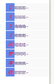
我要做的是把它除去em标签以为的隐藏起来、当鼠标移入的时候会有风琴效果
就像这样
还有这样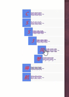
而操作起来也只是用到CSS3就可以实现
代码图如下
	transform: translateX(120px);
	transition: all 0.2s ease;
在a标签里面设置 往x轴里面移120个像素 、让它只裸露出em标签出来
.fqdh a em:hover{
	background: #ff6600;
}
.fqdh:hover a{
	transform: translateX(0px);
}
这个设置是 点击em标签的时候 背景颜色会变为#ff6600
鼠标点击a标签的时候 隐藏的a标签会裸露出来
.fqdh a:nth-of-type(1){
	transition-delay: 0.05s;
}
.fqdh a:nth-of-type(2){
	transition-delay: 0.1s;
}
.fqdh a:nth-of-type(3){
	transition-delay: 0.15s;
}
.fqdh a:nth-of-type(4){
	transition-delay: 0.2s;
}
.fqdh a:nth-of-type(5){
	transition-delay: 0.25s;
}
.fqdh a:nth-of-type(6){
	transition-delay: 0.3s;
}
.fqdh a:nth-of-type(7){
	transition-delay: 0.35s;
}
.fqdh a:nth-of-type(8){
	transition-delay: 0.4s;
}
上面是设置当鼠标点击a标签后 多长时间后实现代码
上一个a标签比下一个a标签要实现的时间短一点 然后鼠标移动到a标签后 显示出来的效果 会有很好的美观效果
用起来简单又方便


 1145
1145


 被折叠的 条评论
为什么被折叠?
被折叠的 条评论
为什么被折叠?
 到【灌水乐园】发言


