


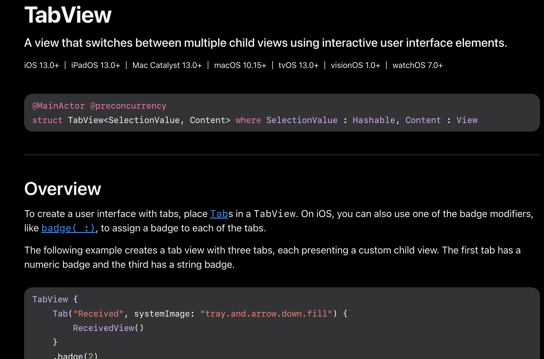
TabView官方文档:TabView | Apple Developer Documentation
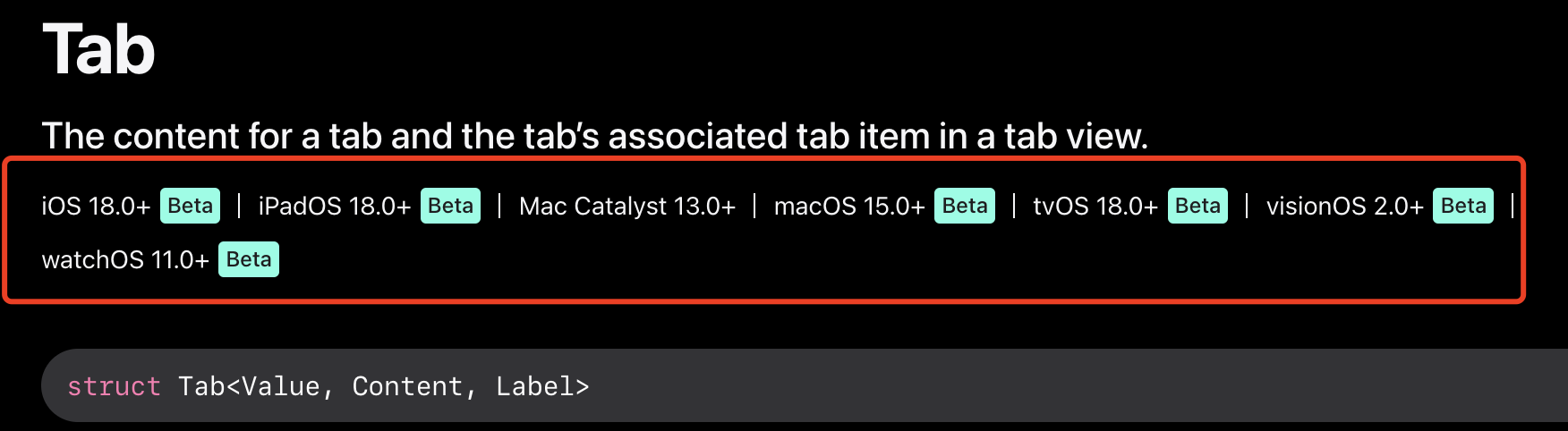
Tab官网文档:Tab | Apple Developer Documentation
使用交互式用户界面元素在多个子视图之间切换的视图。也就是手机底部的几个导航菜单一样,但是注意官方给的例子里面有使用Tab组件的,但是这个Tab组件注意:暂时只支持beta版本的系统,低版本是没有的:
TabView提供了一个交互式界面,允许用户在其内部的子界面间自由的切换,TabView有两种显示模式,一个是DefaultTabViewStyle,另一个是PageTabViewStyle,本文将对DefaultTabViewStyle这种类型的基本使用和外观样式设置进行一下探索学习。
基本使用
DefaultTabViewStyle类型下的TabView就像我们在UIKit中用到的UITabViewController,可以作为构建App的一个基本根视图。要创建带有Tab选项卡的用户界面,在TabView中添加视图,并对每个视图添加tabItem(_:)修饰符即可,比如下面这个简单的示例:
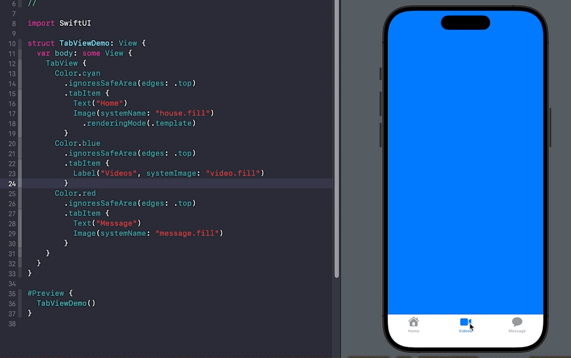
代码:
//
//  SwitchTab.swift
//  SwiftBook
//
//  Created by song on 2024/7/4.
//

import SwiftUI

struct SwitchTab: View {
    var body: some View {
        TabView {
            Color(.red)
                .ignoresSafeArea(edges: .top)
                .tabItem {
                    Text("首页")
                    Image(systemName: "house.fill")
                }

            Color(.blue)
                .ignoresSafeArea(edges: .top)
                .tabItem {
                    Text("消息")
                    Image(systemName: "message.fill")
                }

            Color(.purple)
                .ignoresSafeArea(edges: .top)
                .tabItem {
                    Text("我的")
                    Image(systemName: "person.fill")
                }
        }
    }
}

#Preview {
    SwitchTab()
}
上面代码中,我们在TabView中添加了3个视图,并且给每个视图都添加了tabItem(_:)修饰符,该修饰符的闭包内支持传入一个Label组件或者Text组件加Image的组合方式。
不管是哪种方式都不支持外观的设置。如果用Text和Image组合的方式,添加了除了这两个组件以外的组件,那也是没用的,系统只会认添加的第一个Text和第一个Image,其他的都忽略了。
另外可以添加.badge()修饰符,传入一个字符串,如下:
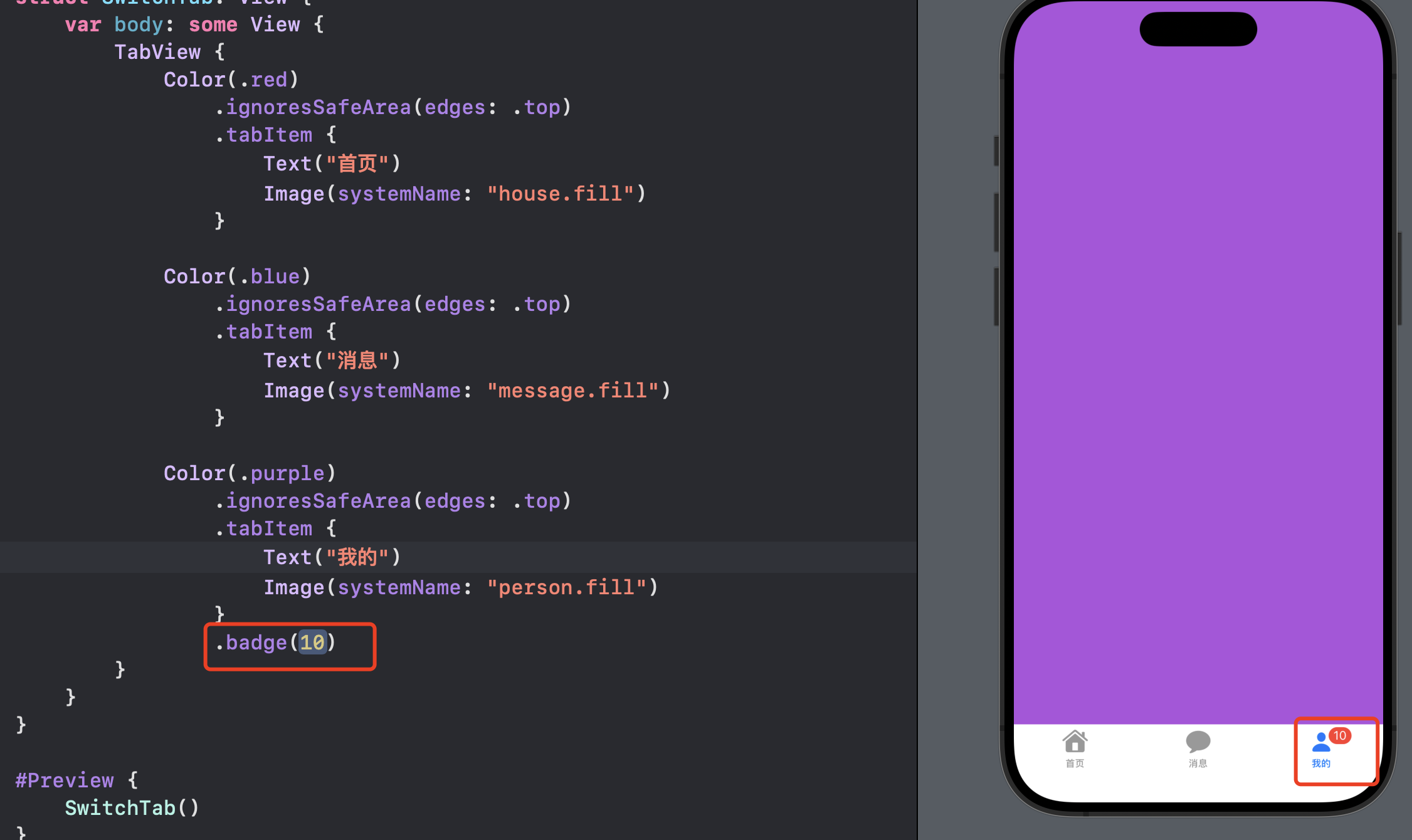
默认badge是红色背景白色文字。
在创建TabView的时候还支持传入一个selection值,用来记录当前选中的tab,当切换tab的时候,selection读取每个子界面的tag值。下面将代码加入tag,并将代码进行一下优化,首先定义一个TabType枚举,定义好要显示的界面,包括界面的文字和图标。
enum TabType: Int, Hashable {
  case home
  case videos
  case message

  var title: String {
    switch self {
      case .home:
        return "Home"
      case .videos:
        return "Videos"
      case .message:
        return "Message"
    }
  }

  var image: String {
    switch self {
      case .home:
        return "house.fill"
      case .videos:
        return "video.fill"
      case .message:
        return "message.fill"
    }
  }
}
有了这个后body的代码优化为:
//
//  SwitchTab.swift
//  SwiftBook
//
//  Created by song on 2024/7/4.
//

import SwiftUI

enum TabType: Int, Hashable {
    case home
    case videos
    case message

    var title: String {
        switch self {
            case .home:
                return "Home"
            case .videos:
                return "Videos"
            case .message:
                return "Message"
        }
    }

    var image: String {
        switch self {
            case .home:
                return "house.fill"
            case .videos:
                return "video.fill"
            case .message:
                return "message.fill"
        }
    }
}

struct SwitchTab: View {
    @State private var selectedTab: TabType = .home

    var body: some View {
        TabView(selection: $selectedTab) {
            Color(.red)
                .ignoresSafeArea(edges: .top)
                .tabItem {
                    Text("首页")
                    Image(systemName: "house.fill")
                }
                .tag(TabType.home)

            Color(.blue)
                .ignoresSafeArea(edges: .top)
                .tabItem {
                    Text("消息")
                    Image(systemName: "message.fill")
                }
                .tag(TabType.message)

            Color(.purple)
                .ignoresSafeArea(edges: .top)
                .tabItem {
                    Text("视频")
                    Image(systemName: "video.fill")
                }
                .tag(TabType.videos)
                .badge(/*@START_MENU_TOKEN@*/10/*@END_MENU_TOKEN@*/)
        }
    }
}

#Preview {
    SwitchTab()
}
上面定义了TabType类型的selectedTab属性,默认值是.home,即默认显示Home界面。我们将selectedTab绑定到TabView中,并对每个子界面添加.tag()修饰符,传入对应的tag,这里的tag采用枚举自身的值。
界面切换只要改变selectedTab的值即可,在Home界面添加了一个Button,点击后跳转到Message界面,Home界面作为一个单独的界面,定义如下:
VStack {
                Color.red.overlay(content: {
                    Button(action: {
                        selectedTab = TabType.message
                    }, label: {
                        Text("Go to Message page").padding().background().cornerRadius(10, antialiased: /*@START_MENU_TOKEN@*/true/*@END_MENU_TOKEN@*/)
                    })
                })
            }
            .frame(width: .infinity, height: .infinity)
            .ignoresSafeArea(edges: .top)
            .tabItem {
                Text("首页")
                Image(systemName: "house.fill")
            }
            .tag(TabType.home)
Home界面定义了一个@Bingding修饰的selectedTab变量,用来绑定父界面的selectedTab变量,这样在Home界面改动selectedTab变量,父界面的selectedTab也会改变。
效果图如下:

样式设置
与之前的UIKit TabBar类似,选中的Tab默认为蓝色,而未选中的为灰色。另外,在UIKit中,整个标签栏默认有一个背景。
然而,如果想改变颜色来匹配我们自己App的主题,例如,选中是Tab的文字和图片是其他颜色,以及badge的背景色和颜色等等。
下面我们将使用的UIKit外观API,来设置TabView的外观样式,让我们看看下面的代码。
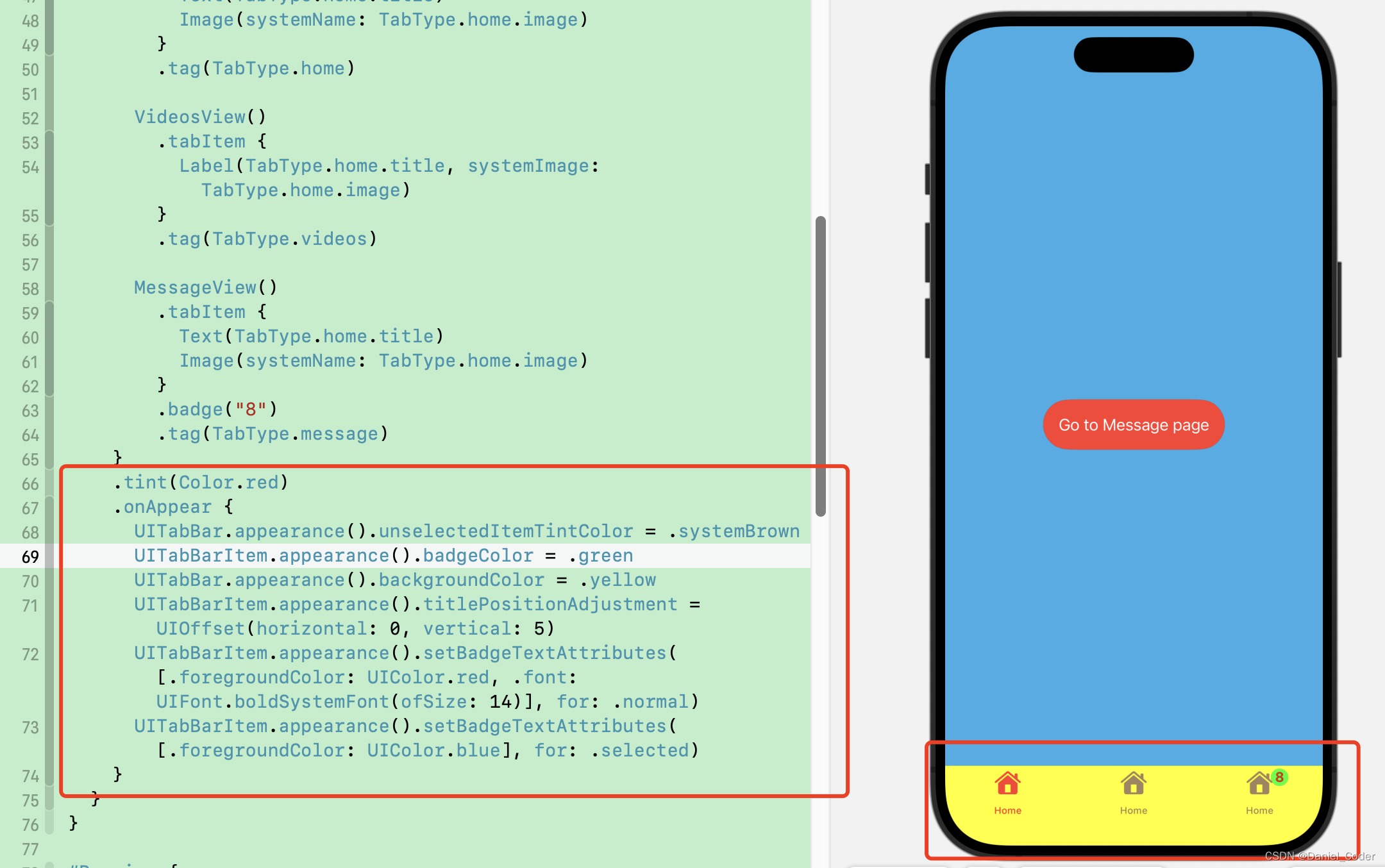
先说一下,给TabView组件添加.tint()修饰符,可以改变TabItem选中时的颜色,其他的就得靠UIKit的API了。
设置选中的TabItem的颜色
.tint(Color.red) // 设置选中的tabitem的颜色。设置未选中的TabItem的颜色
UITabBar.appearance().unselectedItemTintColor = .systemBrown
设置badge的背景色
UITabBarItem.appearance().badgeColor = .green设置badge中文字的样式
UITabBarItem.appearance().setBadgeTextAttributes([.foregroundColor: UIColor.red, .font: UIFont.boldSystemFont(ofSize: 14)], for: .normal) // 未选中时
UITabBarItem.appearance().setBadgeTextAttributes([.foregroundColor: UIColor.blue], for: .selected) // 选中时
设置TabBar的背景色
UITabBar.appearance().backgroundColor = .yellow设置TabItem中文字和图片的间距和偏移量
UITabBarItem.appearance().titlePositionAdjustment = UIOffset(horizontal: 0, vertical: 5) 上面的这些设置,我们可以在初始化组件的时候设置,也可以在.onAppear中设置。
    .onAppear {
      UITabBar.appearance().unselectedItemTintColor = .systemBrown
      UITabBarItem.appearance().badgeColor = .green
      UITabBar.appearance().backgroundColor = .yellow
      UITabBarItem.appearance().titlePositionAdjustment = UIOffset(horizontal: 0, vertical: 5)
      UITabBarItem.appearance().setBadgeTextAttributes([.foregroundColor: UIColor.red, .font: UIFont.boldSystemFont(ofSize: 14)], for: .normal)
      UITabBarItem.appearance().setBadgeTextAttributes([.foregroundColor: UIColor.blue], for: .selected)
    }
以上就是TabView的基本用法及样式设置,希望对大家能有所帮助


 726
726

 被折叠的 条评论
为什么被折叠?
被折叠的 条评论
为什么被折叠?
 到【灌水乐园】发言


