


- 官网地址 点我看
先上图
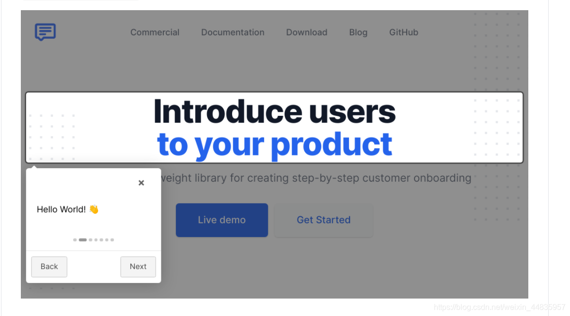
官方实例图片:
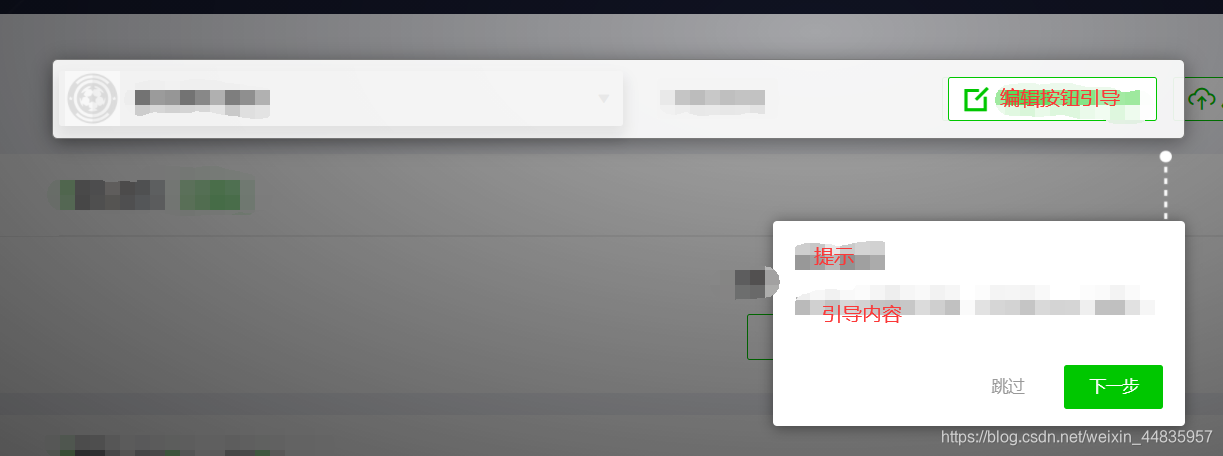
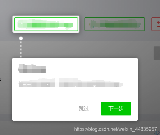
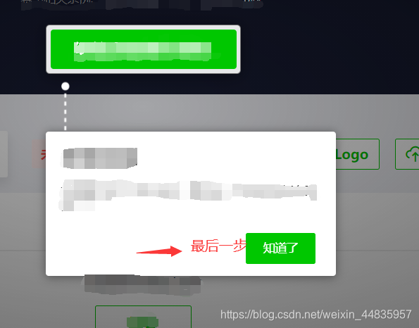
项目成果图片:(糊掉了部分信息)
一、引入
<link rel="stylesheet" href="css/introjs.css">
<script src="js/intro.js"></script>
// or npm安装 Vue可用
npm i vue-introjs intro.js --save
// 在main.js 引入
import VueIntro from 'vue-introjs';
Vue.use(VueIntro);
import 'intro.js/introjs.css';
// 需要在vue.config.js中添加
module.exports = {
	configureWebpack: {
	  plugins: [
	    new webpack.ProvidePlugin({
	      introJs: ['intro.js', 'introJs']
	    })
	  ]
	}
}
二、使用
方法一: 适用于步骤少,相对固定显示内容的dom元素。
方法二: 适用于步骤较多,元素交互较多的情况。
方法1
直接用于dom元素:data-step:表示显示的顺序,步骤
data-intro:表示显示提示框的内容,可以自定义内容
data-position: 表示提示框出现在需要提示dom内容的相对位置: 上下左右方。
<p class="signUpBtn stepOne"  style="margin-top: 25px" data-step="1" data-intro="<div class='title'>赛事报名</div><div class='content'>点击“点击报名”按键进行赛事报名
</div>" data-position="right">点击报名</p>
js:
introJs().start()
方法2
进行配置:introJs().setOptions({
// 配置按钮内容
'skipLabel': '跳过',
'prevLabel': "上一步",
'nextLabel': '下一步',
'doneLabel': '知道了',
// 配置内容 steps数组,内部一个对象代表一个步骤
steps:[{
element: '.faked', // 元素
intro: '<div class=\'title\'>提示信息标题</div><div class=\'content\'>引导信息。\n' +
'</div>', // 内容
position: 'bottom-right-aligned' // 位置
},{
element: '.edit_btn' ,
intro:'<div class=\'title\'>提示信息标题</div><div class=\'content\'>引导信息。\n' +
'</div>',
position: 'bottom-left-aligned'
}]
}).start().onchange(function(obj){
// 切换上下按钮step发生变化时触发
})oncomplete(function(){
// 点击跳过时触发
}).onexit(function(){
// 退出时触发
})
默认配置setOption内容 (摘自源码)
 this._options = {
      /* Next button label in tooltip box */
      nextLabel: 'Next →',
      /* Previous button label in tooltip box */
      prevLabel: '← Back',
      /* Skip button label in tooltip box */
      skipLabel: 'Skip',
      /* Done button label in tooltip box */
      doneLabel: 'Done',
      /* Hide previous button in the first step? Otherwise, it will be disabled button. */
      hidePrev: false,
      /* Hide next button in the last step? Otherwise, it will be disabled button. */
      hideNext: false,
      /* Default tooltip box position */
      tooltipPosition: 'bottom-right-aligned',
      /* Next CSS class for tooltip boxes */
      tooltipClass: '',
      /* CSS class that is added to the helperLayer */
      highlightClass: '',
      /* Close introduction when pressing Escape button? */
      exitOnEsc: true,
      /* Close introduction when clicking on overlay layer? */
      exitOnOverlayClick: false,
      /* Show step numbers in introduction? */
      showStepNumbers: true,
      /* Let user use keyboard to navigate the tour? */
      keyboardNavigation: true,
      /* Show tour control buttons? */
      showButtons: true,
      /* Show tour bullets? */
      showBullets: true,
      /* Show tour progress? */
      showProgress: false,
      /* Scroll to highlighted element? */
      scrollToElement: true,
      /*
       * Should we scroll the tooltip or target element?
       *
       * Options are: 'element' or 'tooltip'
       */
      scrollTo: 'element',
      /* Padding to add after scrolling when element is not in the viewport (in pixels) */
      scrollPadding: 30,
      /* Set the overlay opacity */
      overlayOpacity: 0.8,
      /* Precedence of positions, when auto is enabled */
      positionPrecedence: ["bottom", "top", "right", "left"],
      /* Disable an interaction with element? */
      disableInteraction: false,
      /* Set how much padding to be used around helper element */
      helperElementPadding: 10,
      /* Default hint position */
      hintPosition: 'bottom-right-aligned',
      /* Hint button label */
      hintButtonLabel: 'Got it',
      /* Adding animation to hints? */
      hintAnimation: true,
      /* additional classes to put on the buttons */
      buttonClass: "introjs-button"
    };
项目中的样式是本人自定义的,代码如下:
body .introjs-helperNumberLayer {
  display: none;
}
body .introjs-skipbutton {
  width: 72px;
  height: 32px;
  background: #fff;
  border-radius: 2px;
  color: #999 !important;
  text-align: center;
  line-height: 25px;
}
body .introjs-nextbutton,
body .introjs-donebutton {
  width: 72px;
  height: 32px;
  background: #00C700 !important;
  border-radius: 2px;
  color: #fff !important;
  text-align: center;
  line-height: 25px;
}
body .introjs-disabled {
  display: none;
}
body .introjs-nextbutton:hover {
  background: #00C700;
}
body .introjs-button {
  border: none;
  text-shadow: none;
}
body .introjs-arrow.left {
  height: 8px;
  width: 53px;
  background: url("左箭头图片");
  background-repeat: no-repeat;
  background-size: cover;
  background-position: center bottom;
  border: none;
  left: -53px;
}
body .introjs-arrow.top-middle,
body .introjs-arrow.top,
body .introjs-arrow.top-middle {
  top: -52px;
  height: 56px;
  width: 9px;
  background: url("上箭头图片");
  background-repeat: no-repeat;
  background-size: cover;
  background-position: center bottom;
  border: none;
}
body .introjs-arrow.top-middle,
body .introjs-arrow.bottom,
body .introjs-arrow.top-middle,
body .introjs-arrow.bottom-right,
body .introjs-arrow.bottom-middle {
  bottom: -52px;
  height: 56px;
  width: 9px;
  background: url("上箭头图片");
  -webkit-transform: scaleY(-1);
          transform: scaleY(-1);
  background-repeat: no-repeat;
  background-size: cover;
  background-position: center bottom;
  border: none;
}
body .introjs-arrow.left-bottom {
  height: 8px;
  width: 53px;
  background: url("左箭头图片");
  background-repeat: no-repeat;
  background-size: cover;
  background-position: center bottom;
  border: none;
  left: -53px;
  bottom: 15px;
}
body .introjs-arrow.bottom-right {
  right: 15px;
}
body .introjs-arrow.top-right,
body .introjs-arrow.top-middle {
  top: -52px;
  height: 56px;
  width: 9px;
  background: url("上箭头图片");
  background-repeat: no-repeat;
  background-size: cover;
  background-position: center bottom;
  border: none;
}
body .introjs-tooltip {
  padding: 16px;
  width: 320px;
  height: 149px;
}
body .introjs-bullets {
  display: none;
}
body .introjs-tooltiptext .title {
  font-size: 16px;
  font-weight: 600;
  color: #333333;
  margin-bottom: 16px;
}
body .introjs-tooltiptext .content {
  font-size: 12px;
  font-weight: 500;
  color: #333333;
}
body .introjs-tooltiptext {
  height: 67%;
}


 587
587


 被折叠的 条评论
为什么被折叠?
被折叠的 条评论
为什么被折叠?
 到【灌水乐园】发言


