


目录
第15章 生成数据
数据可视化是指通过可视化表示来探索数据。它与数据分析紧密相关,而数据分析指的是使用代码来探索数据集的规律和关联。
漂亮地呈现数据并非仅仅关乎漂亮的图片,通过以引人注目的简单方式呈现数据,能让观看者明白其含义:发现数据集中原本未知的规律和意义。
15.1 安装Matplotlib
略
15.2 绘制简单的折线图
import matplotlib.pyplot as plt

squares = [1, 4, 9, 16, 25]
fig, ax = plt.subplots()
ax.plot(squares)

plt.show()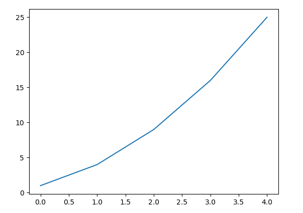
15.2.1 修改标签文字和线条粗细
import matplotlib
import matplotlib.pyplot as plt
matplotlib.rc("font", family='Microsoft YaHei')

squares = [1, 4, 9, 16, 25]
fig, ax = plt.subplots()
ax.plot(squares)

# 设置图表标题并给坐标轴加上标签。
ax.set_title("平方数", fontsize=24)
ax.set_xlabel("值", fontsize=14)
ax.set_ylabel("值的平方", fontsize=14)

# 设置刻度标记的大小。
ax.tick_params(axis='both', labelsize=14)

plt.show()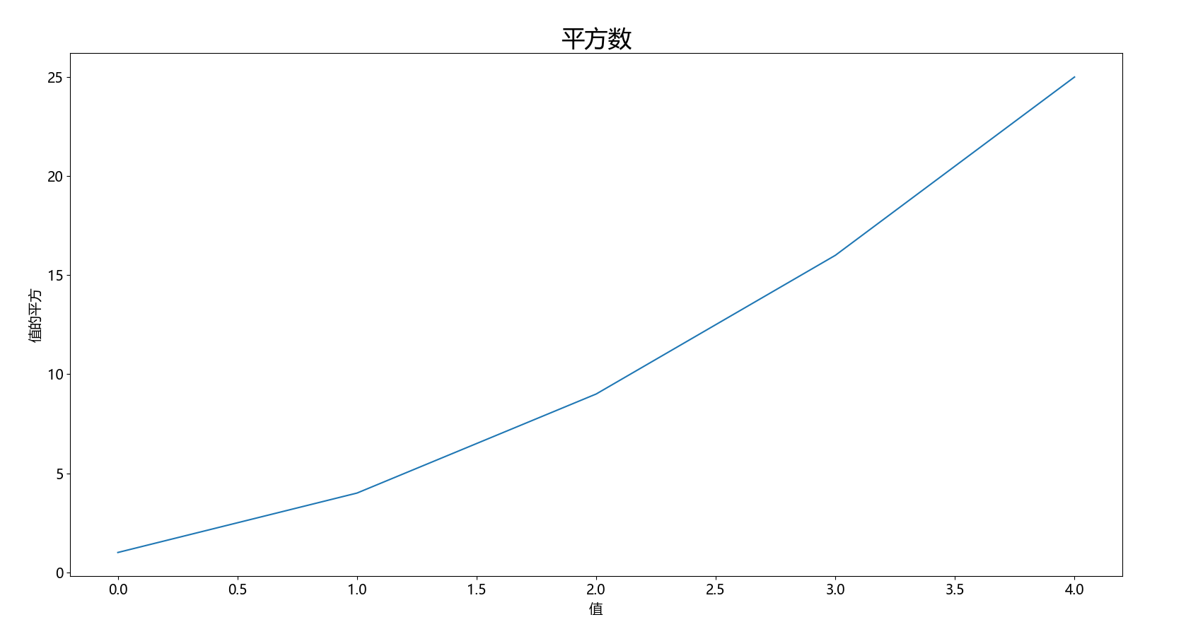
15.2.2 校正图形
input_values = [1, 2, 3, 4, 5]
squares = [1, 4, 9, 16, 25]
fig, ax = plt.subplots()
ax.plot(input_values, squares, linewidth=3)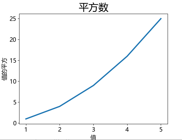
15.2.3 使用内置样式
import matplotlib.pyplot as plt
print(plt.style.available)
['Solarize_Light2', '_classic_test_patch', '_mpl-gallery', '_mpl-gallery-nogrid', 'bmh', 'classic', 'dark_background', 'fast', 'fivethirtyeight', 'ggplot', 'grayscale', 'seaborn', 'seaborn-bright', 'seaborn-colorblind', 'seaborn-dark', 'seaborn-dark-palette', 'seaborn-darkgrid', 'seaborn-deep', 'seaborn-muted', 'seaborn-notebook', 'seaborn-paper', 'seaborn-pastel', 'seaborn-poster', 'seaborn-talk', 'seaborn-ticks', 'seaborn-white', 'seaborn-whitegrid', 'tableau-colorblind10']
plt.style.use('seaborn')
fig, ax = plt.subplots()
ax.plot(input_values, squares, linewidth=3)
15.2.4 使用scatter()绘制散点图并设置样式
import matplotlib.pyplot as plt

plt.style.use('seaborn')
fig, ax = plt.subplots()
ax.scatter(2, 4, s=200)

plt.show()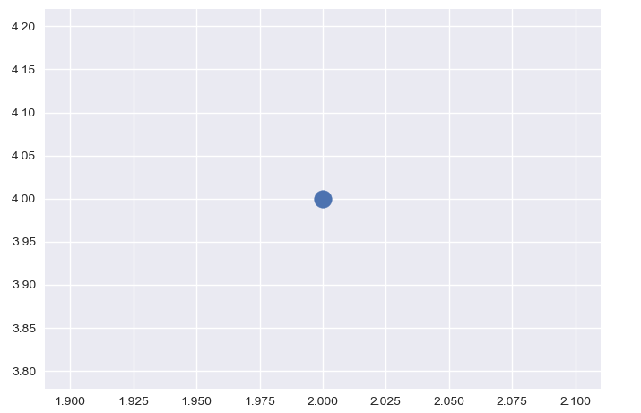
import matplotlib.pyplot as plt
plt.rcParams['font.sans-serif'] = ['SimHei'] # 显示中文标签
plt.rcParams['axes.unicode_minus'] = False   # 这两行需要手动设置

plt.style.use('seaborn')
fig, ax = plt.subplots()
ax.scatter(2, 4, s=200)

# 设置图表标题并给坐标轴加上标签。
ax.set_title("平方数", fontsize=24)
ax.set_xlabel("值", fontsize=14)
ax.set_ylabel("值的平方", fontsize=14)

# 设置刻度标记的大小。
ax.tick_params(axis='both', which='major', labelsize=14)

plt.show()
15.2.5 使用scatter()绘制一系列点
plt.style.use('seaborn')
fig, ax = plt.subplots()
ax.scatter(x_values, y_values, s=100)
15.2.6 自动计算数据
import matplotlib.pyplot as plt

x_values = range(1, 1001)
y_values = [x**2 for x in x_values]

plt.style.use('seaborn')
fig, ax = plt.subplots()
ax.scatter(x_values, y_values, s=10)

# 设置图表标题并给坐标轴加上标签。
ax.set_title("平方数", fontsize=24)
ax.set_xlabel("值", fontsize=14)
ax.set_ylabel("值的平方", fontsize=14)

# 设置刻度标记的大小。
ax.tick_params(axis='both', which='major', labelsize=14)

plt.show()
15.2.7 自定义颜色
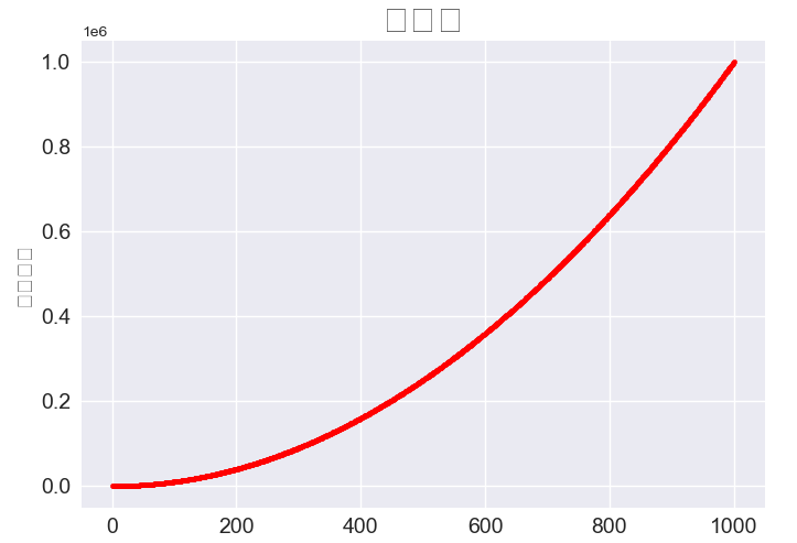
ax.scatter(x_values, y_values, c='red', s=10)注:以下问题暂时没有得到解决,所以汉字无法显示。
UserWarning: Glyph 24179 (\N{CJK UNIFIED IDEOGRAPH-5E73}) missing from current font.ax.scatter(x_values, y_values, c=(0, 0.8, 0), s=10)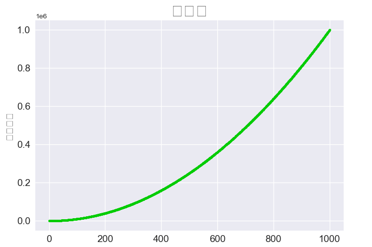
15.2.8 使用颜色映射
ax.scatter(x_values, y_values, c=y_values, cmap=plt.cm.Blues, s=10)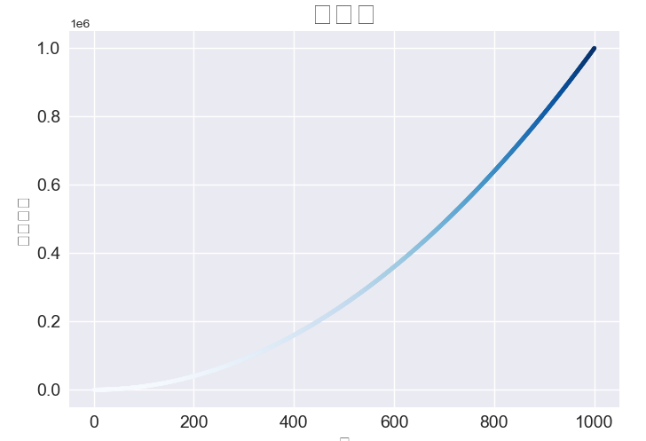
15.2.9 自动保存图表
path = "C:/users/xx/desktop/squares_plot.png"
plt.savefig(path, bbox_inches='tight')
15.3 随机散步
15.3.1 创建RandomWalk类
class RandomWalk:
    """一个生成随机漫步数据的类。"""

    def __init__(self, num_points=5000):
        """初始化随机漫步的属性。"""
        self.num_points = num_points

        # 所有随机漫步都始于(0,0)。
        self.x_values = [0]
        self.y_values = [0]
15.3.2 选择方向
from random import choice


class RandomWalk:
    """一个生成随机漫步数据的类。"""

    def __init__(self, num_points=5000):
        """初始化随机漫步的属性。"""
        self.num_points = num_points

        # 所有随机漫步都始于(0,0)。
        self.x_values = [0]
        self.y_values = [0]

    def fill_walk(self):
        """计算随机漫步包含的所有点。"""

        # 不断漫步,直到列表达到指定的长度。
        while len(self.x_values) < self.num_points:

            # 决定前进方向以及沿这个方向前进的距离。
            x_direction = choice([1, -1])
            x_distance = choice([0, 1, 2, 3, 4])
            x_step = x_direction * x_distance

            y_direction = choice([1, -1])
            y_distance = choice([0, 1, 2, 3, 4])
            y_step = y_direction * y_distance

            # 拒绝原地踏步。
            if x_step == 0 and y_step == 0:
                continue

            # 计算下一个点的x值和y值。
            x = self.x_values[-1] + x_step
            y = self.y_values[-1] + y_step

            self.x_values.append(x)
            self.y_values.append(y)
15.3.3 绘制随机漫步图
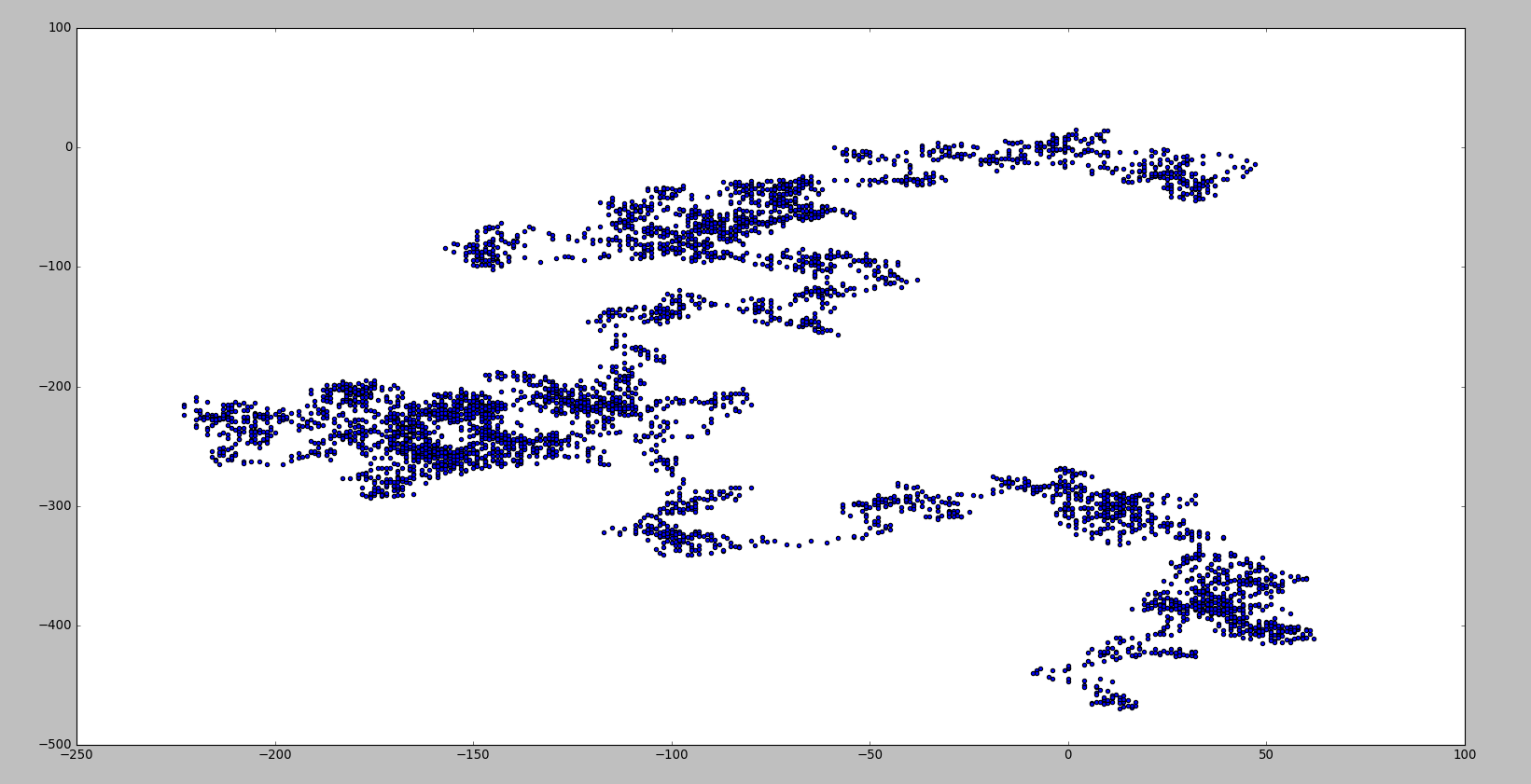
import matplotlib.pyplot as plt
from random_walk import RandomWalk

# 创建一个RandomWalk实例。
rw = RandomWalk()
rw.fill_walk()
# 将所有的点都绘制
plt.style.use('classic')
fig, ax = plt.subplots()
ax.scatter(rw.x_values, rw.y_values, s=15)
plt.show()
15.3.4 模拟多次随机漫步
import matplotlib.pyplot as plt
from random_walk import RandomWalk

# 只要程序处于活动状态,就不断地模拟随机漫步。
while True:
    # 创建一个RandomWalk实例。
    rw = RandomWalk()
    rw.fill_walk()
    # 将所有的点都绘制
    plt.style.use('classic')
    fig, ax = plt.subplots()
    ax.scatter(rw.x_values, rw.y_values, s=15)
    plt.show()

    keep_running = input('Make another walk? (y/n)')
    if keep_running == 'n':
        break
15.3.5 设置随机漫步图的样式
    # 将所有的点都绘制出来。
    plt.style.use('classic')
    fig, ax = plt.subplots()
    point_numbers = range(rw.num_points)
    ax.scatter(rw.x_values, rw.y_values, c=point_numbers, cmap=plt.cm.Blues, edgecolors='none', s=15)
    plt.show()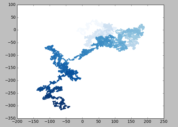
    # 突出起点和终点。
    ax.scatter(0, 0, c='green', edgecolors='none', s=100)
    ax.scatter(rw.x_values[-1], rw.y_values[-1], c='red', edgecolors='none', s=100)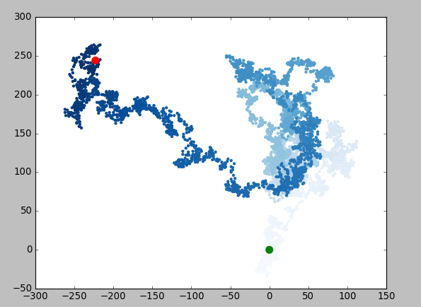
    # 隐藏坐标轴。
    ax.get_xaxis().set_visible(False)
    ax.get_yaxis().set_visible(False)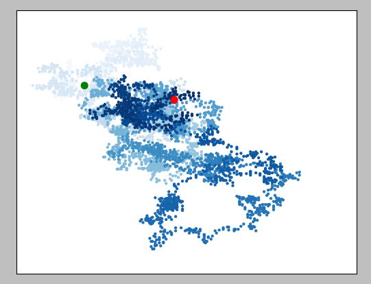
while True:
    # 创建一个RandomWalk实例。
    rw = RandomWalk(50_000)
    rw.fill_walk()
    # 将所有的点都绘制出来。
    plt.style.use('classic')
    fig, ax = plt.subplots()
    point_numbers = range(rw.num_points)
    ax.scatter(rw.x_values, rw.y_values, c=point_numbers, cmap=plt.cm.Blues, edgecolors='none', s=1)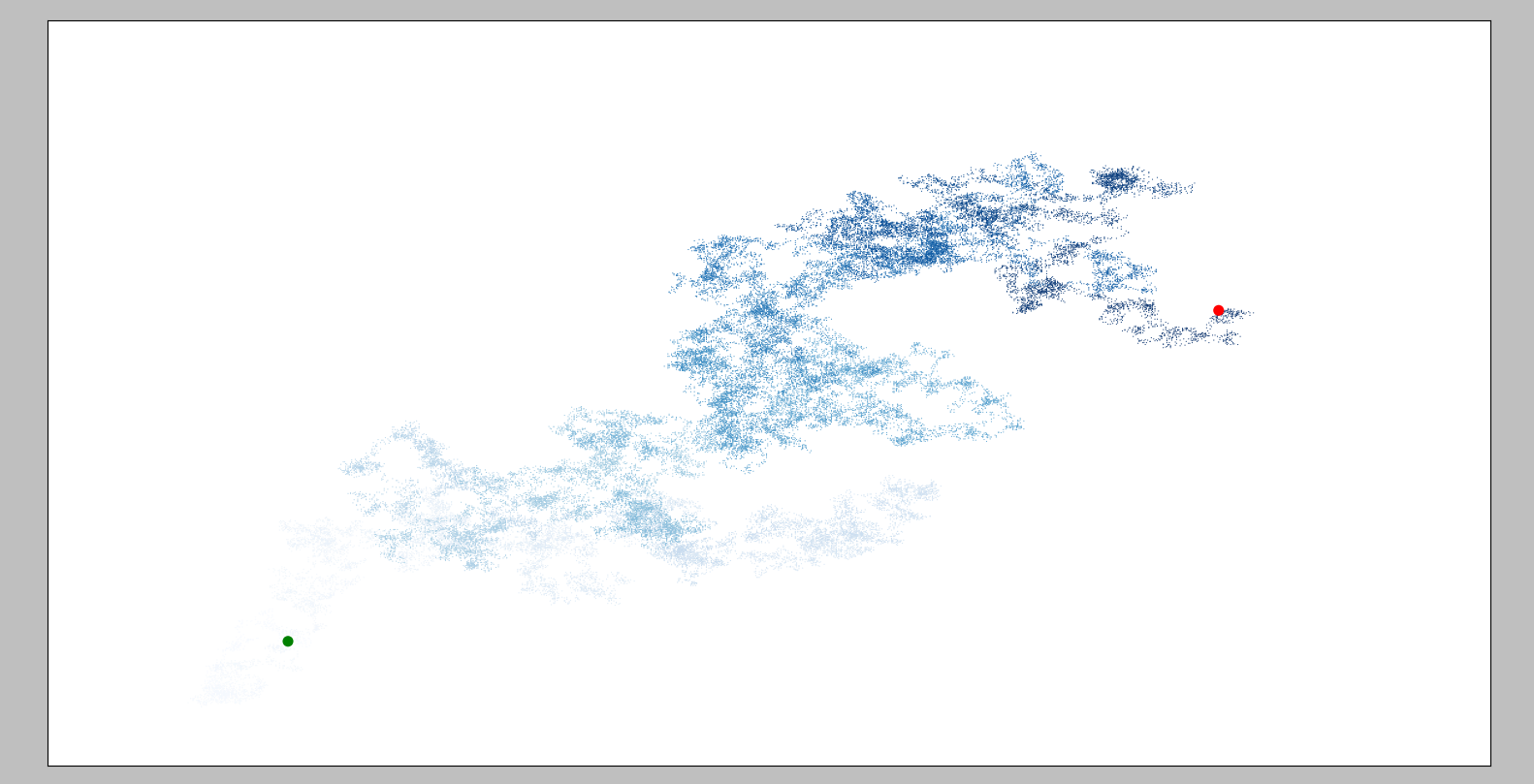
while True:
    # 创建一个RandomWalk实例。
    rw = RandomWalk(50_000)
    rw.fill_walk()
    # 将所有的点都绘制出来。
    plt.style.use('classic')
    fig, ax = plt.subplots(figsize=(15, 9))
    point_numbers = range(rw.num_points)
15.4 使用Plotly模拟掷骰子
15.4.1 安装Plotly
pip install plotly15.4.2 创建Die类
from random import randint


class Die:
    """表示一个骰子的类。"""

    def __init__(self, num_sides=6):
        """骰子默认为6面。"""
        self.num_sides = num_sides

    def roll(self):
        """返回一个位于1和骰子面数之间的随机值。"""
        return randint(1, self.num_sides)
15.4.3 掷骰子
from die import Die

# 创建一个D6。
die = Die()

# 掷几次骰子并将结果存储在一个列表中。
results = []
for roll_num in range(100):
    result = die.roll()
    results.append(result)

print(results)
[1, 6, 5, 1, 1, 6, 4, 6, 3, 1, 6, 2, 4, 5, 5, 3, 4, 4, 5, 4, 6, 2, 2, 1, 3, 1, 1, 1, 6, 2, 6, 2, 4, 5, 5, 3, 3, 5, 4, 4, 6, 2, 3, 4, 4, 4, 5, 6, 6, 3, 5, 1, 6, 3, 3, 5, 5, 5, 5, 2, 3, 1, 4, 6, 2, 1, 1, 4, 5, 6, 1, 4, 2, 6, 3, 4, 5, 6, 2, 2, 1, 2, 4, 2, 6, 6, 6, 6, 6, 1, 5, 6, 2, 2, 4, 2, 5, 6, 5, 6]
15.4.4 分析结果
from die import Die

# 创建一个D6。
die = Die()

# 掷几次骰子并将结果存储在一个列表中。
results = []
for roll_num in range(1000):
    result = die.roll()
    results.append(result)

# 分析结果。
frequencies = []
for value in range(1, die.num_sides+1):
    frequency = results.count(value)
    frequencies.append(frequency)

print(frequencies)
15.4.5 绘制直方图
from plotly.graph_objs import Bar, Layout
from plotly import offline
from die import Die

# 创建一个D6。
die = Die()

# 掷几次骰子并将结果存储在一个列表中。
results = []
for roll_num in range(1000):
    result = die.roll()
    results.append(result)

# 分析结果。
frequencies = []
for value in range(1, die.num_sides+1):
    frequency = results.count(value)
    frequencies.append(frequency)

# 对结果进行可视化。
x_values = list(range(1, die.num_sides+1))
data = [Bar(x=x_values, y=frequencies)]

x_axis_config = {'title': '结果'}
y_axis_config = {'title': '结果的频率'}
my_layout = Layout(title='掷一个D6 1000次的结果',
                   xaxis=x_axis_config, yaxis=y_axis_config)
offline.plot({'data': data, 'layout':my_layout}, filename='d6.html')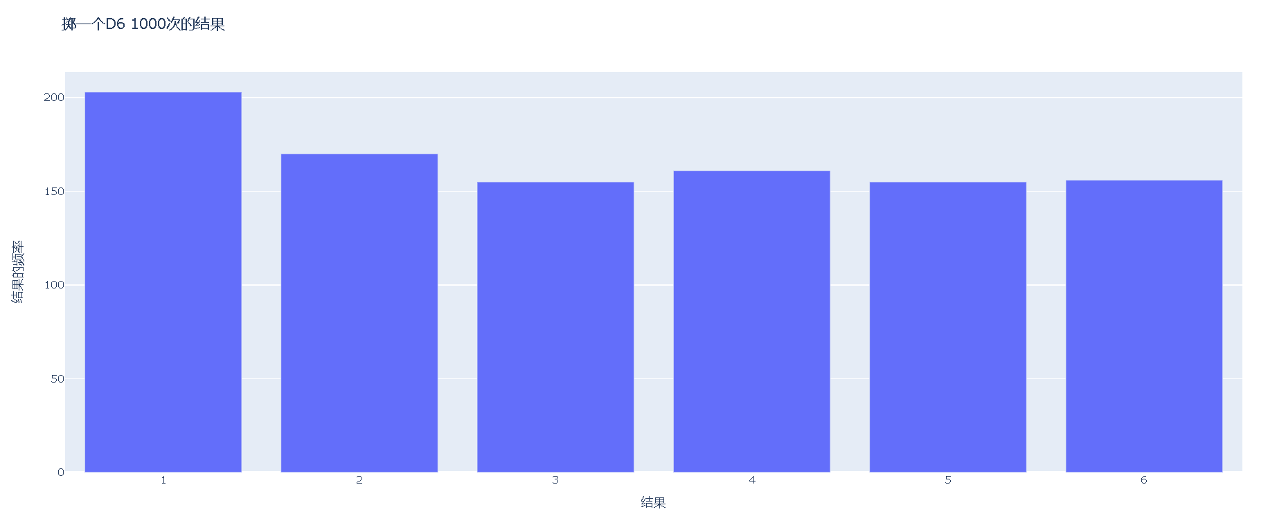
15.4.6 同时掷两个骰子
from plotly.graph_objs import Bar, Layout
from plotly import offline
from die import Die

# 创建一个D6。
die1 = Die()
die2 = Die()

# 掷几次骰子并将结果存储在一个列表中。
results = []
for roll_num in range(1000):
    result = die1.roll() + die2.roll()
    results.append(result)

# 分析结果。
frequencies = []
max_result = die1.num_sides + die2.num_sides
for value in range(1, max_result+1):
    frequency = results.count(value)
    frequencies.append(frequency)

# 对结果进行可视化。
x_values = list(range(2, max_result+1))
data = [Bar(x=x_values, y=frequencies)]

x_axis_config = {'title': '结果', 'dtick': 1}
y_axis_config = {'title': '结果的频率'}
my_layout = Layout(title='掷两个D6 1000次的结果',
                   xaxis=x_axis_config, yaxis=y_axis_config)
offline.plot({'data': data, 'layout': my_layout}, filename='d6_d6.html')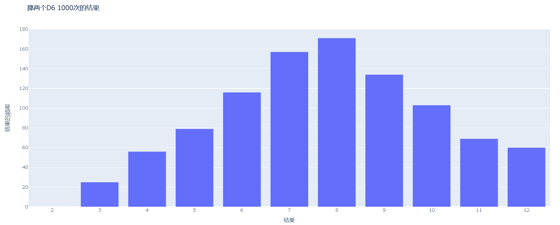
15.4.7 同时掷两个面数不同的骰子
from plotly.graph_objs import Bar, Layout
from plotly import offline
from die import Die

# 创建一个D6。
die1 = Die()
die2 = Die(10)

# 掷几次骰子并将结果存储在一个列表中。
results = []
for roll_num in range(50_000):
    result = die1.roll() + die2.roll()
    results.append(result)

# 分析结果。
frequencies = []
max_result = die1.num_sides + die2.num_sides
for value in range(1, max_result+1):
    frequency = results.count(value)
    frequencies.append(frequency)

# 对结果进行可视化。
x_values = list(range(2, max_result+1))
data = [Bar(x=x_values, y=frequencies)]

x_axis_config = {'title': '结果', 'dtick': 1}
y_axis_config = {'title': '结果的频率'}
my_layout = Layout(title='掷一个D6和一个D10 50000次的结果',
                   xaxis=x_axis_config, yaxis=y_axis_config)
offline.plot({'data': data, 'layout': my_layout}, filename='d6_d10.html')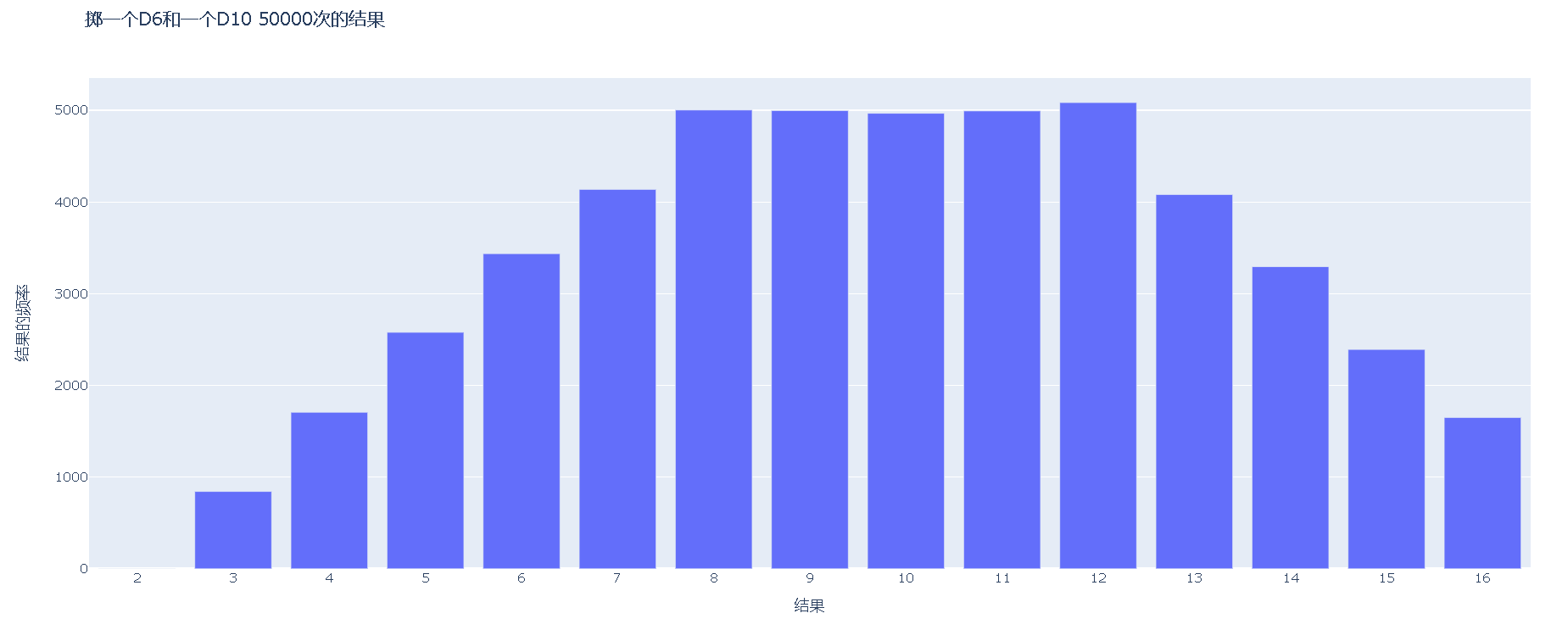


 1253
1253


 被折叠的 条评论
为什么被折叠?
被折叠的 条评论
为什么被折叠?
 到【灌水乐园】发言


