


学习本文,你可以学习到以下知识🍔:
- border 绘制简单几何图形
- transform 与 animation 知识
- 收获一只可爱的飞鸟
border 是个非常神奇、非常强大的属性,通过设置四个方向的 border 可以实现很多简单的几何图形。
下面用几个例子带大家学习 border 的渲染机制:
1、设置 div 的 width 与 height 为 0,设置四个方向的 border 颜色不同。
border-left: 30px solid red;
border-right: 30px solid blue;
border-top: 30px solid green;
border-bottom: 30px solid pink;

2、分别设置 height: 20px;width: 0 width: 20px;height:0 和 width: 20px;height:20px
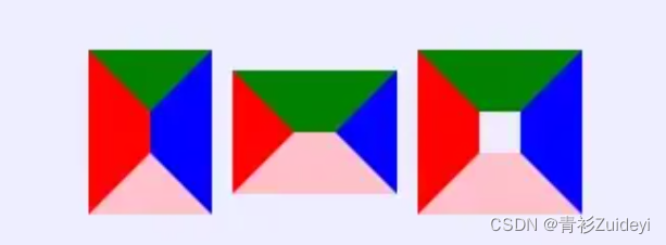
3、不设置 border-top
左侧图为设置 height: 20px 不设置 border-top;右侧图为设置 width: 20px 不设置 border-top
border绘制简单图形总结
通过上面三个案例,我们可以总结出 border 属性绘制简单图形的规律:
- border 共分四个方向,每个方向绘制其中一块,如果宽高都为 0 ,每个方向绘制成三角形;否则绘制成梯形。
- border 的宽度为绘制梯形的高
- height 影响 border-left 和 border-right ,width 影响 border-top 和 border-bottom (例如示例 2 设置)
当一个方向未绘制时, border 会只绘制对立方向部分,并且只会绘制一般(例如示例 3 设置,会被腰斩)
绘制鸟儿
头部实现
/* 设置 bottom 显示, left/right 为透明 */
border-right: 15px solid transparent;
border-bottom: 30px solid #6b83fa;
border-left: 15px solid transparent;
实现右翼
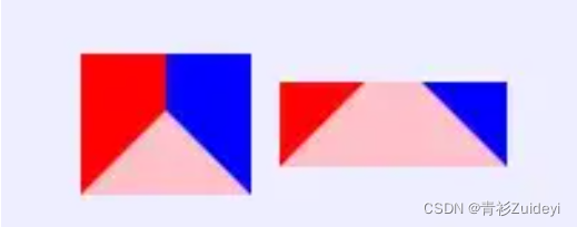
右翼由两部分,分别是直角梯形和直角三角形。通过 border 部分示例 3 可知,如果不设置 border-top ,border-left/right 的设置效果也会被腰斩,形成一个直角边,咱们就利用这个特性,就可以完成直角三角形和直角梯形的设置。
- 直角三角形的实现
/* 设置 border-left, borde-bottom 为透明 */
border-left: 30px solid #c0a9e0;
border-bottom: 30px solid transparent;
- 直角梯形的实现
/* 设置 height 拉长 left 形成梯形效果 */
height: 30px;
border-left: 30px solid #8567f0;
border-bottom: 10px solid transparent;
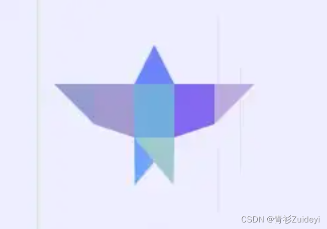
鸟儿组装
通过 position: relative 和 position: absolute 将图形组装起来,组装后的小鸟如下图
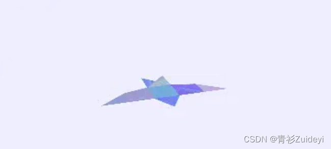
因为只是通过定位组装小鸟,小鸟的所有部位处于同一平面,看起来十分生硬。
让鸟儿更立体
通过 transform: rotate 和 transform-origin 属性将小鸟的头部,尾部,两翼旋转一下,形成立体感
例如头部:
/* 设置 transform 的基点 */
transform-origin: 50% 100%;
/* 沿 x 轴偏移,负值逆时针旋转*/
transform: rotateX(-20deg);
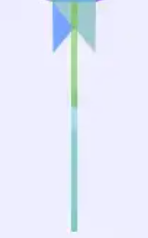
实现风
风的实现并不难,是通过 div 标签与 :before 配合实现。
.wind {
    position: absolute;
    width: 4px;
    height: 200px;
    /* 风是移动的,通过 overflow 可以限制风的长度 */
    overflow: hidden;
}
.wind:before {
    before {
    content: "";
    position: absolute;
    width: 4px;
    height: 300px;
    background: rgba(100, 200, 207, 0.3);
    transform: translateY(-300px);
    -webkit-animation: wind 2331ms 1268ms linear infinite;
    animation: wind 2331ms 1268ms linear infinite;
}
就可以实现 wind ,之后依次按照上述实现 10 组 wind ,实现后的效果如下:
让风动起来
风动起来的效果实现原理非常简单:.wind 设置 height: 200px ,超出 200px 会隐藏, :before 伪类中可以使用 animation 属性,移动 wind 的 translateY
@-webkit-keyframes wind {
    0% {
        transform: translateY(-300px);
    }
    100% {
        transform: translateY(200px);
    }
}
.wind:before {
    transform: translateY(-300px);
    /* 设置每个风的延迟时间和持续时间都不相同 */
    animation: wind 2249ms 3544ms linear infinite;
}
风就动起来了,现在看起来效果就很赏心悦目了,就差飞翔的鸟儿了。
飞翔吧小鸟
再让鸟儿飞起来之前,我们首先来设置一些基本属性
- 初始化3D
- 设置 transform-style: preserve-3d 开启 3D 渲染
- 设置 perspective: 设置视距,让飞翔的鸟儿看起来更符合人类视觉效果
- 设置 drop-shadow: 真实世界的飞鸟怎么能没有影子那。
- 两翼动画
让鸟儿飞起来最重要的就是两翼动起来,分别设置两个动画 wingRight 和 windLeft
/* 两翼翅膀的时针相反,因此动画是反的 */
@keyframes wingRight {
    0% {
        transform: rotateY(40deg);
    }
    100% {
        transform: rotateY(-40deg);
    }
}
@-webkit-keyframes wingLeft {
    0% {
        transform: rotateY(-40deg);
    }
    100% {
        transform: rotateY(40deg);
    }
}
设置完动画后,还有至关重要的一步,要设置 transform-origin ,以右翼为例子,翅膀应该沿红框标识线旋转
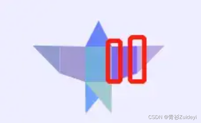
transform-origin 默认值为 50% 50% 0,很明显是无法满足旋转要求的,根据浏览器坐标系的知识,因此设置右翼 transform-origin 为 0 0 ,同理设置左翼为 100% 0
整体动画
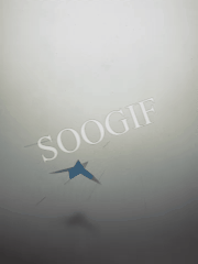
光在一个平面中飞翔不免有几分无聊和乏味,作为天空中的精灵,鸟儿应该自由的飞翔。给鸟儿添加绕 z 轴 360° 旋转的动画。
<!DOCTYPE html>
<html lang="en">
  <head>
    <meta charset="UTF-8" />
    <meta http-equiv="X-UA-Compatible" content="IE=edge" />
    <meta name="viewport" content="width=device-width, initial-scale=1.0" />
    <title>飞翔的小鸟</title>
    <style>
      body {
        background: #eef;
        height: 100vh;
        overflow: hidden;
        display: flex;
        justify-content: center;
        align-items: center;
      }

      #sky {
        margin-top: -60px;
        perspective: 400px;
        filter: drop-shadow(0px 150px 10px rgba(0, 0, 0, 0.2));
      }
      @-moz-document url-prefix() {
        #sky {
          filter: none;
        }
      }
      #sky div {
        transform-style: preserve-3d;
      }
      #sky .bird {
        -webkit-animation: fly 10000ms linear infinite;
        animation: fly 10000ms linear infinite;
      }
      #sky .bird .wind {
        position: absolute;
        left: 50%;
        width: 4px;
        height: 200px;
        margin-left: -2px;
        border-radius: 999px;
        overflow: hidden;
      }
      #sky .bird .wind:nth-child(1) {
        transform: translate3d(189px, -97px, 82px) rotateY(90deg);
      }
      #sky .bird .wind:nth-child(1)::before {
        content: "";
        position: absolute;
        width: 4px;
        height: 300px;
        background: rgba(100, 200, 207, 0.3);
        border-radius: 999px;
        transform: translateY(-300px);
        -webkit-animation: wind 2331ms 1268ms linear infinite;
        animation: wind 2331ms 1268ms linear infinite;
      }
      #sky .bird .wind:nth-child(2) {
        transform: translate3d(132px, 5px, 70px) rotateY(90deg);
      }
      #sky .bird .wind:nth-child(2)::before {
        content: "";
        position: absolute;
        width: 4px;
        height: 300px;
        background: rgba(100, 200, 254, 0.3);
        border-radius: 999px;
        transform: translateY(-300px);
        -webkit-animation: wind 2438ms 1537ms linear infinite;
        animation: wind 2438ms 1537ms linear infinite;
      }
      #sky .bird .wind:nth-child(3) {
        transform: translate3d(65px, -132px, -5px) rotateY(90deg);
      }
      #sky .bird .wind:nth-child(3)::before {
        content: "";
        position: absolute;
        width: 4px;
        height: 300px;
        background: rgba(100, 200, 17, 0.3);
        border-radius: 999px;
        transform: translateY(-300px);
        -webkit-animation: wind 2613ms 2531ms linear infinite;
        animation: wind 2613ms 2531ms linear infinite;
      }
      #sky .bird .wind:nth-child(4) {
        transform: translate3d(-179px, 70px, -25px) rotateY(90deg);
      }
      #sky .bird .wind:nth-child(4)::before {
        content: "";
        position: absolute;
        width: 4px;
        height: 300px;
        background: rgba(100, 200, 124, 0.3);
        border-radius: 999px;
        transform: translateY(-300px);
        -webkit-animation: wind 1421ms 1690ms linear infinite;
        animation: wind 1421ms 1690ms linear infinite;
      }
      #sky .bird .wind:nth-child(5) {
        transform: translate3d(142px, 66px, -87px) rotateY(90deg);
      }
      #sky .bird .wind:nth-child(5)::before {
        content: "";
        position: absolute;
        width: 4px;
        height: 300px;
        background: rgba(100, 200, 127, 0.3);
        border-radius: 999px;
        transform: translateY(-300px);
        -webkit-animation: wind 1639ms 4788ms linear infinite;
        animation: wind 1639ms 4788ms linear infinite;
      }
      #sky .bird .wind:nth-child(6) {
        transform: translate3d(56px, -66px, -72px) rotateY(90deg);
      }
      #sky .bird .wind:nth-child(6)::before {
        content: "";
        position: absolute;
        width: 4px;
        height: 300px;
        background: rgba(100, 200, 147, 0.3);
        border-radius: 999px;
        transform: translateY(-300px);
        -webkit-animation: wind 1856ms 1426ms linear infinite;
        animation: wind 1856ms 1426ms linear infinite;
      }
      #sky .bird .wind:nth-child(7) {
        transform: translate3d(183px, 92px, 74px) rotateY(90deg);
      }
      #sky .bird .wind:nth-child(7)::before {
        content: "";
        position: absolute;
        width: 4px;
        height: 300px;
        background: rgba(100, 200, 31, 0.3);
        border-radius: 999px;
        transform: translateY(-300px);
        -webkit-animation: wind 1585ms 3969ms linear infinite;
        animation: wind 1585ms 3969ms linear infinite;
      }
      #sky .bird .wind:nth-child(8) {
        transform: translate3d(-13px, -33px, 28px) rotateY(90deg);
      }
      #sky .bird .wind:nth-child(8)::before {
        content: "";
        position: absolute;
        width: 4px;
        height: 300px;
        background: rgba(100, 200, 60, 0.3);
        border-radius: 999px;
        transform: translateY(-300px);
        -webkit-animation: wind 1693ms 3611ms linear infinite;
        animation: wind 1693ms 3611ms linear infinite;
      }
      #sky .bird .wind:nth-child(9) {
        transform: translate3d(-68px, -73px, 88px) rotateY(90deg);
      }
      #sky .bird .wind:nth-child(9)::before {
        content: "";
        position: absolute;
        width: 4px;
        height: 300px;
        background: rgba(100, 200, 34, 0.3);
        border-radius: 999px;
        transform: translateY(-300px);
        -webkit-animation: wind 2249ms 3544ms linear infinite;
        animation: wind 2249ms 3544ms linear infinite;
      }
      #sky .bird .wind:nth-child(10) {
        transform: translate3d(174px, -74px, 8px) rotateY(90deg);
      }
      #sky .bird .wind:nth-child(10)::before {
        content: "";
        position: absolute;
        width: 4px;
        height: 300px;
        background: rgba(100, 200, 158, 0.3);
        border-radius: 999px;
        transform: translateY(-300px);
        -webkit-animation: wind 1104ms 4095ms linear infinite;
        animation: wind 1104ms 4095ms linear infinite;
      }
      #sky .bird .wind:nth-child(11) {
        transform: translate3d(-174px, 122px, 20px) rotateY(90deg);
      }
      #sky .bird .wind:nth-child(11)::before {
        content: "";
        position: absolute;
        width: 4px;
        height: 300px;
        background: rgba(100, 200, 116, 0.3);
        border-radius: 999px;
        transform: translateY(-300px);
        -webkit-animation: wind 1100ms 2546ms linear infinite;
        animation: wind 1100ms 2546ms linear infinite;
      }
      #sky .bird_body {
        position: relative;
        width: 30px;
        height: 40px;
        background: #70addd;
      }
      #sky .bird_head {
        position: absolute;
        top: -30px;
        border-right: 15px solid transparent;
        border-bottom: 30px solid #6b83fa;
        border-left: 15px solid transparent;
        transform-origin: 50% 100%;
        transform: rotateX(-20deg);
      }
      #sky .bird_wing_left {
        position: absolute;
        left: -30px;
        height: 30px;
        border-right: 30px solid #a399d1;
        border-bottom: 10px solid transparent;
        transform-origin: 100% 0;
        -webkit-animation: wingLeft 1000ms cubic-bezier(0.36, 0.1, 0.16, 1)
          infinite alternate;
        animation: wingLeft 1000ms cubic-bezier(0.36, 0.1, 0.16, 1) infinite
          alternate;
      }
      #sky .bird_wing_left_top {
        position: absolute;
        left: -30px;
        border-right: 30px solid #929ccf;
        border-bottom: 30px solid transparent;
        transform-origin: 100% 0;
        -webkit-animation: wingLeft 1000ms
          cubic-bezier(0.545, 0.08, 0.52, 0.975) infinite alternate;
        animation: wingLeft 1000ms cubic-bezier(0.545, 0.08, 0.52, 0.975)
          infinite alternate;
      }
      #sky .bird_wing_right {
        position: absolute;
        left: 30px;
        height: 30px;
        border-left: 30px solid #8567f0;
        border-bottom: 10px solid transparent;
        transform-origin: 0 0;
        -webkit-animation: wingRight 1000ms cubic-bezier(0.36, 0.1, 0.16, 1)
          infinite alternate;
        animation: wingRight 1000ms cubic-bezier(0.36, 0.1, 0.16, 1) infinite
          alternate;
      }
      #sky .bird_wing_right_top {
        position: absolute;
        border-left: 30px solid #c0a9e0;
        border-bottom: 30px solid transparent;
        transform-origin: 0 0;
        -webkit-animation: wingRight 1000ms
          cubic-bezier(0.545, 0.08, 0.52, 0.975) infinite alternate;
        animation: wingRight 1000ms cubic-bezier(0.545, 0.08, 0.52, 0.975)
          infinite alternate;
      }
      #sky .bird_tail_left {
        position: absolute;
        top: 40px;
        border-right: 30px solid transparent;
        border-top: 40px solid #74a3ff;
        transform-origin: 50% 0;
        transform: rotateX(-20deg);
      }
      #sky .bird_tail_right {
        position: absolute;
        top: 40px;
        border-left: 30px solid transparent;
        border-top: 40px solid #a3c8ce;
        transform-origin: 50% 0;
        transform: rotateX(-20deg);
      }

      @-webkit-keyframes fly {
        0% {
          transform: rotateX(-120deg) rotateZ(0deg) rotateX(10deg);
        }
        100% {
          transform: rotateX(-120deg) rotateZ(360deg) rotateX(10deg);
        }
      }

      @keyframes fly {
        0% {
          transform: rotateX(-120deg) rotateZ(0deg) rotateX(10deg);
        }
        100% {
          transform: rotateX(-120deg) rotateZ(360deg) rotateX(10deg);
        }
      }
      @-webkit-keyframes wingLeft {
        0% {
          transform: rotateY(-40deg);
        }
        100% {
          transform: rotateY(40deg);
        }
      }
      @keyframes wingLeft {
        0% {
          transform: rotateY(-40deg);
        }
        100% {
          transform: rotateY(40deg);
        }
      }
      @-webkit-keyframes wingRight {
        0% {
          transform: rotateY(40deg);
        }
        100% {
          transform: rotateY(-40deg);
        }
      }
      @keyframes wingRight {
        0% {
          transform: rotateY(40deg);
        }
        100% {
          transform: rotateY(-40deg);
        }
      }
      @-webkit-keyframes wind {
        0% {
          transform: translateY(-300px);
        }
        100% {
          transform: translateY(200px);
        }
      }
      @keyframes wind {
        0% {
          transform: translateY(-300px);
        }
        100% {
          transform: translateY(200px);
        }
      }
    </style>
  </head>
  <body>
    <div id="sky">
      <div class="bird">
        <div class="wind"></div>
        <div class="wind"></div>
        <div class="wind"></div>
        <div class="wind"></div>
        <div class="wind"></div>
        <div class="wind"></div>
        <div class="wind"></div>
        <div class="wind"></div>
        <div class="wind"></div>
        <div class="wind"></div>
        <div class="bird_body">
          <div class="bird_head"></div>
          <div class="bird_wing_left">
            <div class="bird_wing_left_top"></div>
          </div>
          <div class="bird_wing_right">
            <div class="bird_wing_right_top"></div>
          </div>
          <div class="bird_tail_left"></div>
          <div class="bird_tail_right"></div>
        </div>
      </div>
    </div>
  </body>
</html>


 扫一扫
扫一扫


 500
500

 被折叠的 条评论
为什么被折叠?
被折叠的 条评论
为什么被折叠?
 到【灌水乐园】发言


