


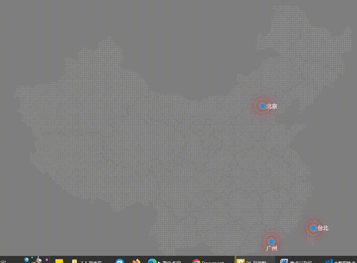
1.案例分析:
结构:一个map大盒子包着三个city地点盒子,三个地点盒子分别有三个pluse光波盒子
样式:map给相对定位,city给绝对定位(父绝子相),pluse也给绝地定位(子绝父绝)
核心:给每一个光波设置居中和动画效果,第二个光波盒子和第三个光波盒子一定要设置延迟
    .city>div[class^=pulse] {
        position: absolute;
        left: 50%;
        top: 50%;
        transform: translate(-50%, -50%);
        width: 8px;
        height: 8px;
        border-radius: 50%;
        box-shadow: 0 0 10px red;
        animation: bowen 3s linear infinite;
    }

    .pulse2 {
        animation-delay: 1s !important;
    }

    .pulse3 {
        animation-delay: 2s !important;
    }
2.运行结果:
3.代码:
<!DOCTYPE html>
<html lang="en">

<head>
    <meta charset="UTF-8">
    <meta name="viewport" content="width=device-width, initial-scale=1.0">
    <meta http-equiv="X-UA-Compatible" content="ie=edge">
    <title>Document</title>
</head>
<style>
    * {
        padding: 0;
        margin: 0;
    }

    body {
        background-color: gray;
    }

    .map {
        position: relative;
        width: 800px;
        height: 600px;
        margin: 50px auto;
        background: url(./img/map.png) no-repeat center;
    }

    .city {
        position: absolute;
        right: 219px;
        top: 219px;
        width: 8px;
        height: 8px;
        background-color: #09F;
        border-radius: 50%;
    }

    .tb {
        right: 106px;
        top: 490px;
    }

    .gz {
        right: 200px;
        top: 520px;
    }

    .city>div[class^=pulse] {
        position: absolute;
        left: 50%;
        top: 50%;
        transform: translate(-50%, -50%);
        width: 8px;
        height: 8px;
        border-radius: 50%;
        box-shadow: 0 0 10px red;
        animation: bowen 3s linear infinite;
    }

    .pulse2 {
        animation-delay: 1s !important;
    }

    .pulse3 {
        animation-delay: 2s !important;
    }

    @keyframes bowen {
        0% {
            width: 8px;
            height: 8px;
            opacity: 1;
        }
        100% {
            width: 60px;
            height: 60px;
            opacity: 0;
        }
    }
</style>

<body>
    <div class="map">
        <div class="city">
            <div class="pulse1"></div>
            <div class="pulse2"></div>
            <div class="pulse3"></div>
        </div>
        <div class="city tb">
            <div class="pulse1"></div>
            <div class="pulse2"></div>
            <div class="pulse3"></div>
        </div>
        <div class=" city gz">
            <div class="pulse1"></div>
            <div class="pulse2"></div>
            <div class="pulse3"></div>
        </div>
    </div>
</body>

</html>


 3024
3024


 被折叠的 条评论
为什么被折叠?
被折叠的 条评论
为什么被折叠?
 到【灌水乐园】发言


