


💌写在开头:
今天主要记录下 微信小程序 父子组件 使用
文章目录
前言
微信小程序 组件使用
近期开发微信小程序 有个弹窗多个地方用到 抽取成公共组件 进行记录学习
图解

一、组件是什么?
示例:将可重复使用部分抽取变成共用组件,可在多个地方使用,减少开发,提升效率。
二、使用步骤
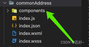
1.创建组件
在目录下创建components文件夹,用于存放组件:
2.声明组件
在components中的json文件中添加"component": true,将其声明为一个组件。

代码如下(示例):
{
  "component": true,
  "usingComponents": {}
}
3.使用组件
在需要使用自定义组件的页面的json文件中注册组件。添加类似以下代码:
{
    "usingComponents": {
        "self-contained-info-pop": "./components/self-contained-info-pop/index"
    },
    "navigationBarTitleText":"常用地址管理"
}
4.组件内容
组件结构,类似以下代码:
<view class="self-contained-info-pop">
  <view class="container">
    <view class="container-item" wx:if="{{type == 0}}">
      <view class="continer-left">提货车牌号</view>
      <input class="continer-right" value="{{form.car_no}}" placeholder="请输入提货车牌号" placeholder-class="input-placeholder" bindinput="getCarNumberFunc"></input>
    </view>
    <view class="container-item">
      <view class="continer-left">提货人姓名</view>
      <input class="continer-right" value="{{form.name}}" placeholder="请输入提货人姓名" placeholder-class="input-placeholder" bindinput="getNameFunc"></input>
    </view>
    <view class="container-item">
      <view class="continer-left">提货人手机号</view>
      <input class="continer-right" value="{{form.phone}}" type="number" maxlength="11" placeholder="请输入提货人手机号" placeholder-class="input-placeholder" bindinput="getPhoneFunc"></input>
    </view>
    <view class="container-item">
      <view class="continer-left">提货人身份证号</view>
      <input class="continer-right" value="{{form.id_no}}" placeholder="请输入提货人身份证号" maxlength="18" placeholder-class="input-placeholder" bindinput="getIdcardFunc"></input>
    </view>
    <view class="container-item" wx:if="{{type != 0}}">
      <view class="continer-left">所在地区</view>
      <input class="continer-right" value="{{form.area}}" placeholder="省、市、区、街道" placeholder-class="input-placeholder" bindinput="getAreaFunc"></input>
    </view>
    <view class="container-item" wx:if="{{type != 0}}">
      <view class="continer-left">详细地址</view>
      <input class="continer-right" value="{{form.address}}" placeholder="小区楼栋/乡村名称" placeholder-class="input-placeholder" bindinput="getAddressFunc"></input>
    </view>
    <view class="btn-box">
      <view class="cancel-btn" catchtap="close">取消</view>
      <!-- 新增 -->
      <view class="preserve-btn" catchtap="handelSubmit" wx:if="{{edit ==false}}">保存</view>
      <!-- 编辑 -->
      <view class="preserve-btn" catchtap="handelEdit" wx:else>保存</view>
    </view>
  </view>
  <view class="close" catchtap="close"></view>
</view>
样式
.self-contained-info-pop {
  position: fixed;
  top: 0%;
  left: 0%;
  width: 100%;
  height: 100%;
  background-color: rgba(0, 0, 0, 0.7);
  z-index: 1001;
  display: flex;
  justify-content: center;
  align-items: center;
  flex-direction: column;

  .container {
    position: relative;
    width: 600rpx;
    // height: 646rpx;
    background: linear-gradient(180deg, #F6F7FF 0%, #FFFFFF 100%);
    border-radius: 10rpx;
    padding: 50rpx 30rpx 49rpx 19rpx;
    box-sizing: border-box;


    .container-item {
      display: flex;
      justify-content: space-around;
      align-items: center;
      margin-bottom: 30rpx;

      .continer-left {
        width: 195rpx;
        font-size: 28rpx;
        font-family: PingFang SC;
        font-weight: 500;
        color: #1C1E25;
        line-height: 55rpx;
        text-align: center;
      }

      .continer-right {
        width: 343rpx;
        height: 72rpx;
        border: 2rpx solid #BFC4CD;
        opacity: 0.5;
        border-radius: 10rpx;
        line-height: 72rpx;
        font-size: 28rpx;
        font-family: PingFang SC;
        font-weight: 400;
        color: #5F6266;
        padding-left: 10rpx;
        box-sizing: border-box;
      }
    }


  }

  .btn-box {
    display: flex;
    justify-content: space-around;
    align-items: center;
    margin-top: 51rpx;
  }

  .cancel-btn {
    width: 250rpx;
    height: 88rpx;
    background: #F2F4F4;
    border-radius: 10rpx;
    font-size: 32rpx;
    font-family: PingFang SC;
    font-weight: 500;
    color: #007EF8;
    line-height: 88rpx;
    text-align: center;
  }

  .preserve-btn {
    width: 250rpx;
    height: 88rpx;
    background: #007EF8;
    border-radius: 10rpx;
    line-height: 88rpx;
    font-size: 32rpx;
    font-family: PingFang SC;
    font-weight: 500;
    color: #FFFFFF;
    text-align: center;
  }
}
5.父组件引入组件
通过showPop和self-contained-info-pop关键字控制组件显示与隐藏
类似以下代码:
 <block wx:if="{{showPop}}">
        <self-contained-info-pop wx:if="{{activePop === 'self-contained-info-pop'}}" bindclose="close" form="{{formData}}" edit="{{edit}}" type="{{type}}"  bindsubmit="selfContainedInfoSubmit" bindedit="selfContainedInfoEdit"></self-contained-info-pop>
    </block>
打开组件
handelSelfContainedInfo() {
        console.log('self-contained-info-pop')
        this.setData({
            showPop: true,
            edit: false,
            formData: {
                address_type: 0
            },
            activePop: 'self-contained-info-pop',
            type: 0
        })
    },
6.父组件给子组件传值
通过form="{{formData}}" edit="{{edit}}" type="{{type}}"
类似以下代码:
<block wx:if="{{showPop}}">
        <self-contained-info-pop wx:if="{{activePop === 'self-contained-info-pop'}}" bindclose="close" form="{{formData}}" edit="{{edit}}" type="{{type}}"  bindsubmit="selfContainedInfoSubmit" bindedit="selfContainedInfoEdit"></self-contained-info-pop>
    </block>
7.子组件接收父组件值
通过properties,定义好接收值的类型及默认值,没有默认值可为空
类似以下代码:
/**
   * 组件的属性列表
   */
  properties: {
    form: {
      type: Object,
      value: {
        id: '',
        car_no: '',
        name: '',
        phone: '',
        id_no: '',
        area: '',
        address: '',
        address_type: 0,// 0 自提, 1: 配送
      }
    },
    type:{
      type:Number,
      value:0
    },
    edit:{
      type:Boolean,
      value:false
    }
  },
7.子组件传参给父组件
通过triggerEvent传参给父组件
triggerEvent接收两个参数,第一个参数为触发的父组件的方法名称,第二个参数为要传递的参数
类似以下代码:
 /**
   * 组件的方法列表
   */
  methods: {
  handelSubmit() {
      this.triggerEvent('submit', this.data.form)
    },
  }
8.父组件接收子组件传递参数
通过bind事件接收
bind+子组件triggerEvent的第一个参数,对应的方法中即可接收
类似以下代码:
<self-contained-info-pop wx:if="{{activePop === 'self-contained-info-pop'}}" bindclose="close" form="{{formData}}" edit="{{edit}}" type="{{type}}" bindsubmit="selfContainedInfoSubmit" bindedit="selfContainedInfoEdit"></self-contained-info-pop>
async selfContainedInfoSubmit(e) {
         console.log(e.detail)//e.detail即为子组件传递的参数
    },
总结
以上就是本次小程序开发使用的组件啦。


 1万+
1万+


 被折叠的 条评论
为什么被折叠?
被折叠的 条评论
为什么被折叠?
 到【灌水乐园】发言


