


一、样式和结果重用
介绍
/*
@Extend:扩展组件(样式、事件)
@Styles: 抽取通用数据、事件
@Builder:自定义构建函数(结构、样式、事件)
*/
@Extend
/*
作用:扩展组件(样式、事件)
场景:两个文本组件,大部分样式类似,事件类似,抽取类似代码,定义成一个方法,将不同的内容用参数获取
*/
/*
语法:
@Extend(扩展的组件名)
function 自定义函数名(参数1...){
  抽取类似的样式和事件
}
*/
@Extend(Text)
function TextStyle(fontSize:number=24,textColor:string=Color.White.toString(),fontWeight:number=700){
  .fontColor(Color.Red).fontWeight(fontWeight).textAlign(TextAlign.Center)
  .backgroundColor(textColor).borderRadius(10).fontSize(fontSize)
}
@Entry
@Component
struct Index {
  build() {
    Column(){
      Swiper(){
        Text("1").TextStyle(16,"#f00",700)
        Text("1").TextStyle(34,"#ff0",700)
        Text("2").TextStyle(66,"#fff",700)
        Text("3").TextStyle(40,"#00f",700)
      }.width("100%").aspectRatio(2.4).loop(true).autoPlay(true).interval(5000).padding(2).borderRadius(10)
      .indicator(
        Indicator.dot()
          // 默认
          .itemWidth(15)
          .itemHeight(4)
          .color("#80737272")
          // 选中
          .selectedItemWidth(30)
          .selectedItemHeight(4)
          .selectedColor("#ffffffff")
      )
    }.width("100%").height("100%").backgroundColor("#ffe7dddd")

  }
}
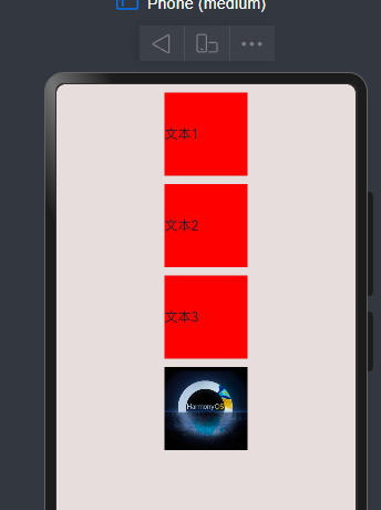
@Styles
/*
构建不同组件的通用样式和事件
场景:如文本和图片框宽和高都是相同的,背景颜色也是一样的,就可以用该注解
注意:@Styles不支持传递参数
*/
// 示例
@Styles
function commonStyle(){
  .width(100).height(100)
  .margin({top:10})
}
@Entry
@Component
struct Index {
  @State bgColor:string = "#f00"
  @Styles commonBgColorStyle(){
    .backgroundColor(this.bgColor)
  }
  @Styles CommonClickStyles(){
    .onClick(()=>{
      this.bgColor= "#ff0"
    })
  }
  build() {
    Column(){
        Text("文本1").commonStyle().commonBgColorStyle().CommonClickStyles()
        Text("文本2").commonStyle().commonBgColorStyle().CommonClickStyles()
        Text("文本3").commonStyle().commonBgColorStyle().CommonClickStyles()
        Image($r("app.media.hos")).commonStyle().commonBgColorStyle().CommonClickStyles()
    }.width("100%").height("100%").backgroundColor("#ffe7dddd")

  }
}
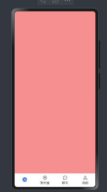
@Builder
/*
@Builder:自定义构建函数(结构、样式、事件)
注意:想使用状态变量,定义为局部的Builder
*/
@Extend(Column)
function ColumnExtend(color:ResourceColor){
  .width("100%").height("100%").backgroundColor(color)
}
@Builder
function itemTab(src:ResourceStr,title:string){
  Column(){
    Image(src).width(20)
    Text(title).fontSize(14).margin({top:5})
  }.layoutWeight(1)
}
@Entry
@Component
struct Index {
  @State bgColor:ResourceColor = "#fff68f8f"
  @Builder
   itemTab(src:ResourceStr,title:string, bgColor:ResourceColor){
  Column(){
    Image(src).width(20)
    Text(title).fontSize(14).margin({top:5})
  }.layoutWeight(1).onClick(()=>{
    // 点击切换Column颜色
    this.bgColor = bgColor
  })
}
  build() {
    Column(){
      Stack({alignContent:Alignment.Bottom}){
        Column().ColumnExtend(this.bgColor)
        Row(){
          // 全局
          itemTab($r("app.media.zfb_tab_home"),"")
          itemTab($r("app.media.zfb_tab_money"),"支付宝")
          // 局部
          this.itemTab($r("app.media.zfb_tab_chat"),"聊天","#fff6d6d6")
          this.itemTab($r("app.media.zfb_tab_me"),"我的","#ffca0c0c")

        }.width("100%").height(60).backgroundColor(Color.White)

      }.width("100%").height("100%")

    }.ColumnExtend("#ffb7b7b7")

  }
}
二、组件
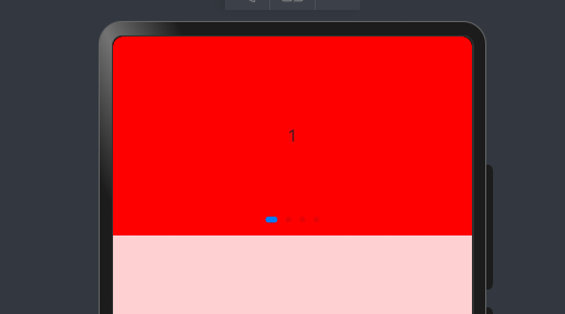
Swiper轮图
- 基本语法
/*
Swiper(){
  //内容
}.width("100%")
  .height(100)
  */

@Entry
@Component
struct Index {

  build() {
    Column(){
      Swiper(){
        Text("1").backgroundColor(Color.Red).textAlign(TextAlign.Center)
        Text("1").backgroundColor(Color.Yellow).textAlign(TextAlign.Center)
        Text("1").backgroundColor(Color.Gray).textAlign(TextAlign.Center)
        Text("1").backgroundColor(Color.Orange).textAlign(TextAlign.Center)

      }.width("100%").height(200)
    }.width("100%").height("100%").backgroundColor("#fffdd1d1")

  }
}
- 效果
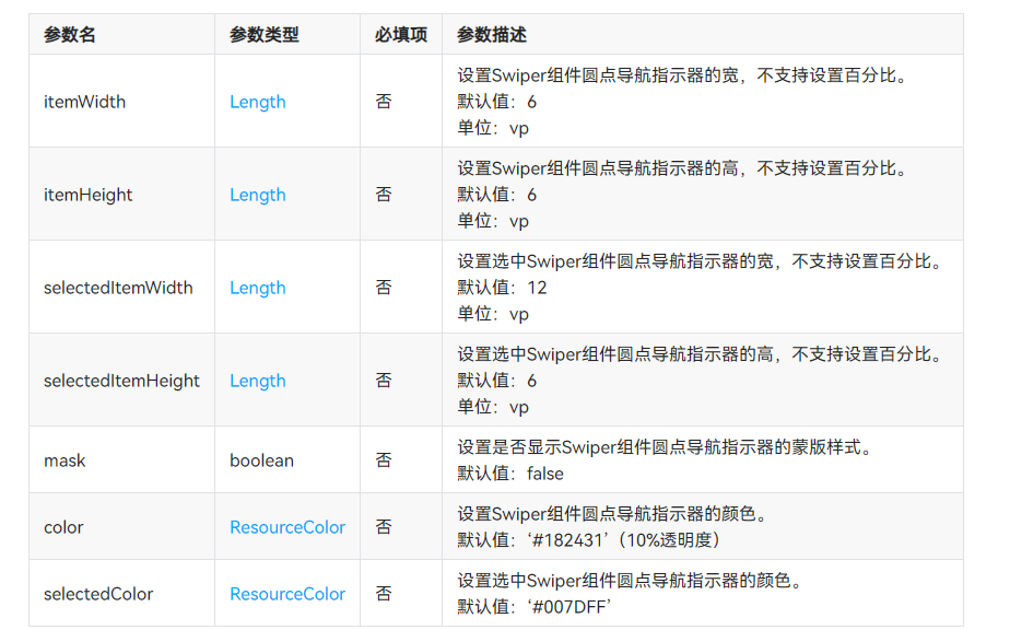
- 常用属性
/*
是否开启循环:loop(boolean)true
是否自动播放:autoPlay(boolean)false
自动播放时间间隔:interval(number)3000
纵向滚动轮播:vertical(boolean)false
*/
// 功能:每隔5秒纵向自动播放图片
@Entry
@Component
struct Index {

  build() {
    Column(){
      Swiper(){
       Image($r("app.media.hw"))
        Image($r("app.media.hos"))

      }.width("100%").height(200).loop(true).autoPlay(true).interval(5000).vertical(true)
    }.width("100%").height("100%").backgroundColor("#fffdd1d1")

  }
}
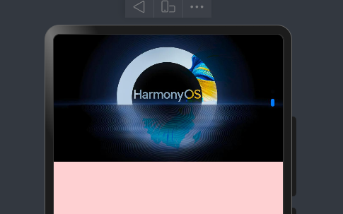
- 小圆点样式自定义
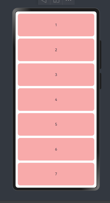
Scroll滚动
- 作用:当子组件的长度超过scroll,内容就可以滚动了。
- 核心用法
/*
基本参数:
滚动方向:默认纵向
scroll组件中,只支持一个子组件
需要设置scroll的尺寸
扩展:
快速创建任意长度的数组:Array.from({length:长度})
*/
@Extend(Column)
function ColumnExtend(color:ResourceColor){
  .width("100%").height("100%").backgroundColor(color)
}
@Builder
function TextItem(title:string){
  Text(title).borderRadius(10).textAlign(TextAlign.Center).padding(10).width("100%")
    .height(100).backgroundColor("#fff8a9a9")


}
@Entry
@Component
struct Index {
  build() {
    Column(){
      Scroll() {
        Column({ space: 10 }) {
          ForEach(Array.from({ length: 10 }), (item: string, index) => {
            TextItem((index + 1).toString())
          })
        }
       .width("100%").padding(10)
      }.width("100%").height("100%")
    }.ColumnExtend("#ffffffff")

  }
}
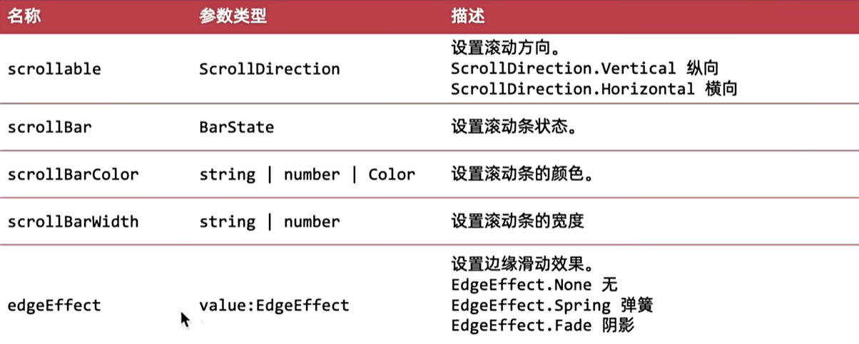
- 常见属性
@Extend(Column)
function ColumnExtend(color:ResourceColor){
  .width("100%").height("100%").backgroundColor(color)
}
@Builder
function TextItem(title:string){
  Text(title).borderRadius(10).textAlign(TextAlign.Center).padding(10).width("100%")
    .height(100).backgroundColor("#fff8a9a9")


}
@Entry
@Component
struct Index {
  build() {
    Column(){
      Scroll() {
        Column({ space: 10 }) {
          ForEach(Array.from({ length: 10 }), (item: string, index) => {
            TextItem((index + 1).toString())
          })
        }
       .width("100%").padding(10)
      }.width("100%").height("100%")
      .scrollBar(BarState.Auto) // 滑动显示,不滑动隐藏
      .scrollBarColor(Color.Black) // 滚动条颜色
      .scrollBarWidth(2) // 滚动条宽度
      .edgeEffect(EdgeEffect.Spring) // 弹框效果

    }.ColumnExtend("#ffffffff")

  }
}
- 控制器
/*
使用步骤:
1 实例化Scroller控制器  ( new 一个scroll对象)
2 绑定给Scroll组件
3 控制器方法控制滚动,属性控制距离
*/

import { AlertDialog } from '@ohos.arkui.advanced.Dialog'

@Extend(Column)
function ColumnExtend(color:ResourceColor){
  .width("100%").height("100%").backgroundColor(color)
}
@Builder
function TextItem(title:string){
  Text(title).borderRadius(10).textAlign(TextAlign.Center).padding(10).width("100%")
    .height(100).backgroundColor("#fff8a9a9")


}
@Entry
@Component
struct Index {
  scroll:Scroller= new Scroller() // 步骤一:new Scroller对象
  build() {
    Column(){

      Scroll(this.scroll) { // 2 绑定
        Column({ space: 10 }) {
          ForEach(Array.from({ length: 20 }), (item: string, index) => {
            TextItem((index + 1).toString())
          })
        }
       .width("100%").padding(10)
      }.width("100%").height("100%")
      .scrollBar(BarState.Auto) // 滑动显示,不滑动隐藏
      .scrollBarColor(Color.Black) // 滚动条颜色
      .scrollBarWidth(2) // 滚动条宽度
      .edgeEffect(EdgeEffect.Spring) // 弹框效果
      Image($r("app.media.ic_shangjiantou")).width(30).border({width:1,color:Color.Black}).borderRadius(15)
        .padding(5).position({
        x:290,y:700
      }).zIndex(999).onClick(()=>{
        this.scroll.scrollEdge(Edge.Top)
      })


    }.ColumnExtend("#ffffffff")

  }
}
- 事件
/*
onScroll((x,y)=>{
// 滚动时,实时触发,
})
*/
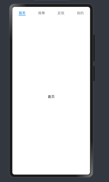
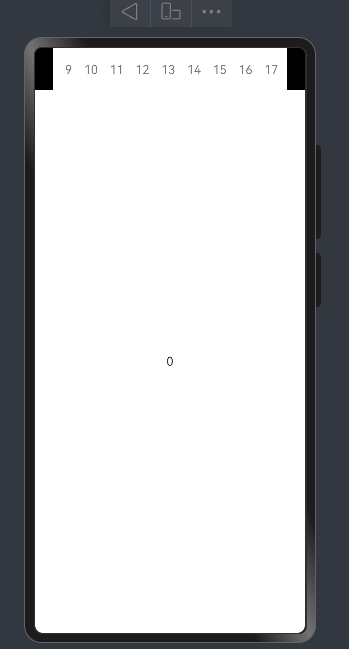
Tabs
- 基本使用
/*
TabContent(){} 内只能有一个字组件
*/

@Extend(Column)
function ColumnExtend(color:ResourceColor){
  .width("100%").height("100%").backgroundColor(color)
}

@Entry
@Component
struct Index {

  build() {
    Column(){
      Tabs(){

        TabContent(){
          Text("首页") // 子组件只能有一个
        }.tabBar("首页")
        TabContent(){
          Text("推荐")
        }.tabBar("推荐")
        TabContent(){
          Text("发现")
        }.tabBar("发现")
        TabContent(){
          Text("我的")
        }.tabBar("我的")


      }

    }.ColumnExtend("#ffffffff")

  }
}
- 常用属性
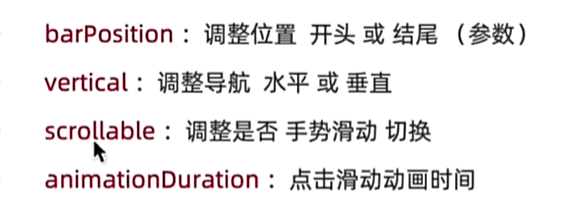
/*
第一个配置使用参数形式,其余都是属性方法
*/
import { AlertDialog } from '@ohos.arkui.advanced.Dialog'
@Extend(Column)
function ColumnExtend(color:ResourceColor){
.width("100%").height("100%").backgroundColor(color)
}
@Entry
@Component
struct Index {
build() {
Column(){
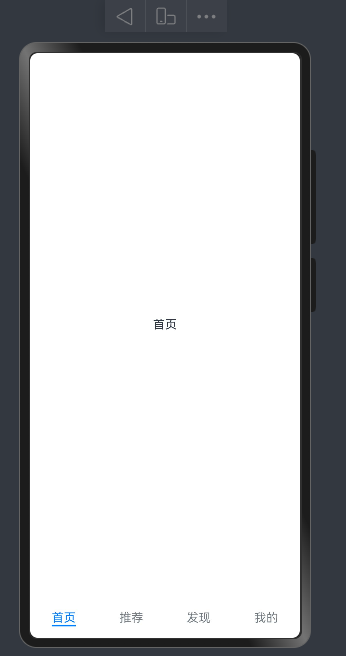
Tabs({barPosition:BarPosition.End}){
TabContent(){
Text("首页") // 子组件只能有一个
}.tabBar("首页")
TabContent(){
Text("推荐")
}.tabBar("推荐")
TabContent(){
Text("发现")
}.tabBar("发现")
TabContent(){
Text("我的")
}.tabBar("我的")
}.scrollable(true) // 手滑
.animationDuration(0) // 动画
}.ColumnExtend("#ffffffff")
}
}
- 滚动导航栏
/*
添加属性:.barMode(BarMode.Scrollable)
*/
@Extend(Column)
function ColumnExtend(color:ResourceColor){
  .width("100%").height("100%").backgroundColor(color)
}

@Entry
@Component
struct Index {

  build() {
    Column(){
      Tabs({barPosition:BarPosition.Start}){
      ForEach(Array.from({length:100}),(item:string,index)=>{
          TabContent(){
            Text(index.toString())
          }.tabBar(index.toString())
      })
      }.scrollable(true) // 手滑
      .animationDuration(0) // 动画
      .barMode(BarMode.Scrollable)
    }.ColumnExtend("#ffffffff")


  }
}
- 自定义TabBar栏
/*
基础结构
自定义导航栏就是使用@Builder重新编写导航栏组件

*/
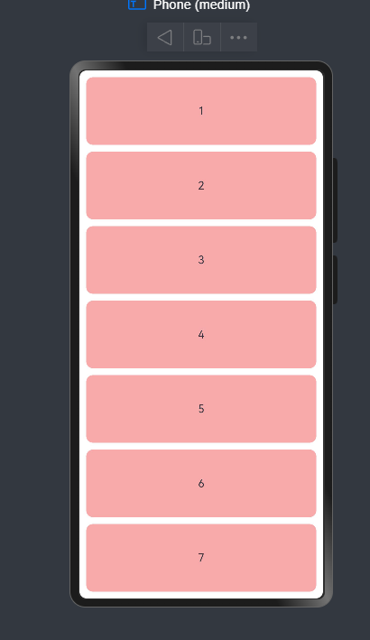
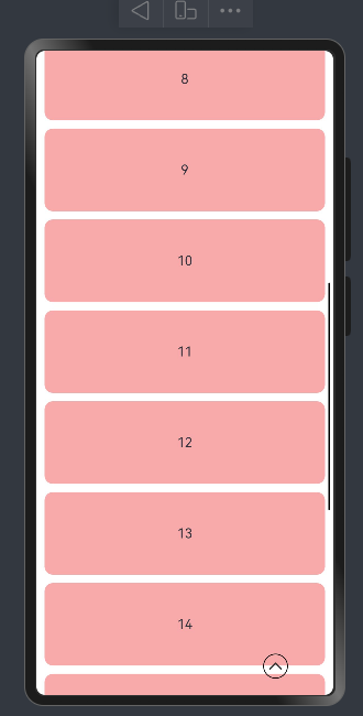
二、案例
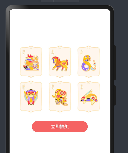
生肖抽卡
扩展知识
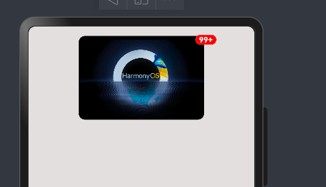
Badge角标组件
- 语法
@Entry
@Component
struct Index {
  build() {
    Column(){
    Badge({
      count:111, // 次数,超过100 变为99+
      position:BadgePosition.RightTop, // 三个方向:
      style:{ // 角标样式
        fontSize:12,
        fontWeight:700,
        badgeColor:Color.Red
    }
    }){
      Image($r("app.media.hos")).width(200).borderRadius(10)
    }
    }.width("100%").height("100%").backgroundColor("#ffe3dfdf").padding(15)


  }
}
- 效果
Grid布局
- 场景:常用于 有规则的布局
- 语法:
@Entry
@Component
struct Index {
  build() {
    Column(){
    Grid(){
        ForEach([0,1,2,3,4,5],(item:number,index)=>{
          GridItem(){
            Image($r(`app.media.img_0${item}`)).width(80)
          }
        })
    }.width("100%").height(300)
      .rowsTemplate("1fr 1fr").columnsTemplate("1fr 1fr 1fr")
      .margin({top:100})
      .padding(25)
      Button("立即抽奖").width(200).backgroundColor("#fff66363")
    }

  }
}
- 效果:
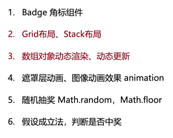
涉及知识点及注意点
// 知识
1.badge角标组件
2.grid布局,stack布局
3.数组对象动态渲染,动态更新
4.遮罩层动画,图像动画效果animation
5.随机抽奖math.random,math.floor
6.假设成立法,判断是否中奖
// 注意点:
鸿蒙对象数组在修改某一个对象的值时,需要将整个对象重新赋值页面才会重新渲染新数据。
实现效果图
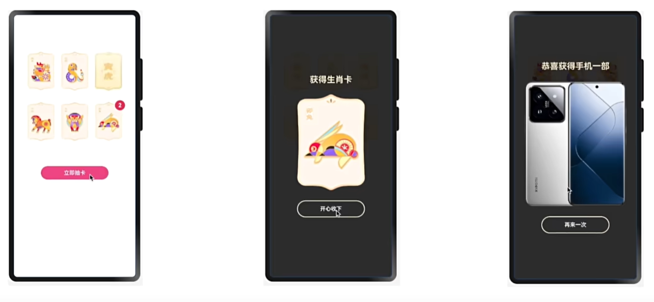
代码
interface Animal{
   id:number,
   name:string,
   goodNum:number,
  url:string, url1:string
}
@Entry
@Component
struct Index {
@State pageStatus:number=0
  @State pagw2Title:string= "获取的生肖卡"
  @State randomNum:number=0
  @State sum:number=0
@State animals:Animal[]=[
  { id:1, name:"龙", goodNum:0, url:"app.media.img_00" ,url1:"app.media.bg_00"},
  { id:2, name:"马", goodNum:0, url:"app.media.img_01" ,url1:"app.media.bg_01"},
  { id:3, name:"蛇", goodNum:0, url:"app.media.img_02" ,url1:"app.media.bg_02"},
  { id:4, name:"牛", goodNum:0, url:"app.media.img_03" ,url1:"app.media.bg_03"},
  { id:5, name:"虎", goodNum:0, url:"app.media.img_04",url1:"app.media.bg_04"},
  { id:6, name:"兔", goodNum:0, url:"app.media.img_05" ,url1:"app.media.bg_05"}
]
  build() {
   Stack(){

     // page1
       Column(){
         Grid(){
           ForEach(this.animals,(item:Animal,index)=>{
             GridItem(){
               Badge({
                 count:item.goodNum,
                 position:BadgePosition.RightTop,
                 style:{
                   fontSize:12,
                   badgeSize:20,
                   badgeColor:Color.Red
                 }
               }){
                 Image($r(item.url1)).width(80)
               }
             }
           })
         }.width("100%").height(300)
         .rowsTemplate("1fr 1fr").columnsTemplate("1fr 1fr 1fr")
         .margin({top:100})
         .padding(25)

         Button("立即抽奖").width(200).backgroundColor("#fff66363").onClick(()=>{
           this.sum=0
           for (let item of this.animals) {
             if (item.goodNum > 0) {
               this.sum+=1
             }

           }
           if(this.sum==6){
             this.pageStatus=2
             this.pagw2Title= `恭喜获得手机一台`

           }else{
             this.pageStatus = 1
             this.randomNum = Math.floor(Math.random()*6)
             console.log("result=>>",this.randomNum)
             this.pagw2Title= `获取生肖${this.animals[this.randomNum].name}卡`
           }


         })
       }.width("100%").height("100%")

     if(this.pageStatus==1){
       //page2
       Column({space:30}){
         Text(this.pagw2Title).fontSize(24).fontWeight(700).fontColor("#ffe3d7b2")
         Image($r(this.animals[this.randomNum].goodNum==0?this.animals[this.randomNum].url:this.animals[this.randomNum].url1)).width(200)
           Button("开心收下").width(160).backgroundColor(Color.Transparent)
             .border({width:2,color:"#ffd0cdcd"}).onClick(()=>{
             this.pageStatus= 0
             this.animals[this.randomNum]={
               id:this.randomNum+1,
               name:  this.animals[this.randomNum].name,
               goodNum:  this.animals[this.randomNum].goodNum+1
             , url:"app.media.img_0" +this.randomNum
             ,url1:"app.media.img_0"+this.randomNum
             }
             // this.animals[this.randomNum].url=  this.animals[this.randomNum].url1
             console.log( JSON.stringify( this.animals[this.randomNum]))
          //   this.animals=this.animals
           })
       }.width("100%").height("100%").backgroundColor("#cc000000").justifyContent(FlexAlign.Center)

     }else if(this.pageStatus==2){
       //page3
       Column({space:30}){
         Text(this.pagw2Title).fontSize(24).fontWeight(700).fontColor("#ffe3d7b2")
         Image($r("app.media.xm")).width(400)
         Button("再来一次").width(160).backgroundColor(Color.Transparent)
           .border({width:2,color:"#ffd0cdcd"}).onClick(()=>{
           this.pageStatus= 0

           this.animals=

             [
               { id:1, name:"龙", goodNum:0, url:"app.media.img_00" ,url1:"app.media.bg_00"},
               { id:2, name:"马", goodNum:0, url:"app.media.img_01" ,url1:"app.media.bg_01"},
               { id:3, name:"蛇", goodNum:0, url:"app.media.img_02", url1:"app.media.bg_02"},
               { id:4, name:"牛", goodNum:0, url:"app.media.img_03" ,url1:"app.media.bg_03"},
               { id:5, name:"虎", goodNum:0, url:"app.media.img_04", url1:"app.media.bg_04"},
               { id:6, name:"兔", goodNum:0 ,url:"app.media.img_05" ,url1:"app.media.bg_05"}
             ]

         })
       }.width("100%").height("100%").backgroundColor("#cc000000").justifyContent(FlexAlign.Center)

     }


   }

  }
}
小米轮播
- 实现效果
/*
宽高比=宽/高
属性:aspectRatio()

  */

@Entry
@Component
struct Index {
  build() {
    Column(){
      Swiper(){
        Image($r("app.media.ic_swiper_xmyp01")).borderRadius(10)
        Image($r("app.media.ic_swiper_xmyp02")).borderRadius(10)
        Image($r("app.media.ic_swiper_xmyp03")).borderRadius(10)
        Image($r("app.media.ic_swiper_xmyp04")).borderRadius(10)
      }.width("100%").aspectRatio(2.4).loop(true).autoPlay(true).interval(5000).padding(2).borderRadius(10)
      .indicator(
        Indicator.dot()
          // 默认
          .itemWidth(15)
          .itemHeight(4)
          .color("#80737272")
          // 选中
          .selectedItemWidth(30)
          .selectedItemHeight(4)
          .selectedColor("#ffffffff")
      )

    }.width("100%").height("100%").backgroundColor("#ffe7dddd")

  }
}

点图标回到顶部
import { AlertDialog } from '@ohos.arkui.advanced.Dialog'

@Extend(Column)
function ColumnExtend(color:ResourceColor){
  .width("100%").height("100%").backgroundColor(color)
}
@Builder
function TextItem(title:string){
  Text(title).borderRadius(10).textAlign(TextAlign.Center).padding(10).width("100%")
    .height(100).backgroundColor("#fff8a9a9")


}
@Entry
@Component
struct Index {
  @State status :boolean =false
  scroll:Scroller= new Scroller() // 步骤一:new Scroller对象
  build() {
    Column(){

      Scroll(this.scroll) { // 2 绑定
        Column({ space: 10 }) {
          ForEach(Array.from({ length: 20 }), (item: string, index) => {
            TextItem((index + 1).toString())
          })
        }
       .width("100%").padding(10)
      }.width("100%").height("100%")
      .scrollBar(BarState.Auto) // 滑动显示,不滑动隐藏
      .scrollBarColor(Color.Black) // 滚动条颜色
      .scrollBarWidth(2) // 滚动条宽度
      .edgeEffect(EdgeEffect.Spring) // 弹框效果
      .onScroll((x,y)=>{

        if(this.scroll.currentOffset().yOffset>150){
          this.status = true
        }else{
          this.status=false
        }

      })
      if(this.status){
        Image($r("app.media.ic_shangjiantou")).width(30).border({width:1,color:Color.Black}).borderRadius(15)
          .padding(5).offset({x:110,y:-50}).zIndex(999).onClick(()=>{
          this.scroll.scrollEdge(Edge.Top)
        })
      }
    }.ColumnExtend("#ffffffff")

  }
}
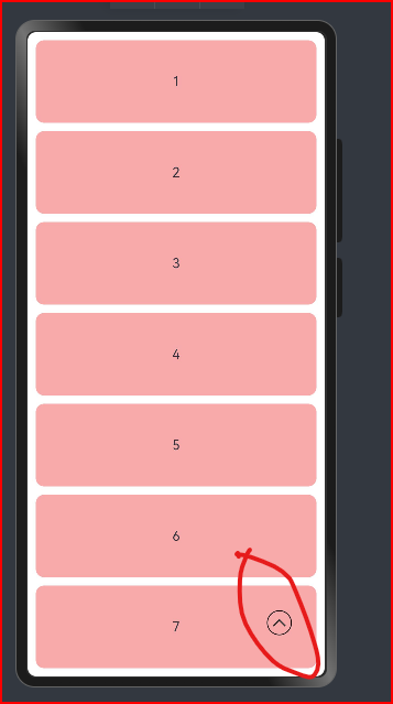
- 实现效果:
- 滚动到大于150显示图标,点击图标滚动到最顶部
自定义导航栏切换
效果:点击导航标题时,切换到对应的页面,并修改当前页面导航的状态。
@Entry
@Component
struct Index {
  @State iconIndex:number = 0
  @Builder
  centerBuilder(){
    Image($r("app.media.flower")).width(40)
  }
  @Builder
  tabBarItem(numIndex:number,title:string,icon:ResourceStr,selectIcon:ResourceStr){
    Column(){
      Image(this.iconIndex==numIndex? icon :selectIcon).width(30)
      Text(title).fontColor(this.iconIndex==numIndex? "#ffe99607" :Color.Black)
    }
  }
  build() {
      Tabs({barPosition:BarPosition.End}){
        TabContent(){
          Text("内容1")
        }.tabBar(this.tabBarItem(0,"首页",$r("app.media.ic_tabbar_icon_0_selected"),$r("app.media.ic_tabbar_icon_0")))
        TabContent(){
          Text("内容2")
        }.tabBar(this.tabBarItem(1,"分类",$r("app.media.ic_tabbar_icon_1_selected"),$r("app.media.ic_tabbar_icon_1")))

        TabContent(){
          Text("内容3")
        }.tabBar(this.centerBuilder())
        TabContent(){
          Text("内容4")
        }.tabBar(this.tabBarItem(3,"购物车",$r("app.media.ic_tabbar_icon_1_selected"),$r("app.media.ic_tabbar_icon_2")))
        TabContent(){
          Text("内容5")
        }.tabBar(this.tabBarItem(4,"我的",$r("app.media.ic_tabbar_icon_3_selected"),$r("app.media.ic_tabbar_icon_3")))
      }
    .onChange((index)=>{
        this.iconIndex= index
    })

  }
}


 2345
2345


 被折叠的 条评论
为什么被折叠?
被折叠的 条评论
为什么被折叠?
 到【灌水乐园】发言


