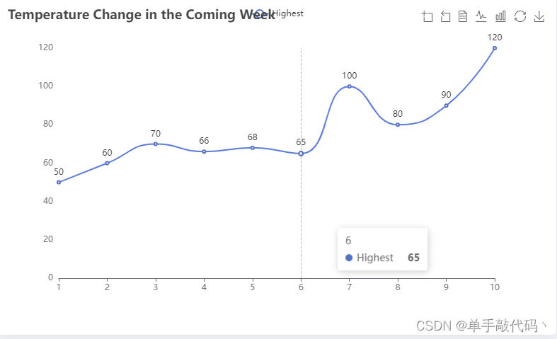
1、效果图
2、代码
option = {
  title: {
    text: 'Temperature Change in the Coming Week'
  },
  tooltip: {
    trigger: 'axis'
  },
  legend: {},
  toolbox: {
    show: true,
    feature: {
      dataZoom: {
        yAxisIndex: 'none'
      },
      dataView: { readOnly: false },
      magicType: { type: ['line', 'bar'] },
      restore: {},
      saveAsImage: {}
    }
  },
  xAxis: {
    type: 'category',
    boundaryGap: false,
    data: ['1', '2', '3', '4', '5', '6', '7', '8', '9', '10']
  },
  yAxis: {
    type: 'value',
    axisLabel: {
      formatter: '{value}'
    },
    splitLine: {
      show: false
    }
  },
  series: [
    {
      name: 'Highest',
      type: 'line',
      data: [50, 60, 70, 66, 68, 65, 100,80,90,120],
      smooth: true,


     label: {
          show: true,
          position: 'top', // 标签位置在顶部
          formatter: '{c}' // 显示数据点的值
      },
      labelLine: {
        show: true // 显示从数据点到 X 轴的线
      }
    },
  ]
};


 被折叠的 条评论
为什么被折叠?
被折叠的 条评论
为什么被折叠?
 到【灌水乐园】发言


