


从网上下载数据,并将数据进行可视化
读取文件头,第一行
import csv
with open("sitka_weather_07-2018_simple.csv") as sw:
    reader = csv.reader(sw)
    header_row = next(reader)#调用next()并将阅读器对象传递给它时,它将返回文件中的下一行
print(header_row)

#打印文件头及其位置
import csv
with open("sitka_weather_07-2018_simple.csv") as sw:
    reader = csv.reader(sw)
    header_row = next(reader)
    for index, column_header in enumerate(header_row):
        print(index, column_header)

#提取并读取数据
import csv
with open("sitka_weather_07-2018_simple.csv") as sw:
    reader = csv.reader(sw)
    header_row = next(reader)#把这一行去掉后就会连第一行打印出来
    highs = []
    for row in reader:
        highs.append(row[5])
    print(highs)

#将读取的字符串转换成整型数字,可以计算
import csv
with open("sitka_weather_07-2018_simple.csv") as sw:
    reader = csv.reader(sw)
    header_row = next(reader)
    highs = []
    for row in reader:
        high = int(row[5])
        highs.append(high)
    print(highs)

#绘制图表
import csv
from matplotlib import pyplot as plt
filename = "sitka_weather_07-2018_simple.csv"
with open(filename) as f:
    f_copy = csv.reader(f)#将f文件存储在f_copy中调用
    header_row = next(f_copy)
    temmax = []
    for row in f_copy:
        temmax.append(int(row[5]))
    print(temmax)

plt.plot(temmax, c = "red")
plt.title("Daily Highest Temp", fontsize = 24)
plt.ylabel = ("Temp")
plt.xlabel = ("Date")
#plt.figure(dpi = 256, figuresize = (10,6))#传递分辨率,及窗口大小
plt.tick_params(axis="both", which="major", labelsize=16)
plt.show()


#画图
import csv
from matplotlib import pyplot as plt
from datetime import datetime

# 从文件中获取最高气温
filename = 'sitka_weather_2018_full.csv'
with open(filename) as f:
  reader = csv.reader(f)
  header_row = next(reader)
  print(header_row)
  dates, highs , lows = [], [], []
  for row in reader:
    current_date = datetime.strptime(row[2], "%Y/%m/%d")#提取时间
    dates.append(current_date)
    highs.append(int(row[8]))
    lows.append(int(row[9]))
  print(highs)
  print(lows)
  print(dates)

# 根据数据绘制图形
fig = plt.figure(dpi=128, figsize=(10, 6))
plt.plot(dates, highs, c='red', alpha=0.5)
plt.plot(dates, lows, c="blue", alpha=0.5)#指定颜色透明度
plt.fill_between(dates, highs, lows, facecolor="blue", alpha=0.1)#设置填充

# 设置图形的格式
plt.title("Daily high and low temperatures", fontsize=24)
plt.xlabel('Date', fontsize=16)
plt.ylabel("Temperature(F)", fontsize=16)
plt.tick_params(axis='both', which='major', labelsize=16)
fig.autofmt_xdate()#横坐标日期倾斜
plt.show()
折线图
#简单的折线图
import matplotlib.pyplot as plt#导入pyplot,一个包含很多函数的模块
squares = [1,4,9,16,25]#创建列表
plt.plot(squares)#将列表传递给plot函数
plt.show()#显示绘制的图形

#修改标签文字与线条粗细
import matplotlib.pyplot as plt#导入pyplot,一个包含很多函数的模块
squares = [1,4,9,16,25]#创建列表
plt.plot(squares, linewidth=5)#设置线的宽度
plt.title("Square Numbers", fontsize=24)#标题
plt.xlabel("Value", fontsize=14)#坐标轴
plt.ylabel("Square Value", fontsize=14)
plt.tick_params(axis="both", labelsize=14)#设置刻度的样式
plt.show()#显示绘制的图形

#校正图形
import matplotlib.pyplot as plt#导入pyplot,一个包含很多函数的模块
value = [1,2,3,4,5]
squares = [1,4,9,16,25]#创建列表
plt.plot(value, squares, linewidth=5)#横纵坐标值,并设置线的宽度
plt.title("Square Numbers", fontsize=24)#标题
plt.xlabel("Value", fontsize=14)#坐标轴
plt.ylabel("Square", fontsize=14)
plt.tick_params(axis="both", labelsize=14)#设置刻度的样式
plt.show()#显示绘制的图形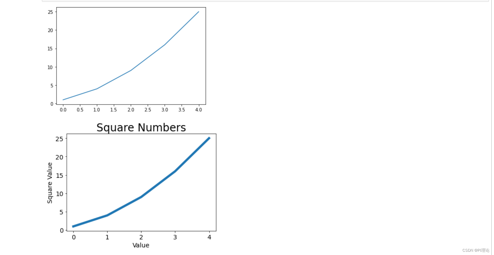
散点图
绘制散点图
import matplotlib.pyplot as plt
#plt.scatter(2, 4, s=200)#s是点的尺寸,绘制一个点
xvalue = [1,2,3,4,5]
yvalue = [1,4,9,16,25]
plt.scatter(xvalue, yvalue, s=100)#s是点的尺寸,绘制一个点
plt.title("Square Numbers", fontsize=24)
plt.xlabel("value", fontsize=14)
plt.ylabel("Square", fontsize=14)
plt.tick_params(axis="both", which="major", labelsize=14)#对xy两个轴进行相同处理,只显示主刻度
plt.show()

自动计算数据
import matplotlib.pyplot as plt
#plt.scatter(2, 4, s=200)#s是点的尺寸,绘制一个点
xvalue = list(range(1,1001))
yvalue = [x**2 for x in xvalue]
plt.scatter(xvalue, yvalue, s=10)#s是点的尺寸,绘制一个点
plt.title("Square Numbers", fontsize=24)
plt.xlabel("value", fontsize=14)
plt.ylabel("Square", fontsize=14)
plt.axis([0,1100,0,1100000])
plt.tick_params(axis="both", which="major", labelsize=14)#对xy两个轴进行相同处理,只显示主刻度
plt.show()

#删除数据点的轮廓,去掉线的黑色轮廓,使点更加的清晰,自定义颜色,只要在scatter里面添加形参就可以
#c="red",c=(0,0,0.8)渐变的颜色效果,使用参数cmap=plt.cm.bules
import matplotlib.pyplot as plt
#plt.scatter(2, 4, s=200)#s是点的尺寸,绘制一个点
xvalue = list(range(1,1001))
yvalue = [x**2 for x in xvalue]
plt.scatter(xvalue, yvalue, s=10, edgecolor="none", c= yvalue, cmap=plt.cm.Blues)#s是点的尺寸,绘制一个点
plt.title("Square Numbers", fontsize=24)
plt.xlabel("value", fontsize=14)
plt.ylabel("Square", fontsize=14)
plt.axis([0,1100,0,1100000])
plt.tick_params(axis="both", which="major", labelsize=14)#对xy两个轴进行相同处理,只显示主刻度
plt.show()
#自动保存图表,第一个指定文件名(python的工作路径下),第二个裁掉图的空白区域
plt.savefig('squares_plot.png', bbox_inches='tight')


 139
139


 被折叠的 条评论
为什么被折叠?
被折叠的 条评论
为什么被折叠?
 到【灌水乐园】发言


