


6.CSS3 的动画
6.1 @keyframes 关键帧
使用动画之前必须先定义关键帧,一个关键帧表示动画过程中的一个状态。在CSS3中,@keyframes规则用于创建动画。在@keyframes中规定某项CSS样式,就能创建由当前样式逐渐变为新样式的动画效果
<!DOCTYPE html>
<html lang="en">
<head>
    <meta charset="UTF-8">
    <meta http-equiv="X-UA-Compatible" content="IE=edge">
    <meta name="viewport" content="width=device-width, initial-scale=1.0">
    <title>@keyframes</title>
    <link rel="stylesheet" href="./style20.css">
</head>
<body>
    <div class="rect1"></div>
    <div class="rect2"></div>
    <div class="rect3"></div>
</body>
</html>
CSS 设置盒子不断地围绕浏览器运动的动画,运动过程可以向不同方向行进和变换颜色
.rect1 {
    width: 100px;
    height: 100px;
    background-color: red;
    position: fixed;
    /* 加上动画 mymove,执行两秒 反复执行  */
    animation: mymove1 2s infinite;
}

@keyframes mymove1 {
    from {
        top: 0;
        left: 20%;
    }

    to {
        top: 0;
        left: 80%;
    }
}

.rect2 {
    width: 100px;
    height: 100px;
    background-color: red;
    position: fixed;
    /* 加上动画 mymove,执行两秒 反复执行  */
    animation: mymove2 2s infinite;
}

@keyframes mymove2 {
    0% {
        top: 0;
        left: 20%;
    }

    25% {
        top: 0;
        left: 80%;
    }

    50% {
        top: 80%;
        left: 80%;
    }

    75% {
        top: 80%;
        left: 20%;
    }

    100% {
        top: 0;
        left: 20%;
    }
}

.rect3 {
    width: 100px;
    height: 100px;
    border-radius: 50%;
    background-color: red;
    position: fixed;
    /* 加上动画 mymove,执行两秒 反复执行  */
    animation: mymove3 5s infinite;
}

@keyframes mymove3 {
    0% {
        top: 0;
        left: 20%;
        background-color: red;
    }

    25% {
        top: 0;
        left: 80%;
        background-color: blue;
    }

    50% {
        top: 80%;
        left: 80%;
        background-color: green;
    }

    75% {
        top: 80%;
        left: 20%;
        background-color: black;
    }

    100% {
        top: 0;
        left: 20%;
        background-color: red;
    }
}
6.2 animation复合属性
| 值 | 描述 |
|---|---|
| animation-name | 引入哪个动画 |
| animation-duration | 动画持续多少秒 |
| animation-timing-function | 动画持续速度 |
| animation-delay | 动画延迟多少秒开始 |
| animation-iteration-count | 动画循环次数 |
| animation-direction | 动画 normal 正常 或者 alternate 反着回来 |
<!DOCTYPE html>
<html lang="en">
<head>
    <meta charset="UTF-8">
    <meta http-equiv="X-UA-Compatible" content="IE=edge">
    <meta name="viewport" content="width=device-width, initial-scale=1.0">
    <title>animation复合属性</title>
    <link rel="stylesheet" href="./style21.css">
</head>
<body>
    <div class="rect"></div>
</body>
</html>
.rect {
    width: 100px;
    height: 100px;
    border-radius: 50%;
    background-color: red;
    position: fixed;
    /* 引入哪个动画 */
    animation-name: mymove;
    /* 动画持续多少秒 */
    animation-duration: 3s;
    /* 动画持续速度 */
    animation-timing-function: ease;
    /* 动画延迟多少秒开始 */
    animation-delay: 1s;
    /* 动画循环次数 */
    animation-iteration-count: 3;
    /* 动画 normal 正常 或者 alternate 反着回来 */
    animation-direction: alternate;

    /* 复合写法 */
    /* animation: mymove 3s 3 ; */
}

@keyframes mymove {
    0% {
        top: 0;
        left: 20%;
        background-color: red;
    }

    25% {
        top: 0;
        left: 80%;
        background-color: blue;
    }

    50% {
        top: 80%;
        left: 80%;
        background-color: green;
    }

    75% {
        top: 80%;
        left: 20%;
        background-color: black;
    }

    100% {
        top: 0;
        left: 20%;
        background-color: red;
    }
}
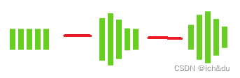
6.3 加载loading动画实现
<!DOCTYPE html>
<html lang="en">
<head>
    <meta charset="UTF-8">
    <meta http-equiv="X-UA-Compatible" content="IE=edge">
    <meta name="viewport" content="width=device-width, initial-scale=1.0">
    <title>加载loading动画实现</title>
    <link rel="stylesheet" href="./style22.css">
</head>
<body>
    <div class="spinner">
        <div></div>
        <div></div>
        <div></div>
        <div></div>
        <div></div>
    </div>
</body>
</html>
.spinner {
    margin: 100px auto;
    width: 60px;
    height: 60px;
    text-align: center;
    font-size: 10px;
}

.spinner > div {
    background-color: #67cf22;
    height: 100%;
    width: 6px;
    display: inline-block;
    animation: mymove 1.2s infinite ease-in-out;
}

.spinner > div:nth-child(2) {
    animation-delay: -1.1s;
}

.spinner > div:nth-child(3) {
    animation-delay: -1.0s;
}

.spinner > div:nth-child(4) {
    animation-delay: -0.9s;
}

.spinner > div:nth-child(5) {
    animation-delay: -0.8s;
}

@keyframes mymove {
    0%,40%,100% {transform: scaleY(0.4);}
    20% {transform: scaleY(1);}
}
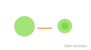
6.4 加载loading动画实现案例
<!DOCTYPE html>
<html lang="en">
<head>
    <meta charset="UTF-8">
    <meta http-equiv="X-UA-Compatible" content="IE=edge">
    <meta name="viewport" content="width=device-width, initial-scale=1.0">
    <title>加载loading动画实现案例</title>
    <link rel="stylesheet" href="./style23.css">
</head>
<body>
    <div class="spinner">
        <div></div>
        <div></div>
    </div>
</body>
</html>
.spinner {
    width: 60px;
    height: 60px;
    position: relative;
    margin: 100px auto;
}

.spinner > div {
    width: 100%;
    height: 100%;
    border-radius: 50%;
    background-color: #67cf22;
    opacity: 0.6;
    position: absolute;
    top: 0px;
    left: 0px;
    animation: mymove 2.0s infinite ease-in-out;
}

.spinner > div:nth-child(2) {
    animation-delay: -1s;
}

@keyframes mymove {
    0%,100% {transform: scale(0.0);}
    50% {transform: scale(1.0);}
}


 1万+
1万+


 被折叠的 条评论
为什么被折叠?
被折叠的 条评论
为什么被折叠?
 到【灌水乐园】发言


