


伪元素
span::before {
    content: "杰伦";
    position: absolute;
    left: 0;
    top: 100px;
    display: inline-block;
    width: 100px;
    height: 100px;
    background-color: red;
}

span::after {
    content: ",是的,的确是这样";
}

下面是用伪元素选择器解决前面的清除浮动问题而不改动html结构:
注意:当要用到clear时,元素必须为块级元素
<div class="wrapper">
        <div class="content">1</div>
        <div class="content">2</div>
        <div class="content">3</div>
</div>
.wrapper {
    border: 1px solid black;
}

.content {
    float: left;
    color: #259876;
    background-color: #fbe;
    width: 100px;
    height: 100px;
}

.wrapper::after {
    content: "";
    clear: both;
    display: block;
}

position:abolute;float:left/right
打内部把元素转换成inline-block
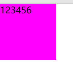
span {
    position: absolute;
    width: 100px;
    height: 100px;
    background-color: fuchsia;
}
下面用浮动模型做出淘宝一个小导航条案例
<ul class="nav">
        <li class="list-item">
            <a href="#">天猫</a>
        </li>
        <li class="list-item">
            <a href="#">聚划算</a>
        </li>
        <li class="list-item">
            <a href="#">天猫超市</a>
        </li>
    </ul>
* {
    margin: 0;
    padding: 0;
    color: #424242;
    font-family: Arial;
}

a {
    text-decoration: none;
}

.nav::after {
    content: "";
    display: block;
    clear: both;
}

.nav {
    list-style: none;
}

.nav .list-item {
    float: left;
    margin: 0 10px;
    height: 30px;
    line-height: 30px;
}

.nav .list-item a {
    padding: 0 5px;
    color: #f40;
    font-weight: bold;
    height: 30px;
    display: inline-block;
    border-radius: 15px;
}

.nav .list-item a:hover {
    background-color: #f40;
    color: #fff;
}


 110
110


 被折叠的 条评论
为什么被折叠?
被折叠的 条评论
为什么被折叠?
 到【灌水乐园】发言


