


前端之弹性盒子布局
正常布局流
- 改变元素尺寸要display:block 或 inline-block;
- 相邻元素,margin重叠,大者保存,小者消失 — 这被称为外边距叠加。
弹性盒子
- 弹性盒子是一种用于按行或按列布局元素的一维布局方法 。
- 膨胀, 填充额外空间; 收缩, 适应更小空间
<!DOCTYPE html>
<html lang="en">

<head>
    <meta charset="UTF-8">
    <meta http-equiv="X-UA-Compatible" content="IE=edge">
    <meta name="viewport" content="width=device-width, initial-scale=1.0">
    <title>Flexbox</title>
    <link rel="stylesheet" href="./styles//flexbox.css">
</head>

<body>
    <header>
        <h1>Sample flexbox example</h1>
    </header>

    <section>
        <article>
            <h2>First article</h2>

            <p>Tacos actually microdosing, pour-over semiotics banjo chicharrones retro fanny pack portland everyday carry vinyl typewriter. Tacos PBR&B pork belly, everyday carry ennui pickled sriracha normcore hashtag polaroid single-origin coffee cold-pressed.
                PBR&B tattooed trust fund twee, leggings salvia iPhone photo booth health goth gastropub hammock.</p>
        </article>

        <article>
            <h2>Second article</h2>

            <p>Tacos actually microdosing, pour-over semiotics banjo chicharrones retro fanny pack portland everyday carry vinyl typewriter. Tacos PBR&B pork belly, everyday carry ennui pickled sriracha normcore hashtag polaroid single-origin coffee cold-pressed.
                PBR&B tattooed trust fund twee, leggings salvia iPhone photo booth health goth gastropub hammock.</p>
        </article>

        <article>
            <h2>Third article</h2>

            <p>Tacos actually microdosing, pour-over semiotics banjo chicharrones retro fanny pack portland everyday carry vinyl typewriter. Tacos PBR&B pork belly, everyday carry ennui pickled sriracha normcore hashtag polaroid single-origin coffee cold-pressed.
                PBR&B tattooed trust fund twee, leggings salvia iPhone photo booth health goth gastropub hammock.</p>

            <p>Cray food truck brunch, XOXO +1 keffiyeh pickled chambray waistcoat ennui. Organic small batch paleo 8-bit. Intelligentsia umami wayfarers pickled, asymmetrical kombucha letterpress kitsch leggings cold-pressed squid chartreuse put a bird
                on it. Listicle pickled man bun cornhole heirloom art party.</p>
        </article>
    </section>
</body>

</html>
<style>
/* General styles
-------------------------------------------------- */

html {
    font-family: sans-serif;
}

body {
    margin: 0;
}

header {
    background: purple;
    height: 100px;
}

h1 {
    text-align: center;
    color: white;
    line-height: 100px;
    margin: 0;
}

article {
    padding: 10px;
    margin: 10px;
    background: aqua;
}

</style>

display:flex

指定父元素section为弹性布局
内部每一个article都是 flex item,每个都会是等宽高

网页实例
换行(父)
flex-direction

flex: 200px; 每个item的宽度至少是200px; 剩余部分拉伸匀分.
flex-wrap(父)

flex(子)
用于设置或检索弹性盒模型对象的子元素如何分配空间。
flex:200px每个flex item元素的宽度至少是200px;
flex-flow
<style>
flex-direction: row;
flex-wrap: wrap;

/* 等价于 */
flex-flow: row wrap;
</style>
flex item的动态尺寸
nth-of-type()
父容器中指定选择器类型的第n个元素:
<style>
article:nth-of-type(3) {
	/* 占等份中的两份 */
    flex: 2;
}
</style>
flex
 数字,规定项目相对于其余flex item的增长量。
数字,相对于其余flex item的收缩量。用于溢出容器的 flex 项,相当于一个高级的弹性盒子.
最小值.
建议不要使用全写属性,建议用flex.
指定flex item的最小值
占等比的两份,最小宽度是200px
<style>
article:nth-of-type(3) {
  flex: 2 200px;
}
</style>

水平和垂直对齐
为了整洁,灵活的按钮/工具栏, 冲
align-item
flex布局中的 flex item 的在纵轴的对齐方式.

justify-content
在弹性盒对象的 div 元素中的各项周围留有空白:
flex布局中的 flex item 的在横轴的对齐方式.

flex item 排序
所有 flex 项默认的 order 值是 0。
flex item设置order属性后会从小到大排列(可正可负).
flex 嵌套
父容器
<style>
section {
    /* 弹性布局 -- 每个 */
    display: flex;
    /* row:所有flex item 都排成一行 */
    /* wrap:当页面缩小时, 允许越界换行*/
    flex-flow: row wrap;
}
</style>
还可以加入
<style>
    /* 纵向位置:居中 */
    align-items: center;
    /* 横向位置: */
    justify-content: space-around;
</style>
子容器 – flex item
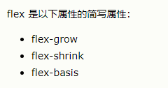
flex:flex-grow, flex-shrink, flex-basis;
0:固定,不放大缩小
1:占均分的一份;也可以占2份
这个flex-basis是设置固定宽度的
<style>
button {
    /* 占一份,大小可变*/
 /* 0:不放大缩小;1,放大缩小且均分 */
    flex: 1 auto;
}
</style>


 1351
1351


 被折叠的 条评论
为什么被折叠?
被折叠的 条评论
为什么被折叠?
 到【灌水乐园】发言


