


一、基础概念
不使用css时设置表格背景色,需要给每个td都加上bgcolor属性
<table border="1">
  <tr >
      <td bgcolor="gray" >1</td>
      <td bgcolor="gray">2</td>
  </tr>
    <tr>
      <td  bgcolor="gray">3</td>
      <td  bgcolor="gray">4</td>
  </tr>
    <tr>
      <td  bgcolor="gray">a</td>
      <td  bgcolor="gray">b</td>
  </tr>
  </table>
使用css时,只需在最前面写一段css代码
<style>
td{
  background-color:gray;
}
</style>
 <table border="1">
  <tr >
      <td>1</td>
      <td>2</td>
  </tr>
    <tr>
      <td>3</td>
      <td>4</td>
  </tr>
    <tr>
      <td>a</td>
      <td>b</td>
  </tr>
  </table>
分层设计:css将颜色、大小、位置等信息剥离到<style>中,html只需提供内容即可
1.语法:selector{property:value}即 选择器{属性:值}
选择所有的p元素,并设置其文字颜色为红色
<style>
p{
   color:red;
}
</style>
<p>这是一个P</p>
<!--也可直接在某个元素上增加style属性-->
<p style="color:red">这是一个P</p>
<p>这是一个P</p>
<p>这是一个P</p>

2.选择器:主要3种:元素选择器、id选择器、类选择器
①元素选择器,如1中
②id选择器:通过id选择元素,每个元素的id是唯一的
<style>
p{
  color:red;
}
#p1{
  color:blue;
}
#p2{
  color:green;
}
</style>
 <p>没有id的p</p>
<p id="p1">id=p1的p</p>
<p id="p2">id=p2的p</p>

②类选择器:适用于当需要多个元素都使用同样的css时
<style>
.pre{
  color:blue;
}
.after{
  color:green;
}
</style>
 <p class="pre">前3个</p>
<p class="pre">前3个</p>
<p class="pre">前3个</p>
 <p class="after">后3个</p>
<p class="after">后3个</p>
<p class="after">后3个</p>

④更准确的选择:同时根据元素名和class来选择
<style>
 p.blue{
  color:blue;
}
 </style>
 <p class="blue">class=blue的p</p>
 <span class="blue">class=blue的span</span>

3.注释:/*…*/
4.尺寸:属性为width,值可以是百分比或像素
<style>
p#percentage{
  width:50%;
  height:50%;
  background-color:pink;
}
p#pix{
  width:180px;
  height:50px;
  background-color:green;
}
</style>
 <p id="percentage"> 按比例设置尺寸50%宽 50%高</p>
 <p id="pix"> 按象素设置尺寸  180px宽 50 px高</p>

5.背景
①背景色:属性名为background-color,值有3种:颜色名、rgb格式、16进制
<style>
p.gray {background-color: gray;}
h1 {background-color: transparent}
h2 {background-color: rgb(250,0,255)}
h3 {background-color: #00ff00}
 </style>
 <p class="gray">灰色</p>
<h1>透明背景,默认即透明背景</h1>
<h2>紫色</h2>
<h3>绿色背景</h3>

②背景图:属性名为background-image,值为url(路径),还可设置width,height
<style>
div#test
  {
    background-image:url(/study/background.jpg);
    width:200px;
    height:100px;
  }
</style>
 <div id="test">
  这是一个有背景图的DIV
</div>

③背景重复:属性为background-repeat,值为repeat(水平垂直方向都重复)repeat-x, repeat-y,no-repeat
<style>
div#norepeat
  {
    background-image:url(/study/background_small.jpg);
    width:200px;
    height:100px;
    background-repeat: no-repeat;
  }
 div#repeat-x
  {
    background-image:url(/study/background_small.jpg);
    width:200px;
    height:100px;
    background-repeat: repeat-x;
  }
</style>
 <div id="norepeat">
  背景不重复
</div>
 <div id="repeat-x">
  背景水平重复
</div>

④背景屏幕(拉伸):设置属性background-size的值为contain
6.文本
①文字颜色:属性为color,值同background-color
②对齐:属性为text-align,值为left,right,center
对span无效,因为span的宽度默认是其文本内容的宽度
③文本修饰:属性为text-decoration,值如下:
<style type="text/css">
h1 {text-decoration: overline}
h2 {text-decoration: line-through}
h3 {text-decoration: underline}
.a {text-decoration: none}
</style>
 <h1>上划线</h1>
<h2>删除效果</h2>
<h3>下划线</h3>
<br/>
<a href="https://how2j.cn/">默认的超链</a>
<a class="a" href="https://how2j.cn/">去掉了下划线的超链</a>

④行间距:属性为line-height,值为数字或百分比
⑤字符间距:属性为letter-spacing,值为数字
⑥单词间距:属性为word-spacing,值为数字
⑦首行缩进:属性为text-indent,值为数字
⑧大小写:属性为text-transform,值为uppercase(全部大写),capitalize(首字母大写),lowercase(全部小写)
⑨空白格及换行:属性为white-space,值为:
normal:默认,多个空白格或者换行符会被合并成一个
pre:有多少显示多少,长度超出父容器也不会换行
pre-wrap:有多少显示多少,长度超出父容器会换行
nowrap:不换行,除非使用br/
7.字体 ①尺寸:属性为font-size,值为数字或百分比
②风格:属性为font-style,值为normal或italic
③粗细:属性为font-weight,值为normal或bold
④字库:属性为font-family,值如下:
<style>
p.f1{
  font-family:"Times New Roman";
}
 p.f2{
  font-family:Arial;
}
p.f3{
  font-family:宋体;
}
p.f4{
  font-family:黑体;
}
p.f5{
  font-family:楷体;
}
p.f6{
  font-family:微软雅黑;
}
</style>
 <p >默认字库 font family:default </p>
<p class="f1">设置字库 font-family: Times New Roman</p>
<p class="f2">设置字库 font-family: Arial</p>
<p class="f3">设置字库 font-family: 宋体, 这种字体是IE默认字体</p>
<p class="f4">设置字库 font-family: 黑体</p>
<p class="f5">设置字库 font-family: 楷体</p>
<p class="f6">设置字库 font-family: 微软雅黑, 这个字体是火狐默认字体</p>

⑤整合在一起:
<style>
p.all{
   font:italic bold 30px "Times New Roman";
}
 </style>
 <p>默认字体</p>
 <p class="all">斜体的 粗体的 大小是30px的 "Times New Roman" </p>

即{font: font-style font-variant font-weight font-size/line-height font-family;},其中size和family为必须指定
8.鼠标样式 如:
<style>
  span{
    cursor:crosshair;
  }
</style>
  <span>鼠标移动到这段文字上,就看到鼠标样式变成了十字架</span>
常用样式:default, auto, crosshair, pointer, e-resize, ne-resize, nw-resize, n-resize, se-resize, sw-resize, w-resize, text, wait, help, not-allowed
9.表格属性
①表格布局:属性为table-layout,值为
automatic:单元格的大小由td的内容宽度决定
fixed:单元格的大小由td上设置的宽度决定
注意:只对连续的英文字母生效
②表格边框:属性为border-collapse,值为separate(边框分隔),collapse(边框合并)
<style>
table.t1{
  border-collapse:separate;
}
 table.t2{
   border-collapse:collapse;
}

</style>
 <table class="t1" border="1" width="200px">
   <tr>
      <td width="50%">边框分离</td>
      <td width="50%">边框分离</td>
   </tr>
</table>
 <br/>
<br/>
 <table class="t2" border="1" width="200px">
   <tr>
      <td width="50%">边框合并</td>
      <td width="50%">边框合并</td>
   </tr>
</table>

10.边框
①边框风格:属性为border-style,值为solid(实线),dotted(点状线),dashed(虚线),double(双实线)
②边框颜色:属性为border-color,值同其他颜色(三种)
③边框宽度:属性为border-width,值为数字
④边框间距:属性为border-spacing,值为数字(一个数字时为水平和垂直距离,两个时分别为水平、垂直距离)(仅用于边框分离模式)
④放在一起:属性为border,值为宽度、风格、颜色
<style>
.red{
   border:1px dotted LightSkyBlue;
}
 </style>
 <div> 默认无边框div </div>
 <div class="red"> 点状天蓝色细边框  </div><br/>

⑤单向边框:border-x-style, border-x-color, border-x-width,其中x为top, bottom, left, right
<style>
 div{
   width:150px;
   height:150px;
   border-top-style:solid;
   border-top-color:red;
   border-top-width: 50px;
   background-color:lightgray;
  }
</style>
 <div>
只有上面有边框
</div>

交界边出现边框时:
11.内边距:元素里内容和元素边框之间的距离 属性为padding-x,x可为left, right, top, bottom, 属性还可为padding, 值为数字(上 右 下 左),如果值小于3个: 缺少左则用右,缺少下则用上,缺少右则用上 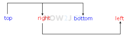
12.外边距:元素边框之间的距离
属性为margin-x,x可为left,right,top,bottom,
属性还可为margin,值为数字或百分比(上 右 下 左),如果值小于3个:
3个时:上 左右 下 ; 2个时:上下 左右; 1个时:上下左右
13.超连接状态:link-初始状态;visited-已访问过;hover-鼠标悬停与链接上方;active:鼠标点击下去但还未弹起
<style>
a:link {color: #FF0000}
a:visited {color: #00FF00}
a:hover {color: #FF00FF}
a:active {color: #0000FF}
</style>
  <a href="http://www.baidu.com">超链的不同状态</a>
去除下划线:text-decoration:none;
14.隐藏元素 display:none;隐藏一个元素,且不再占有原空间 visibility:hidden;隐藏一个元素,继续占有原空间,只是看不到
<style>
div.d{
  display:none;
}
 div.v{
  visibility:hidden;
}
</style>
 <div>可见的div1</div>
<div class="d">隐藏的div2,使用display:none隐藏</div>
<div>可见的div3</div>
<div class="v">隐藏的div4,使用visibility:hidden隐藏</div>
<div>可见的div5</div>

15.css文件:如果把所有的css都写在html文件里面,一旦样式比较多的时候,就会显得不易维护,这个时候就会选择把所有的css内容,放在一个独立文件里,然后在html中引用该文件。通常这个文件会被命名为style.css。在css文件中,不用写style标签。
引用:来自网站时-
<link rel="stylesheet" type="text/css" href="https://how2j.cn/study/style.css" />
来自本地文件时-
<link rel="stylesheet" type="text/css" href="file://d:/style.css" />
link:连接,表示引入外部文件。
rel=“stylesheet”:relationship的缩写,含义为关系;
而stylesheet由style(样式)和sheet(表格),合起来就是样式表,描述了当前页面与href所指定文档的关系。
type=“text/css”:表示了外联文档的类型为css。
href=“http://how2j.cn/study/style.css”:表示指定关联文档的路径
16.优先级: ①style标签和外部style.css样式重复时:优先使用最后出现的那个 ②style标签和style属性重复时:优先使用style属性
<style>
.p1{
  color:green;
}
</style>
 <p class="p1" style="color:red">p1 颜色是红色,优先使用style属性</p>

③样式上增加了!important则优先级最高
<style>
.p1{
  color:green !important;
}
 </style>
 <p class="p1" style="color:red">p1 颜色是绿色,优先使用!important样式</p>

二、布局
1.绝对定位:属性为position,值为absolute,通过指定left,top来绝对定位一个元素(将原位置空出)
①当绝对定位的子容器§的父容器(div)也是绝对定位时,则p出现的位置是以div为基础的
②当绝对定位的子容器§的父容器(div)没有定位时,p出现的位置是
以最近的一个定位了的父容器为基础的
③重叠时的优先级:设定z-index属性,值越大越在上面
2.相对定位:属性为position,值为relative,通过指定left,top来相对原位置进行定位(不将原位置空出)
3.浮动:浮动的框可以向左右移动,直到其外边缘碰到包含框或另一个浮动框的边框为止
属性为float, 值为left,right
①向右浮动:
<style>
.f{
  float:right;
}
 </style>
 <div >正常文字1</div>
<div >正常文字2</div>
<div class="f">浮动的文字</div>
<div >正常文字4</div>
<div >正常文字5</div>

②向左浮动:首先,向左浮动后,会把“坑”让出来,这个时候"正常的文字4“ 就会过来试图占这个坑,但是,发现 “浮动的文字”并没有走,结果,就只好排在它后面了
<style>
.f{
  float:left;
}
 </style>
 <div >正常文字1</div>
<div >正常文字2</div>
<div class="f">浮动的文字</div>
<div >正常文字4</div>
<div >正常文字5</div>

③文字围绕图片
<style>
.f{
  float:left;
}
 div{
  width:320px;
}
</style>
 <div >
 <img src="https://how2j.cn/example.gif"/>
 <p>  当图片不浮动时,文字就会换行出现在下面
  当图片不浮动时,文字就会换行出现在下面
  当图片不浮动时,文字就会换行出现在下面
  当图片不浮动时,文字就会换行出现在下面
  当图片不浮动时,文字就会换行出现在下面
  当图片不浮动时,文字就会换行出现在下面
</p>
</div>
 <div >
 <img  class="f" src="https://how2j.cn/example.gif"/>
 <p>  当图片浮动时,文字围绕着图片
 当图片浮动时,文字围绕着图片
 当图片浮动时,文字围绕着图片
 当图片浮动时,文字围绕着图片
 当图片浮动时,文字围绕着图片
</p>
</div>

④使文字不围绕图片:属性为clear,值为left, right, both ,none
如果p左边出现了浮动的元素,如此例,则设置clear:left 即达到不允许浮动元素出现在左边的效果
<style>
.f{
  float:left;
}
 div{
  width:320px;
}
 .clearp{
  clear:left;
}
 </style>
 <div >
 <img  class="f" src="https://how2j.cn/example.gif"/>
 <p>  当图片浮动时,文字围绕着图片
 当图片浮动时,文字围绕着图片
 当图片浮动时,文字围绕着图片
 当图片浮动时,文字围绕着图片
 当图片浮动时,文字围绕着图片
</p>
</div>
 <div >
 <img  class="f" src="https://how2j.cn/example.gif"/>
 <p class="clearp">  当图片浮动时,文字却不想围绕图片
当图片浮动时,文字却不想围绕图片
当图片浮动时,文字却不想围绕图片
当图片浮动时,文字却不想围绕图片
 </p>
</div>

⑤借助float水平排列div:默认的div排列是会换行的,如果使用float就可以达到水平排列的效果,通常会用在菜单,导航栏等地方。如果超出了父容器,还会有自动换行的效果
<style>
div#floatingDiv{
  width:200px;
}
div#floatingDiv div{
   float:left;
}
</style>
默认的div排列是会换行的
  <div>
       菜单1
 </div>
 <div>
       菜单2
 </div>
 <div>
       菜单3
 </div>
 如果使用float就可以达到水平排列的效果,通常会用在菜单,导航栏等地方
 如果超出了父容器,还会有自动换行的效果
 <div id="floatingDiv">
  <div>
       菜单1
 </div>
 <div>
       菜单2
 </div>
 <div>
       菜单3
 </div>
 <div>
       菜单4
 </div>
 <div>
       菜单5
 </div>
 <div>
       菜单6
 </div>
</div>

4.显示方式:隐藏、块级、内联、内联-块级
①隐藏:display:none;使被选择的元素隐藏,并且不占用原来的位置
②块级元素:display:block;块级元素会自动在前后加上换行,其上的width和height也能生效
<style>
div,span{
   border: 1px solid lightgray;
   margin:10px;
   width:200px;
   height:100px;
}
 .d{
  display:block;
}
</style>
  <div>普通的div块</div>
<span>这是普通span</span> <span>这是普通span</span> <span>这是普通span</span>
<span class="d">这是span,被改造成了块级元素</span>

③内联:display:inline;内联元素前后不换行,且width和height无效,大小由其中的内容决定
④内联-块级:display:inline-block;使元素处于同一行的同时还能指定大小
<style>
span{
   display:inline-block;
   border: 1px solid lightgray;
   margin:10px;
   width:100px;
}
</style>
像这样 ,每个都能设置宽度 ,同时还能在同一行。
<br>
<span>盖伦</span>
<span>蒙多医生</span>
<span>奈德丽</span>
<span>蒸汽机器人</span>

⑤其他:显示为列表:list-item;显示为表格:table;显示为前后无换行的表格:inline-table;显示为单元格:table-cell
5.水平居中
①内容居中:通过设置属性align="center"或通过样式style=“text-align:center”
<style>
div{
  border:1px solid lightgray;
  margin:10px;
}
</style>
<div align="center">
通过设置属性align="center" 居中的内容
</div>
 <div  style="text-align:center">
通过样式style="text-align:center" 居中的内容
</div>

②元素居中:使用样式样式style=“margin:0 auto”(对于div)
<style>
  div{
     border: solid 1px lightgray;
     margin: 10px;
  }
  span{
     border: solid 1px lightskyblue;
  }
</style>
<div> 默认情况下div会占用100%的宽度,所以无法观察元素是否居中</div>
 <div style="width:300px;margin:0 auto">
  设置本div的宽度,然后再使用样式 margin: 0 auto来使得元素居中</div>
 <span style="width:300px;margin:0 auto">
  span 是内联元素,无法设置宽度,所以不能通过margin:0 auto居中</span>
 <div style="text-align:center">
  <span>span的居中可以通过放置在div中,然后让div text-align实现居中</span>
</div>

6.清除浮动:overflow:hidden;详见收藏
7.垂直居中:三种方式
①设置属性line-height:适合单独一行垂直居中
②设置相同的上下内边距:可以用在多行文本上
<style>
#d {
    padding: 30 0;
}
div{
    border:solid 1px lightskyblue;
}
</style>
<div id="d">多行内容 多行内容 多行内容 多行内容 多行内容 多行内容 多行内容 多行内容 多行内容 多行内容 多行内容 多行内容 多行内容 多行内容 多行内容 多行内容 多行内容 多行内容 多行内容 多行内容 多行内容 多行内容 多行内容 多行内容 多行内容 多行内容 多行内容 多行内容 多行内容 多行内容 多行内容 多行内容 多行内容 多行内容 多行内容 多行内容 多行内容 多行内容 多行内容 多行内容  </div>

③table方式:首先通过display:table-cell;把div用单元格的形式显示,然后借用单元格的垂直居中vertical-align:middle;实现效果。对图片也可以居中
<style>
#d {
display: table-cell;
vertical-align: middle;
height:200px;
}
 div{
  border:solid 1px lightskyblue;
}
</style>
  <div id="d">
<img src="https://how2j.cn/example.gif">
</div>

8.使一个div始终贴在下方
首先把蓝色div设置为相对定位,然后把内部的绿色div设置为绝对定位, bottom: 0表示贴在下面
子绝父相
<style>
#div1
        {
            position: relative;
            height: 300px;
            width: 90%;
            background-color: skyblue;
        }
        #div2
        {
            position: absolute;
            bottom: 0;
            height: 30px;
            width: 100%;
            background-color: lightgreen;
        }
    </style>
 <div id="div1">
    <div id="div2"> 无论蓝色div高度如何变化,绿色div都会贴在下面
    </div>
</div>

9.去除块间空格

解决:使用float来解决。float使用完毕之后,在下面加上 <div style="clear:both"></div> 用于使得后续的元素,不会和这些span重复在一起
<style>
div.nocontinue span{
border-bottom:2px solid lightgray;
  float:left;
}
</style>
  <div class="nocontinue">
<span>有换行的span</span>
<span>有换行的span</span>
<span>有换行的span</span>
</div>
 <div style="clear:both"></div>
 <div>后续的内容</div>

三、显示图片的一部分
1.使用背景的方式
对div使用背景图片
background:transparent url(/study/wangwang.gif) no-repeat scroll -83px -0px ;
等同于
background-color:transparent;
background-image:url(/site/wangwang.gif);
background-repeat:no-repeat;
background-attachment:scroll;
background-position: -83px -0px;
即把图片向左滚动83个像素,向上滚动0个像素,再把div大小设置为和小图片大小一样,即可实现效果
<style>
div{
    width:25;
    height:25;
    background:transparent url(https://how2j.cn/study/wangwang.gif) no-repeat scroll -83px -0px ;
}
</style>
<div></div>
2.借助裁剪方式:属性为clip,值为rect(top,right,bottom,left) 裁剪之后,只显示被裁剪出来的图片,所以还需要把整个图片向左移动,才看上去像拿到了想要的那部分图片
<style>
img{
    position:absolute;
    left:-83px;
    clip:rect(0px 108px 25px 83px);
}
</style>
<img src="https://how2j.cn/study/wangwang.gif">


 261
261

 被折叠的 条评论
为什么被折叠?
被折叠的 条评论
为什么被折叠?
 到【灌水乐园】发言


