


【CSS】关于BFC的理解
一 两个基本概念
学习BFC之前,先简单看一下两个基本的概念。
- Box: CSS 布局的对象和基本单位,⼀个⻚⾯是由很多个 Box 组成的,这个Box就是我们所说的盒模型。
- Formatting context:块级上下⽂格式化,它是⻚⾯中的⼀块渲染区域,并且有⼀套渲染规则,它决定了其⼦元素将如何定位,以及和其他元素的关系和相互作⽤。
二 什么是BFC?
BFC(Block formatting context)是页面中的一块渲染区域,有着自己的渲染规则,可以看作是一个隔离的独立容器,在这个容器中按照一定规则进行物品摆放,并且不会影响其它环境中的物品,如果一个元素符合触发BFC的条件,则BFC中的元素布局不受外部影响。
三 创建BFC的条件
- 根元素:
body; - 元素设置浮动:
float除none以外的值; - 元素设置定位:
position值为absolute、fixed; - display 值为:
inline-block、table-cell、table-caption、flex等; - overflow的值不是
visible;
四 BFC的特点
- 垂直方向上,自上而下排列,和文档流的排列方式一致。
- 在BFC中上下相邻的两个容器的margin会重叠
- 计算BFC的高度时,需要计算浮动元素的高度
- BFC区域不会与浮动的容器发生重叠
- BFC是独立的容器,容器内部元素不会影响外部元素
- 每个元素的左margin值和容器的左border相接触
了解BFC的特点有助于帮助我们理解BFC如何应用。
五 BFC的作用
5.1 避免外边距重叠
html代码:
<!DOCTYPE html>
<html lang="en">
<head>
    <meta charset="UTF-8">
    <meta http-equiv="X-UA-Compatible" content="IE=edge">
    <meta name="viewport" content="width=device-width, initial-scale=1.0">
    <title>Document</title>
    <style>
        .box {
            width: 100px;
            height: 100px;
            background: pink;
            margin: 100px;
        }
    </style>
</head>
<body>
    <div class="box"></div>
    <div class="box"></div>
</body>
</html>
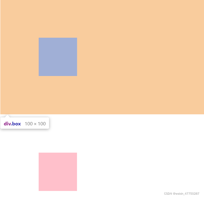
运行效果:
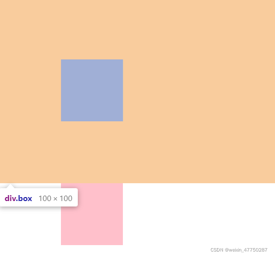
- 可以发现第一个盒子的
margin-bottom和第二个盒子的margin-top重叠了。 - 根据上述BFC特点2,属于同一个BFC的两个相邻的Box会发生margin重叠。
- 所以我们可以设置成两个不同的BFC。
<!DOCTYPE html>
<html lang="en">
<head>
    <meta charset="UTF-8">
    <meta http-equiv="X-UA-Compatible" content="IE=edge">
    <meta name="viewport" content="width=device-width, initial-scale=1.0">
    <title>Document</title>
    <style>
        .container {
            overflow: hidden;
        }
        .box {
            width: 100px;
            height: 100px;
            background: pink;
            margin: 100px;
        }
    </style>
</head>
<body>
    <div class="container">
        <div class="box"></div>
    </div>
    <div class="container">
        <div class="box"></div>
    </div>
</body>
</html>
5.2 清除浮动
当我们不给父元素设置高度,而子元素却设置了浮动的时候,会发生高度塌陷,影响到父元素下面的元素布局,这个时候我们就要清除浮动。
html代码:
<!DOCTYPE html>
<html lang="en">
<head>
    <meta charset="UTF-8">
    <meta http-equiv="X-UA-Compatible" content="IE=edge">
    <meta name="viewport" content="width=device-width, initial-scale=1.0">
    <title>Document</title>
    <style>
         .box {
            width: 800px;
            border: 1px solid blue;
            margin: 0 auto;
        }

        .damao {
            float: left;
            width: 300px;
            height: 200px;
            background-color: purple;
        }

        .ermao {
            float: left;
            width: 200px;
            height: 200px;
            background-color: pink;
        }

        .footer {
            height: 200px;
            background-color: black;
        }
    </style>
</head>
<body>
    <div class="box">
        <div class="damao">大毛</div>
        <div class="ermao">二毛</div>
    </div>
    <div class="footer"></div>
</body>
</html>
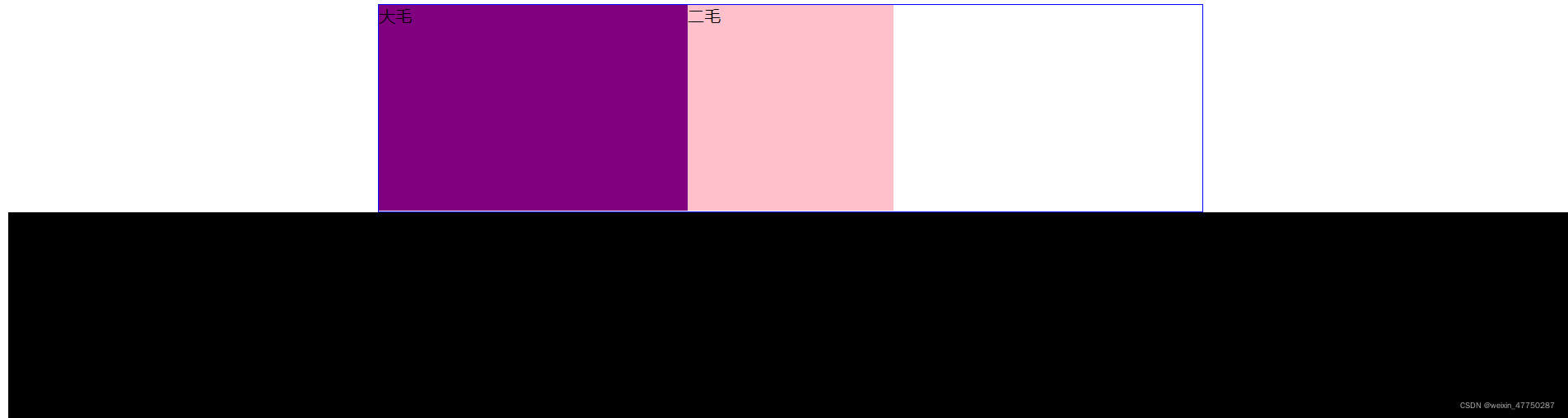
运行效果:
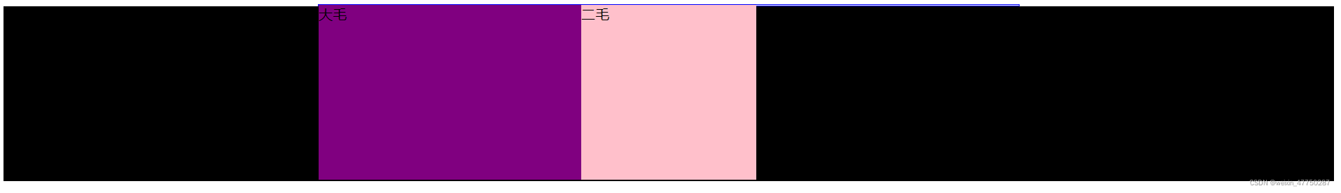
- 根据BFC特点3,计算BFC的高度时,需要计算浮动元素的高度。
- 我们可以把父元素变成BFC,这样就可以清除浮动带来的影响。
/* 给box添加 overflow: hidden; 触发父元素BFC */
.box {
            overflow: hidden;
            width: 800px;
            border: 1px solid blue;
            margin: 0 auto;
        }
5.3 创建自适应两列布局
可以利用BFC阻止元素被浮动元素覆盖,从而创建自适应两栏布局:左边的宽度固定,右边的宽度自适应。
html代码:
<!DOCTYPE html>
<html lang="en">
<head>
    <meta charset="UTF-8">
    <meta http-equiv="X-UA-Compatible" content="IE=edge">
    <meta name="viewport" content="width=device-width, initial-scale=1.0">
    <title>Document</title>
    <style>
        .floatBox {
            width: 100px;
            height: 100px;
            background-color: blue;
            float: left;
        }
        .normalBox {
            width: 200px;
            height: 200px;
            background-color: red;
        }
    </style>
</head>
<body>
    <div class="floatBox"></div>
    <div class="normalBox"></div>
</body>
</html>
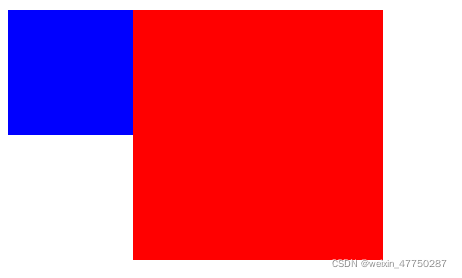
运行结果:
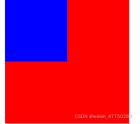
- 根据BFC特点4,BFC区域不会与浮动的容器发生重叠
- 可以实现自适应两栏布局
<!DOCTYPE html>
<html lang="en">
<head>
    <meta charset="UTF-8">
    <meta http-equiv="X-UA-Compatible" content="IE=edge">
    <meta name="viewport" content="width=device-width, initial-scale=1.0">
    <title>Document</title>
    <style>
        .floatBox {
            width: 100px;
            height: 100px;
            background-color: blue;
            float: left;
        }
        .normalBox {
            width: 200px;
            height: 200px;
            background-color: red;
           /* 给普通盒子触发BFC */
            overflow: hidden;
        }
    </style>
</head>
<body>
    <div class="floatBox"></div>
    <div class="normalBox"></div>
</body>
</html>


 328
328


 被折叠的 条评论
为什么被折叠?
被折叠的 条评论
为什么被折叠?
 到【灌水乐园】发言


