


线性布局
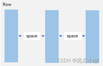
布局子元素在排列方向上的间距
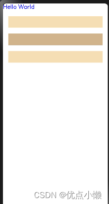
1、在Column容器内,子元素排列示意图

案例:
@Entry
@Component
struct Index {
  @State message: string = 'Hello World'
  build() {
      Column({space: 20}) {
        Text("Hello World").fontSize(20).fontColor(Color.Blue).width('100%')
        Row().width("90%").height(40).backgroundColor(0xF5DEB3)
        Row().width('90%').height(40).backgroundColor(0xD2B48C)
        Row().width("90%").height(40).backgroundColor(0xF5DEB3)
      }.width('100%')
  }
}
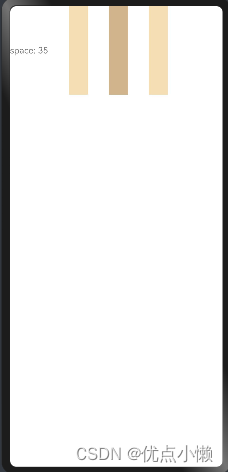
2、在Row容器内,子元素排列示意图
@Entry
@Component
struct Index {
  @State message: string = 'Hello World'

  build() {
    Row({ space: 35 }) {
      Text('space: 35').fontSize(15).fontColor(Color.Gray)
      Row().width('10%').height(150).backgroundColor(0xF5DEB3)
      Row().width('10%').height(150).backgroundColor(0xD2B48C)
      Row().width('10%').height(150).backgroundColor(0xF5DEB3)
    }.width('90%')
  }
}
布局子元素在交叉轴上的对齐方式
1、Column容器内子元素在水平方向上的排列
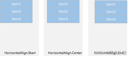
@Entry
@Component
struct Index {
  @State message: string = 'Hello World'

  build() {
    Column({}) {
      Column() {
      }.width('80%').height(50).backgroundColor(0xF5DEB3)

      Column() {
      }.width('80%').height(50).backgroundColor(0xD2B48C)

      Column() {
      }.width('80%').height(50).backgroundColor(0xF5DEB3)
    }.width('100%').alignItems(HorizontalAlign.Start).backgroundColor('rgb(242,242,242)')
  }
}
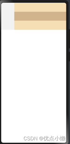
HorizontalAlign.Start
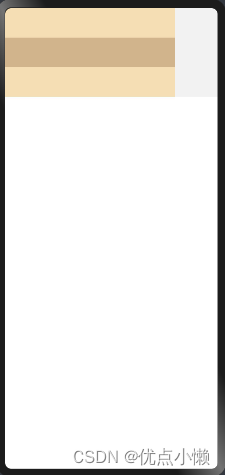
HorizontalAlign.Center
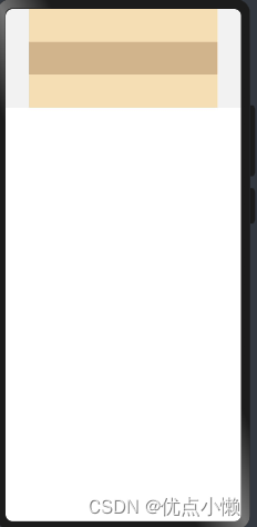
HorizontalAlign.End
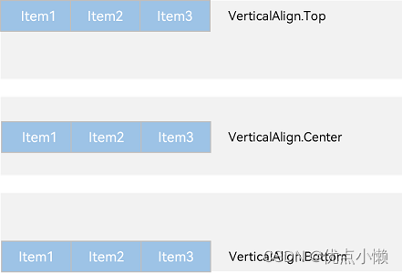
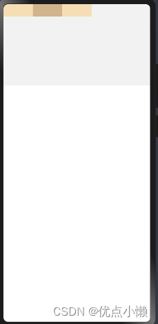
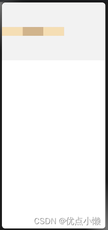
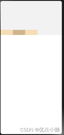
2、Row容器内子元素在垂直方向上的排列
@Entry
@Component
struct Index {
  @State message: string = 'Hello World'

  build() {
    Row({}) {
      Column() {
      }.width('20%').height(30).backgroundColor(0xF5DEB3)

      Column() {
      }.width('20%').height(30).backgroundColor(0xD2B48C)

      Column() {
      }.width('20%').height(30).backgroundColor(0xF5DEB3)
    }.width('100%').height(200).alignItems(VerticalAlign.Top).backgroundColor('rgb(242,242,242)')
  }
}
VerticalAlign.Top
VerticalAlign.Center
VerticalAlign.Bottom
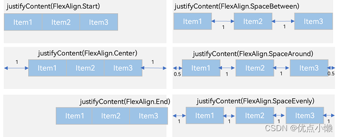
布局子元素在主轴上的排列方式
1、Column容器内子元素在垂直方向上的排列
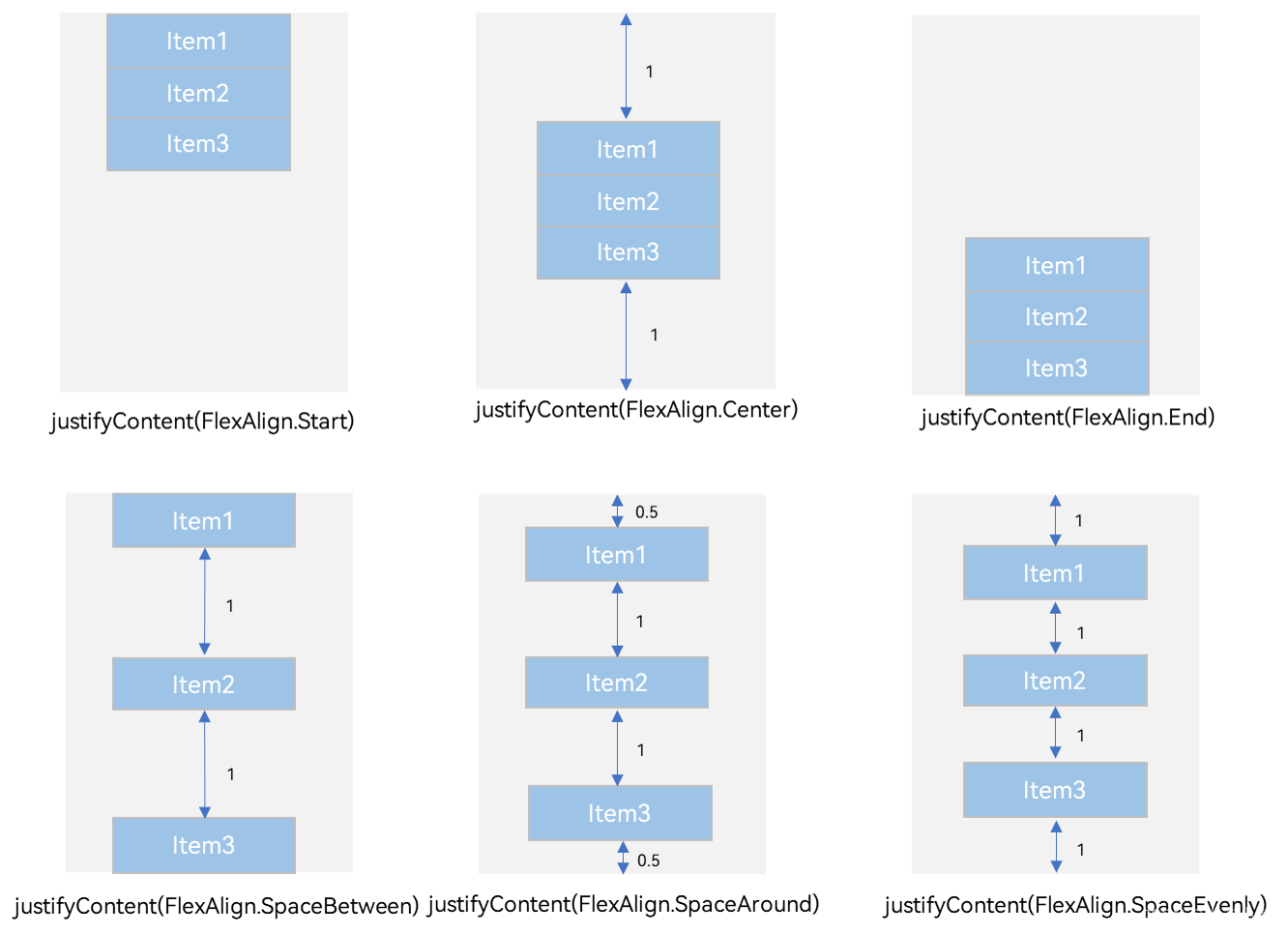
2、Row容器内子元素在水平方向上的排列
自适应拉伸
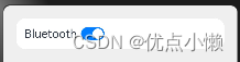
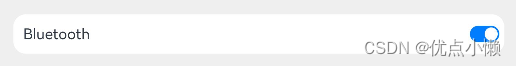
当我们添加文本和按钮时,会自动紧挨在一起,但是我们想要的是一个在最前一个在最后。使用上述方式,虽然可以实现,但是对于不同的设备,由于屏幕尺寸不一样,可能达不到预期的目标。所以使用自适应拉伸。
@Entry
@Component
struct BlankExample {
  build() {
    Column() {
      Row() {
        Text('Bluetooth').fontSize(18)
        Toggle({ type: ToggleType.Switch, isOn: true })
      }.backgroundColor(0xFFFFFF).borderRadius(15).padding({ left: 12 }).width('100%')
    }.backgroundColor(0xEFEFEF).padding(20).width('100%')
  }
}
@Entry
@Component
struct BlankExample {
  build() {
    Column() {
      Row() {
        Text('Bluetooth').fontSize(18)
        Blank()
        Toggle({ type: ToggleType.Switch, isOn: true })
      }.backgroundColor(0xFFFFFF).borderRadius(15).padding({ left: 12 }).width('100%')
    }.backgroundColor(0xEFEFEF).padding(20).width('100%')
  }
}
竖屏:
横屏:

注:横屏竖屏的切换,点击预览模式中的按钮即可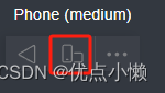
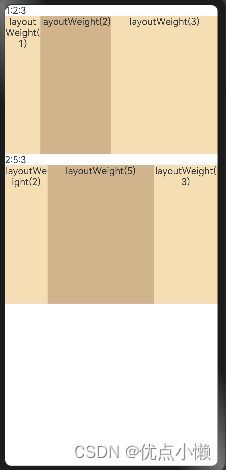
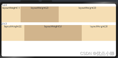
自适应缩放
在父容器尺寸确定时,使用layoutWeight属性设置子组件和兄弟元素在主轴上的权重,忽略元素本身尺寸设置,使它们在任意尺寸的设备下自适应占满剩余空间。
@Entry
@Component
struct layoutWeightExample {
  build() {
    Column() {
      Text('1:2:3').width('100%')
      Row() {
        Column() {
          Text('layoutWeight(1)')
            .textAlign(TextAlign.Center)
        }.layoutWeight(1).backgroundColor(0xF5DEB3).height('100%')

        Column() {
          Text('layoutWeight(2)')
            .textAlign(TextAlign.Center)
        }.layoutWeight(2).backgroundColor(0xD2B48C).height('100%')

        Column() {
          Text('layoutWeight(3)')
            .textAlign(TextAlign.Center)
        }.layoutWeight(3).backgroundColor(0xF5DEB3).height('100%')

      }.backgroundColor(0xffd306).height('30%')

      Text('2:5:3').width('100%')
      Row() {
        Column() {
          Text('layoutWeight(2)')
            .textAlign(TextAlign.Center)
        }.layoutWeight(2).backgroundColor(0xF5DEB3).height('100%')

        Column() {
          Text('layoutWeight(5)')
            .textAlign(TextAlign.Center)
        }.layoutWeight(5).backgroundColor(0xD2B48C).height('100%')

        Column() {
          Text('layoutWeight(3)')
            .textAlign(TextAlign.Center)
        }.layoutWeight(3).backgroundColor(0xF5DEB3).height('100%')
      }.backgroundColor(0xffd306).height('30%')
    }
  }
}
竖屏:
横屏:
自适应延伸
自适应延伸是指在不同尺寸设备下,当页面的内容超出屏幕大小而无法完全显示时,可以通过滚动条进行拖动展示。这种方法适用于线性布局中内容无法一屏展示的场景。通常有以下两种实现方式。
竖向布局中使用Scroll组件:
@Entry
@Component
struct ScrollExample {
  scroller: Scroller = new Scroller();
  private arr: number[] = [0, 1, 2, 3, 4, 5, 6, 7, 8, 9];

  build() {
    Scroll(this.scroller) {
      Column() {
        ForEach(this.arr, (item) => {
          Text(item.toString())
            .width('90%')
            .height(150)
            .backgroundColor(0xFFFFFF)
            .borderRadius(15)
            .fontSize(16)
            .textAlign(TextAlign.Center)
            .margin({ top: 10 })
        }, item => item)
      }.width('100%')
    }
    .backgroundColor(0xDCDCDC)
    .scrollable(ScrollDirection.Vertical) // 滚动方向纵向
    .scrollBar(BarState.On) // 滚动条常驻显示
    .scrollBarColor(Color.Gray) // 滚动条颜色
    .scrollBarWidth(10) // 滚动条宽度
    .edgeEffect(EdgeEffect.Spring) // 滚动到边沿后回弹
  }
}

横向布局中使用Scroll组件
@Entry
@Component
struct ScrollExample {
  scroller: Scroller = new Scroller();
  private arr: number[] = [0, 1, 2, 3, 4, 5, 6, 7, 8, 9];

  build() {
    Scroll(this.scroller) {
      Row() {
        ForEach(this.arr, (item) => {
          Text(item.toString())
            .height('90%')
            .width(150)
            .backgroundColor(0xFFFFFF)
            .borderRadius(15)
            .fontSize(16)
            .textAlign(TextAlign.Center)
            .margin({ left: 10 })
        })
      }.height('100%')
    }
    .backgroundColor(0xDCDCDC)
    .scrollable(ScrollDirection.Horizontal) // 滚动方向横向
    .scrollBar(BarState.On) // 滚动条常驻显示
    .scrollBarColor(Color.Gray) // 滚动条颜色
    .scrollBarWidth(10) // 滚动条宽度
    .edgeEffect(EdgeEffect.Spring) // 滚动到边沿后回弹
  }
}


 1317
1317


 被折叠的 条评论
为什么被折叠?
被折叠的 条评论
为什么被折叠?
 到【灌水乐园】发言


