


Element Plus 提供了一套常用的图标集合。
1.使用图标# 如果你想像用例一样直接使用,你需要全局注册组件,才能够直接在项目里使用。
2.如若想查看所有可用的 SVG 图标请查阅 @element-plus/icons-vue 和 element-plus-icons
的源代码或当前页的 Icon Collection3.CDN 导入和 自动导入 正在开发中。
1.安装
# 选择一个你喜欢的包管理器

# NPM
$ npm install @element-plus/icons-vue
# Yarn
$ yarn add @element-plus/icons-vue
# pnpm
$ pnpm install @element-plus/icons-vue
2.导入
vue3 目前只支持按需导入
<el-icon><caret-bottom /></el-icon>
import { CaretBottom } from '@element-plus/icons-vue' // svg图标
import { Calendar, Search } from '@element-plus/icons-vue'
基础用法
<!-- 使用 el-icon 标签来包裹 SVG 图标 -->
<template>
  <div>
    <el-icon :size="size" :color="color">
      <edit />
    </el-icon>
    <!-- 也可以直接使用图标标签,无需父标签包裹 -->
    <edit />
  </div>
</template>
3.显示
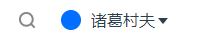
4.hover作用另外一个对象,css:hover状态改变另一个元素样式的使用
这里我想hover整个大盒子,只让icon变色,便是这样
.personal-center-info {
      display: flex;
      // justify-content: space-around;
      align-items: center;
      width: 200px;
      height: 100%;
      line-height: 100%;
      margin: auto;
    }
    .personal-center-info:hover .el-icon {
      color: red;
    }
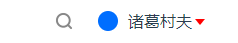
5.如果让鼠标往下滑的时候让下面这个Hover继续保持呢
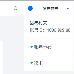
 .personal-center-info:hover .personal-center-info__detail {
      display: block;
      transform: scale(1.1);
      transition: all 1s linear;
    }```


 被折叠的 条评论
为什么被折叠?
被折叠的 条评论
为什么被折叠?
 到【灌水乐园】发言


