


一、绘制单个坐标系下单张图
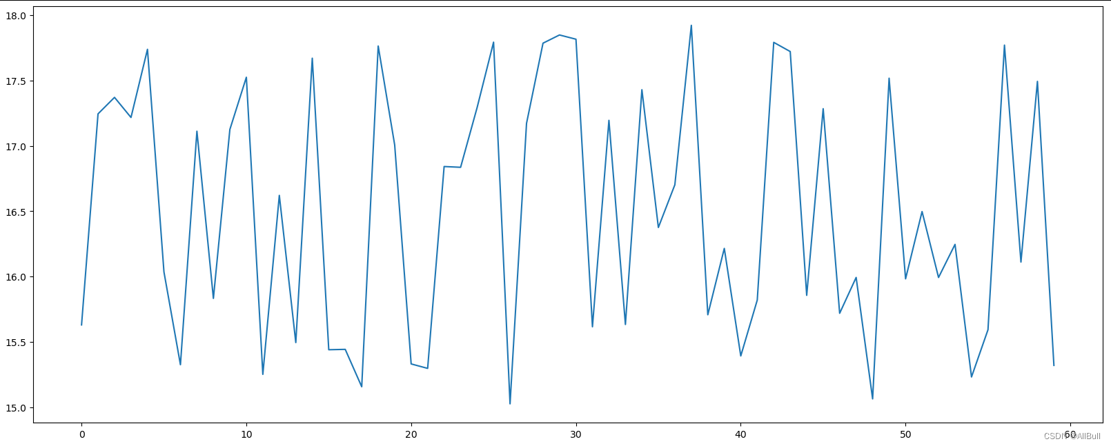
1.1 入门版
# In[0] 导入库
import matplotlib.pyplot as plt
import random


# =============================================================================
# 一、绘制单个坐标系下单张图
# =============================================================================
# In[1] 0.准备数据
x = range(60)
y_shanghai = [random.uniform(15, 18) for i in x] #列表生成式

# In[2] 1.创建画布
plt.figure(figsize=(20,8), dpi=100) # 长宽比20:8, 分辨率100dpi

# In[3] 2.绘制图像
plt.plot(x, y_shanghai)

# In[4] 3.图像显示
plt.show()
图像:
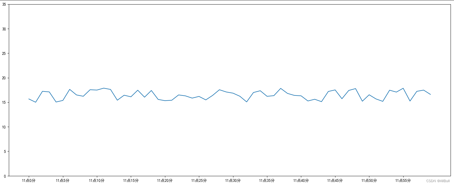
1.2 自定义坐标轴
# In[0] 导入库
import matplotlib.pyplot as plt
import random

# 设置显示中文字符
from pylab import mpl
mpl.rcParams['font.sans-serif'] =['SimHei']
# 设置正常显示符号
mpl.rcParams['axes.unicode_minus'] = False

# =============================================================================
# 添加自定义x,y刻度
# plt.xticks()
# =============================================================================
# In[1] 0.准备数据
x = range(60)
y_shanghai = [random.uniform(15, 18) for i in x] #列表生成式

# In[2] 1.创建画布
plt.figure(figsize=(20,8), dpi=100) # 长宽比20:8, 分辨率100dpi

# In[3] 2.绘制图像
plt.plot(x, y_shanghai)

# 添加刻度
# 设置x,y刻度
x_ticks_label = ['11点{}分'.format(i) for i in x]
y_ticks = range(40)
# 修改刻度显示
plt.xticks(x[::5], x_ticks_label[::5])  # 不是基本数字做轴刻度时,第一个参数是数字,第二个是字符串替换
plt.yticks(y_ticks[::5])    # 基本数字直接传第一个参数 [::5]是5为步长


# In[4] 3.图像显示
plt.show()
图像:
注意:
# 设置显示中文字符
from pylab import mpl
mpl.rcParams['font.sans-serif'] =['SimHei']
# 设置正常显示符号
mpl.rcParams['axes.unicode_minus'] = False
设置中文显示问题,不然会出现:
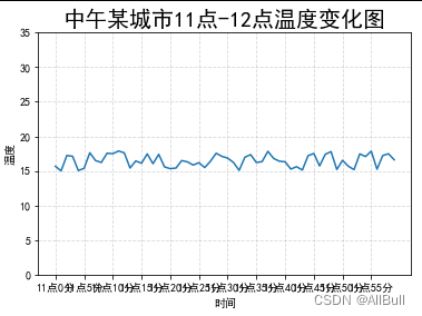
1.3 其他功能(网格,描述,表名等)
# In[0] 导入库
import matplotlib.pyplot as plt
import random

# 设置显示中文字符
from pylab import mpl
mpl.rcParams['font.sans-serif'] =['SimHei']
# 设置正常显示符号
mpl.rcParams['axes.unicode_minus'] = False

# =============================================================================
# 添加网格显示、描述信息等
#
# =============================================================================
# In[1] 0.准备数据
x = range(60)
y_shanghai = [random.uniform(15, 18) for i in x] #列表生成式

# In[2] 1.创建画布
plt.figure(figsize=(20,8), dpi=100) # 长宽比20:8, 分辨率100dpi

# In[3] 2.绘制图像
plt.plot(x, y_shanghai)

# 2.1 添加刻度
# 2.1.1设置x,y刻度
x_ticks_label = ['11点{}分'.format(i) for i in x]
y_ticks = range(40)
# 2.1.2修改刻度显示
plt.xticks(x[::5], x_ticks_label[::5])  # 不是基本数字做轴刻度时,第一个参数是数字,第二个是字符串替换
plt.yticks(y_ticks[::5])    # 基本数字直接传第一个参数 [::5]是5为步长

# 2.2 添加网格显示
plt.grid(True,linestyle='--',alpha=0.5) # 线型 和 透明度

# 2.3 添加描述信息
plt.xlabel("时间")    # x 标题
plt.ylabel("温度")
plt.title("中午某城市11点-12点温度变化图", fontsize=20)  # 图表名

# 2.4 图像保存,一定在show之前保存
# plt.savefig("test.png") # plt.show()会释放figure资源,如果在show之后保存,会保存空图片

# In[4] 3.图像显示
plt.show()
图片:
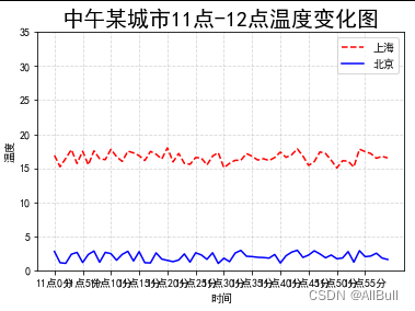
二、绘制单个坐标系下多张图
# In[0] 导入库
import matplotlib.pyplot as plt
import random

# 设置显示中文字符
from pylab import mpl
mpl.rcParams['font.sans-serif'] =['SimHei']
# 设置正常显示符号
mpl.rcParams['axes.unicode_minus'] = False

# =============================================================================
# 二、绘制单个坐标系下多张图
# =============================================================================
# In[1] 0.准备数据
x = range(60)
y_shanghai = [random.uniform(15, 18) for i in x] #列表生成式
y_beijing = [random.uniform(1, 3) for i in x]

# In[2] 1.创建画布
plt.figure(figsize=(20,8), dpi=100) # 长宽比20:8, 分辨率100dpi

# In[3] 2.绘制图像
plt.plot(x, y_shanghai, color='r', linestyle='--', label='上海')  # 虚线 ,label图例
plt.plot(x, y_beijing, color='b', linestyle='-', label='北京')    # 实线

# 2.1 添加刻度
# 2.1.1设置x,y刻度
x_ticks_label = ['11点{}分'.format(i) for i in x]
y_ticks = range(40)
# 2.1.2修改刻度显示
plt.xticks(x[::5], x_ticks_label[::5])  # 不是基本数字做轴刻度时,第一个参数是数字,第二个是字符串替换
plt.yticks(y_ticks[::5])    # 基本数字直接传第一个参数 [::5]是5为步长

# 2.2 添加网格显示
plt.grid(True,linestyle='--',alpha=0.5) # 线型 和 透明度

# 2.3 添加描述信息
plt.xlabel("时间")    # x 标题
plt.ylabel("温度")
plt.title("中午某城市11点-12点温度变化图", fontsize=20)  # 图表名

# 2.4 显示图例
plt.legend(loc='best')      # 显示图例,位置在最好的位置

# 2.5 图像保存,一定在show之前保存
# plt.savefig("test.png") # plt.show()会释放figure资源,如果在show之后保存,会保存空图片

# In[4] 3.图像显示
plt.show()
图像:
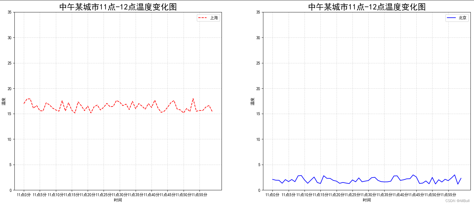
三、绘制多个坐标系下多张图
# In[0] 导入库
import matplotlib.pyplot as plt
import random

# 设置显示中文字符
from pylab import mpl
mpl.rcParams['font.sans-serif'] =['SimHei']
# 设置正常显示符号
mpl.rcParams['axes.unicode_minus'] = False

# =============================================================================
# 三、绘制多个坐标系下多张图
# =============================================================================
# In[1] 0.准备数据
x = range(60)
y_shanghai = [random.uniform(15, 18) for i in x] #列表生成式
y_beijing = [random.uniform(1, 3) for i in x]

# In[2] 1.创建画布
# plt.figure(figsize=(20,8), dpi=100) # 长宽比20:8, 分辨率100dpi
# nrows=1, ncols=2, 一行两列   fig,整张图,  axes 各个坐标系
fig, axes = plt.subplots(nrows=1, ncols=2, figsize=(20,8), dpi=100)


# In[3] 2.绘制图像
# plt.plot(x, y_shanghai, color='r', linestyle='--', label='上海')  # 虚线 ,label图例
# plt.plot(x, y_beijing, color='b', linestyle='-', label='北京')    # 实线
axes[0].plot(x, y_shanghai, color='r', linestyle='--', label='上海')  # 虚线 ,label图例
axes[1].plot(x, y_beijing, color='b', linestyle='-', label='北京')    # 实线

# 2.1 添加刻度
# 2.1.1设置x,y刻度
x_ticks_label = ['11点{}分'.format(i) for i in x]
y_ticks = range(40)
# 2.1.2修改刻度显示
# plt.xticks(x[::5], x_ticks_label[::5])  # 不是基本数字做轴刻度时,第一个参数是数字,第二个是字符串替换
# plt.yticks(y_ticks[::5])    # 基本数字直接传第一个参数 [::5]是5为步长
axes[0].set_xticks(x[::5])
axes[0].set_yticks(y_ticks[::5])
axes[0].set_xticklabels(x_ticks_label[::5]) # 字符串做刻度 需要置换
axes[1].set_xticks(x[::5])
axes[1].set_yticks(y_ticks[::5])
axes[1].set_xticklabels(x_ticks_label[::5]) # 字符串做刻度 需要置换

# 2.2 添加网格显示
# plt.grid(True,linestyle='--',alpha=0.5) # 线型 和 透明度
axes[0].grid(True,linestyle='--',alpha=0.5)
axes[1].grid(True,linestyle='--',alpha=0.5)

# 2.3 添加描述信息
#plt.xlabel("时间")    # x 标题
#plt.ylabel("温度")
#plt.title("中午某城市11点-12点温度变化图", fontsize=20)  # 图表名
axes[0].set_xlabel("时间")    # x 标题
axes[0].set_ylabel("温度")
axes[0].set_title("中午某城市11点-12点温度变化图", fontsize=20)  # 图表名
axes[1].set_xlabel("时间")    # x 标题
axes[1].set_ylabel("温度")
axes[1].set_title("中午某城市11点-12点温度变化图", fontsize=20)  # 图表名

# 2.4 显示图例
# plt.legend(loc='best')      # 显示图例,位置在最好的位置
axes[0].legend(loc='best')
axes[1].legend(loc='best')

# 2.5 图像保存,一定在show之前保存
# plt.savefig("test.png") # plt.show()会释放figure资源,如果在show之后保存,会保存空图片

# In[4] 3.图像显示
plt.show()
图像:


 177
177


 被折叠的 条评论
为什么被折叠?
被折叠的 条评论
为什么被折叠?
 到【灌水乐园】发言


