


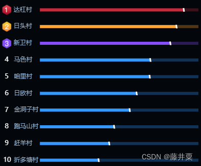
本图表实现的难点主要在于1、序号自定义图片2、前三行颜色特殊处理3、斜线效果4、底色阴影效果
1、序号自定义图片
本质上就是设置y轴的标签样式。这里采用base64格式的图片,这里可以替换为自己的图片,推荐一个图片转base64格式的网址:链接: 图片转base64格式
let ranking1 = "`data:image/png;base64,......"
let ranking2 = "`data:image/png;base64,......"
let ranking3 = "`data:image/png;base64,......"
Option.yAxis.axisLabel = {
        margin: 75,
        fontSize: 12,
        align: 'left',
        color: '#fff',
        rich: {
          a: {
			color: '#90B2D2',
          },
		  b: {
            padding: [0, 0, 0, 6],
			fontSize: 13
          },
		  c: {
            padding: [0, 0, 0, 3],
			fontSize: 13
          },
		  d: {
			color: '#90B2D2',
			padding: [0, 0, 0, -5]
          },
          a0: {
            backgroundColor: {
              image: ranking1,
            },
            width: 20,
            height: 20,
            align: 'center',
          },
		  a1: {
            backgroundColor: {
              image: ranking2,
            },
            width: 20,
            height: 20,
            align: 'center',
          },
		  a2: {
            backgroundColor: {
              image: ranking3,
            },
            width: 20,
            height: 20,
            align: 'center',
          }
        },
        formatter: function (params,index) {
		  	if(index >= 7){
			  let newIndex = 9 - index
			  return `{a${newIndex}|} {a|${params}}`;
			}else{
			  let newIndex = 9 - index + 1
			  if(newIndex == 10){
			  //为了让序号对齐,单独进行处理
				return `{c|${newIndex}}   {d|${params}}`
			  }
			  return `{b|${newIndex}}   {a|${params}}`
			}
        },
      }
2、前三行颜色特殊处理
这部分是对series中的color进行判断处理
let colorList = ["#C9293D","#FEA636","#854DFC","#3399FF"]
Option.series[0].itemStyle = {
	  normal: {
		barBorderRadius: 0,
		color: (params) => {
		  if(params.dataIndex >= 7){
			let index = 9 - params.dataIndex
			return colorList[index]
		  }
		  else
			return colorList[3]
		}
	  },
	}
3、斜线效果
斜线效果是通过向series中添加一个矢量平行四边形并调整其位置实现的
Option.series.push(
		{
		  type: "pictorialBar",
		  symbol: 'path://M 50,0 35,0 40,100 55,100 Z',
		  symbolPosition: 'end',
		  symbolSize: [4, 7],
		  symbolOffset: [2, 0],
		  emphasis: {
			scale: false
		  },
		  itemStyle: {
			color: "#fff",
			borderWidth: 1,
			opacity: 1
		  },
		  zlevel: 3,
		  data: data,
		  animationDelay: 500,
		  label: {
			normal:{
			  show: false
			},
			emphasis: {
			  show: false
			}
		  }
		}
	  )
4、底色阴影效果
同样向series中加入type为bar的柱状图,颜色通过添加判断来进行区分,数据是基本数据的1.1倍大小,实现了类似进度条的效果
let max = Option.series[0].data[chartOption.series[0].data.length - 1].value * 1.1
Option.series.push(
		{
		  name: '底色',
		  type: 'bar',
		  barCateGoryGap: 20,
		  barGap: '-100%', // 设置外框粗细
		  data: new Array(data.length).fill(max),
		  barWidth: 6,
		  itemStyle: {
			normal: {
			  barBorderRadius: 0,
			  color: function (params) {
				if(params.dataIndex >= 7){
				  let index = 9 - params.dataIndex
				  return colorList[index]
				}
				else
				  return colorList[3]
			  },
			  opacity: 0.3
			},
		  },
		  z: 0,
		  label: {
			normal:{
			  show: false
			},
			emphasis: {
			  show: false
			}
		  }
		}
	  )


 987
987


 被折叠的 条评论
为什么被折叠?
被折叠的 条评论
为什么被折叠?
 到【灌水乐园】发言


