


1.npm下载highcharts并引入项目(highcharts官网兼容 IE6+、完美支持移动端、图表类型丰富的 HTML5 交互图表 | Highcharts),或者直接在线引入都可以
2.新建.html文件,图表代码:
<!DOCTYPE html>
<html lang="en">
<head>
<meta charset="UTF-8">
<meta http-equiv="X-UA-Compatible" content="IE=edge">
<meta name="viewport" content="width=device-width, initial-scale=1.0">
<title>第一个 Highcharts 图表</title>
</head>
<!-- 图表容器 DOM -->
<div id="container" style="width: 800px;height:500px;"></div>
<!-- 引入 highcharts.js -->
<script src="http://cdn.highcharts.com.cn/highcharts/highcharts.js"></script>
<script>
// 图表配置
var chart = Highcharts.chart('container', {
chart: {
type: 'bar'
},
title: {
text: '各洲不同时间的人口条形图',
style: {
fontSize: '25px',
color: 'red'
}
},
subtitle: {
text: '数据来源: Wikipedia.org',
// align: 'right',
style: {
fontSize: '13px',
// color: 'green'
}
},
xAxis: {
categories: ['非洲', '美洲', '亚洲', '欧洲', '大洋洲'],
title: {
text: '地区',
style: {
fontSize: '15px',
color: 'red',
},
},
labels: {
rotation: -30 // 设置轴标签旋转角度
},
lineWidth: 1,
lineColor: 'black',
},
yAxis: {
min: 0,
title: {
text: '人口总量 (百万)',
style: {
fontSize: '15px',
color: 'red',
},
// align: 'middle'
},
labels: {
overflow: 'justify',
rotation: 30, // 设置轴标签旋转角度
style: {
fontSize: '10px',
color: 'skyblue',
},
},
lineWidth: 1,
lineColor: "green",
},
tooltip: {
valueSuffix: ' 百万'
},
plotOptions: {
bar: {
dataLabels: {
style: {
fontSize: '10px',
color: 'red',
},
enabled: true,
allowOverlap: true // 允许数据标签重叠
}
}
},
legend: {
layout: 'vertical',
align: 'right',
verticalAlign: 'top',
verticalAlign:'middle',
borderWidth: 1,
shadow: true,
itemStyle: {
fontSize: '12px'
}
},
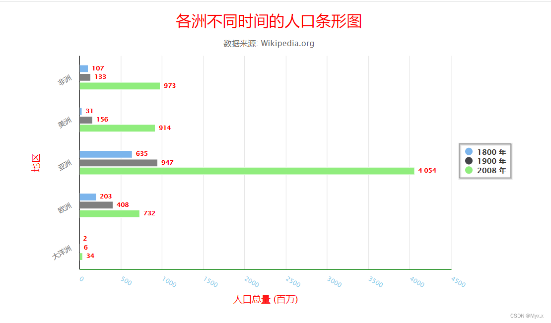
series: [{
name: '1800 年',
data: [107, 31, 635, 203, 2],
}, {
name: '1900 年',
data: [133, 156, 947, 408, 6],
zones: [{
color: 'gray'
}]
}, {
name: '2008 年',
data: [973, 914, 4054, 732, 34],
}],
credits: {
enabled: false
}
});
</script>
</body>
</html>
<style scoped="sass">
#container {
margin: 0 auto;
}
</style>3.效果图:


 5681
5681


 被折叠的 条评论
为什么被折叠?
被折叠的 条评论
为什么被折叠?
 到【灌水乐园】发言


