


一、Figure和Axes上的文本
1、text
一些重要的参数:
| alpha | float or None 该参数指透明度,越接近0越透明,越接近1越不透明 |
| backgroundcolor | color |
| bbox | dict with properties for patches.FancyBboxPatch 这个是用来设置text周围的box外框 |
| color or c | color 指的是字体的颜色 |
| fontfamily or family | {FONTNAME, 'serif', 'sans-serif', 'cursive', 'fantasy', 'monospace'} 该参数指的是字体的类型 |
| fontproperties or font or font_properties | font_manager.FontProperties or str or pathlib.Path |
| fontsize or size | float or {'xx-small', 'x-small', 'small', 'medium', 'large', 'x-large', 'xx-large'} 该参数指字体大小 |
| fontstretch or stretch | {a numeric value in range 0-1000, 'ultra-condensed', 'extra-condensed', 'condensed', 'semi-condensed', 'normal', 'semi-expanded', 'expanded', 'extra-expanded', 'ultra-expanded'} 该参数是指从字体中选择正常、压缩或扩展的字体 |
| fontstyle or style | {'normal', 'italic', 'oblique'} 该参数是指字体的样式是否倾斜等 |
| fontweight or weight | {a numeric value in range 0-1000, 'ultralight', 'light', 'normal', 'regular', 'book', 'medium', 'roman', 'semibold', 'demibold', 'demi', 'bold', 'heavy', 'extra bold', 'black'} |
| horizontalalignment or ha | {'center', 'right', 'left'} 该参数是指选择文本左对齐右对齐还是居中对齐 |
| label | object |
| linespacing | float (multiple of font size) |
| position | (float, float) |
| rotation | float or {'vertical', 'horizontal'} 该参数是指text逆时针旋转的角度,“horizontal”等于0,“vertical”等于90。我们可以根据自己设定来选择合适角度 |
| verticalalignment or va | {'center', 'top', 'bottom', 'baseline', 'center_baseline'} |
# fontdict学习的案例
# ---------设置字体样式,分别是字体,颜色,宽度,大小
font1 = {'family': 'SimSun',#华文楷体
         'alpha':0.7,#透明度
        'color':  'purple',
        'weight': 'normal',
        'size': 16,
        }
font2 = {'family': 'Times New Roman',
        'color':  'red',
        'weight': 'normal',
        'size': 16,
        }
font3 = {'family': 'serif',
        'color':  'blue',
        'weight': 'bold',
        'size': 14,
        }
font4 = {'family': 'Calibri',
        'color':  'navy',
        'weight': 'normal',
        'size': 17,
        }
# -----------四种不同字体显示风格-----

# -------建立函数----------
x = np.linspace(0.0, 5.0, 100)
y = np.cos(2*np.pi*x) * np.exp(-x/3)
# -------绘制图像,添加标注----------
plt.plot(x, y, '--')
plt.title('震荡曲线', fontdict=font1)
# ------添加文本在指定的坐标处------------
plt.text(2, 0.65, r'$\cos(2 \pi x) \exp(-x/3)$', fontdict=font2)
# ---------设置坐标标签
plt.xlabel('Y=time (s)', fontdict=font3)
plt.ylabel('X=voltage(mv)', fontdict=font4)

# 调整图像边距
plt.subplots_adjust(left=0.15)
plt.show()
2、xlabel和ylabel
一些参数:
xlabel或者ylabel:label的文本
labelpad:设置label距离轴(axis)的距离
loc:{'left', 'center', 'right'},默认为center
**kwargs:文本属性
#文本属性的输入一种是通过**kwargs属性这种方式,一种是通过操作 matplotlib.font_manager.FontProperties 方法
#该案例中对于x_label采用**kwargs调整字体属性,y_label则采用 matplotlib.font_manager.FontProperties 方法调整字体属性

x1 = np.linspace(0.0, 5.0, 100)
y1 = np.cos(2 * np.pi * x1) * np.exp(-x1)

font = FontProperties()
font.set_family('serif')
font.set_name('Times New Roman')
font.set_style('italic')

fig, ax = plt.subplots(figsize=(5, 3))
fig.subplots_adjust(bottom=0.15, left=0.2)
ax.plot(x1, y1)
ax.set_xlabel('time [s]', fontsize='large', fontweight='bold')
ax.set_ylabel('Damped oscillation [V]', fontproperties=font)

plt.show()
3、字体属性的设置
plt.rcParams['font.sans-serif'] = ['SimSun']    # 指定默认字体为新宋体。
plt.rcParams['axes.unicode_minus'] = False      # 解决保存图像时 负号'-' 显示为方块和报错的问题。

# 局部字体的设置
x = [1, 2, 3, 4, 5, 6, 7, 8, 9, 10]
plt.plot(x, label='小示例图标签')

# 直接用字体的名字。
plt.xlabel('x 轴名称参数', fontproperties='Microsoft YaHei', fontsize=16)         # 设置x轴名称,采用微软雅黑字体
plt.ylabel('y 轴名称参数', fontproperties='Microsoft YaHei', fontsize=14)         # 设置Y轴名称
plt.title('坐标系的标题',  fontproperties='Microsoft YaHei', fontsize=20)         # 设置坐标系标题的字体
plt.legend(loc='lower right', prop={"family": 'Microsoft YaHei'}, fontsize=10);    # 小示例图的字体设置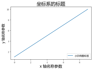
4、数学表达式
import numpy as np
import matplotlib.pyplot as plt
t = np.arange(0.0, 2.0, 0.01)
s = np.sin(2*np.pi*t)

plt.plot(t, s)
plt.title(r'$\alpha_i > \beta_i$', fontsize=20)
plt.text(1, -0.6, r'$\sum_{i=0}^\infty x_i$', fontsize=20)
plt.text(0.6, 0.6, r'$\mathcal{A}\mathrm{sin}(2 \omega t)$',
         fontsize=20)
plt.xlabel('time (s)')
plt.ylabel('volts (mV)')
plt.show()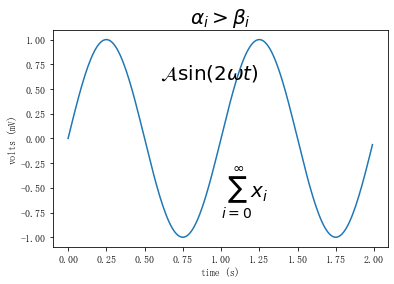
二、Tick上的文本
1、简单模式
可以使用axis的set_ticks方法手动设置标签位置,使用axis的set_ticklabels方法手动设置标签格式。
import matplotlib.pyplot as plt
import numpy as np
import matplotlib
x1 = np.linspace(0.0, 5.0, 100)
y1 = np.cos(2 * np.pi * x1) * np.exp(-x1)

# 使用axis的set_ticks方法手动设置标签位置的例子,该案例中由于tick设置过大,所以会影响绘图美观,不建议用此方式进行设置tick
fig, axs = plt.subplots(2, 1, figsize=(5, 3), tight_layout=True)
axs[0].plot(x1, y1)
axs[1].plot(x1, y1)
axs[1].xaxis.set_ticks(np.arange(0., 10.1, 2.))
plt.show()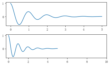
#一般绘图时会自动创建刻度,而如果通过上面的例子使用set_ticks创建刻度可能会导致tick的范围与所绘制图形的范围不一致的问题。
#所以在下面的案例中,axs[1]中set_xtick的设置要与数据范围所对应,然后再通过set_xticklabels设置刻度所对应的标签
import numpy as np
import matplotlib.pyplot as plt
fig, axs = plt.subplots(2, 1, figsize=(6, 4), tight_layout=True)
x1 = np.linspace(0.0, 6.0, 100)
y1 = np.cos(2 * np.pi * x1) * np.exp(-x1)
axs[0].plot(x1, y1)
axs[0].set_xticks([0,1,2,3,4,5,6])

axs[1].plot(x1, y1)
axs[1].set_xticks([0,1,2,3,4,5,6])#要将x轴的刻度放在数据范围中的哪些位置
axs[1].set_xticklabels(['zero','one', 'two', 'three', 'four', 'five','six'],#设置刻度对应的标签
                   rotation=30, fontsize='small')#rotation选项设定x刻度标签倾斜30度。
axs[1].xaxis.set_ticks_position('bottom')#set_ticks_position()方法是用来设置刻度所在的位置,常用的参数有bottom、top、both、none
print(axs[1].xaxis.get_ticklines())
plt.show()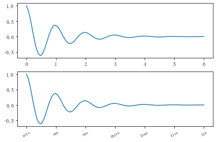
2、Tick Locators
在普通的绘图中,我们可以直接通过上图的set_ticks进行设置刻度的位置,缺点是需要自己指定或者接受matplotlib默认给定的刻度。当需要更改刻度的位置时,matplotlib给了常用的几种locator的类型。如果要绘制更复杂的图,可以先设置locator的类型,然后通过axs.xaxis.set_major_locator(locator)绘制即可
locator=plt.MaxNLocator(nbins=7)
locator=plt.FixedLocator(locs=[0,0.5,1.5,2.5,3.5,4.5,5.5,6])#直接指定刻度所在的位置
locator=plt.AutoLocator()#自动分配刻度值的位置
locator=plt.IndexLocator(offset=0.5, base=1)#面元间距是1,从0.5开始
locator=plt.MultipleLocator(1.5)#将刻度的标签设置为1.5的倍数
locator=plt.LinearLocator(numticks=5)#线性划分5等分,4个刻度
# 接收各种locator的例子
fig, axs = plt.subplots(2, 2, figsize=(8, 5), tight_layout=True)
for n, ax in enumerate(axs.flat):
    ax.plot(x1*10., y1)

locator = matplotlib.ticker.AutoLocator()
axs[0, 0].xaxis.set_major_locator(locator)

locator = matplotlib.ticker.MaxNLocator(nbins=10)
axs[0, 1].xaxis.set_major_locator(locator)


locator = matplotlib.ticker.MultipleLocator(5)
axs[1, 0].xaxis.set_major_locator(locator)


locator = matplotlib.ticker.FixedLocator([0,7,14,21,28])
axs[1, 1].xaxis.set_major_locator(locator)

plt.show()
此外matplotlib.dates 模块还提供了特殊的设置日期型刻度格式和位置的方式
import matplotlib.dates as mdates
import datetime
# 特殊的日期型locator和formatter
locator = mdates.DayLocator(bymonthday=[1,15,25])
formatter = mdates.DateFormatter('%b %d')

fig, ax = plt.subplots(figsize=(5, 3), tight_layout=True)
ax.xaxis.set_major_locator(locator)
ax.xaxis.set_major_formatter(formatter)
base = datetime.datetime(2017, 1, 1, 0, 0, 1)
time = [base + datetime.timedelta(days=x) for x in range(len(x1))]
ax.plot(time, y1)
ax.tick_params(axis='x', rotation=70)
plt.show()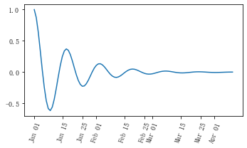
三、图例
常用的几个参数:
(1)设置图列位置
plt.legend(loc='upper center') 等同于plt.legend(loc=9),对应关系如下表。
| loc by number | loc by text |
|---|---|
| 0 | 'best' |
| 1 | 'upper right' |
| 2 | 'upper left' |
| 3 | 'lower left' |
| 4 | 'lower right' |
| 5 | 'right' |
| 6 | 'center left' |
| 7 | 'center right' |
| 8 | 'lower center' |
| 9 | 'upper center' |
| 10 | 'center' |
(2)设置图例字体大小
fontsize : int or float or {‘xx-small’, ‘x-small’, ‘small’, ‘medium’, ‘large’, ‘x-large’, ‘xx-large’}
(3)设置图例边框及背景
plt.legend(loc='best',frameon=False) #去掉图例边框
plt.legend(loc='best',edgecolor='blue') #设置图例边框颜色
plt.legend(loc='best',facecolor='blue') #设置图例背景颜色,若无边框,参数无效
(4)设置图例标题
legend = plt.legend(["CH", "US"], title='China VS Us')
(5)设置图例名字及对应关系
legend = plt.legend([p1, p2], ["CH", "US"])
line_up, = plt.plot([1, 2, 3], label='Line 2')
line_down, = plt.plot([3, 2, 1], label='Line 1')
plt.legend([line_up, line_down], ['Line Up', 'Line Down'],loc=5, title='line',frameon=False);#loc参数设置图例所在的位置,title设置图例的标题,frameon参数将图例边框给去掉
当一个图出现多图例时
#这个案例是显示多图例legend
import matplotlib.pyplot as plt
import numpy as np
x = np.random.uniform(-1, 1, 4)
y = np.random.uniform(-1, 1, 4)
p1, = plt.plot([1,2,3])
p2, = plt.plot([3,2,1])
l1 = plt.legend([p2, p1], ["line 2", "line 1"], loc='upper left')

p3 = plt.scatter(x[0:2], y[0:2], marker = 'D', color='r')
p4 = plt.scatter(x[2:], y[2:], marker = 'D', color='g')
# 下面这行代码由于添加了新的legend,所以会将l1从legend中给移除
plt.legend([p3, p4], ['label', 'label1'], loc='lower right', scatterpoints=1)
# 为了保留之前的l1这个legend,所以必须要通过plt.gca()获得当前的axes,然后将l1作为单独的artist
plt.gca().add_artist(l1);


 396
396


 被折叠的 条评论
为什么被折叠?
被折叠的 条评论
为什么被折叠?
 到【灌水乐园】发言


