


写在前面
Python中画图是很大一块内容,我在学数据分析过程中,认为最常用的图分为以下几四种
i、数据探索找特征相关性和散点图
ii、数据清洗箱线图
iii、趋势分析、分布分析等
iv、数据偏度和正态分布情况
常用图包括:scatter plot散点图, boxplot箱线图, heatmap热力图, bar/line/hist/pie 形图
为了阻止notebook出现提示文字,在绘图语句最后加上“ ; ”
基本要素
图的基本要素包括figsize, axis label, tick label 轴的刻度, title, legend
a=np.linspace(-10,10,200)
x_ticks=[]
b=list(map(lambda x: x_ticks.append(x), range(-10,11)))
print(x_ticks)
y=np.sin(a)
#构建一个图
#首先定义figure对象(图需要多大)
plt.figure(figsize=(6,3))
#然后说明x,y取值,
plt.plot(a,y,linestyle=':')
plt.xlabel('x取值')
plt.ylabel('y值')
plt.title('正弦函数')
plt.xticks(x_ticks);
xticks还可以展示月份
#通过xticks还可以展示月份、小时、string等
import calendar
a=range(1,13,1)
y=np.sqrt(a)+np.log(a)+5
plt.figure(figsize=(6,3))
plt.plot(a,y,linewidth=2,color='green')
plt.xlabel('月份')
plt.ylabel('y值')
plt.title('线性函数')
plt.xticks(a,calendar.month_name[1:13],color='black',rotation=60);
subplot
subplot是一个同时展示多个图形的功能,可以很直观看到特征之间的相关特性。比如在做分类问题时,查看特征与应变量的相关关系或者特征本身属性可以使用subplot。
team=pd.read_excel('team.xlsx')
team.head(1)
plt.figure(figsize=(15,15))
fig,axes=plt.subplots(2,2,sharex=True)
team.plot(x='name',y='Q1',ax=axes[0,0],colormap='cividis')
team.plot(x='name',y='Q2',ax=axes[0,1],colormap='cividis')
team.plot(x='name',y='Q3',ax=axes[1,0],colormap='cividis')
team.plot(x='name',y='Q4',ax=axes[1,1],colormap='cividis')
axes[0,0].set_title('Q1')
axes[0,1].set_title('Q2')
axes[1,0].set_title('Q3')
axes[1,1].set_title('Q4');
team文件是统计了几个队伍的队员们在Q1~Q4的得分情况的表,这里用subplot展示其得分波动性。

subplot还有另一种方法展示
x=np.linspace(1,11,10)
ax1=plt.subplot(2,2,1)
plt.plot(x,np.sin(x),color='k')

ax2=plt.subplot(2,2,2,sharey=ax1)
plt.plot(x,np.cos(x),color='g')

ax3=plt.subplot(2,2,3)
plt.plot(x,x,color='r')

ax4=plt.subplot(2,2,4,sharey=ax3)
plt.plot(x,x*2,color='y')
scatter_matrix
使用scatter_matrix可以更轻松达到和subplot类似效果
df=pd.DataFrame(np.random.randn(100,4),columns=['a','b','c','d'])
pd.plotting.scatter_matrix(df,figsize=(8,6),marker='o',
                           diagonal='kde',alpha=0.4,range_padding=0.05);
#scatter_matrix中diagonal可选kde曲线和hist柱状图,range_padding是图像在x轴y轴原点附近留白
#sns有个类似的pairplot可以用
bar/line/pie/hist
在做对比分析、趋势分析时,常用柱状图表示分层分布,常用histogram图体现各区间频率,常用折线图展现某个特征一段时间的波动趋势,常用饼图展示在各业务组成的贡献比例。
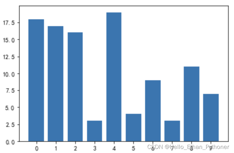
#简易Bar
x=np.arange(10)
y=np.random.randint(0,20,10)
plt.bar(x,y)#plt.bar是bar graph调用函数
plt.xticks(x);
也可以做成对比图或者堆叠图
#对比图
df=pd.DataFrame(np.random.rand(10,3),columns=['a','b','c'])
df.plot(kind='bar',grid=True,colormap='cividis')
plt.title('df')
plt.legend()

#stacked
df.plot(kind='bar',grid=True,colormap='BuGn_r',stacked=True)

hist
#hist频率直方图
#hist 是画(频率分布)直方图,x 轴表示这一列数据的种类,y 轴表示该类别出现的次数(频数);bar 是画柱状图。
#hist 直方图展示的是数据的分布,bar 柱状图展示的数据本身的大小。
a=pd.Series(np.random.randn(1000))
a.hist(bins=100,histtype='bar',align='mid',orientation='vertical',alpha=0.5)
line
y=[]
test=list(map(lambda x: y.append(x), range(0,31)))
y=pd.Series(y)
y
x=pd.DataFrame(np.exp(y)).rename(columns={0:'exp'})
x
plt.figure(figsize=(5,2))
x.plot(linewidth='2')
plt.title('line graph')
plt.legend(loc='upper left');
import warnings
warnings.filterwarnings('ignore');
pie
饼图中labels是各块饼的名称,colors是颜色,explode是定义哪几块需要炸开,autopct可以定义比例以小数还是百分比展示
a=np.array([35,25,25,15])
plt.pie(a,labels=['a','b','c','d'],colors=['yellowgreen','gold','lightblue','coral'],
        explode=(0,0.1,0,0),autopct='%.2f%%')
plt.title('Pie chart')
scatter plot
用于直观展现两个变量之间可能存在的线性相关关系
x=np.random.randn(50)
y=np.random.randn(50)
plt.scatter(x,y)
plt.xlabel('x取值')
plt.ylabel('y值')
plt.title('scatter')
plt.legend(); 
box plot
box plot是处理异常数据时(如果数据不近似符合正态分布时)最常用的处理方式。
np.random.seed(1234)
data=np.random.normal(size=1000,loc=0,scale=1)
plt.boxplot(data);
heatmap
在数据探索过程中,需要查看各个特征变量之间的correlation,常用seaborn的heatmap功能直观体现。
#heatmap中特征必须均为数值型
team=pd.read_excel('team.xlsx')
team=pd.DataFrame(team)
team=pd.get_dummies(team,columns=['team'])
team=team.drop('name',axis=1)
corr=team.corr()
plt.figure(figsize=(6,6))
sns.heatmap(data=corr,annot=True,cmap='summer_r');
#注意:heatmap中的特征必须均为数值型

如上简单记录了在数据分析过程中,常用画图函数的方法。作为学习过程记录


 5313
5313


 被折叠的 条评论
为什么被折叠?
被折叠的 条评论
为什么被折叠?
 到【灌水乐园】发言


