


渐变
线性渐变
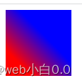
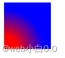
语法:background-image:linear-gradient(方向(deg),颜色 渐变点的百分比)
方向:上下左右,角度(默认的是top,to bottom,180deg)
如果添加方向,必须使用浏览器内核识别标识:
-webkit- safari&chrome
-moz- firefox
-ms- IE
-o- opera


径向渐变
语法:radial-gradient(中心点,形状,颜色 渐变点的百分比)
形状:circle ellipse
终点:
closest-side
closest-corner
farthest-side
farthest-corner

过渡:
transition 在不适用动画的情况下变换状态
使用: transition:属性名 时间 延迟时间 速度曲线
transition-property 设置过渡的属性 值:全部css属性
transition-duration 定义过渡时间
transition-delay 定义延时执行时间
transition-timing-function 过度效果的时间曲线
linear 匀速
ease 慢快慢
ease-in 慢,快
ease-out 快慢
ease-in-out 慢快慢
cubic-bezier(n,n,n,n) 函数中可以定义自己的值 (范围在0~1)
倒影
box-reflect
值:
none 默认
below above left right
语法 box-reflect:方向 偏移量 ?蒙版或渐变
(火狐不支持,且倒影是脱离文档流的)
变形
transform
translate 平移 (单位:px)
rotate 旋转 (单位:deg)
scale 伸缩 (单位:数值)
skew 拉扯 (单位:deg)
transform-style:preserve-3d
动画(animation)
关键帧 keyframes
animation-name 动画属性名
animation-duration 动画持续时间
animation-delay 动画延迟时间
animation-timing-function 动画速度曲线
animation-iteration-count 定义循环次数(infinite为无限循环)
animation-direction:alternate 动画轮流反向播放
animation-play-state 动画状态(值:paused running)
animation-fill-mode forwards 保留最后一帧动画


 143
143


 被折叠的 条评论
为什么被折叠?
被折叠的 条评论
为什么被折叠?
 到【灌水乐园】发言


