


渐变
1.线性渐变
语法 background-image:linear-gradient(方向(deg),颜色 渐变点的百分比)
百分比的作用:在线性的方向上分段,该节点达到颜色值,其余渐变
方向
上 下 左 右 角度
默认值是 top、to bottom、180deg
如果添加方向,则必须使用浏览器内核识别标记
-webkit- safari&chrome
-moz- firefox
-ms- IE
-o- opera
2.径向渐变
语法
radial-gradient(中心点,形状,颜色 渐变点的百分比)
形状
circle
ellipse
终点
closest-side
closest-corner
farthest-side
farther-corner
3.重复渐变
repeating-(径向、线性)
4.颜色
可用多个yanse
还可以使用透明度
过渡
1.transition
在不适合动画的情况下变换状态
简写状态
transitin:all 1s 0.1s linear 顺序:属性名 时间 延迟时间 速度曲线
2. transition-property
设置过度的属性
值 全部css属性
3.transition-duration
定义过度时间
4.transition-delay
定义延时执行时间
5.transition-timing-function
过度效果的时间曲线
linear
匀速
cubic-bezier(0,0,1,1)
ease
慢。快,慢
默认的
cubic-bezier(0.25,0.1,0.25,0.1)
ease-in
man,快
cubic-bezier(0.42,0,1,1)
ease-out
快,慢
cubic-bezier(0,0,0.58,1)
ease-in-out
慢,快,慢
cubic-bezier(0.42,0,0.58,1)
cubic-bezier(n,n,n,n)
在函数中可以定义自己的值
值0-1
倒影
box-reflect
值
none 默认的
below
above
left
right
语法
box-reflect:方向 偏移量 ? 蒙版或渐变
注意
火狐不支持,且倒影是脱离文档流的
变形
transform
平移 translat xyz px
旋转 rotate xyz deg
伸缩 scale xyz 数值
拉扯 skew deg x y
3D效果 transform-style:preserve-3D
案例如下:
<!DOCTYPE html>
<html lang="en">

<head>
    <meta charset="UTF-8">
    <meta http-equiv="X-UA-Compatible" content="IE=edge">
    <meta name="viewport" content="width=device-width, initial-scale=1.0">
    <title>旋转立方体</title>
    <style>
        @keyframes roll {
            from {
                transform: rotateX(0) rotateY(0) rotateZ(0);
            }

            to {
                transform: rotateX(360deg) rotateY(720deg) rotateZ(360deg);
            }
        }

        * {
            margin: 0;
            padding: 0;
        }

        body {
            background-color: #111;
        }

        div {
            width: 200px;
            height: 200px;
            position: absolute;
        }

        .wrap {
            margin: 200px;
            margin-left: 500px;
            animation: roll 4s linear infinite;
            /* 开启3d */
            transform-style: preserve-3d;
        }

        .wrap div {
            opacity: .5;
        }

        .wrap .small {
            width: 100px;
            height: 100px;
            margin: 50px;
        }

        /* 左右  */
        .wrap div:nth-of-type(1) {
            transform: rotateY(-90deg) translateZ(100px);
            background-color: hotpink;
        }

        .wrap div:nth-of-type(2) {
            transform: rotateY(90deg) translateZ(100px);
            background-color: deepskyblue;
        }

        /* 上下 */
        .wrap div:nth-of-type(3) {
            transform: rotateX(90deg) translateZ(100px);
            background-color: gold;
        }

        .wrap div:nth-of-type(4) {
            transform: rotateX(-90deg) translateZ(100px);
            background-color: greenyellow;
        }

        /* 前后 */
        .wrap div:nth-of-type(5) {
            transform: translateZ(100px);
            background-color: palevioletred;
        }

        .wrap div:nth-of-type(6) {
            transform: rotateX(180deg) translateZ(100px);
            background-color: rgb(255, 162, 0);
        }

        .wrap div:nth-of-type(7) {
            transform: rotateY(-90deg) translateZ(50px);
            background-color: hotpink;
        }

        .wrap div:nth-of-type(8) {
            transform: rotateY(90deg) translateZ(50px);
            background-color: deepskyblue;
        }

        .wrap div:nth-of-type(9) {
            transform: rotateX(90deg) translateZ(50px);
            background-color: gold;
        }

        .wrap div:nth-of-type(10) {
            transform: rotateX(-90deg) translateZ(50px);
            background-color: greenyellow;
        }

        .wrap div:nth-of-type(11) {
            transform: translateZ(50px);
            background-color: palevioletred;
        }

        .wrap div:nth-of-type(12) {
            transform: rotateX(180deg) translateZ(50px);
            background-color: rgb(255, 162, 0);
        }
    </style>
</head>

<body>
    <div class="wrap">
        <div></div>
        <div></div>
        <div></div>
        <div></div>
        <div></div>
        <div></div>

        <div class="small"></div>
        <div class="small"></div>
        <div class="small"></div>
        <div class="small"></div>
        <div class="small"></div>
        <div class="small"></div>
    </div>
</body>

</html>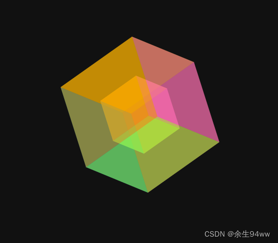


 2122
2122


 被折叠的 条评论
为什么被折叠?
被折叠的 条评论
为什么被折叠?
 到【灌水乐园】发言


