


目录
实现要求:
请分别做出四个不同的鼠标效果,效果如下
屏幕悬停(一)效果
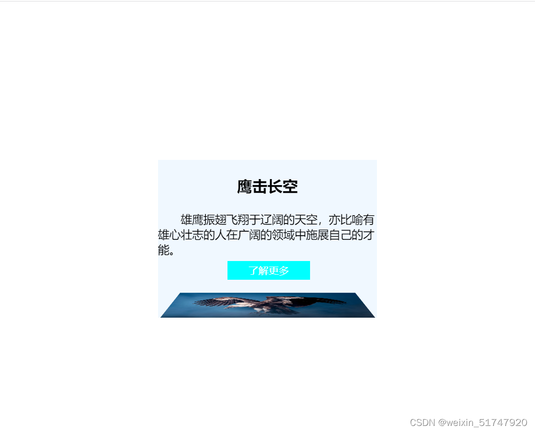
第一个鼠标悬停
分析:
当鼠标悬停时,出现了内容框下滑遮住图片框,并且图片放大显示;当鼠标在内容框内的按钮处悬停时,按钮的背景颜色、字体颜色也发生了相应的变化。
关键思路:我们可以设置一个元素A,让这个元素的大小和图片的大小一致。并使内容框位于元素A的上方,图片的位置与元素A一致。最后别忘了设置元素A的overflow属性呢~
代码实现:
<!DOCTYPE html>
<html>
	<head>
		<meta charset="utf-8" />
		<title>第一个</title>
		<style>
			*{
				margin: 0;
				padding: 0;
			}
			figure {
				width: 346px;
				height: 250px;
				position: relative;
				top: 250px;
				left: 250px;
				/* 超出部分隐藏 */
				overflow: hidden;
			}
			figure .content {
				width: 346px;
				height: 250px;
				position: absolute;
				top: -250px;
				background-color: aliceblue;
				opacity: 0.9; /* 透明度降低 */
				transition: 1s all;
			}
			figure .imgs img{
				transition: 1s all;
			}
			figure:hover .content {
				top: 0;
				transition: 1s all;
			}
			figure:hover .imgs img {
				/* 把图片缩放至原来的1.2倍 */
				transform: scale(1.2, 1.2);
				transition: 1s all;
			}
			figure .content figcaption h2{
				margin: 25px;
				text-align: center;
			}
			figure .content p {
				font-size: 18px;
				text-indent: 2em; /* 使p标签内的文字空2个字符 */
			}
			figure .content a {
				display: inline-block;
				width: 130px;
				height: 30px;
				line-height: 30px;
				text-align: center;
				text-decoration: none; /* 删除超链接底部下划线 */
				position: absolute;
				bottom: 60px;
				left: 110px;
				color: #fff;
				background-color: aqua;
			}
			figure .content a:hover {
				/* 将背景设置为无 */
				background: none;
				color: aqua;
				border: 1px solid aqua;
			}

		</style>
	</head>
	<body>
		<figure>
			<div class="imgs">
				<img src="img/img-1.jpg" alt="">
			</div>
			<div class="content">
				<figcaption><h2>鹰击长空</h2></figcaption>
				<p>雄鹰振翅飞翔于辽阔的天空,亦比喻有雄心壮志的人在广阔的领域中施展自己的才能。</p>
				<a href="#">了解更多</a>
			</div>
		</figure>


	</body>
</html>
第二个鼠标悬停
分析:
当鼠标悬停时,图片框进行了倾斜,并且当鼠标在内容框内的按钮处悬停时,按钮的背景颜色、字体颜色也发生了相应的变化。
关键思路:对于本个图片框倾倒样式,我们可以认为是图片沿着它的底部的X轴进行了一定角度的旋转,并且产生了“近大远小”的3D效果。
查看一些资料,很多博主说perspective 属性要放在父级身上,所以我之前就把“perspective: 1000px;”放在图片img的直接父级元素.imgs中,但是3D效果未发生;后来将其放入顶级元素figure中,3D效果产生了。这究竟是为什么呀?很疑惑。希望大佬们能解解惑!!!感谢
perspective属性是指元素的z平面距离用户之间的距离,浏览器通过该距离来计算用户的视角大小,从而制造出"近大远小"的3D效果。
注意:perspective属性只影响3D转换元素。
代码实现:
<!DOCTYPE html>
<html>
	<head>
		<meta charset="utf-8" />
		<title>再尝试一次</title>
		<style>
			*{
				margin: 0;
				padding: 0;
			}
			figure {
				width: 346px;
				height: 250px;
				position: relative;
				top: 250px;
				left: 250px;
				/* 超出部分隐藏 */
				overflow: hidden;
				perspective: 1000px;  /* 一定要注意此行代码!!! 没有该代码会影响其超链接的悬浮*/
			}
			figure .content {
				width: 346px;
				height: 250px;
				position: absolute;
				top: -250px;
				background-color: aliceblue;
				/*opacity: 0.9;  透明度降低 */
				transition: 1s all;
				z-index: -1;
			}
			figure .imgs{
				transform-style: preserve-3d;
                /* perspective: 1000px;  */
				/* 如果上行的perspective属性未注释点而注释掉figure里面的该属性,则内容框的按钮悬停失效!! */
				transition: 1s all;
			}
			figure:hover .content {
				top: 0;
				transition: 1s all;
			}
			figure:hover .imgs {
				transform-origin: center bottom;
				transform: rotateX(85deg);
				transition: 1s all;
			}
			figure .content figcaption h2{
				margin: 25px;
				text-align: center;
			}
			figure .content p {
				font-size: 18px;
				text-indent: 2em; /* 使p标签内的文字空2个字符 */
			}
			figure .content a {
				display: inline-block;
				width: 130px;
				height: 30px;
				line-height: 30px;
				text-align: center;
				text-decoration: none; /* 删除超链接底部下划线 */
				position: absolute;
				bottom: 60px;
				left: 110px;
				color: #fff;
				background-color: aqua;
			}
			figure .content a:hover {
				/* 将背景设置为无 */
				background: none;
				color: aqua;
				border: 1px solid aqua;
			}

		</style>
	</head>
	<body>
		<figure>
			<div class="imgs">
				<img src="img/img-1.jpg" alt="">
			</div>
			<div class="content">
				<figcaption><h2>鹰击长空</h2></figcaption>
				<p>雄鹰振翅飞翔于辽阔的天空,亦比喻有雄心壮志的人在广阔的领域中施展自己的才能。</p>
				<a href="#">了解更多</a>
			</div>
		</figure>


	</body>
</html>
第三个鼠标悬停
分析:
此样式很简单,看看代码分析一下就可以啦~
代码实现:
<!DOCTYPE html>
<html>
	<head>
		<meta charset="utf-8" />
		<title>旋转</title>
		<style>
			*{
				margin: 0;
				padding: 0;
			}
			figure {
				width: 346px;
				height: 250px;
				position: relative;
				top: 250px;
				left: 250px;
				/* 超出部分隐藏 */
				overflow: hidden;
			}
			figure .content {
				width: 346px;
				height: 250px;
				position: absolute;
				top: 0px;
				background-color: aliceblue;
				opacity: 0.9; /* 透明度降低 */
				transition: 1s all;
				/* z-index: =1; */
				transform: rotateY(180deg) scale(0,0);
			}
			figure .imgs img{
				transform: rotateY(180deg) scale(1,1);
				transition: 1s all;
				/* z-index: 1; */
			}
			figure:hover .content {

				transform: rotateY(720deg) scale(1,1);

				transition: 1s all;
			}
			figure:hover .imgs img {
				transform: rotateY(720deg) scale(0,0);
				transition: 1s all;
			}
			figure .content figcaption h2{
				margin: 25px;
				text-align: center;
			}
			figure .content p {
				font-size: 18px;
				text-indent: 2em; /* 使p标签内的文字空2个字符 */
			}
			figure .content a {
				display: inline-block;
				width: 130px;
				height: 30px;
				line-height: 30px;
				text-align: center;
				text-decoration: none; /* 删除超链接底部下划线 */
				position: absolute;
				bottom: 60px;
				left: 110px;
				color: #fff;
				background-color: aqua;
			}
			figure .content a:hover {
				/* 将背景设置为无 */
				background: none;
				color: aqua;
				border: 1px solid aqua;
			}

		</style>
	</head>
	<body>
		<figure>
			<div class="imgs">
				<img src="img/img-1.jpg" alt="">
			</div>
			<div class="content">
				<figcaption><h2>鹰击长空</h2></figcaption>
				<p>雄鹰振翅飞翔于辽阔的天空,亦比喻有雄心壮志的人在广阔的领域中施展自己的才能。</p>
				<a href="#">了解更多</a>
			</div>
		</figure>


	</body>
</html>
第四个鼠标悬停
分析:
当鼠标悬停时,内容框从右侧滑入,图片框进行了缩放,并置于内容框之上;当鼠标在内容框内的按钮处悬停时,按钮的背景颜色、字体颜色也发生了相应的变化。
关键思路:对于缩放后的图片框置于内容框之上,我们可以选择z-index属性来设置元素的堆叠顺序。
z-index层叠等级属性可以调整元素的堆叠顺序。该属性值可以是正整数、负整数或0,默认值是0,一般情况数值越大,盒子越靠上。
注意:z-index属性只能用于相对定位、绝对定位和固定定位的元素,其他标准流、浮动和静态定位无效。此外,属性值中的数字后面不能加单位。
代码实现:
<!DOCTYPE html>
<html>
	<head>
		<meta charset="utf-8" />
		<title>左右移动</title>
		<style>
			*{
				margin: 0;
				padding: 0;
			}
			figure {
				width: 346px;
				height: 250px;
				position: relative;
				top: 250px;
				left: 250px;
				/* 超出部分隐藏 */
				/* overflow: hidden;
				transform-style: preserve-3d;
				perspective: 1000px; */
				z-index: 9;
			}
			figure .content {
				width: 346px;
				height: 250px;
				position: absolute;
				top: 0px;
				left: 346px;
				background-color: aliceblue;
				opacity: 0; /* 透明度降低 */
				transition: 1s all;
			}
			figure .imgs{
				position: absolute; /* z-index才会有用!! */
				transition: 1s all;
			}
			figure:hover .content {
				top: 0;
				opacity: 1;
				transform: translateX(-346px);
				transition: 1s all;
				border: 1px solid skyblue;
			}
			figure:hover .imgs {
				/* 把图片缩放至原来的0.5倍 */
				transform: scale(0.5) translateX(-346px);
				transition: 1s all;
				z-index: 9;
			}
			figure .content figcaption h2{
				margin: 25px;
				text-align: center;
			}
			figure .content p {
				font-size: 18px;
				text-indent: 2em; /* 使p标签内的文字空2个字符 */
				margin-left: 87px;
			}
			figure .content a {
				display: inline-block;
				width: 130px;
				height: 30px;
				line-height: 30px;
				text-align: center;
				text-decoration: none; /* 删除超链接底部下划线 */
				position: absolute;
				bottom: 50px;
				left: 110px;
				color: #fff;
				background-color: aqua;
			}
			figure .content a:hover {
				/* 将背景设置为无 */
				background: none;
				color: aqua;
				border: 1px solid aqua;
			}

		</style>
	</head>
	<body>
		<figure>
			<div class="imgs">
				<img src="img/img-1.jpg" alt="">
			</div>
			<div class="content">
				<figcaption><h2>鹰击长空</h2></figcaption>
				<p>雄鹰振翅飞翔于辽阔的天空,亦比喻有雄心壮志的人在广阔的领域中施展自己的才能。</p>
				<a href="#">了解更多</a>
			</div>
		</figure>


	</body>
</html>


 4375
4375


 被折叠的 条评论
为什么被折叠?
被折叠的 条评论
为什么被折叠?
 到【灌水乐园】发言


