


因为原生的select不太好封装,所以就选用了div+ul来模拟下拉框选择,本文使用的是vue3将其封装成一个组件,需要用到vueuse,不过如果不认识这个插件或者不想安的,也不碍事,这个插件就是让我们封装的组件的在组件范围之外点击可以关闭显示下拉框
1. 封装
<script lang="ts" setup>
import {getCurrentInstance, ref} from "vue";
import {onClickOutside} from "@vueuse/core";

interface Props {
    width?: number, // 宽度
    height?: number, // 高度
    options: any, // option数组,下拉框显示内容,为数组类型,如:['选项1','选项2',...]
    selectValue?: any, // 默认展示的option
}

const props = withDefaults(defineProps<Props>(), {
    width: 150,
    height: 30,
});
const {proxy} = getCurrentInstance();

// 组装样式
const selectStyle = {
    width: props.width + "px",
    height: props.height + "px",
};

// 控制显示下拉框
const show = ref(false);
// 获取本组件实例
const target = ref();
// 选中的值,其中的判断是看父组件是否传递有默认展示的值,如果没有就默认展示option数组的第一个值
const selectValue = ref(props.selectValue != null ? props.selectValue : props.options[0]);

// 在组件范围之外的点击事件
onClickOutside(target, () => {
    // 在组件范围之外点击,关闭显示下拉框
    show.value = false;
})
// 下拉框点击事件
const getOption = (option: any) => {
    // 将选择的值传递给父组件
    proxy.$emit("getOption", option);
    // 修改展示的值
    selectValue.value = option;
    // 关闭显示下拉框
    show.value = false;
}
</script>

<template>
    <div class="custom-select" :style="selectStyle" ref="target">
        <div class="selected-option" @click="show = !show">
            <span>{{ selectValue }}</span>
            <img v-if="!show" class="icon" src="@/assets/images/system/up.png" alt="">
            <img v-else class="icon" src="@/assets/images/system/bottom.png" alt="">
        </div>
        <ul class="options-list" v-show="show">
            <li
                    v-for="option in options"
                    :key="option"
                    :class="['option', selectValue == option && 'active']"
                    @click="getOption(option)"
            >
                {{ option }}
            </li>
        </ul>
    </div>
</template>

<style lang="scss" scoped>
.custom-select {
  border: 1px solid #ccc;
  border-radius: 4px;
  margin: 0 10px;

  .selected-option {
    display: flex;
    align-items: center;
    justify-content: space-between;
    height: 30px;
    line-height: 30px;
    padding: 0 10px;
    cursor: pointer;

    .icon {
      width: 15px;
      height: 15px;
    }
  }

  .options-list {
    position: absolute;
    top: 30px;
    left: 0;
    width: 100%;
    background-color: #fff;
    border: 1px solid #ccc;
    border-top: none;
    list-style: none;
    padding: 0;
    margin: 0;
    z-index: 200;
    transition: all 1s ease-in-out;
  }

  .option {
    padding: 10px;
    cursor: pointer;
  }

  .option:hover {
    background-color: #409EFF;
    color: white;
  }

  .active {
    background-color: #409EFF;
    color: white;
  }
}
</style>
2. 使用
<script lang="ts" setup>
// 引入组件
import MySelect from "@/components/componet/MySelect.vue";
// option数组
const options = ["全部", "待付款", "待发货", "待收货", "待评价"]
// 获取配置项
const getOption = (val) => {
    console.log(val)
}
</script>

<template>
  <MySelect :options="options" @getOption="getOption"/>
</template>
3. 效果
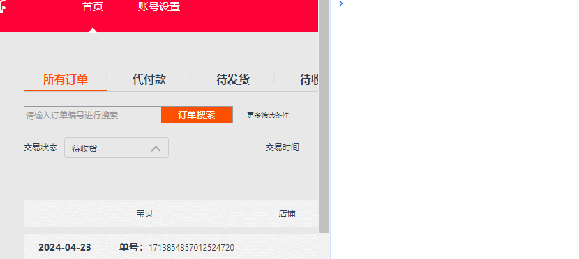
最终实现,父组件可以同步获取到select组件中点击的option值,vueuse中onClickOutside也就帮我们实现了最后展示在组件外点击关闭显示下拉框,但是这个演示不太能看的出来,所以不在意这个小功能的话也可以在封装组件中删除以下代码
// 在组件范围之外的点击事件
onClickOutside(target, () => {
    // 在组件范围之外点击,关闭显示下拉框
    show.value = false;
})


 9231
9231

 被折叠的 条评论
为什么被折叠?
被折叠的 条评论
为什么被折叠?
 到【灌水乐园】发言


