


前面画页面经常flex布局是非常好用的,但是列表换行的时候就会有很多问题
下面直接上代码
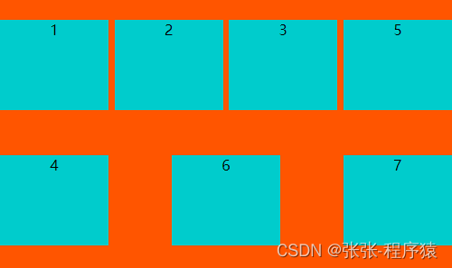
方法一:
利用伪类选择器解决,简单好用。一行四个,一个三个,一行五个都可以很快的去设置。
.flex {
	background: #ff5500;
	width: 500px;
	height: 300px;
	display: flex;
	align-items: center;
	justify-content: space-between;
	flex-wrap: wrap;
}
.flex::after {
	content: '';
	width: 24%;
}
效果图:
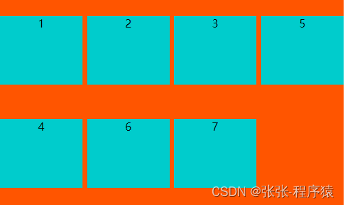
方法二:
模拟space-between和间隙
.flex {
	background: #ff5500;
	width: 500px;
	height: 300px;
	display: flex;
	align-items: center;
	flex-wrap: wrap;
}
.sublevel:not(:nth-child(5n)) {
  margin-right: calc(20% / 4);
}
.sublevel {
	width: 16%;
	height: 100px;
	background: #00cccc;
	text-align: center;
}
效果图:
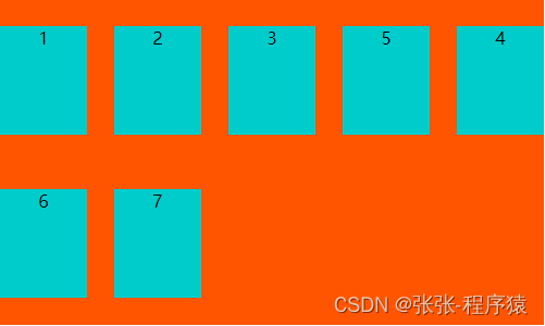
方法三:
Grid布局,号称是最强大的的 CSS 布局方案,是目前唯一一种 CSS 二维布局
.flex {
	background: #ff5500;
	width: 500px;
	height: 300px;
	display: grid;
	justify-content: space-between;
	grid-template-columns: repeat(auto-fill, 100px);
	grid-gap: 5px;
}

.sublevel {
	width: 100%;
	height: 100px;
	background-color: skyblue;
	margin-top: 5px;
}
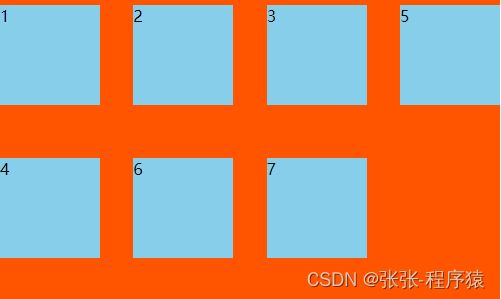
效果图:
希望对大家有一定的帮助,持续更新前端。


 879
879


 被折叠的 条评论
为什么被折叠?
被折叠的 条评论
为什么被折叠?
 到【灌水乐园】发言


