pip install matplotlib -i https://pypi.tuna.tsinghua.edu.cn/simple
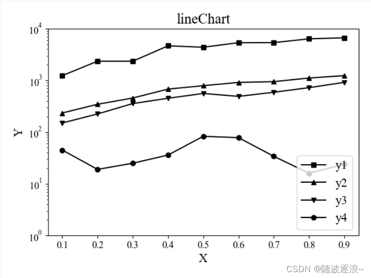
折线图
import matplotlib.pyplot as plt
plt.rcParams['font.sans-serif']=['SimHei']
plt.rcParams['axes.unicode_minus'] = False
font = {'family': 'serif',
'serif': 'Times New Roman',
'weight': 'normal',
'size': 15}
plt.rc('font', **font)
x = [i * 0.1 for i in range(1, 10)]
y1 = [1234, 2345, 2345, 4656, 4366, 5356, 5367, 6356, 6654]
y2 = [234, 345, 456, 678, 789, 912, 945, 1111, 1234]
y3 = [150, 224, 356, 451, 558, 490, 589, 723, 915]
y4 = [45, 19, 25, 36, 83, 78, 34, 16, 24]
plt.plot(x, y1, 's-', color='black', label='y1')
plt.plot(x, y2, '^-', color='black', label="y2")
plt.plot(x, y3, 'v-', color='black', label="y3")
plt.plot(x, y4, 'o-', color='black', label="y4")
plt.xticks([x * 0.1 for x in range(1, 10)], fontsize=12)
plt.xlabel("X", fontsize=15)
plt.yscale('log')
plt.yticks([1,10, 100, 1000, 10000],fontsize=12)
plt.ylabel("Y", fontsize=15)
plt.legend(loc="lower right")
plt.title("lineChart")
plt.show()
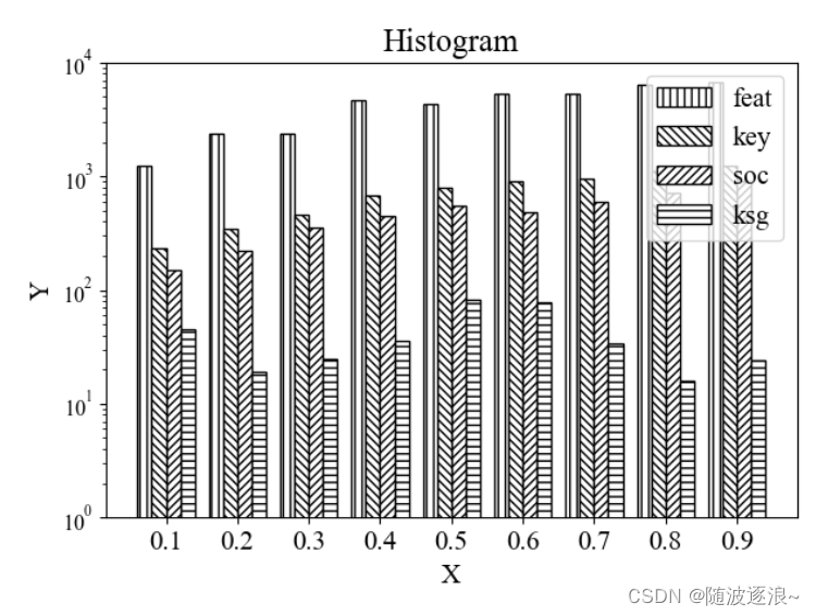
直方图
import matplotlib.pyplot as plt
import numpy as np
font = {'family': 'serif',
'serif': 'Times New Roman',
'weight': 'normal',
'size': 15}
plt.rc('font', **font)
labels= ['0.1','0.2','0.3','0.4','0.5','0.6','0.7','0.8','0.9']
y1 = [1234, 2345, 2345, 4656, 4366, 5356, 5367, 6356, 6654]
y2 = [234, 345, 456, 678, 789, 912, 945, 1111, 1234]
y3 = [150, 224, 356, 451, 558, 490, 589, 723, 915]
y4 = [45, 19, 25, 36, 83, 78, 34, 16, 24]
x = np.arange(len(labels))
width = 0.2
plt.bar(x - width * 1.5, y1, width, color='white', edgecolor='black', hatch='|||', label='feat')
plt.bar(x - width * 0.5, y2, width, color='white', edgecolor='black', hatch='\\\\\\\\\\', label='key')
plt.bar(x + width * 0.5, y3, width, color='white', edgecolor='black', hatch='/', label='soc')
plt.bar(x + width * 1.5, y4, width, color='white', edgecolor='black', hatch='---', label='ksg')
plt.xticks(x, labels)
plt.xlabel("X", fontsize=15)
plt.yscale('log')
plt.yticks([1,10, 100, 1000, 10000], fontsize=12)
plt.ylabel('Y')
plt.legend(loc="upper right")
plt.title("Histogram")
plt.show()


 8276
8276


 被折叠的 条评论
为什么被折叠?
被折叠的 条评论
为什么被折叠?
 到【灌水乐园】发言


