


嘿👋!我是 [康小汪],今天要带大家体验一个超酷的前端效果——“多时区动态时钟”!✨
快来围观,一起探索这个炫酷的动态时钟页面吧!🎉
记得点赞、收藏、转发,让更多小伙伴看到哦!❤️
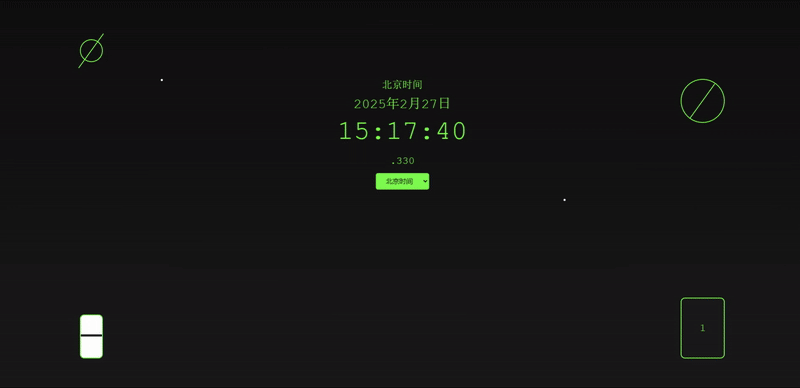
整体效果
思路
一、整体架构
采用经典的三层结构:
HTML:搭建页面基础骨架
CSS:实现视觉样式与动画效果
JavaScript:处理动态交互与背景特效
二、核心技术实现
页面布局设计:
- 使用Flexbox布局,使内容居中显示。
- 设置背景颜色为深黑色,文字颜色为绿色,字体为等宽字体,增强可读性。
元素结构设计:
- 创建一个包含多个子元素的容器,用于显示位置名称、日期时间、时间、毫秒和时区选择器。
- 使用绝对定位和变换,将时钟、日历、和沙漏等元素放置在页面的不同位置。
CSS样式设计:
- 定义各个元素的样式,包括字体大小、颜色、边框和背景。
- 使用CSS动画,为时钟、陨石和沙漏添加动态效果。
JavaScript功能实现:
- 使用Date对象获取当前时间,并根据选定的时区调整显示。
- 实现时区切换功能,用户可以通过下拉选择器选择不同的时区。
- 在每个小时开始时,翻转日历页面,显示当前日期。
- 根据当前小时,动态调整背景颜色,模拟白天和夜晚的变化。
动态更新机制:
- 使用setInterval函数,每隔1毫秒更新一次时钟,确保时间显示的准确性。
- 在特定时间点(如每个小时开始时),触发日历翻页和其他动态效果。
视觉效果增强:
- 通过CSS动画和变换,为页面添加旋转、移动、缩放和渐变效果。
- 使用背景渐变和动态颜色,增强页面的视觉层次感。
核心代码
HTML
    <div class="background">
        <div class="small-clock" style="top: 10%; left: 10%;">
            <div class="clock-pointer" style="animation-duration: 60s;"></div>
        </div>
        <div class="large-clock" style="top: 20%; right: 10%;">
            <div class="clock-pointer" style="animation-duration: 60s;"></div>
        </div>
        <div class="calendar">
            <div class="page front-page" id="frontPage">1</div>
            <div class="page back-page" id="backPage">2</div>
        </div>
        <div class="meteor" style="top: 20%; left: 20%;"></div>
        <div class="meteor" style="top: 50%; left: 70%;"></div>
        <div class="flower" style="top: 60%; left: 30%;"></div>
        <div class="flower" style="top: 80%; left: 50%;"></div>
        <div class="hourglass">
            <div class="sand-top"></div>
            <div class="sand-bottom"></div>
        </div>
    </div>
    <div class="clock-container">
        <div class="location-name" id="locationName"></div>
        <div class="date-time" id="dateTime"></div>
        <div class="time" id="time"></div>
        <div class="milliseconds" id="milliseconds"></div>
        <select onchange="changeTimezone(this.value)">
            <option value="Asia/Shanghai">北京时间</option>
            <option value="America/New_York">纽约时间</option>
            <option value="Europe/London">伦敦时间</option>
        </select>
    </div>
CSS
        body {
            display: flex;
            justify-content: center;
            align-items: center;
            height: 100vh;
            background-color: #0f0f0f;
            color: #39ff14;
            font-family: 'Courier New', Courier, monospace;
            position: relative;
            overflow: hidden;
        }
        .clock-container {
            text-align: center;
            position: absolute;
            top: 20%;
            left: 50%;
            transform: translateX(-50%);
            z-index: 1;
        }
        .location-name {
            font-size: 1.5em;
            margin-bottom: 10px;
        }
        .date-time {
            font-size: 2em;
            margin-bottom: 10px;
        }
        .time {
            font-size: 4em;
            margin-bottom: 20px;
        }
        .milliseconds {
            font-size: 1.5em;
            margin-bottom: 10px;
        }
        select {
            padding: 10px 20px;
            font-size: 1em;
            cursor: pointer;
            border: none;
            background-color: #39ff14;
            color: #0f0f0f;
            border-radius: 5px;
            transition: background-color 0.3s;
            margin: 5px;
        }
        select:hover {
            background-color: #5fff33;
        }
        .background {
            position: absolute;
            top: 0;
            left: 0;
            width: 100%;
            height: 100%;
            background: linear-gradient(to bottom, #0f0f0f, #1a1a1a);
            overflow: hidden;
        }
        .clock-pointer {
            position: absolute;
            width: 100px;
            height: 2px;
            background-color: #39ff14;
            transform-origin: bottom center;
            animation: rotate infinite linear;
        }
        .small-clock {
            position: absolute;
            width: 50px;
            height: 50px;
            border: 2px solid #39ff14;
            border-radius: 50%;
            display: flex;
            justify-content: center;
            align-items: center;
        }
        .large-clock {
            position: absolute;
            width: 100px;
            height: 100px;
            border: 2px solid #39ff14;
            border-radius: 50%;
            display: flex;
            justify-content: center;
            align-items: center;
        }
        .calendar {
            position: absolute;
            bottom: 10%;
            right: 10%;
            width: 100px;
            height: 140px;
            background-color: #1a1a1a;
            border: 2px solid #39ff14;
            border-radius: 10px;
            overflow: hidden;
            perspective: 1000px;
        }
        .page {
            position: absolute;
            width: 100%;
            height: 100%;
            backface-visibility: hidden;
            transition: transform 0.5s ease-in-out;
            display: flex;
            justify-content: center;
            align-items: center;
            font-size: 1.5em;
            color: #39ff14;
        }
        .front-page {
            transform: rotateY(0deg);
        }
        .back-page {
            transform: rotateY(180deg);
        }
        .meteor {
            position: absolute;
            width: 5px;
            height: 5px;
            background-color: #ffffff;
            border-radius: 50%;
            animation: meteor-move infinite ease-in-out;
        }
        .flower {
            position: absolute;
            width: 50px;
            height: 50px;
            background-image: url('data:image/svg+xml;utf8,<svg xmlns="http://www.w3.org/2000/svg" viewBox="0 0 50 50"><circle cx="25" cy="25" r="20" fill="#39ff14"/></svg>');
            background-size: cover;
            animation: flower-grow 10s infinite alternate;
        }
        .hourglass {
            position: absolute;
            bottom: 10%;
            left: 10%;
            width: 50px;
            height: 100px;
            background-color: #1a1a1a;
            border: 2px solid #39ff14;
            border-radius: 10px;
            display: flex;
            flex-direction: column;
            align-items: center;
            justify-content: space-between;
            overflow: hidden;
        }
        .sand-top {
            width: 100%;
            height: 50%;
            background-color: #ffffff;
            animation: sand-flow 10s infinite;
        }
        .sand-bottom {
            width: 100%;
            height: 50%;
            background-color: #ffffff;
        }

        @keyframes rotate {
            from { transform: rotate(0deg); }
            to { transform: rotate(360deg); }
        }
        @keyframes meteor-move {
            0% { transform: translate(-50%, -50%) scale(0); opacity: 0; }
            50% { transform: translate(150%, 150%) scale(1); opacity: 1; }
            100% { transform: translate(150%, 150%) scale(1); opacity: 0; }
        }
        @keyframes flower-grow {
            0% { transform: scale(0.1); opacity: 0; }
            50% { transform: scale(1); opacity: 1; }
            100% { transform: scale(0.1); opacity: 0; }
        }
        @keyframes sand-flow {
            0% { height: 50%; }
            100% { height: 0%; }
        }
部分JS
            const options = { year: 'numeric', month: 'long', day: 'numeric' };
            const dateString = localNow.toLocaleDateString(undefined, options);

            const hours = String(localNow.getHours()).padStart(2, '0');
            const minutes = String(localNow.getMinutes()).padStart(2, '0');
            const seconds = String(localNow.getSeconds()).padStart(2, '0');
            const milliseconds = String(now.getMilliseconds()).padStart(3, '0');

            dateTimeElement.textContent = dateString;
            timeElement.textContent = `${hours}:${minutes}:${seconds}`;
            millisecondsElement.textContent = `.${milliseconds}`;
以上是完整HTML代码、CSS代码以及部分JS代码。
获取完整代码,请关注WeChat official account【康小汪】
回复:【时钟01】获取


 扫一扫
扫一扫


 7717
7717

 被折叠的 条评论
为什么被折叠?
被折叠的 条评论
为什么被折叠?
 到【灌水乐园】发言


